Grippy grabby and those three horizontal lines
Thibaut Sailly added an extra dimension to the three-lines responsive navigation icon discussion by suggesting that the three horizontal lines could represent a gesture.
Three horizontal lines tells the user “touch me and I’ll show you the navigation.” It could also be easily understood as ”swipe three fingers horizontally and I’ll show you the navigation.”
I like that. It’s clever, but it doesn’t quite gel with my thoughts last week:
Three horizontal lines is still the right, not perfect but right icon to use for navigation that’s revealed vertically — either up, or down — as in Toggle Navigation and Footer Anchor from Brad’s This Is Responsive patterns.
But, when navigation’s revealed horizontally — left or right — as in the Left Nav Flyout pattern, I think three vertical lines make better sense.
My grippy, grabby logic is that, the three-lines responsive navigation icon look very similar to the grippy grabby bars you’ll find, for example, in Instacast and I’m sure plenty of other apps.
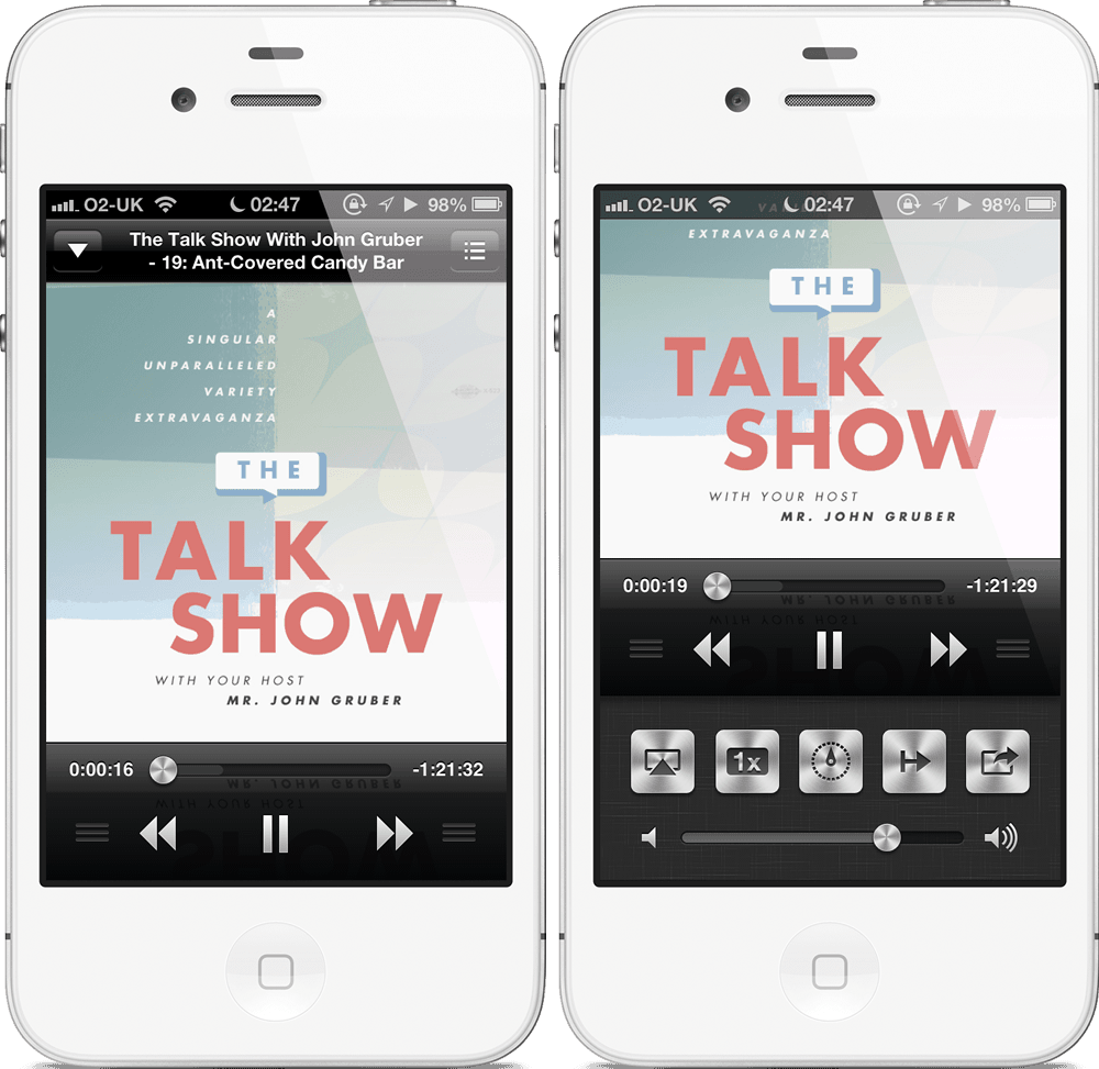
Here, the orientation of the icon doesn’t indicate the direction of a gesture as Thibaut suggests, but the structure of content and navigation within a layout. Horizontal bars suggest that content and navigation are arranged vertically, one on top of the other, whereas vertical bars suggest they are arranged horizontally, side-by-side.
Update: How could I forget the example every iPhone user will know? The grippy grabbies around the camera icon on the iPhone lock screen. Thanks to Jordan Moore (who has a ’coon dawg named Bo.)