Eleventy in a Box
A premium Eleventy starter kit for designers and developers who want to spend less time setting up the same project structure and more time designing distinctive websites.
I’ve been tempted to redesign the Stuff & Nonsense website since we moved back from Australia, but you know, there’s always something else to do.
Also, I didn’t want to make a half-hearted attempt at a refresh. Instead, I wanted a new design to reflect all the things I’ve learned over the past couple of years and where I am now as a designer. Plus, I didn’t have an idea.
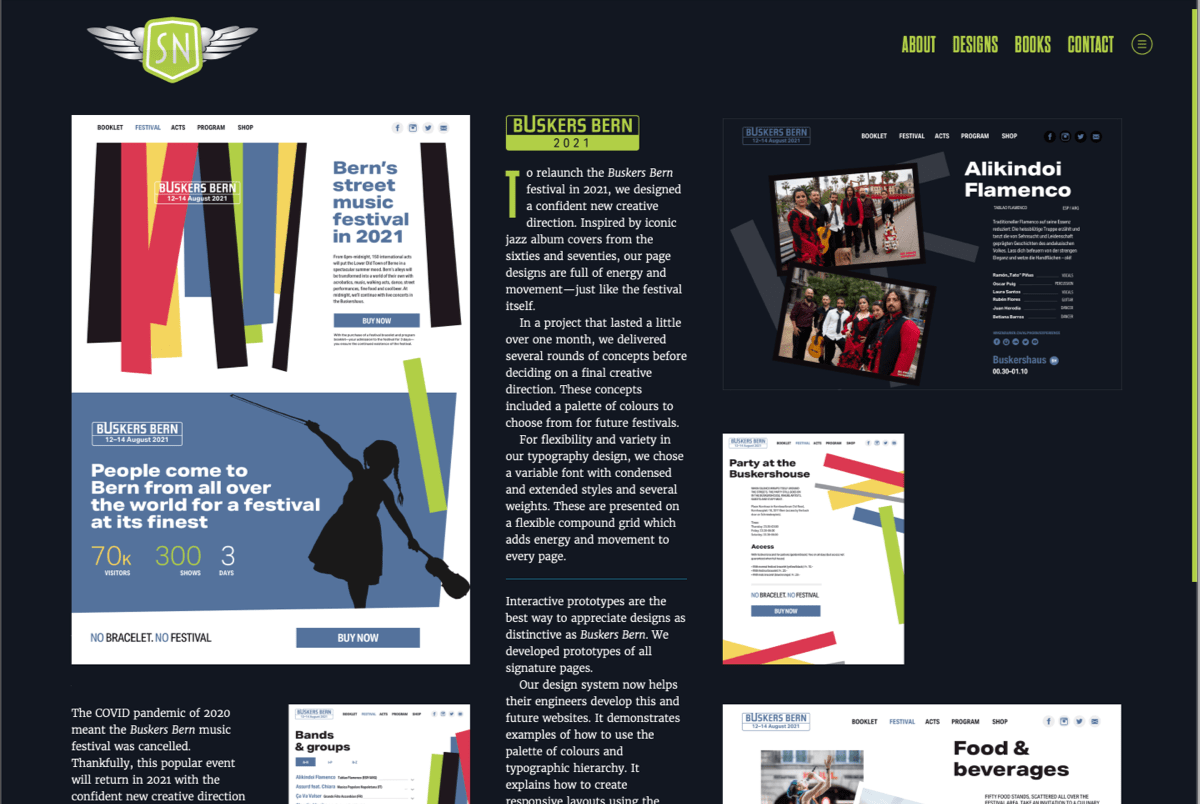
Over the Christmas break, an idea for a new design came to mind and I started to sketch rough layouts and experiment by implementing them in Grid. What really made the design feel right to me was the 4+5 compound grid I’d chosen. It not only allowed for dozens of layout modules, but also looked distinctive and interesting. Those experiments lead to the design you see today. I’ll talk more about the compound grid and how I implemented it in a future post.
I’m now working as Director of Product Design for Nozomi Networks three weeks per month. In the one or two weeks off between sprints, I’m available to work on projects I think are interesting. These should be commissions where I can add value and at the same time enjoy creating something I can be proud of.
The new website is tailored to helping me find the right clients and projects for the time I have available. I know not everyone will like it, but I hope those who do will better understand what I can offer, then get in touch.
Choosing the right typeface is a fine balance between flexibility, performance, and style. I quickly fell in love with the personality of Dharma Gothic by Dharma Type’s Ryoichi Tsunekawa. Dharma Gothic might’ve been inspired by 1800s-style wood type, but it has a certain contemporary feel and seems friendlier than condensed alternatives like Champion Gothic or Tungsten Narrow.
Although Dharma Gothic is available from Adobe’s font library and Typekit, for performance reasons I decided to buy a license for the four web fonts I use and am hosting them on my own server.
For body copy, I settled on Merriweather which I downloaded from Google Fonts and also host on my server. The total payload of these font files is 265Kb. That might seem expensive, but as typography is such an important aspect of this design, these fonts are worth their weight.
It’s been over ten years since Jon Hicks turned Kevin Cornell’s sketches for a car badge-based design into a Stuff & Nonsense logo. This time, I wanted to evolve that logo mark by enlarging its wings, reshaping the badge, and making the “SN” inside it clearer. My Illustrator skills aren’t up to much, so I asked the one and only Veerle Pieters to turn my Sketch concepts into the finished new logo.
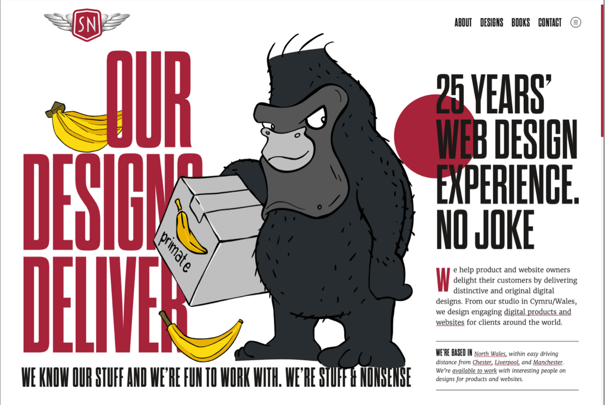
The default colour of that Stuff & Nonsense badge is the same red we’ve used for years. But when it came to the dark colour theme, I wanted to do something different by making the badge colour blue.
For this new design, I chose two palettes with a very limited set of colours. One shade of red, black, and white for the light theme, and two shades of blue for the dark version.
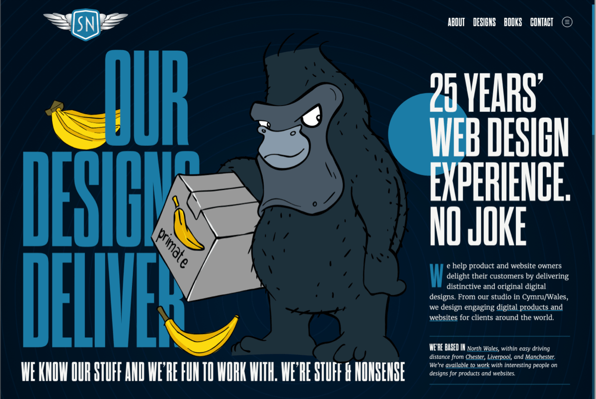
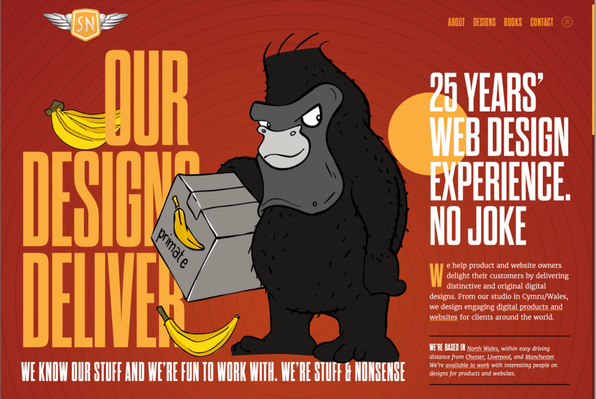
I laboured for far too long to find the two shades of yellow for the banana skins which litter the site, because I needed them to work well with both the blue and red themes. If you can find it, there’s also an orange theme Easter egg version of the design.
I’ll talk more about my colour choices and how I implemented them in a future post but needless to say, using CSS Custom properties make switching between colour palettes simpler than ever before.
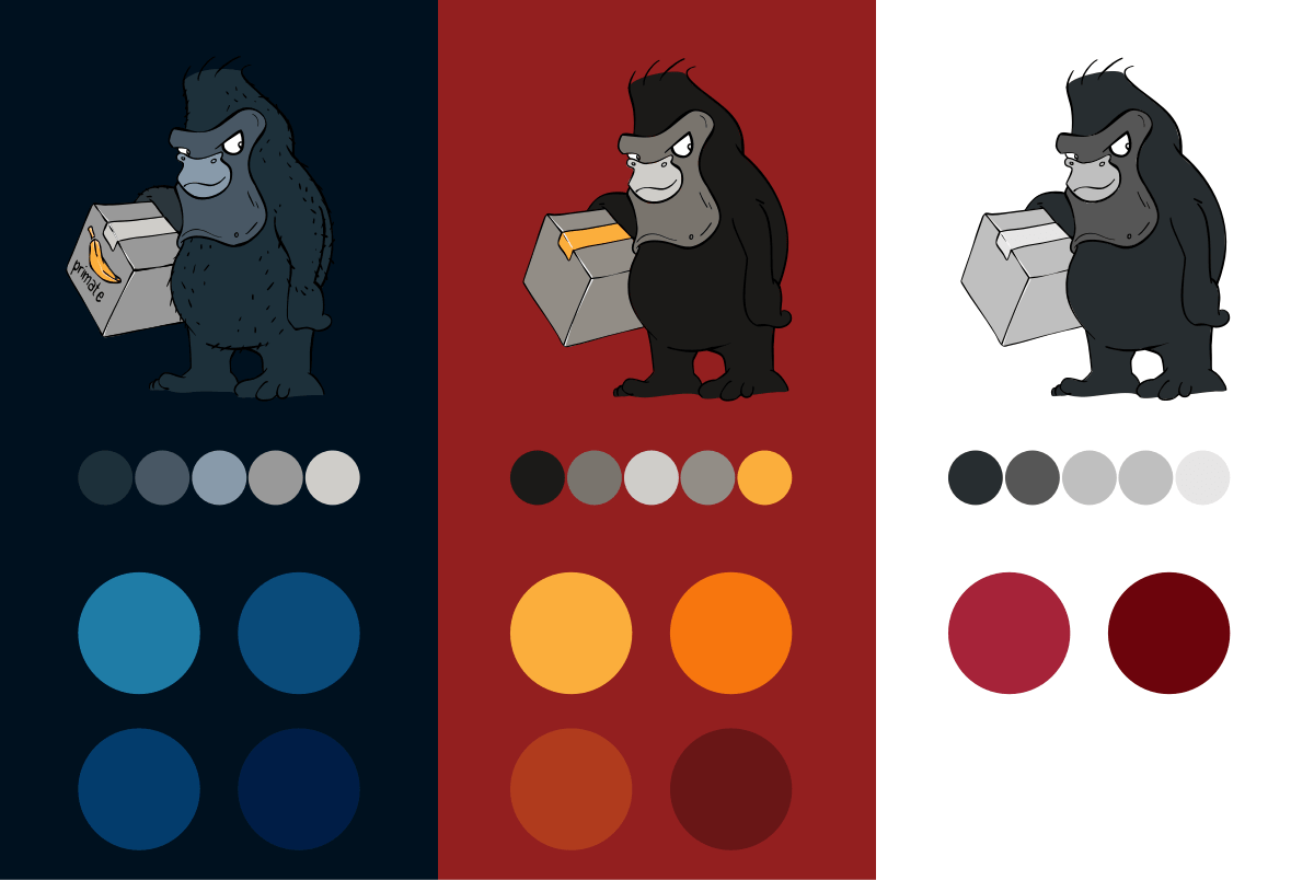
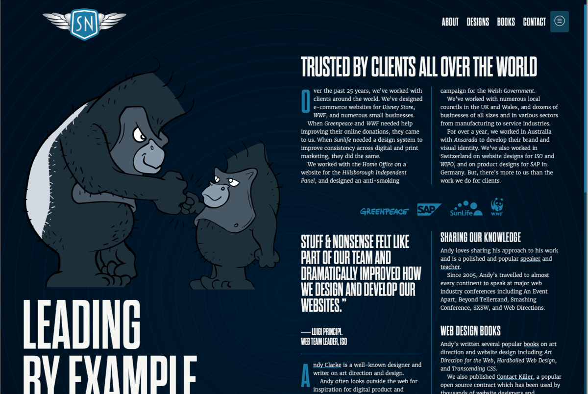
It isn’t just backgrounds, buttons, and text which change for each theme. Each Fast Eddie illustration also subtly changes colour to blend better into light, dark, and Easter egg versions. Each of the stories in my portfolio also include a new colour palette which matches the client’s brand.
If you stay clear of the generic style so popular with tech companies, illustrations can add real personality to a website. I also love working with illustrators, and couldn’t be happier about working with Markus Freise.
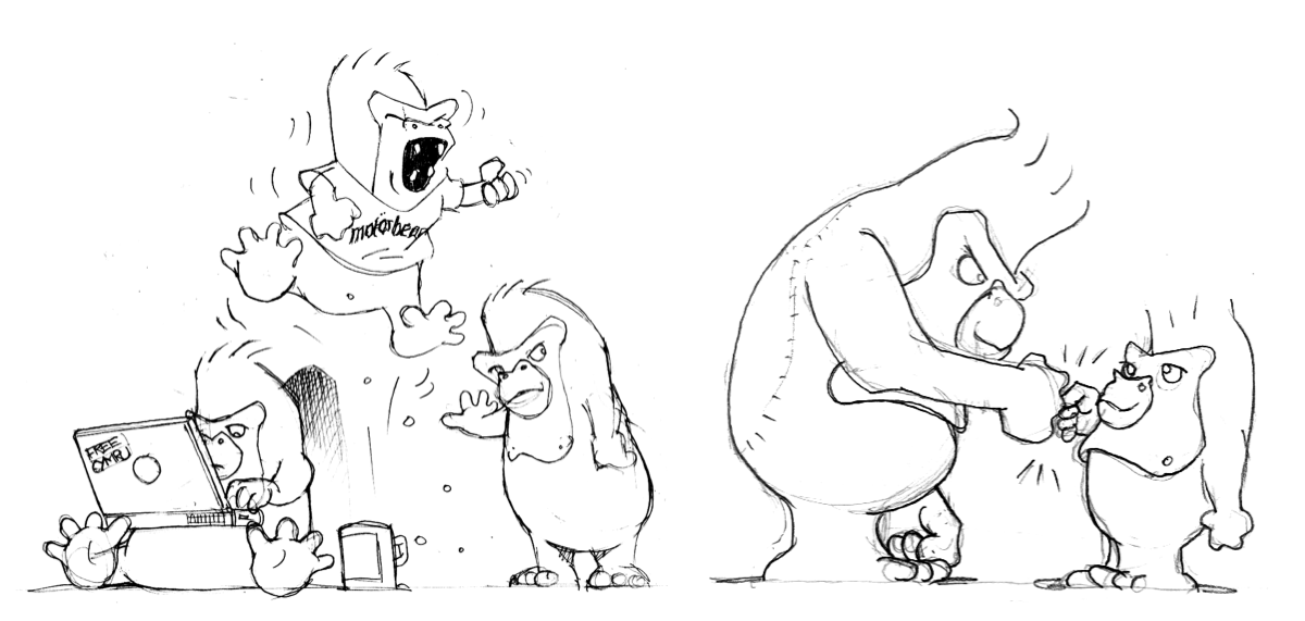
Markus took my ideas, added plenty of his own including the COVID-safe, fist-bumping, pair of gorillas on the about page, and the Kong-style, banana holding gorilla on the contact page. I asked for very few changes to Markus’s initial sketches.
As a tribute to Motorhead’s classic line-up guitarist, this new gorilla is called Fast Eddie (Clarke.) The small gorilla on the about page is of course called Philthy Phil.
This new website is laden with SVG, from the obvious Fast Eddie illustrations to key headlines and data visualisations. Learning more about developing creative, high-performance SVG files has been one of the most enjoyable parts of implementing the new design.
For Fast Eddie, I took the Illustrator SVGs Markus delivered and deleted all the colour-filled paths, leaving just his hand-drawn outlines. Using Sketch, I added new filled paths using as few points and curves as possible to reduce the overall file size. From there, I optimised the resulting files using Jake Archibald’s SVGOMG! online tool, then opened them in my text editor (Nova) and added class attributes to each path which allows for the subtle changes in colour.
This process to took time, but the result is some highly optimised, low weight, high performance SVGs. Including Fast Eddie, his bananas, and both blocks of text, the header section of the home page weighs only 80kb.
I’ve really enjoyed learning about how to combine SVG text elements with graphical components. This layering of elements is important because it adds extra depth to the design.
The key headlines are set using SVG text elements and the Dharma Gothic typeface. Unlike HTML/CSS text, SVG text scales fluidly and positions can be very precisely controlled. I’m very surprised I don’t see more designers and developers setting text in SVG and I will definitely being doing it more often.
With several different element types inside my SVGs—paths, primitives, and text—I needed a way to change their positions without exporting new versions every time I changed the design. Before this project, I hadn’t learned that it’s possible to nest SVGs. Doing this allowed me to put every element exactly where I wanted it, and change positions without leaving Nova. I’ll talk more about how I used SVG text in a future post.
Spending time experimenting with my compound grid encourages me to design several, very different page layouts for this new website. There’s a very different look at feel to my biography page, a simpler layout on the contact page, and I had plenty of fun bring the information on my speaking and workshop pages to life.
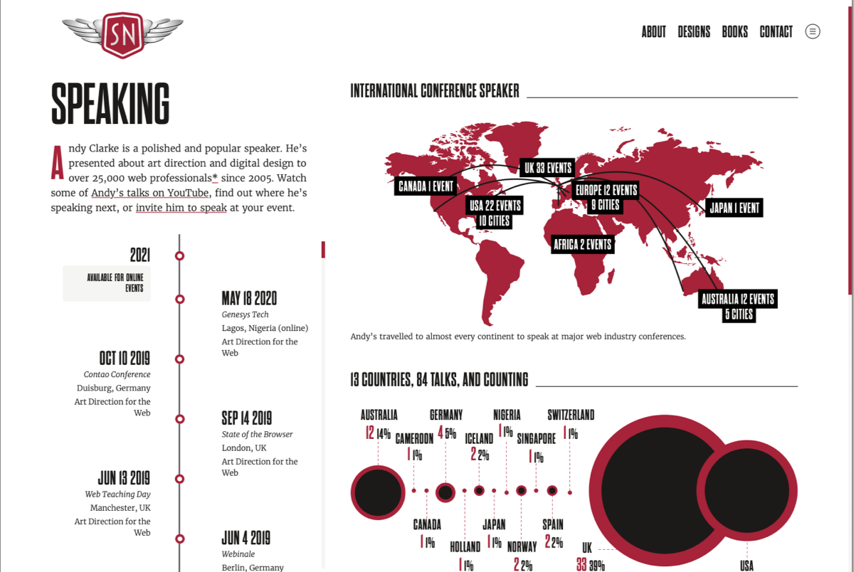
Over the past few years I’ve become fascinated by data visualisation and the speaking page in particular allowed me plenty of scope to play with both visualisation design and how to implement them using SVG.
Accessibility and performance matter as much as style in this design. I paid close attention to accessibility and while I haven’t (yet) tested its accessibility with people and assistive technologies, I plan to do just that over the next few weeks.
With so many visual elements in this design, I also wanted its performance to be better than ever. Along with optimising my images and serving them from my Cloudinary CDN, I optimised SVGs aggressively.
I also took advice from Harry Roberts on structuring the content order of my pages’ HTML head portion. To give the illusion of even faster pages, I now use Instant.page to preload pages when someone hovers over a link.
The home page now has a Lighthouse score of 96/100 on mobile and 100% on desktop. I couldn’t be happier about that.
This was a team effort, but there’s really only me on the design, so I called on some of friends to help out where my experience is lacking.
Paul Boag reviewed content, helping me focus messaging on what appeals to potential clients. Markus Freise created Fast Eddie and was a pleasure to collaborate with on the new illustrations. Steven Grant was a shoulder to lean on when deploying the website to GitHub and Digital Ocean. Sush Kelly wrote the Javascript and implemented the swing-out menu. Veerle Pieters polished my design and finessed the new Stuff & Nonsense logo mark. Harry Roberts—in person and with his excellent video course—helped me improve performance. Dave Smyth helped get the website running locally and resolve some sticky Statamic issues.
I really hope you enjoy the new Stuff & Nonsense design. If you haven’t been there yet, start exploring from the home page.
A premium Eleventy starter kit for designers and developers who want to spend less time setting up the same project structure and more time designing distinctive websites.
Contract Killer is plain and simple and there’s no legal jargon. It’s customisable to suit your business and has been used on countless web projects since 2008.
Free compound grid and modular grid layout generators, plus a set of HTML/CSS layout templates you can call on to make more interesting layouts, available to buy.