Inspired Design Decisions webinar: Pressing Matters
I’m looking forward to tomorrow afternoon (May 21st,) and sitting down with Smashing Magazine’s Vitaly Friedman for the second of my Inspired Design Decisions webinars, exclusive for Smashing members. This webinar is my deepest dive so far into the concept of compound grids and how to use them.
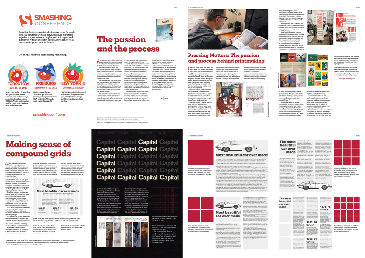
Grids have a long and varied history in design, from the earliest books, through movements like constructivism and the International Typographic Style, right up to the present-day popularity of grids in frameworks like Bootstrap and material design.
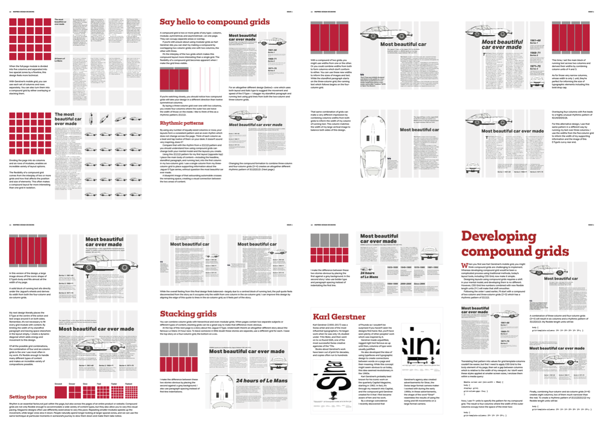
A compound grid is two or more grids of any type—column, modular, symmetrical, and asymmetrical—on one page. They can occupy separate areas or overlap. It’s the interplay of the two grids which makes this compound layout more interesting than a single grid.
In this, the second webinar in this monthly series, I will teach you how to expand your repertoire of layouts by combining more than one grid into a compound grid. I explain why to design with, and how to develop with compound grids.
- How combining grids increases design flexibility
- The difference between layered and stacked compound grids
- How to use 2 + 3 columns, 3 + 4, and 4 + 6 columns
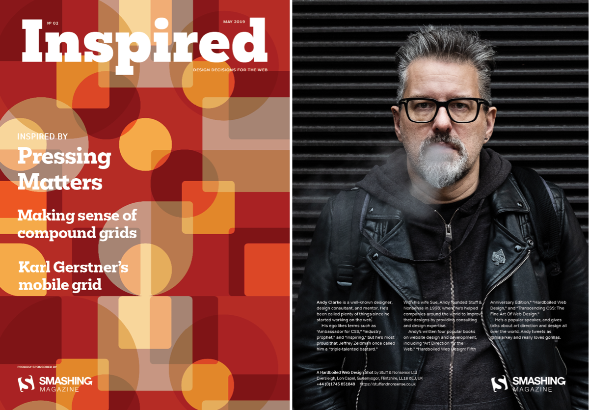
Over the hour-long webinar, I’ll also introduce you to the inspiring Pressing Matters magazine and Swiss artist and typographer Karl Gerstner with whom I share a strange connection.
Smashing members get access to:
- The beautifully art-directed article (PDF)
- Full code examples
- A one hour webinar with slides