Lead weight
As I wrote yesterday, CSS has unresolved problems concerning the lack of variable line-heights (leading) in relation to available installed typefaces. I don’t expect those to be resolved any time soon, unless by switching to @font-face for even commonly installed typefaces or some clever JavaScript font detection. During my teaching in Australia last week, another leading issue, in relation to CSS frameworks, came to mind. This one can be resolved by applying a little typography knowledge.
CSS frameworks, including, but not limited to the 960 Grid System, that include a typography component, encourage designers to set baseline values for type size (CSS font-size) and leading (line-height), in 960’s case:
body {
font : 13px/1.5 Helvetica, Arial,'Liberation Sans', FreeSans, sans-serif; }
Others, including Blueprint offer a helpful grid image for you to apply to the body element while designing or prototyping in a browser.
I'm not saying that either of these are problems by themselves, after-all the approach they advocate was developed by some top-class, diamond geezers like Mark Boulton, and Wilson Miner (and more). But readability problems can occur if designers or developers apply supplied, third-party code out-of-thebox and use it like a shake-and-bake, instant cake mix.
To repeat what I wrote yesterday, there are several factors that should influence your choice of leading amount for body text.
- Does your design use dark text against a light background or (like this one) the reverse? You should always increase the amount of leading for reversed designs.
- How long are your line lengths? You should always increase the amount of leading in proportion to the length of a readable line (the measure). Of course this becomes difficult in liquid-width designs, but more on that another day.
- The x-height of your chosen typeface.
Where framework defaults fail
Let’s take a look at one or two examples using Blueprint:
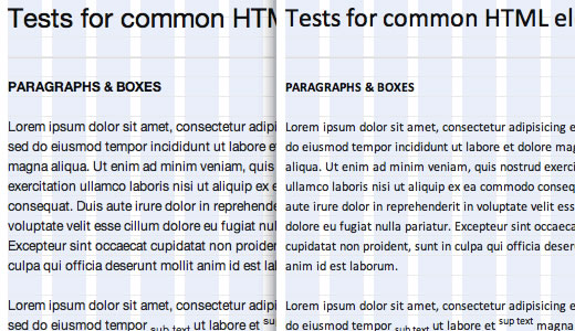 Helvetica (left), Calibri (right)
Above: On the left, the default framework Helvetica adheres beautifully to the specified 18px baseline. On the right, after changing the typeface to Calibri the baseline is maintained. Yet because Calibri has been designed with a smaller x-height, the leading becomes too open. For typefaces with a smaller x-height, you should reduce leading.
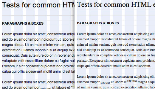 Helvetica (left), Times (right)
Above: Sans-serif vs serif: Sans-serif typefaces generally require different (more open) leading than the more readable serifs.
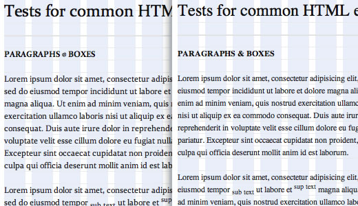 Constantia (left), Times (right)
Above: Comparing two serifs, Constantia (left) and Times (right).
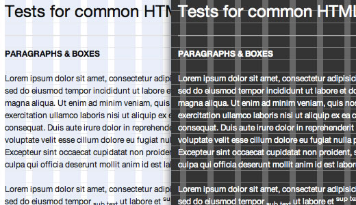 Helvetica (left), Times (right) comparing reversed designs
Above: You should consider several factors when making designs that are light-on-dark. Lighten the font-weight, although this is currently impossible with most browsers. Increase letter-spacing if that's possible and most importantly – increase leading.
Moving beyond shake-and-bake
In each of these examples, changes to leading from the out-of-the-box values, by increasing or reducing it, will improve readability over what comes as standard. Opening leading for sans-serif typefaces and for light-on-dark designs. Decreasing leading for some sans-serifs and for typefaces with a smaller x-height.
My general distaste for CSS frameworks isn’t (always) because of the frameworks themselves, but because of the fact that they encourage designers and developers to use their components as recipes, out-of-the-box, rather than develop their own unique solutions.
By all means use frameworks code as a starting point, but please don't use their typography code as ‘set and forget’. Instead use leading appropriately for the typefaces you choose and the designs you make.