New Internationalist online branding
As part of the New Internationalist redesign project, I’m focussing on how the organization presents itself online. To begin that process, I’ve been researching the printed magazine since it started in 1973. (I should stress that I’m not working on the organization’s overall branding, nor the design of the magazine.)
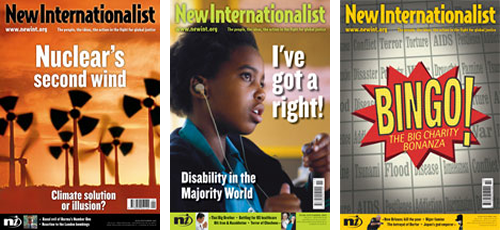
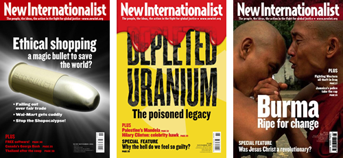
The branding of New Internationalist magazine has changed, at times radically, since the first issue in March 1973. That month the Provisional IRA bombed Whitehall and the Old Bailey in London, Pink Floyd released Dark Side of the Moon and the last US soldier left Vietnam. Back then, New Internationalist sported an uppercase, slab serif header with a sash emphasizing its newness. As would become a common device over the years, its wordmark's colour changed to blend with its cover art.
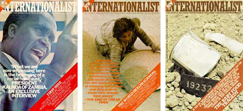 1973: Uppercase, slab serif header
With a gap of six years in New Internationalist's online archives, we pick up the story with issue 80 in October 1979, to find that the workmark has mutated — losing the all uppercase letters and placing the word new above x-height. Again the wordmark colour changed to blend or contrast with each issue's cover art. This branding continued for six plus years, until it said its goodbyes in issue 157.
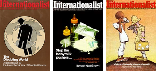 1979: Lowercase slab serif header
March 1986 (a month notable if only for the launch of the Today newspaper — the first in the UK to use computer photosetting and full-colour printing) saw a radical departure as New Internationalist became NI. First utilizing uppercase slab serif characters, a device that lasted until April 2000;
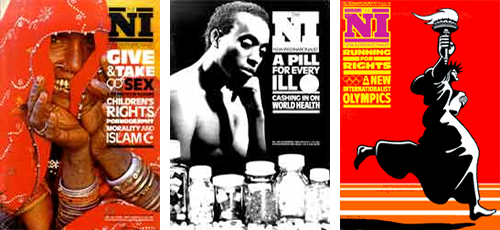 1986: Uppercase slab serif initials
and from then on, just as the United States government began its anti-trust tussles with Microsoft, as ni.
 2000: ni
I must admit that this 2000 incarnation of New Internationalist's ni's branding is my least favorite. Maybe that's because its swoosh quickly became a cliche, but mainly I think because the sans-serif letters and italicized i seem to have little to do with the organization's visual history.
In September 2005, 382 issues under its belt, ni and its swoosh were gone and New Internationalist was back, the full wordmark, this time in contemporary (and current) sans-serif.
 2005: New Internationalist was back in sans-serif
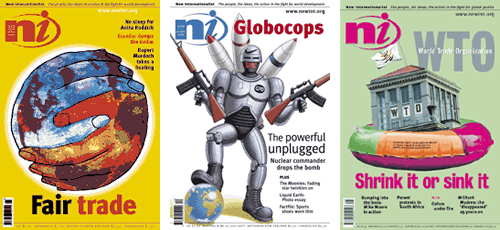
One of the magazine's longest running design devices, that of blending or contrasting with each issue's cover art, remained, at least for a time, before establishing a new standard of white against a red background, that continues today.
 New Internationalist today
This trip through the archives might be fascinating, but what does it have to do with my job today?
Although the magazine's branding changes has followed patterns, during any period it has remained largely consistent. The current web site seems at times positively schizophrenic. If you dig deep enough you might be (un)lucky enough to find three different New Internationalist/NI/ni logos on the same page.
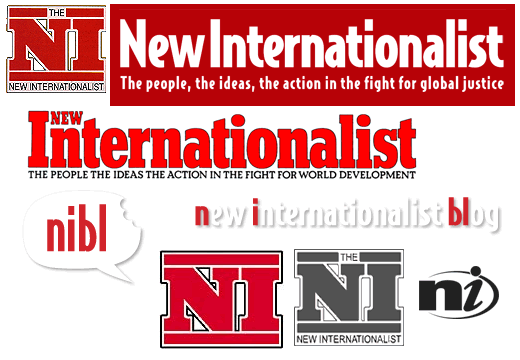 New Internationalist/NI/ni
Part of my task is to create a consistent look for all of New Internationalist's online magazine content, blogs and its shop, while at the same time keeping it clear to a visitor what section they are reading. My current thinking is to adapt and resurrect a long-standing New Internationalist tradition and use subtle colour changes to denote each section.
I'm also concerned that the website branding must be consistent to no small degree with the printed magazine. This will help to keep a unified feel for people moving from web to print and from print to web. At the same time, I don't feel that the website will benefit by being constrained by the magazine branding; colour or typography.
What's needed, I think, is a fine balancing act — a design that nods respectfully at the past, but has its own air of self-assured confidence.
More from Stuff & Nonsense
Services I offer
Product UX design
The contract template trusted by thousands of designers and developers to keep their web projects running smoothly.
Design mentorship and teaching
Whether you’re stuck, starting out, or stepping up—Andy’s here to help you become a better designer.
Squarespace templates for sale
Take your Squarespace designs from good to great with my bespoke templates.
Andy Clarke on YouTube
Join Andy on YouTube to learn how you can make better product and website designs.