New Internationalist redesign - entering the final stages
Now is the time, particularly during this open design process, where I get nervous about presenting the design I hope to launch. While I know that there are still aspects left to resolve, I wanted to share my process and thinking behind what I’m showing today.
I know that a lot of designers spend hours crafting their designs in Photoshop or Fireworks before asking a client to sign-off on a design. When ink is on paper, only then will they start to write code. As you'll know from this process, I do things differently. I wireframe and prototype in a browser and I design using one too.
On this project, working with markup and CSS, I have been able to see the effects of design decisions across all thirty templates in a seconds after changing often just a few lines of CSS. I know that I've written about this before, but I honestly believe that (for me at least) designing in a browser makes the process of design more spontaneous, fun and accurate than making iterations in Photoshop or Fireworks.
Rather than spend hours or days at the start creating an overall look-and-feel direction, I've worked from the inside out.
- Building structure and layout
- Working on typography
- Layering on hues
- Adding, removing, then sometimes adding again, graphic elements
Instead of designing for intensive periods, I prefer to work in short bursts, sometimes for only a few minutes a day. I often leave a design open on my second monitor so that I can live with it for a while, then I move on to the next step. Recently I've found that one result of this is adding far fewer graphic elements and only where I really feel that a design benefits from them.
The New Internationalist look-and-feel
I had several objectives when I started out designing the New Internationalist look-and-feel. I wanted:
- Continuity with aspects of the existing brand where they worked. That is why I retained similar base colours and used red as an accent/action colour.
- To evolve the character of New Internationalist to make it appear more open and confident.
- To reflect the heritage of the printed magazine by using subtle halftone shading to hint at printed dots
So here it is.
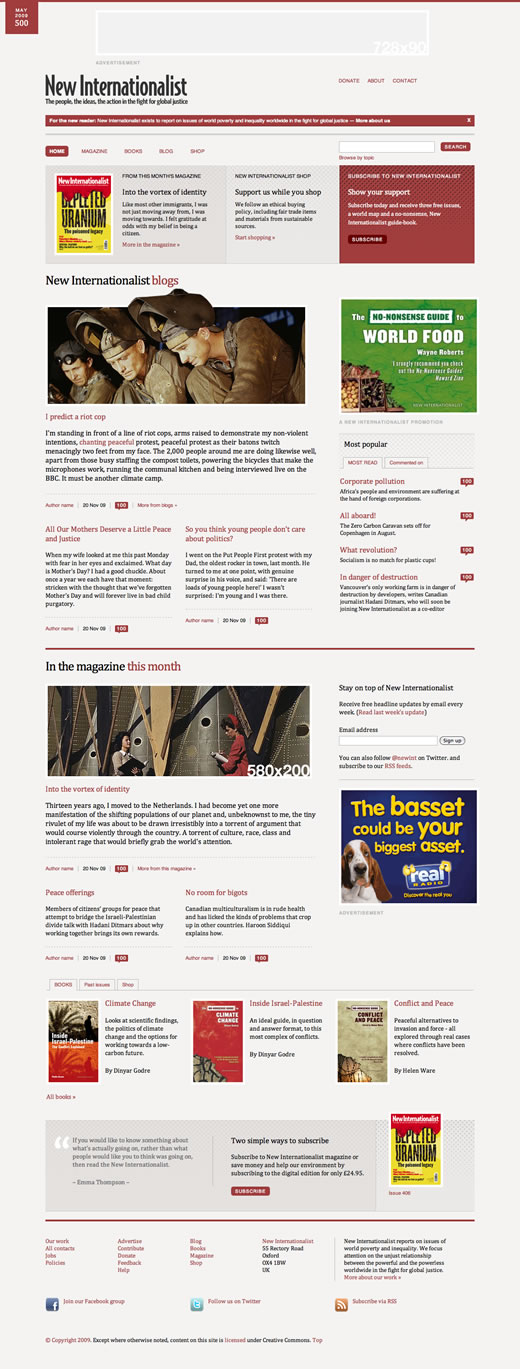 New Internationalist home page redesign
You can view the design as:
- An image on Flickr
- A demonstration with links to many other templates for the new site.
- A side-by-side comparison with the current home page
I'm always conscious when I work on an existing brand that I need people to recognize the character of a familiar site in certain aspects of a new design. I hope that readers of New Internationalist will see this design as an evolution and that my use of some familiar elements will help them to quickly feel at home.