Layout Love: Take the guesswork out of layout by using ratios
One of my biggest problems with grids included with frameworks is that they offer little or no help in deciding proportional relationships between elements. Ratios can be an enormous help in determining these relationships, but they’re rarely written about in relation to web design. I want to change that.
The 12-column mental model
There’s nothing fundamentally wrong with the type of grid included with Bootstrap, Tailwind, or countless other tools, including layout helpers. But they offer little or no help in deciding the width of or proportional relationship between elements. These grids are little more than guides for aligning content.
Take this simple example of a three-column layout where a wider column contains the main content, a narrower column includes supporting information, and an image fits between them. But, how many grid columns should be devoted to each area?

Should the supplementary content occupy two, three, or four columns? What, if any, should the relationship be between this and the main content? If the supplementary content occupies three columns, how many columns should the main content occupy? A framework grid can’t answer these questions, but ratios can.
Wolfgang von Wersin’s orthogons
Most people will have heard of the golden (Auron) ratio of 1:1.618, but in 1956, Czech-born designer Wolfgang von Wersin wrote about several other ratios. In his book, von Wersin described twelve dynamic rectangles, which he called “orthogons.” These orthogons each have their mathematical ratio:
- Quadrat (1:1) is an even or square ratio
- Hemidiagon has a ratio of 1:1.118
- Trion 1:1.154
- Quadriagon 1:1.207
- Biauron 1:1.236
- Penton 1:1.376
- Diagon 1:1.414
- Bipenton 1:1.46
- Hemiolion 1:1.5
- Auron (or the golden) 1:1.618
- Sixton (or Hecton) 1:1.732
- Doppelquadrat (Halves) is a a rational ratio of 1:2
Although von Wersin wrote about these ratios over 60 years ago, they can still help inform design decisions today. Let’s go back to that three-column example. Using a diagon ratio of 1:1.414, the narrowest text column (A) is the base unit. The width of the image (B) is the base unit multiplied by 1.414. Finally, the widest text column (C) is the width of the image multiplied by 1.414.

Switching to a different ratio changes the relationship between elements. With a lower biauron ratio of 1:1.236, the supplementary content is wider. But with a higher doppelquadrat ratio of 1:2, the supplementary content is narrower, and the main content is much wider.

Using ratios helps us connect the size of elements within a design. The ratio you choose will depend on content and the feeling you want from a design. Lower ratios produce subtle size differences and help lay out academic or editorial content. Higher ratios have greater differences. They add drama to a composition which makes them useful for designs with a strong purpose.
A quadrat, even, or square ratio (1:1) feels harmonious and unchallenging. It’s hardly surprising that people have used it on countless website designs. A biauron ratio (1:1.236) produces subtle size differences. The auron or golden ratio (1:1.618) is likely the best-known ratio. It’s balanced but more distinctive than an even ratio.

The diagon ratio (1:1.414) increases variety in column widths. Using a sixton or hecton ratio (1:1.732) adds drama to a composition, and a doppelquadrat ratio (1:2) increases that drama even more.

5 columns with several ratios
The differences between these ratios becomes even more apparent when increasing the number of columns from three to five. In a grid based on a biauron ratio, column widths increase subtly and there’s much less of a difference between the narrowest and widest columns. Those differences increase more steeply when the grid is based on a diagon ratio. With a doppelquadrat ratio, there’s a dramatic difference between the two extremes.

Layout Love includes three and five-column layout modules which are based on five of these ratios:
- Biauron 1:1.236
- Diagon 1:1.414
- Auron 1:1.618
- Sixton 1:1.732
- Doppelquadrat 1:2
For each grid, the width of the first column is a 1fr base unit. The second column multiplies that base unit by the chosen ratio. The third multiples the second by the ratio again, and so on. For example, for a three column layout based on a biauron ratio of 1:1.236, the column widths are 1fr, 1.236fr, and 1.262fr. These are easily translated into fractional units for CSS Grid:
.grid-biauron-3 {
grid-template-columns:
[a1] 1fr
[a2] 1.236fr /* 1fr x 1.236 */
[a3] 1.262fr /* 1.236 x 1.236 */
[a4]; }
To suit my content and design, I can reorder columns—by moving any column into another position in the centre, on the left or right—while still maintaining the connections between them. This offers incredible flexibility and countless possibilities for developing distinctive layouts.
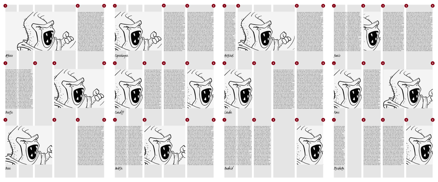
Layout Love modules
When making Layout Love, I developed sets of layout modules for three and five-column grids. There are fifteen modules based on three columns and sixty with five columns. I gave each module the name of a European city and prefixed them with the ratio and number of columns. I named the line numbers in each ratio grid to make switching between ratios much easier.
Layout Love
All these ratio-based grids and more are available in my Layout Love ratios set to make prototyping and site development work simpler. Layout Love is intentionally un-opinionated and only contains the HTML and CSS Grid you need to implement these ratio-based grids.
You can use Layout Love’s HTML and CSS for any personal or commercial design project. This set is just £2.99 and all five compound, modular, and ratio sets together are £9.99 which could save you many hours or work.