Two things about the iPad mini
Two things about the iPad mini as I’ve owned one since Friday:
- It’s the best iPad I’ve ever held and therefore the best tablet I’ve ever held. It feels perfectly balanced, both in size and weight. It’s solid but not heavy and the screen is a perfect size and aspect ratio.
- But, that screen’s terrible for displaying text. Really terrible, especially at small sizes. Don’t take my word for it, the footer on Apple’s website says it all.

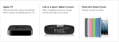
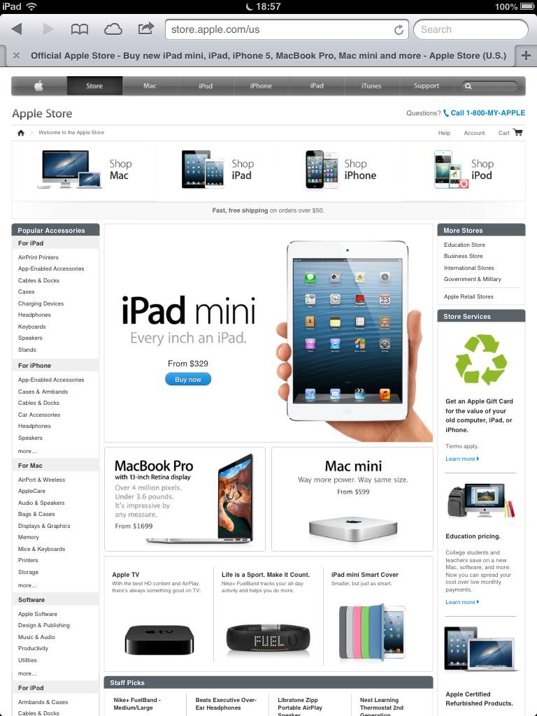
Their store’s full of tiny text too.
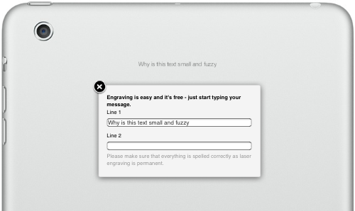
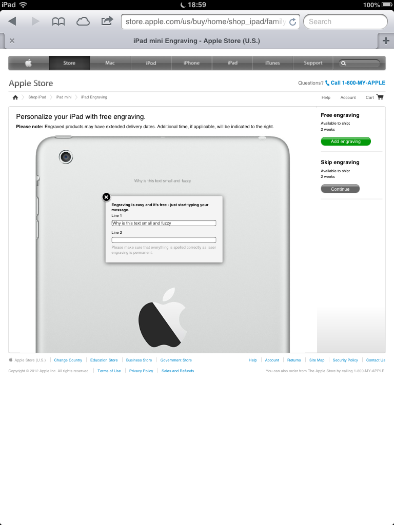
And Lord help you if you want to read what you’re asking them to engrave on the back of one of these things.
The iPad mini has the same number of pixels as the 1st generation iPad and the (still available) iPad 2, although it packs them in tighter into its smaller size. Oddly, this makes the rendering of text worse to my eyes.
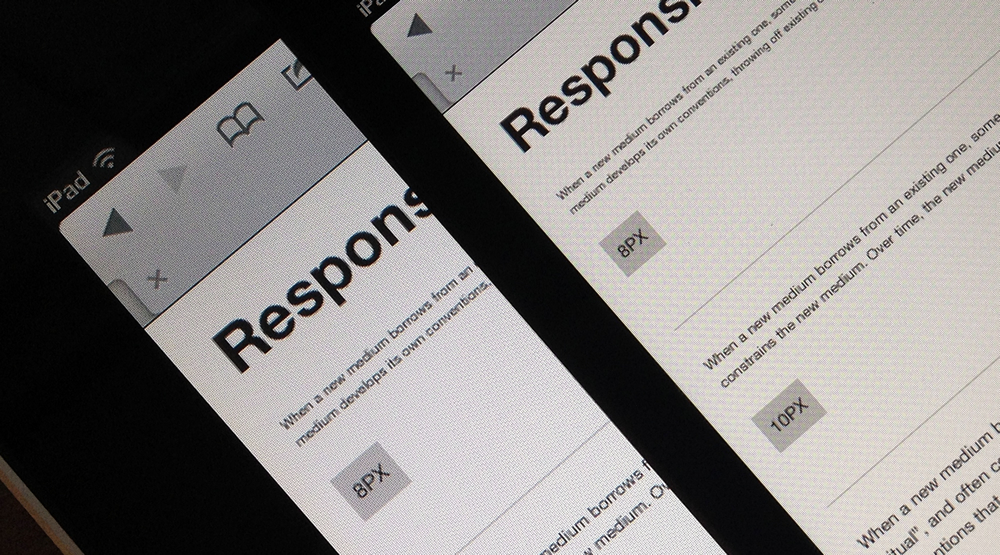
In an ideal world, I’d use a CSS Media Query to bump small text sizes up a notch or two, perhaps making 14px the minimum instead of 12px. Trouble is, there’s no Media Query that can tell these iPads apart (the resolution query isn’t supported by Safari). That means that from now on I’ll serve larger text to all 1x iPads.
If you’re not already doing it, evaluating type on devices during design is essential. Me, I use versions of my type testing sheets. Here are the defaults.
And they’re on on Github too. Open them on your devices and squint until you can read.