Using data- attributes for style variations

In a video of one his talks, Andy Bell mentioned CUBE CSS and his approach to using data attributes for variations (exceptions) to design styles. I’m currently working on a grid system for a product project and revamping my Layout Love templates, so was keen to implement this approach.
“We use data attributes because an exception should only occur in exceptional circumstances (the clue is in the name.) The goal of most of the CUBE CSS methodology is clarity and separating exceptions into data attributes achieves exactly that.”
https://cube.fyi/exception.html#why-data-attributes
My system started with a basic flex container which by default spaces any number of items evenly. This component is ideal for arranging items in a simple interface element:
<div class="flex">
<div>1</div><!-- one -->
<div>2</div><!-- two -->
</div><!-- flex -->
I used a class attribute value (flex) on every flex container:
.flex {
display: flex; }

.flex > * {
flex-grow: 1; }
This flex container is a starting point as most interface elements need styling more precisely with several layout variations possible:
- Alignment
- Direction
- Gap
- Number of items
- Proportions
There are plenty of possible ways to write variations. I could use BEM-style class attributes to build on the basic flex container:
<div class="flex flex--center …">
…
</div><!-- flex -->
But, I’ve come to realise that BEM reduces instead of increases clarity and doesn’t help separate default styles from variations in the way that data attribute do. Data attributes offer a clearer way to describe variations (eg: align) and their values (eg: centre:)
- data-align="centre"
- data-direction="reverse"
- data-gap="default"
- data-items="2"
- data-proportions="asymmetrical"
Instead of using multiple, similar-looking BEM class attributes—which rely on someone understanding the BEM syntax—in HTML, a single class property followed by data attributes is much clearer:
<div class="flex
data-proportions="asymmetrical">
…
</div><!-- flex -->

<div class="flex"
data-proportions="asymmetrical"
data-direction="reverse">
…
</div><!-- flex -->
Styles can be bound to each data attribute using attribute selectors:
[data-align="start"] {
align-items: flex-start; }

[data-direction="reverse"] {
flex-direction: row-reverse; }

[data-variant="asymmetrical"] > :nth-of-type(1) {
flex: 2; }
Data attributes for grid
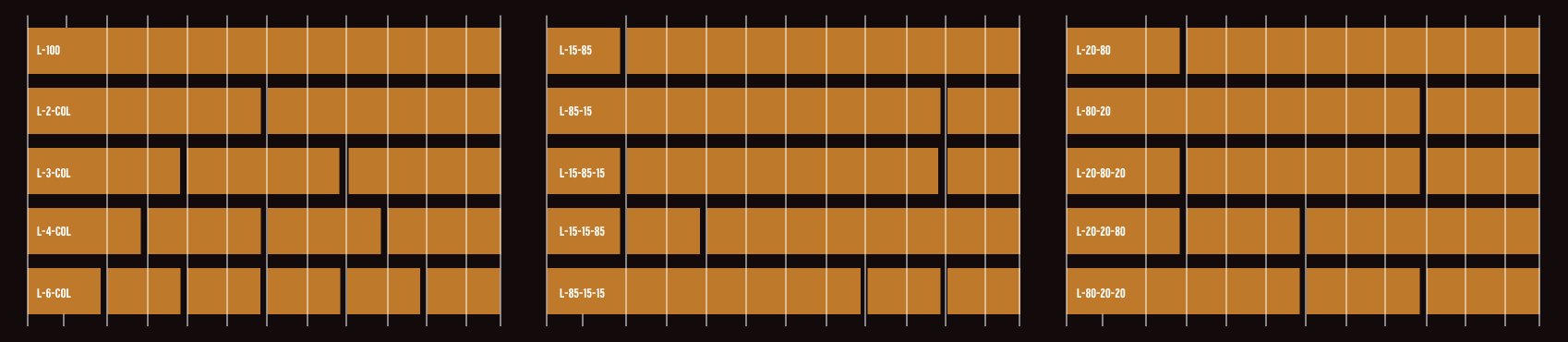
I used a similar approach to grid for the design system I’m working on and chose a twelve-column even-ratio grid as the foundation as that’s most familiar to the developers. I identified fifteen common layout patterns for the interface. These include common symmetrical layouts of 2, 3, 4, and six columns. They also include asymmetrical two and three column layouts:
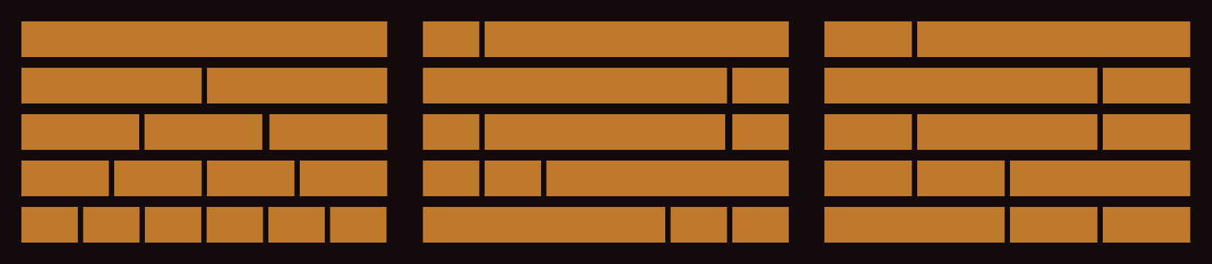
I named each pattern with a l- prefix followed by a description of the proportions in the layout. A two-column symmetrical layout is named l-2-col and three asymmetric 20% 20% 60% column is named l-20-20-60-:
To create a grid layout, I add a single class attribute (grid) to a container, then change the display property value to grid, adding the twelve even-width columns:
<div class="grid">
…
</div><!-- grid -->

@media (min-width: 48em) {
.grid {
display: grid;
grid-template-columns: repeat(12, 1fr); }
}
These grid containers share common attributes with my Flexbox components including alignment and gap, so where necessary I added CSS Grid styles to those rules:
[data-align="start"] {
align-items: start; }
Then, I added data attributes for data-layout and data-gap to my grid containers. For example a two-column symmetrical layout with a default gap:
<div class="grid"
data-layout="l-2-col"
data-gap="default">
<div>1</div><!-- one -->
<div>2</div><!-- two -->
</div><!-- grid -->
The column layout is defined using line numbers and the default gap added:
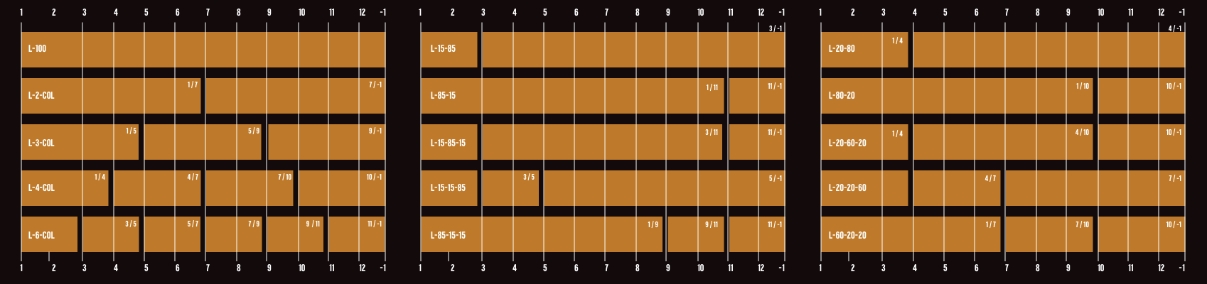
[data-columns="l-2-col"] > :nth-child(1) {
grid-column: 1 / 7; }

[data-columns="l-2-col"] > :nth-child(2) {
grid-column: 7 / -1; }

[data-gap="gap"] {
gap: 0 1vw; }
It took a long while for me to be won over by the BEM approach of adding multiple class attributes for variations to my design elements, but somehow—just as with Tailwind—those multiple classes were still uncomfortable to write. Using data attributes feels cleaner as they clearly separate the role of every attribute in a selector. Also, using data attributes also forces me to think clearly about the purpose of each attribute: alignment, columns, direction, or gap.
In the next week or two, I’ll be updating my Layout Love templates with this new approach. If you grab a copy before then, you’ll receive the updated files free of charge.