Walls Come Tumbling Down presentation slides and transcript
It’s been one helluva busy, tiring but inspiring week, traveling first to speak at An Event Apart Boston, then, with Jeremy Keith and Jason Santa Maria onto London for @media2009. At both events, I presented Walls Come Tumbling Down. Here are the presentation slides and transcript.
Presentation slides and transcript
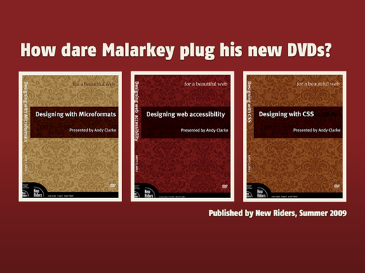
I've been wanting to give this talk for a while. This is a different type of talk for me to give. I know that people largely expect me to talk about design or style-sheets or Microformats or any of that other malarkey.
Now I am aware that not everything that I'll talk about will resonate for everybody. Because not everybody shares the same experiences, personal or political. But I can only speak from my own perspective and experiences: I'm a designer and I run a small business.
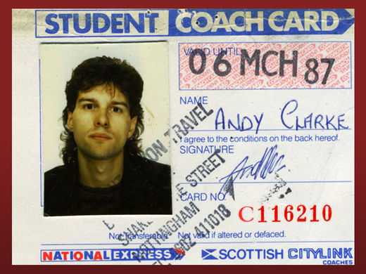
It seems like a long time ago, but in 1985 I left home to go art school. Where did those years go? Where did that mullet go?
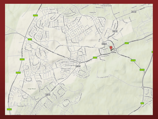
I grew up in a small town called Corby in the East Midlands (UK). It was steel-making town until the plant was closed under Margaret Thatcher.
Unemployment hit 21% and there was very little hope, even for people coming out of school with a decent education.
I remember that people there were genuinely fearful about how the economy was affecting them and their families. You know what? No one should be made to suffer that agony, not then, not now.
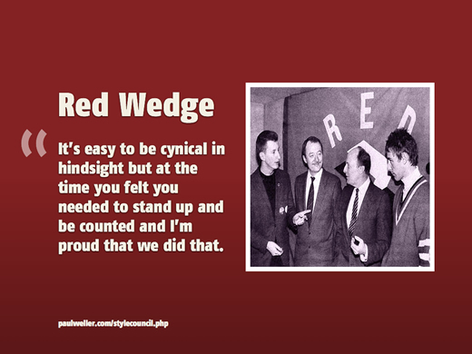
Red Wedge
In the run-up to the general election in 1987, a few of my musical heroes; Paul Weller and Billy Bragg formed Red Wedge, playing concerts to raise support for the Labour Party (as it was then). Actually support for the Labour Party was largely coincidental, and the Labour Party was really just the most convenient vehicle for people (like me) who despised Margaret Thatcher and the Tories.
What I learned during that time was that it was the pride, ingenuity and determination of working people to change things for the better, for themselves, for their fellow workers and for their communities that helped them to survive, better than any government scheme ever could do.
There were several songs from that Red Wedge period that I still listen to today. Ghost Town by The Specials is one favorite.
Between The Wars and There's Power In A Union by Billy Bragg are others.
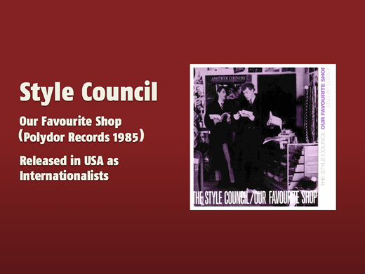
As you were taking your seats, I don't know if you noticed the song that was playing over the PA? In case you were wondering, it was Walls Come Tumbling Down by The Style Council. It was from their Internationalists album (as it was called in the US) in 1985, Our Favourite Shop in the UK.
Walls Come Tumbling Down can tell us a lot about how to handle today's troubles. The words still resonate today.
To justify recession, we're told that economies have natural cycles, like tides and that we should expect periods of growth (and) recession to come like waves. These are theories that go back to the French economist Clement Juglar who theorized that the capitalist economy cycles every 8-11 years. This recession might be not be 'natural' and I'm not an economist.
One thing that I do know is that the people who are hit hardest by recession are working people, you and me, who have little or no control over the causes. If you're affected by this recession (or any other) it is so important to remember that it's not your fault. It is important to stay positive.
What has all this to do with the web? We sometimes forget that recessions can be creatively stimulating. You only have to think back to how Thatcherism and the social depravation that it created affected popular music at that time. This recession can affect the web in similar ways, because the limitations that a recession imposes makes us to think and work in new ways.
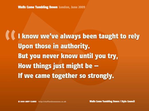
The constraints that recessions impose; on budgets and on time can help us focus more sharply on what matters most, and sharpen our methods and skills to make us more competitive and better at what we do.
We might not have the power (yet) to prevent a recession, but we do have the power to affect its outcome on ourselves, rather than, as the song says, rely on those in authority
. We have the knowledge and the skills and the power to change things for the better. Changing things is part of what this talk is about:
- Changing working methods
- Cooperating rather than competing
- Changing attitudes and expectations
But it is also about us taking control over what we know better than anyone — working on the web. We know it better than any client, any manager, any employer, because we live it every day.
We know it better because it's highly likely that we learned by our own initiative, rather than having knowledge passed down to us from above. We learned about the tools that we use and the way that we work best in our own time. This is particularly true of web standards, CSS or accessibility.
It's also important to remember that we own that knowledge and those skills, no one else. It's up to us to use them to make sure that we look after ourselves and our livelihoods and those of our colleagues. Now is the time to improve what we do to make it more efficient and profitable but also more creative.
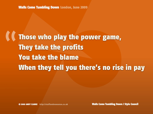
It's important that we take these steps, not wait for our clients or employers to impose new ways of working on us. Particularly when their reasons for change will likely be based on improving the bottom-line or appeasing shareholders, rather than on improving our situations.
It's also the time for us to take stock of what we know and use that to plan how we can take control of our futures. That means making our skills portable, so that we can take them with us to another organization, perhaps even one that we own, if the worst should happen.
When I think about the work that I do, every day is roughly divided into:
- Getting work
- Doing work
- Working on my business
- (Oh, and Twitter)
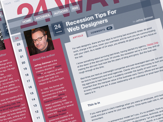
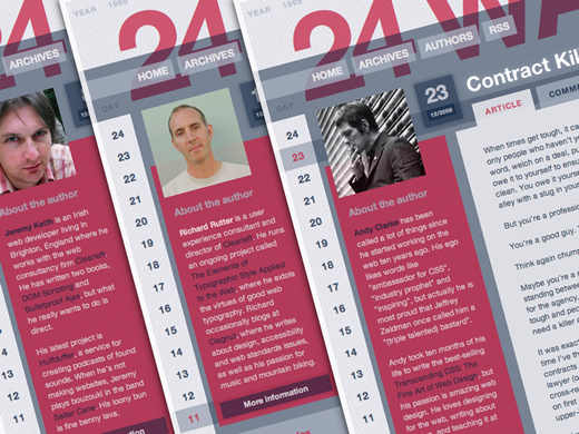
How to get work, how to present and how to sell, they will have to wait for another day. Jeffrey Zeldman wrote about these on 24ways last year. So in the time that we have, I'd like to focus on the aspect that I find most satisfying — designing.
It is also an area where I've found it possible to improve productivity and quality by finding new ways to work, at the same time making things better for me and the people I work with.
Creativity is the essential ingredient
I know it to be very common that when they are faced with appeasing shareholders or boosting short-term profitability, clients, business owners and managers look at creative departments to cut costs first. I think that this approach fundamentally misunderstands the value of creativity in business.
Creativity is the single most important aspect of a business, because it drives innovation and ideas. Ideas sell, even during a recession.
You should make more time to be creative
One of the ways that we can do this is by cutting out-dated methods and processes to make us more efficient. Becoming more efficient isn't only about reducing costs. It should also be about making more time to be creative. So if businesses and organizations are looking to maximize value for money, we need to find ways to make more time for creativity.
We also need to take a long, hard look at attitudes, preconceptions and misconceptions that our clients and employers might have about what we do.
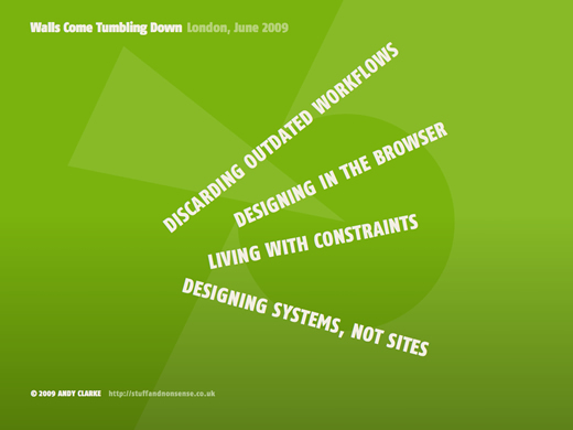
When I spend more time designing and developing than I do managing, my clients get a better job and I am more satisfied with the result. These are some of the areas that have made a big difference to me.
- Coming up with new and better workflows
- Designing in the browser
- Learning to live with constraints
- Designing systems, rather than sites
Time to discard outdated workflows
When I was working in digital photography in the mid-nineties, I saw the backwards and forwards, trial and error workflow that had been commonplace in digital repro change in just a few years. I can see parallels with the largely waterfall process for web design and development that is so common today.
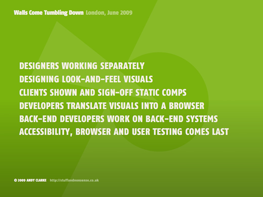
- Designers and developers often work separately
- Designers work on static look and feel visuals
- Clients are shown and sign-off on static comps
- Developers translate those visuals into the browser
- Back-end developers work on back-end systems
- Testing, by users and for browsers and accessibility comes last
In this workflow, changes and corrections mean regularly going back to the drawing board and there is often tension between the people involved in the process. This workflow, the workflow that most us continue to work inside is overly time-consuming, inefficient and wasteful.
It is also history, period. When this recession is over, we will look back at how we work today with the same sense of disbelief that I remember from the mid-nineties. What will it be replaced by? That is going to be up to you.
Developing new workflows based on creativity
I'm no expert in workflow methodologies. I don't think that any single process will work for everybody, or for every project. I hope that you'll find your own ways for everyone; designers, developers and clients to interact that will waste less time, allow more time for creativity, and give a real, overall boost in quality from concept to production.
What I know from my own work is that a more agile process, one that includes:
- Designing in a browser with markup and CSS
- Working in short, focussed bursts (or sprints)
- Designing iteratively
- Working in groups
- And side-by-side with developers and clients
Is incredibly efficient and also very creatively stimulating. Clients understand this process and they enjoy it. They also have more input during it, and in my experience, consider it better value for money.
Designing in a browser
I think that now, in a recession, more so than ever before, that creating one single point around which designers and developers can work cooperatively, in parallel rather than in series, immediately creates a better workflow. That central point need not be a functional specification or a static visual design but instead — content — expressed as HTML or XHTML and worked on in a browser. For example by using browsers as design tools rather than seeing their differences as irritations has helped me enormously.
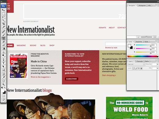
Most sites and applications today start as static design visuals. Often designers will create static visuals of dozens of templates or pages. I'm sure that it's happened to everybody. You work for hours or days in Photoshop or Fireworks, making a series of designs and your client (rightfully) asks to see alternative versions of layouts, typography or color themes. Designing in a browser eliminates the need to design more than one template in a graphic tool like Photoshop or Fireworks.
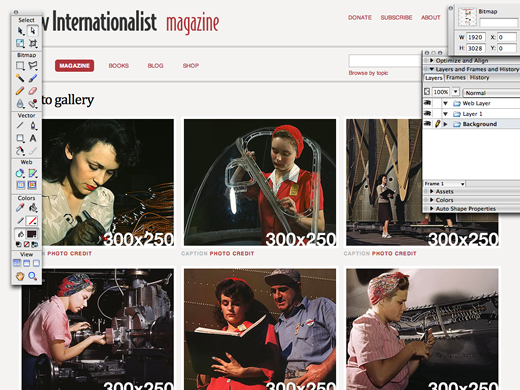
But why use a graphics application when there are more effective, browser-based tools that are better suited to designing for the web? Photoshop and Fireworks are perfect tools for sketching look and feel and for creating elements, but almost by definition they fail at the job that many people still put them to, designing web pages.
Static visuals fail by definition
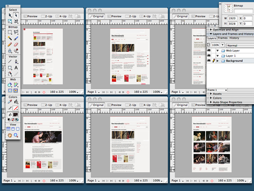
Designing in a browser makes the design process more fluid, efficient and accurate because it addresses issues that are difficult when making static visuals, if they are addressed at all.
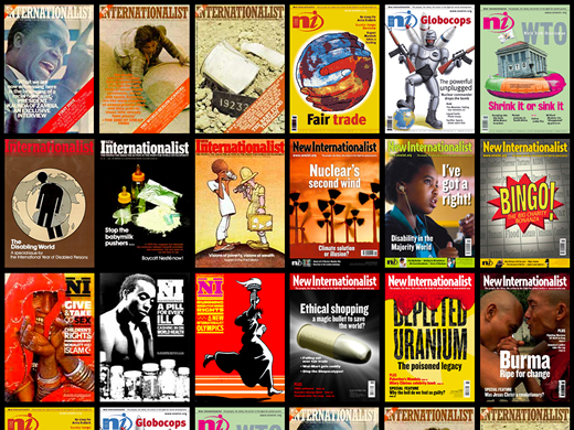
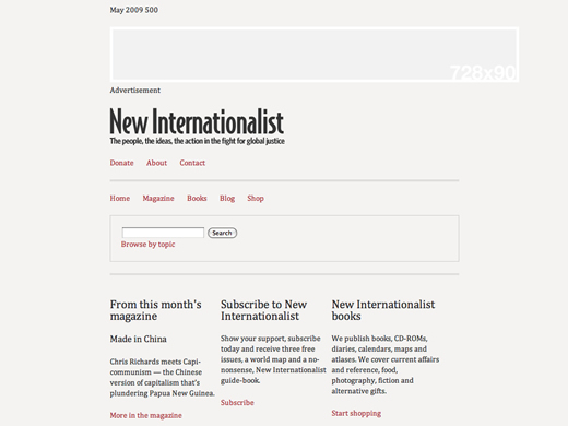
You might have read on my blog that I've been working on a redesign for New Internationalist. It's been an open, public, design process (scary, but great fun) and one where I have designed entirely in a browser. The next examples are all issues that came about during that project.
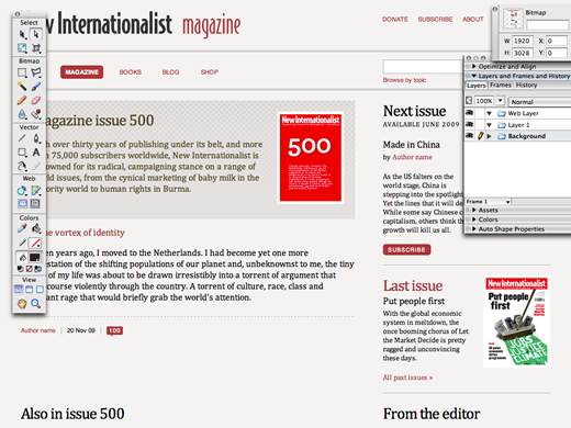
Static visuals cannot demonstrate the effects of liquid or elastic layouts, at least not easily and without multiple files.
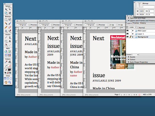
When you design using markup and CSS, a few small changes to code will allow you to correct potential liquid design problems in just a few seconds.
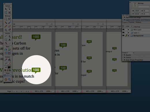
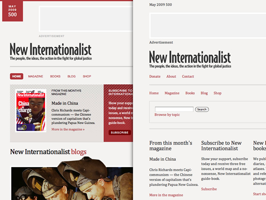
Likewise, static visuals cannot easily demonstrate the effect of resizing text in a browser. Take this example of where this entry title collides with the comment count. Being able to spot potential problems like these at the design stage, problems that would, in a traditional workflow, not present themselves until development or even testing, means that as designers you achieve greater creative control.
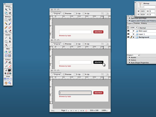
If even the simplest interactions such as :hover or :target states can be time-consuming to demonstrate and explain to developers or clients through static visuals, what about more complex JavaScript behaviours or AJAX? I know from experience that when you show clients static visuals, it can take as long to explain to a client how a feature will work, as it does to design it.
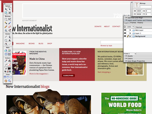
Most times, designers leave these details out of their static design comps which means that decisions about them will have to be made later in the process and then often not by designers.

In contrast, when you design using markup and CSS, clients (whether they are internal or external) don't need to use their imagination. I know that I when I design in a browser I spend less time explaining to my clients how a page or an interface will work because they can readily interact with them in their browser, no matter how old or capable that browser might be. Your designs become more tactile as a result.
It's time to stop showing clients static design visuals
Worse still are the expectations that static visuals set in the minds of clients, particularly when designers use them as a method to get sign-off for a design. I often wonder, is the fact that so many web pages are fixed-width and centered, a direct result of clients signing off fixed-width design visuals?
I would even go so far and say that when you demonstrate a design as a static image, you are reinforcing a mistaken notion that a web page will be a facsimile of a frozen image. And when you demonstrate a design or ask for sign-off on a frozen image, you immediately leave yourself open to the problems that often come when you later implement that design.
(See also It's time to stop showing clients static design visuals.)
Web sites should not look the same in every browser
For example, what about the issues of how a browser renders code? We all know that it is impossible today for a design to render exactly the same in every browser or device.
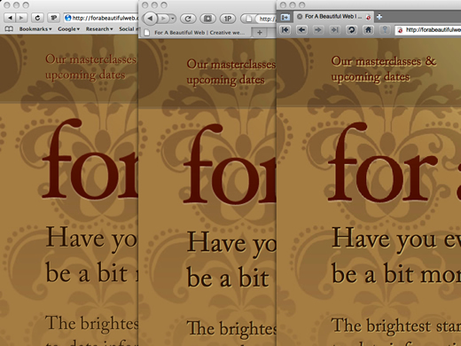
You need only look at the different ways that Gecko and Webkit and Opera anti-alias text. The browser landscape is more diverse today than it ever has been before.
I know that many designers and developers understand that it's neither practical, economical or desirable to attempt cross-browser pixel perfection, but what about the clients and managers that we work for? They still often subscribe to the outdated notion that you should strive for pixel perfection.
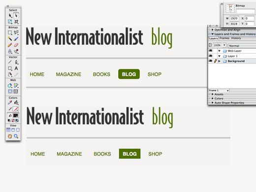
Static design visuals reinforce this outdated notion and they fail to help you easily demonstrate those natural differences between browsers.
How do you demonstrate even the simple matter of border-radius generated rounded corners in modern browsers and square corners in Internet Explorer without making multiple visuals and then often a great deal of time spent explaining these natural differences between browsers?
Repeat: Web sites should not look the same in every browser
On the other hand, demonstrating designs to clients using markup and CSS helps them to more easily understand the natural differences between browsers and then to make informed decisions as to when those differences are acceptable. There are no misconceptions. What they see and sign off is so close to the final product as makes no difference.
Web sites need not look the same in all browsers. I know that I've said this before and I believe that this issue is going to become even more important as budgets and time-scales are squeezed during the recession.
Please allow me to clear up a common misconception. When I talk about designs not looking exactly the same in all browsers, I am not talking about making bad designs for people using older or abandoned software. I would never accept that:
- A design should look poor or broken
- A person should be denied access to content or services if they are using a less capable browser
Designing alternatives
What I am talking about is creating a visual design that looks best to people who are using modern software, while at the same time thinking carefully about what a person using less capable software will see. This is an approach based around designing alternatives. It's little different to the way that I hope we have been taught to think about web accessibility.
You might be thinking that it's strange for me, as a designer, to promote an approach where some people see a lesser design than others. But I'm also a pragmatist and I know that in my business, I would rather ask my clients to spend their money wisely on things that will improve their business, than to waste it on hours of unnecessary development.
How far you take this will depend on several factors and your own circumstances. I have my limits too. So here are five examples of CSS design differences that I can live with and do live with every day.
(See also Five browser differences I can live with.)
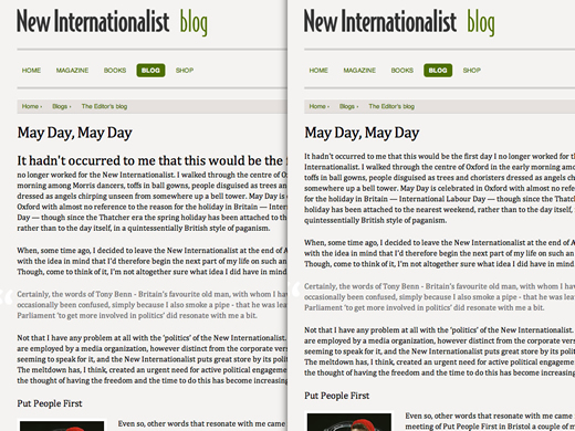
CSS pseudo-elements offer far greater control over type without requiring unnecessary, presentational markup. For example, when I want to style the first line of a first paragraph by increasing the font-size and weight, I would use the first-line pseudo element. People using Internet Explorer 6 will see a regular first line. I can live with that.
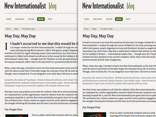
Perhaps I want to add a drop-cap using the first-letter pseudo element. IE6 will render a normal first letter. I can live with that too.
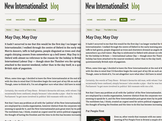
In the same vein, I often like to visually emphasize and separate the first, often most important, paragraphs of text that follow a heading. I find it improves readability enormously. Using an adjacent selector, I can style specific paragraphs without needing unnecessary class or id attributes. Of course people using Internet Explorer 6 will again see a normal paragraph, but guess what? I can live with that.
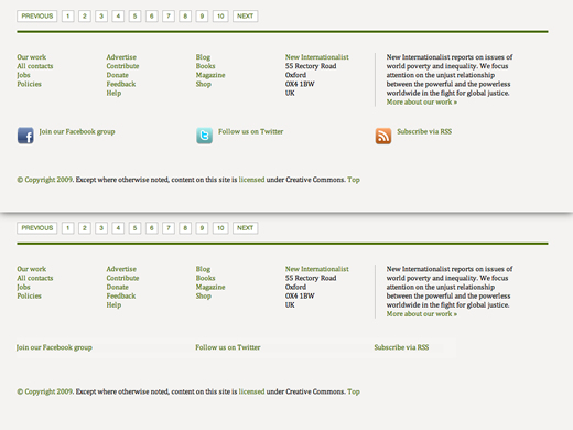
If you love to add those tiny icons to links, perhaps a PDF icon or RSS icon for feeds or an external link icon, why add additional class attributes such a class="twitter" when you can just as easily use the more meaningful rel attribute, rel="me twitter"? People using browsers that did not implement CSS attribute selectors will simply not notice what they are missing, so they can live with that too.
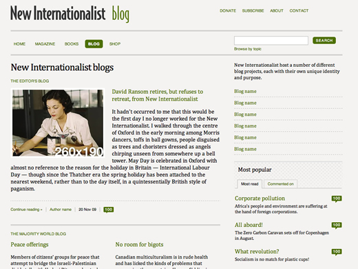
Unless rounded corners are an integral part of a design and not simply a visual flourish —

It makes sense to avoid unnecessary markup (directly in the document or inserted by DOM scripting) and to use border-radius.

Opera and Internet Explorer will see square corners instead of rounded ones, but I can live with that.
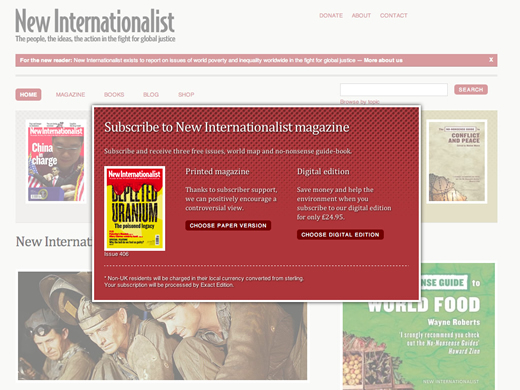
CSS offers an easy way to add a subtle shadow to text. This can be particularly effective if you place white text over a darker background.

I wish all browsers would implement text-shadow, but until they do I'll have to live with that.
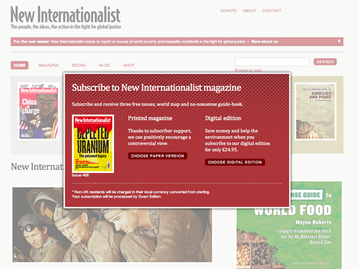
I often also utilize the box-shadow property instead of making a compound of additional elements, attributes and images.
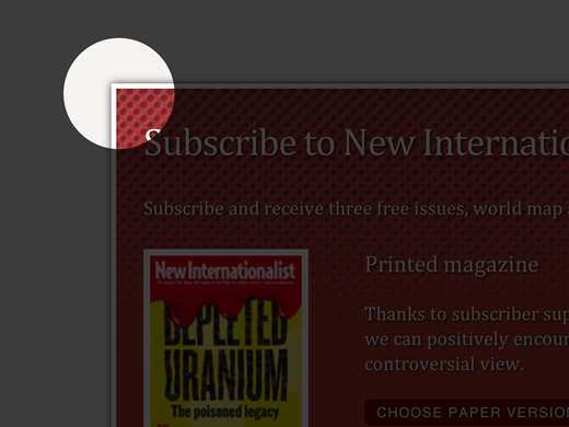
Not every browser will see these generated shadows, but unless they are an integral part of a design, I can live with that too.
Exactly what CSS3 was designed to do
Each of these CSS properties helps me to reduce unwanted markup and make my designs less reliant on presentational elements or attributes. So I can and I do live with these differences.
I also know that it is highly unlikely that every browser will ever support every CSS property at the same time. You should learn to live with that, because it's exactly how the CSS3 modules were designed to work. When you explain the issues to them clearly, your clients will learn to live with these differences too and will stop asking you for cross-browser pixel-perfection long before that utopian day when all browsers render a design the same way.
Letting go of the notion that we should spend hours of remedial development time in an impossible quest for cross-browser, pixel-perfection allows more time for the details in a design. It allows us time to design the different experiences that people using different software will always have, by designing around browser differences rather than attempting to hack around them.
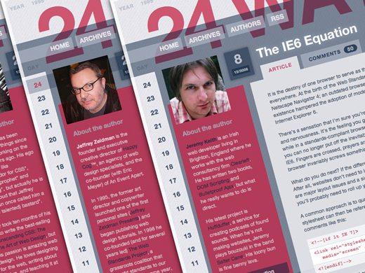
How far you take browser differences will depend on several factors including your brand requirements and the needs of your target audience. As Jeremy Keith wrote last year on 24ways:
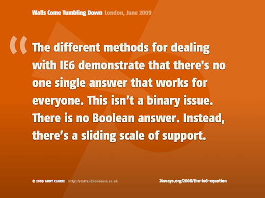
The different methods for dealing with IE6 demonstrate that there's no one single answer that works for everyone. This isn't a binary issue. There is no Boolean answer. Instead, there's a sliding scale of support.
That was one of the reasons why I developed Universal Internet Explorer CSS, a single CSS file for Internet Explorer 6, hosted on Google Code, that where it is appropriate I serve to all sites, universally (give or take a little branding here, or a touch of customization there).
When I ask why people visit my sites, and the ones that I make for other people, the answer is always for the content
. That content is almost always written words and that means type. That is why I'm now advocating to my clients, that where feasible, not to waste hours of my time and their money on lengthy workarounds in an unnecessary attempt at cross-browser perfection.
Instead I provide simple but effectively designed HTML elements. This means great typography for headings, paragraphs, quotations, lists, tables and forms and no styling of layout. I think that Universal Internet Explorer 6 CSS pushes all the right buttons as a concept, but I know that it won't be appropriate in every situation. That's for you and your clients to judge. As Jeffrey Zeldman wrote in response:
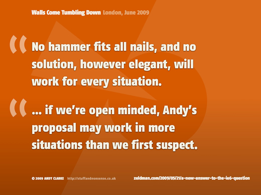
No hammer fits all nails, and no solution, however elegant, will work for every situation. If we're open minded, Andy's proposal may work in more situations than we first suspect.
Selling Universal IE6 CSS to clients
What I do know is that using Universal Internet Explorer 6 CSS saves me hours if not days per project; time that I can spend on work that will bring better business benefits for my clients and for me. Letting go of the notion that not all browsers see the same design isn't only so designers can use new technologies and do cool things, it is now a business decision.
How to design in a browser
So what does designing in a browser mean for the design process and what does it practically entail? What advantages have I and my clients seen from me working in this way? Designing in a browser for New Internationalist allowed me to design around thirty templates, from sketches to finished design, with full client approval in less than three weeks of studio time.

I was able to see the effects of design decisions across all thirty templates in a few seconds after changing just a few lines of CSS. That is why I honestly believe that designing in a browser makes the process of design more spontaneous, more fun and more accurate than making designs in Photoshop or Fireworks. Rather than spending hours or days at the start, creating a look-and-feel direction, I now build designs more gradually and naturally in a more considered way.
Sometimes I work on a design in short bursts, often for only a few minutes a day. Most of the time I leave a design open on my second monitor so that I can live with it for a while, then I move on to the next step. Often I''ll work on a design to where I'm happy to show it to a client, then I'll schedule a series of days to intensively work side-by-side with them while we build the final design.
Most often I'll start my design process by designing a system grid.
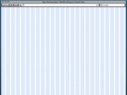
My process involves designing a structural grid and applying that grid as background image to a page.
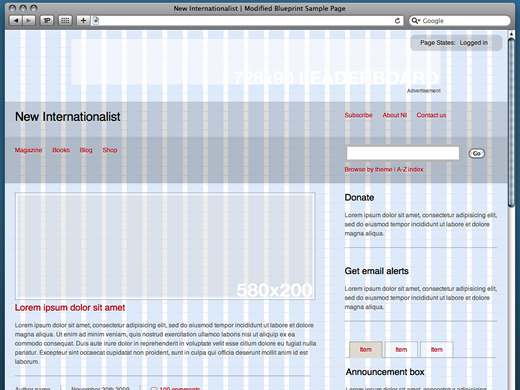
Then, working with CSS makes it simple to adjust grid proportions and experiment with layout combinations across dozens of templates.
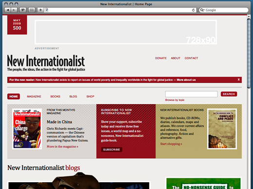
I can make sure that every element that I add to a page conforms perfectly to my system grid. There is no guess work. It's faster, cleaner and more flexible in allowing me or my clients the ability to work on and test a variety of layouts — all in a real-world browser environment that is so close to the end product as makes no difference.
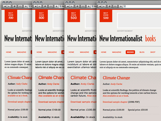
Working with CSS when designing in a browser makes it simple to experiment with different typefaces and treatments, adjusting sizes and leading on content site-wide, something that can be highly time-consuming when working in Photoshop or Fireworks.
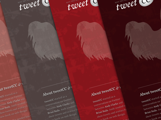
All modern browsers (except the one lashed together in Redmond) have also implemented RGBa; red, green, blue and alpha transparency. It is this transparency that allows elements behind, often background colors and images, to show through. This is a great way to make designs that look more layered. Using RGBa is also a fantastic way to experiment with color while designing. When I'm designing I use RGBa to move very quickly through iterations, checking how color changes affect different elements in a design across several templates.
Instead of specifying a whole host of different color values, I use hues of black and white with alpha transparency over a single base color bound to either HTML or body elements. This allows me to experiment and demonstrate a range of color options by changing just one value. It's also a device that I used in my design for tweetCC.
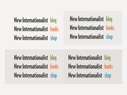
Staying with transparency for a moment, alpha-transparent PNG images are perfect when you're designing in a browser, particularly when you are experimenting with different color options.
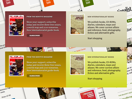
You can use the same approach by making a single, alpha-transparent PNG graduated image.
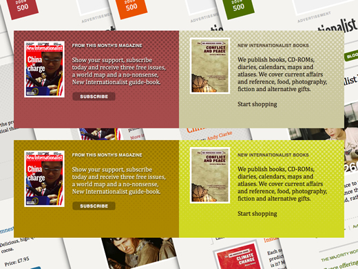
Or in the case of New Internationalist, a semi-transparent halftone dot pattern that can be applied to any number of base colors.
Instead of making one or several completed designs before I demonstrate to a client, I prefer a design to build gradually and naturally through a series of iterations. This approach allows me to live with a design for a period of time and my clients to experiment with it in their browser, perhaps testing it with their colleagues or customers before we move onto the next iteration. It also helps a client to focus on specific aspects of a design while we iterate.
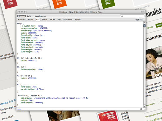
I've mostly watched developers use tools such as Firebug for Firefox to debug CSS and JavaScript. But Firebug is just as useful to designers working in a browser.
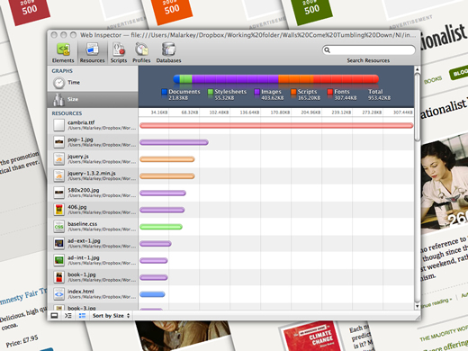
Browser tools make it easy to experiment with design options:
- Switching layout directions with just a few characters of CSS
- Experimenting with typeface and leading combinations
- Working with different color combinations

When you are designing side-by-side with a client, they can make requests, see the results of changes, then make immediate sign-off decisions based on how the design will display in a browser.
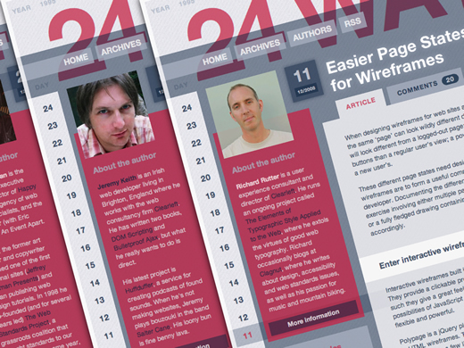
If you need to demonstrate different page states, for example logged in or logged out, there are Javascript tools including plugins for jQuery that will help you do that.
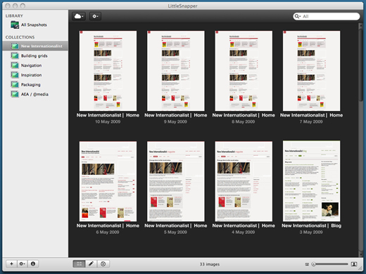
During this process, I often catalogue the iterations using LittleSnapper. This process is far more spontaneous and interactive than proofing with static visuals. It is also more efficient, leaving you more time to spend on the nuances of a design.
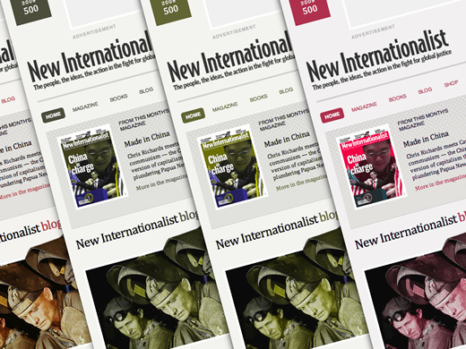
What about testing? In the out-dated, backwards and forwards, wash-rinse-repeat, workflow that many people are forced to work with, testing usually takes place at the end of the process; after days of design and development. Designing in a browser makes it easier for testing to take place during even the earliest phases. If you spot problems, you can correct them far closer to the source and without the need to burn down what has already been produced.
These issues might range from simple display problems to more fundamental issues such as inaccessible color combinations. If I'm honest, at times in the past, I rarely concerned myself with checking that the color combinations I chose were accessible to people with color deficiencies.
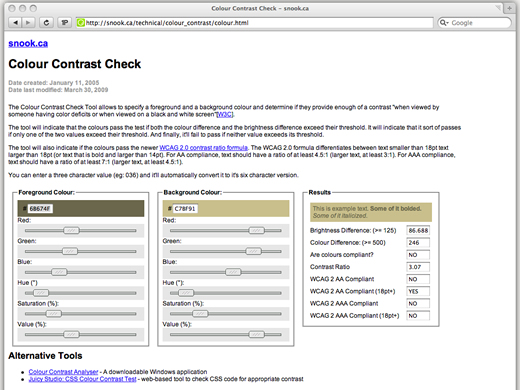
Browser based tools such as Jonathon Snook's Colour Contrast Check make it easy for everyone involved in the design process to check for color contrast issues from the very beginning. I've found that the best time to use Jonathon's tool is before I demonstrate a design to a client. This avoids any embarrassment should a client sign-off on a design that contains inaccessible color combinations —
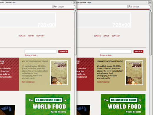
like the one on the left that I originally chose for the New Internationalist teaser bar.
Designing a system, not a page
Many clients still look at their site as a collection of pages or templates. When timescales and budgets are being squeezed, how can you better deliver a large scale project, for example like New Internationalist. One answer is to design a system, not a web page or site.
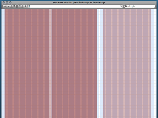
Designing a system involves working from the content-out to design a toolkit of modular, reusable content components and an underlying grid structure. The decision over my choice of grid for New Internationalist was based on three factors:
- Advertising sizes
- A 950 width that their research told them would best suit their readers
- Their developers were already familiar with the Blueprint CSS framework and its dimensions
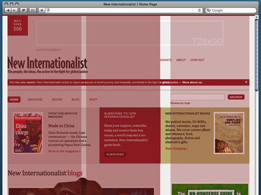
Dividing up this grid into several larger column widths allowed me to design a framework that could support a range of content module sizes.
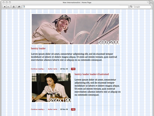
In the limited time available, designing full-page templates that cover ever every eventuality was unrealistic. Instead I designed a series of content modules, ranging from full articles to teaser titles and summaries, versions with images and versions without.
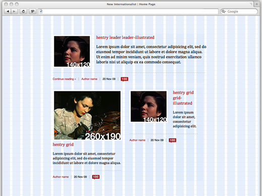
Each of these content modules was designed to fit the supporting grid with simple CSS class-switches to allow New Internationalist to change the visual presentation of an article or teaser by adding nothing more than an extra class via their CMS.

As important as designing visual systems, developing reusable markup and CSS is essential to making designing in a browser fast and the overall project more efficient. I'm convinced that developing a set of markup patterns and naming conventions for id and class attributes makes design and development faster. Naming conventions take the guess work out of writing reusable content modules.
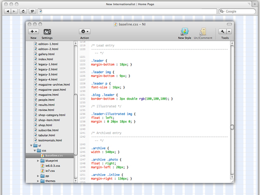
Microformats also play a huge part in standardized markup patterns (There, I knew I wouldn't be able to resist talking about Microformats) because their attributes combine semantics with more elements and attributes than you can hang a parka on.
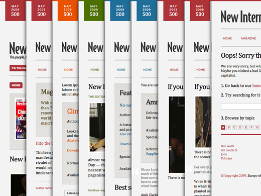
By building a toolkit and system, a client can easily place these components in the grid in various configurations to create the site. This gives them incredible flexibility but also the best value for money for the time that they spend with you. This is the approach that I took with New Internationalist. I estimate that by designing a system for New Internationalist in a browser, I achieved 100% of the work in only 30% of the time. This with fewer issues and less, but more focussed, communication.
What do you do with the time you save?
All of these changes to conventional web design and development workflow will help you to save time by reducing wasted effort; that has definitely been my experience. So what can you do with the time that you save? Does spending less time mean that you should charge less?
Of course making more in less time does make you more competitive. But remember, you clients or employers are not paying you for the hours that you work, but for the years of knowledge you've learned and the skills that you've gained. It's vital that you remember your worth and that it's in your clients' and employers' interest that you'll be around and willing to support them even after the tough times are over.
This isn't only going to benefit the people that you work for, internally and externally, it will benefit you and the people that you work with. You might choose to invest the extra time in doing more work, in learning new skills or, if you run a business like I do, in working on rather than for that business.
This could mean writing better contracts, keeping on top of sales or possibly even developing your own products to give you a second (or third) income stream. What matters is that we use difficult times as an opportunity to make things better, for ourselves but also for other people.
This might mean sharing your skills and knowledge with your co-workers or others by blogging about your work. After-all none of us would be where we are today if it weren't for the generosity of sharing by people like the speakers here and so many others. Sharing could also mean devoting some of your extra time to community or non-profit projects. So many are underfunded and could put a few hours a week with your skills to use helping many more people.
When I was writing this talk, people asked me if I was nostalgic for the protests of the 1980's. I had to think about that, but no, I don't miss them. I don't miss Thatcher, YOP schemes or being told to get on my bike
. I'm not nostalgic for the tension, or for Duran Duran.
What I am nostalgic for is the sense of common purpose and a real desire to change the status quo that I felt existed then, that I think is lacking today. But I do have faith that as an industry and as a community that we can come together to change things for the better, and that conferences like this are a strong sign of that.
Now isn't the time to be worried about the future or what might happen. Now is the time to focus efforts on redefining why we do what we love so much. After all, what is the alternative? As the song says:
Are you gonna try to make this work,
Or spend your days down in the dirt?
You see things can change —
Yes and walls can come tumbling down!

Thank you so much for listening (reading). Comments?
More
- View on Slideshare
- Download PDF (25Mb)