We need a standard show navigation icon for responsive web design
You know those responsively designed sites where — on small screens like smartphones — navigation is either hidden or set at the bottom of a layout, then revealed when you click a button? Well, I think we need a standard ‘show navigation’ icon for that button in responsive web design.
I flicked through responsively designed sites featured on Media Queries and found several different icons in use.
Plus symbol
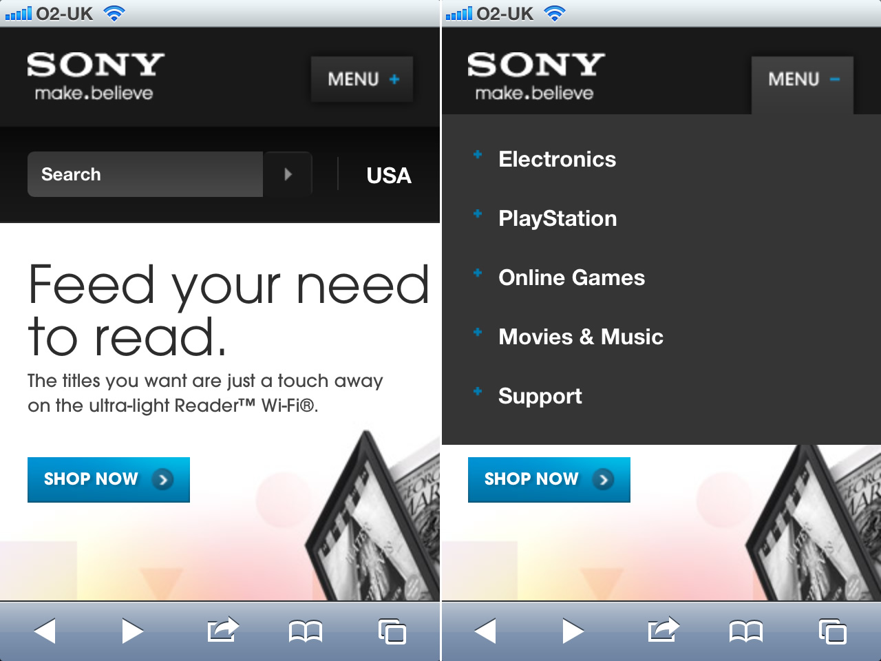
Macdonald Hotels have chosen a plus symbol accompanied by the word “show” (show what?) for their collapsed navigation. Unsurprisingly, when the navigation’s visible the icon and text change to a minus symbol and “hide.” Sony use the same plus and minus symbols but their button reads “menu.”
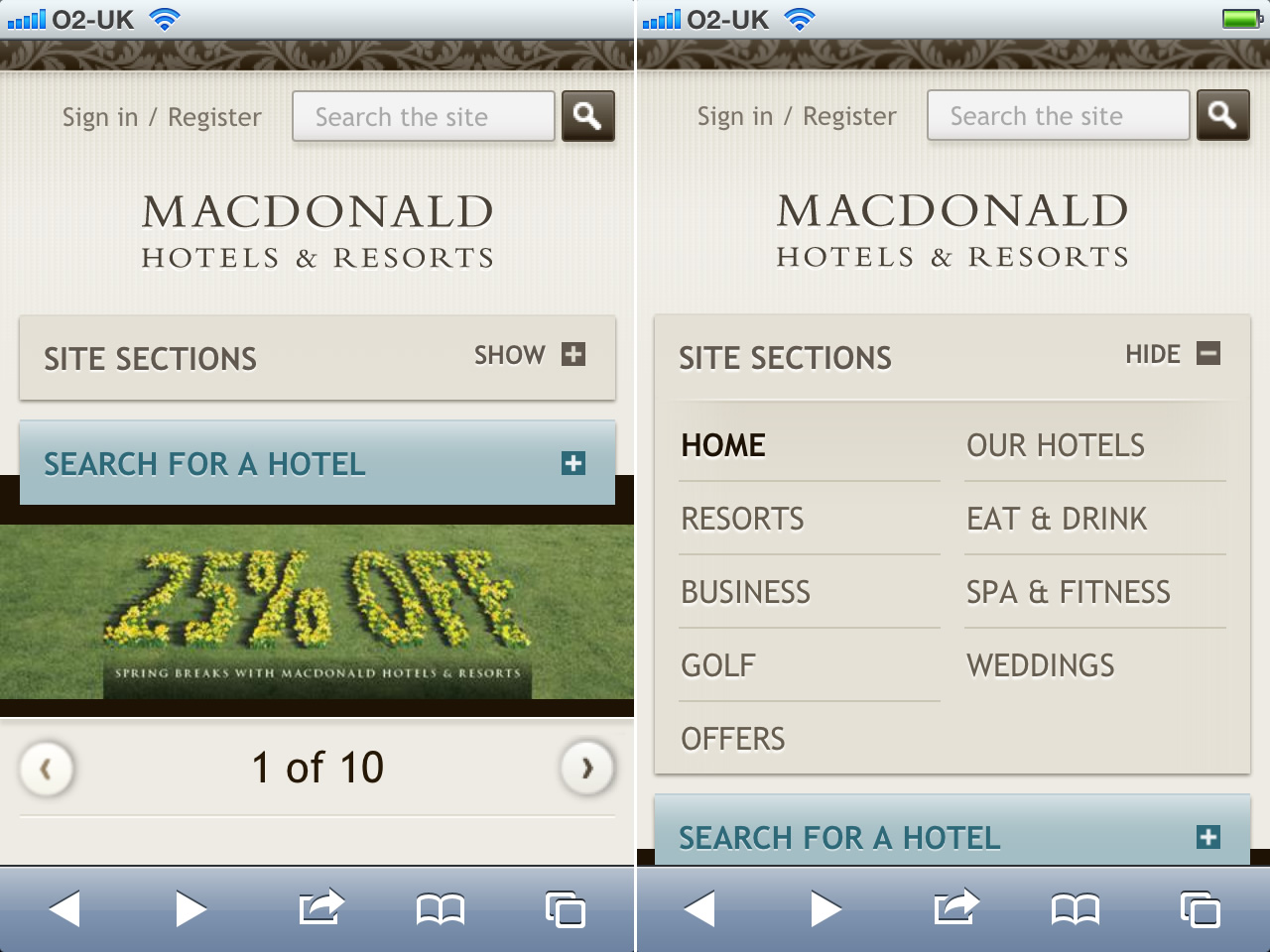
Using a plus symbol to reveal navigation could be confusing, as it usually indicates that you can can add something. In iOS:
- An event in Calendar
- A contact in Contacts
- A friend in Find My Friends
- A note in Notes
- A URL in Readability
- A reminder in, err, Reminders

You get the idea.
Grid icon
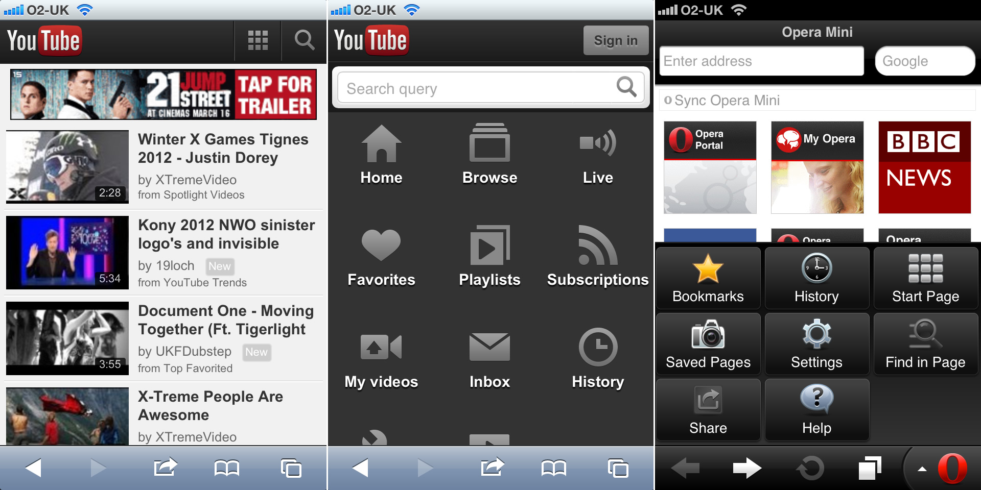
YouTube’s mobile site uses a 3x3 grid icon to indicate navigation. The same icon makes sense for the Start Page button in Opera Mini too. It makes sense because a grid is exactly what you see when you tap the button.
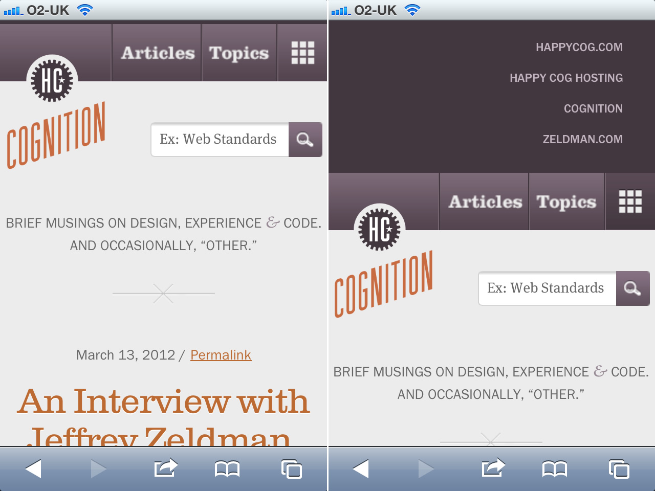
The use of a grid icon makes no sense however on the Happy Cog’s Cognition blog, because when its navigation’s revealed it’s anything but a grid.
Unordered list icon
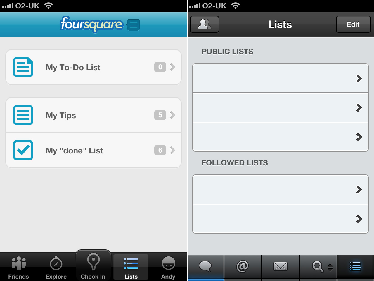
Designers Bearded and Belgian job site Jobat both chose an an unordered list icon (although their accompanying text is different). I can see why they chose it. Navigation’s often a list of links, usually unordered in HTML.
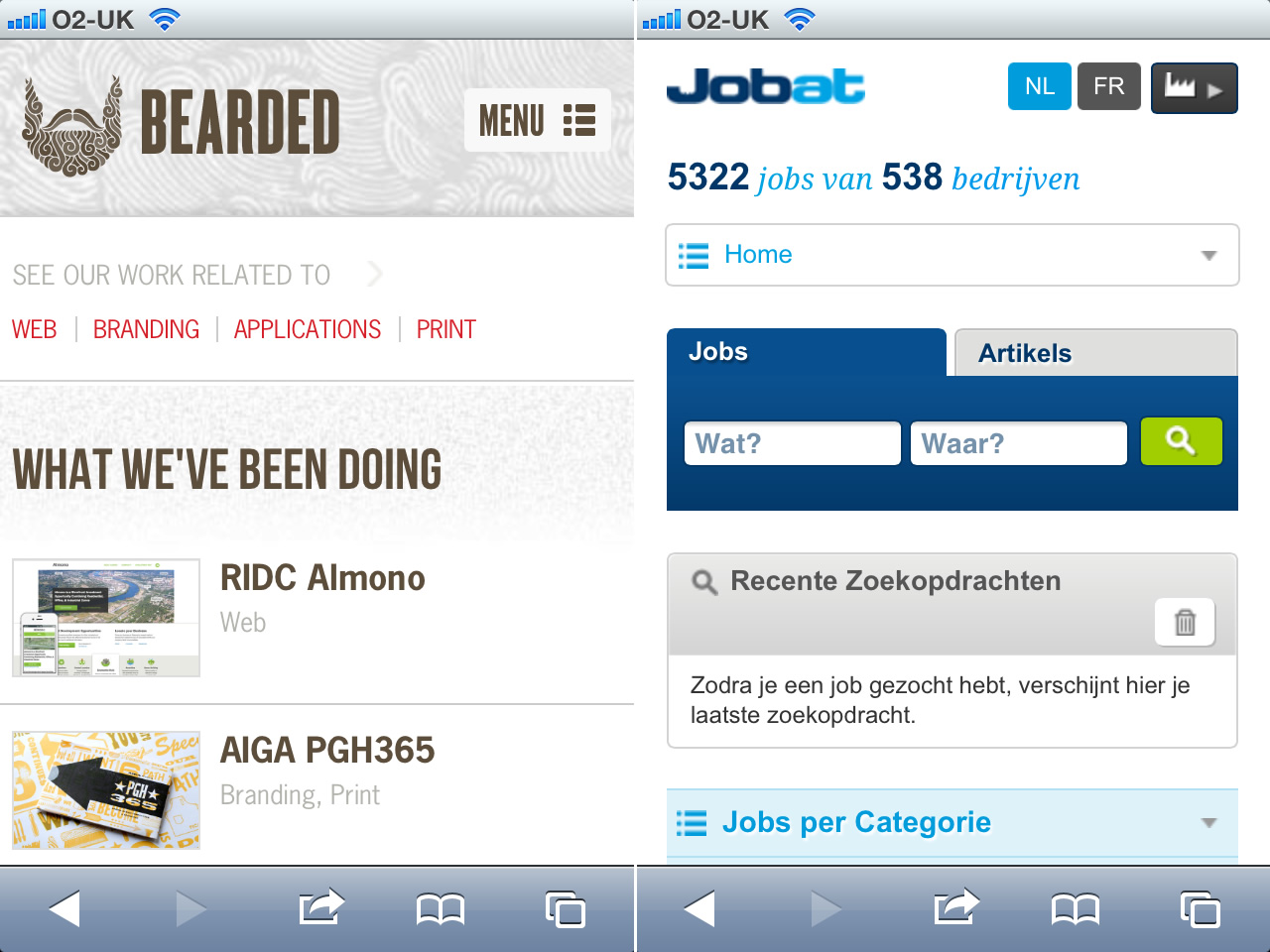
Designers understand this but do normal people? When they see that icon in Foursquare or Tweetbot they know it means a ‘list.’ So why do we expect them to know it means ‘navigation’ when they see it on a website in Safari?
Three lines
That leaves us with three lines that represent a variety of things across a variety of apps:
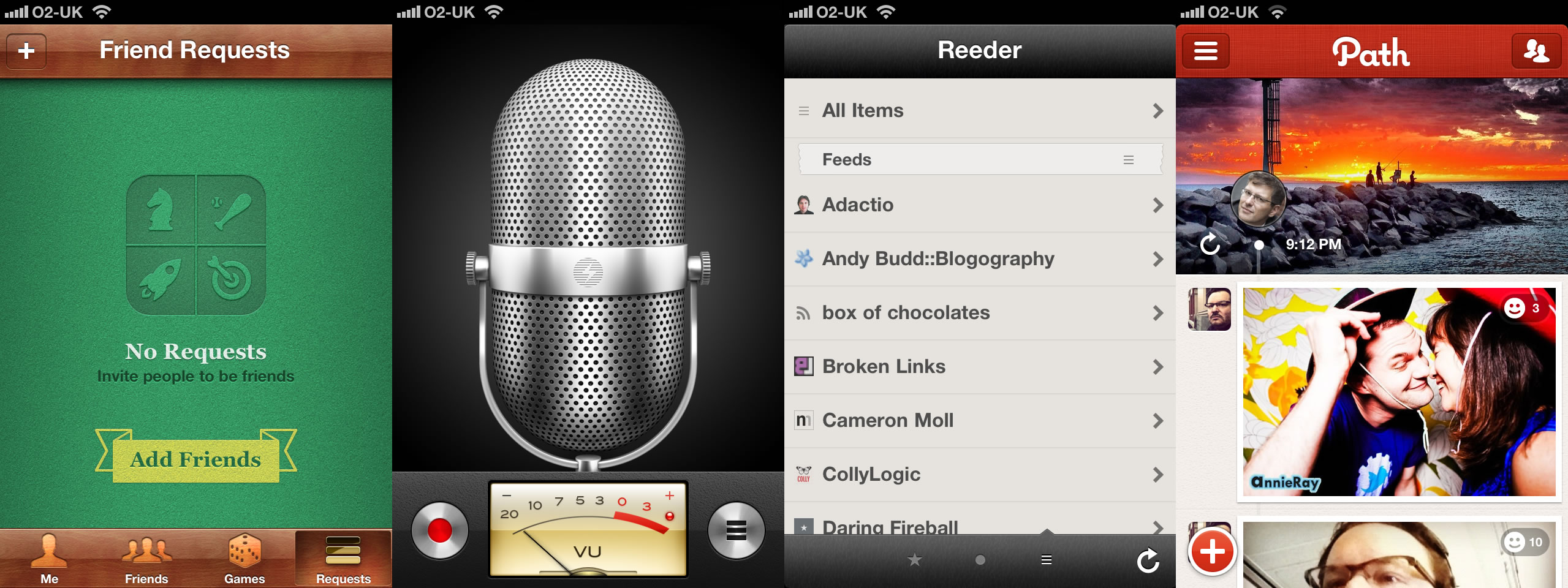
- Friend request list in Game Center
- Recordings list in Voice Recorder
- Subscription list in Reeder
And show navigation in Path.
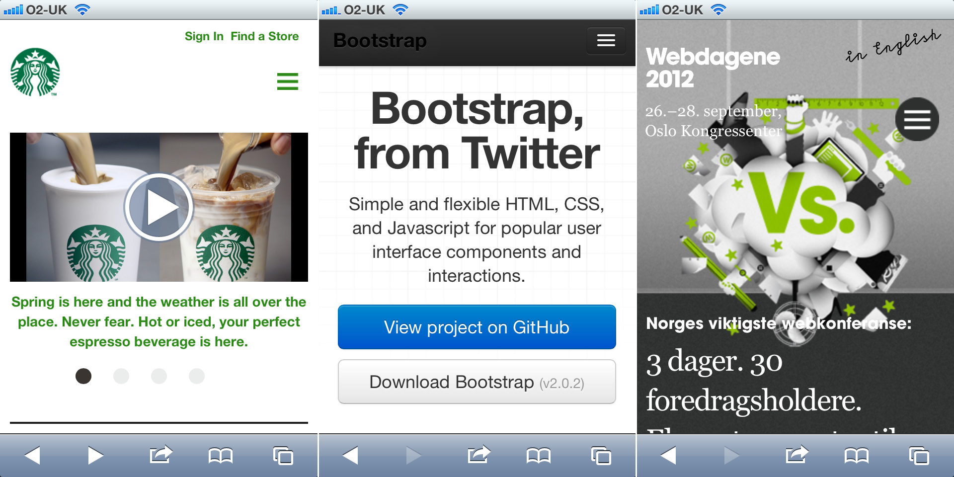
This is an icon I’m seeing more and more of to represent show navigation. You’ll find it on Starbucks, Twitter’s Bootstrap and the 2012 Webdagene conference.
What icon should become a standard?
Unless our navigation’s arranged in a grid (and so we should use a grid icon), I’m putting my weight behind three lines because I think it’s most recognisable as navigation to the average person.
Postscript: To slide his content to the right and reveal his navigation, Barack Obama’s site uses the President’s own, unique icon.
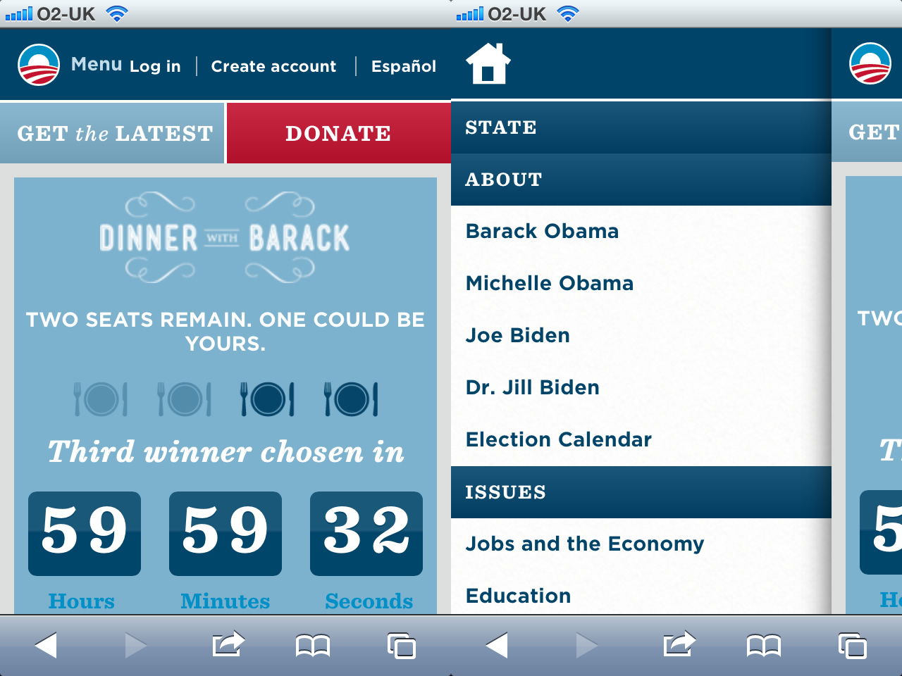
But hey. He’s the President.