When to use display:contents to improve semantics in your HTML
Working with CSS Grid is a lot of fun, as well as making distinctive and original layouts easier and with less code. However, using Grid does occasionally come at a cost and that is semantic markup. Fortunately, there’s a new CSS display property which—when used thoughtfully—can overcome the problem of ‘flattened HTML.’
What’s flattened HTML?
CSS Trickster Chris Coyier first brought up the problem of flattening our HTML for CSS Grids two years ago, but what does “flattening” mean? I’ll give you an example.
To make Grid work, you turn an element into a grid container by applying display:grid or display:inline-grid. Most likely, this grid container will be the <body> or another structural element such a division, <header>, <main>, or <footer>. With display:grid applied, all direct children of grid containers become grid items and you can then position them on a grid using areas, line numbers, or names.
Plenty of Grid examples use a simple markup structured like this:
<body> <!-- Grid container -->
<header>…</header> <!-- Grid item -->
<main>…</main> <!-- Grid item -->
<footer>…</footer> <!-- Grid item -->
</body>
This flat CSS structure—where all the grid items are siblings of each other— is what Chris meant by flattened HTML. Flatness might not be a problem for a simple markup structure like that, but there are plenty of occasions where—with the current absence of sub-grids—flattening your HTML to work with CSS Grid would be detrimental to the semantics of your markup. Here’s a straightforward example of a <figure> <img> with its <figcaption> from Art Direction for the Web.

This design includes a large suitcase image and some accompanying text about needing a “go bag” to get away after a robbery. When I first made this example I applied display:grid to the <body> and flattened my markup so I could position the <picture> and <p>:
<body> <!-- Grid container -->
<picture>…</picture> <!-- Grid item -->
<p>…</p> <!-- Grid item -->
</body>
There’s a semantic relationship between the picture and text which has been lost by flattening my markup. A far better solution would be to bind them both together using a <figure>:
<body> <!-- Grid container -->
<figure> <!-- Grid item -->
<picture>
<source srcset="" media="(min-width: 64em)">
<img src="" alt="">
</picture>
<figcaption>…</figcaption>
</figure>
</body>
However, while I’ve now made my markup more meaningful, I lost the ability to position the <picture> and <figcaption> using CSS Grid, because by being inside a <figure> neither are direct descendents of the <body> which defines my grid.
display:contents
There’s a new CSS display:contents; property which—when used thoughtfully—can overcome the problem.
For this design I don’t need to style my <figure>, I don’t need to add any backgrounds or borders, I only need to style its <picture> and <figcaption>. By applying display:contents; to my <figure>, I effectively remove it from the DOM for styling purposes and so its child elements take its place:
figure {
display: contents; }
picture { /* Grid styles }
img { /* Grid styles }
Instead of needing to flatten my markup using to enable the positioning of the picture and text, I can now use a more appropriate element and get the same visual results.
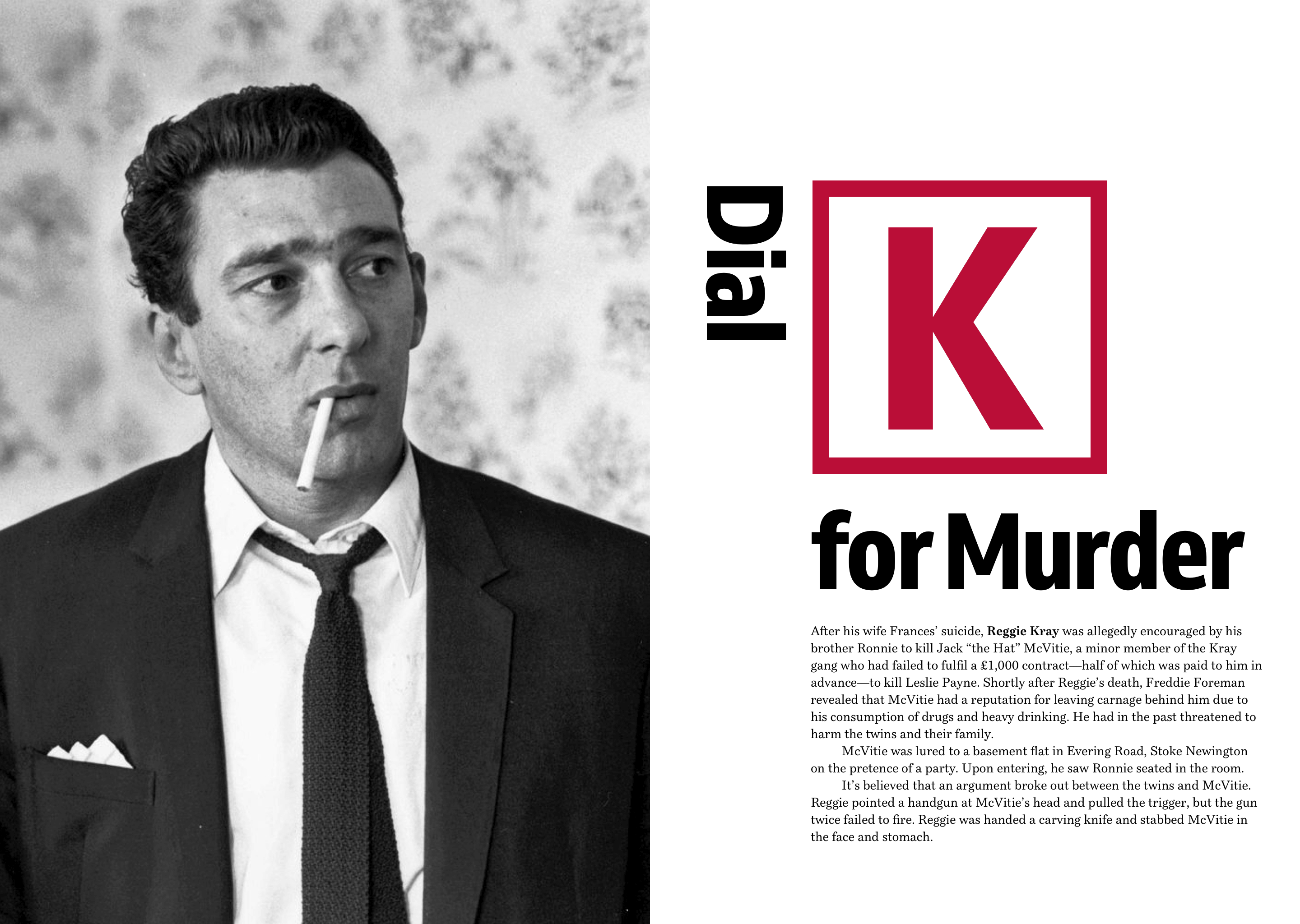
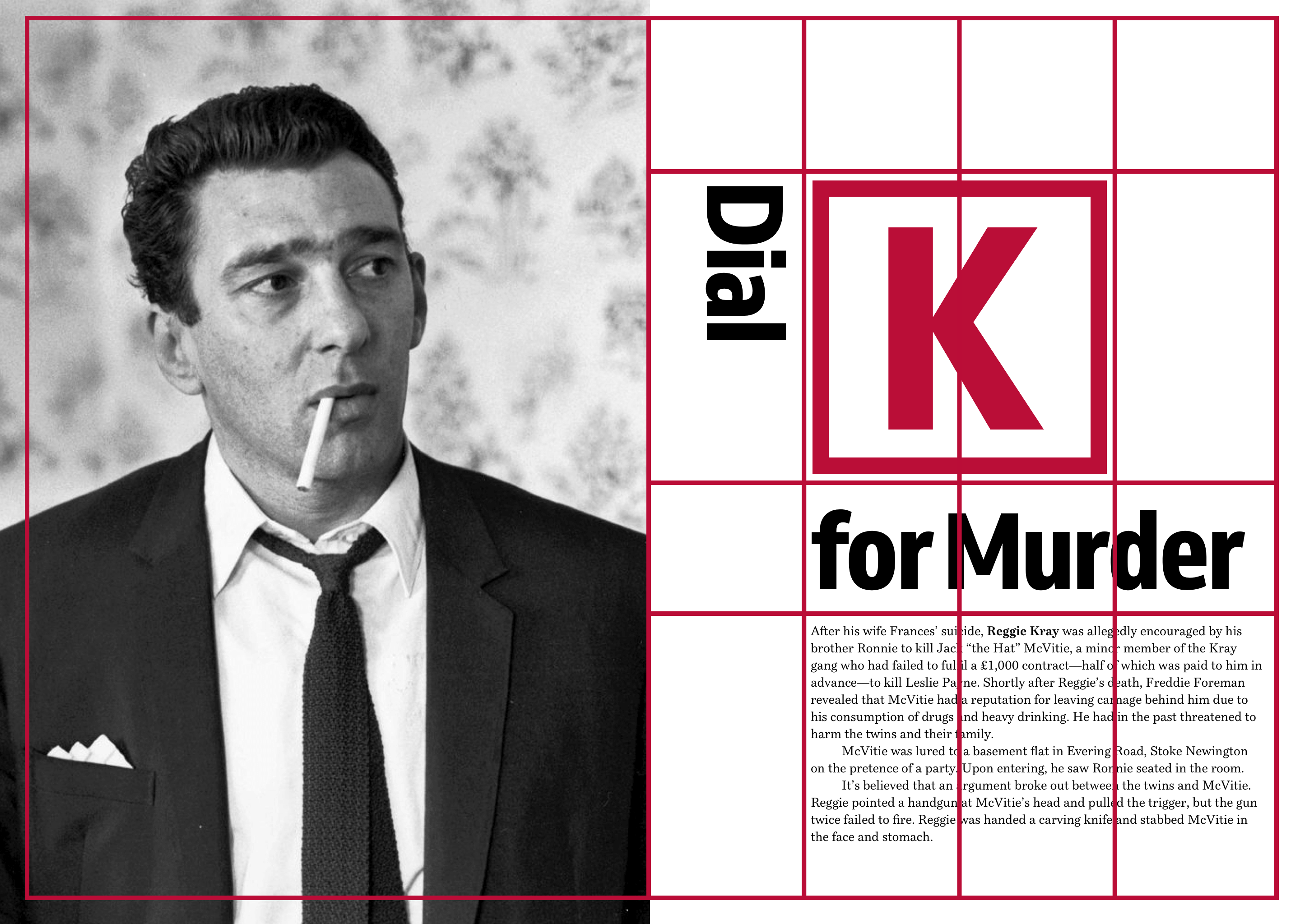
In another example from ‘Art Direction for the Web,’ my goal was to create a distinctive headline, “Dial K for Murder,” using as little HTML as possible:

There’s really not a lot to my markup, just the <body>, a <header> which contains a large image, an <h1> headline, and my <main> content. To give me the three elements I need for that distinctive headline, I wrapped each element in a <span>:
<body> <!-- Grid container -->

<header>…</header>

<h1>
<span>Dial</span>
<span>K</span>
<span>for Murder</span>
</h1>

<main>…</main>

</body>
CSS Grid is perfect to achieve this distinctive look and the <body> was the ideal place to apply it:
body {
display: grid;
grid-template-columns: 4fr 1fr 1fr 1fr 1fr;
grid-template-rows: 100px 14em auto auto;
grid-gap: var(--grid-gap);
align-items: start; }
<header> and <main> onto that grid:
[role="banner"] {
grid-column: 1 / 2;
grid-row: 1;
min-height: 100vh; }

[role="banner"] img {
object-fit: cover; }
That just left the headline, and as wanted to style it and not its contents, I added display: contents; to the h1:
h1 {
display: contents;
font-size: 4.188em;
line-height: 1;
margin: 0; }
Then placed those span elements on the grid:
h1 span:nth-of-type(1) {
grid-column: 2;
grid-row: 2;
writing-mode: vertical-lr;
justify-self: end; }

h1 span:nth-of-type(2) {
grid-column: 3 / 5;
grid-row: 2;
padding: 12px 0;
border: 18px solid #ba0d37;
font-size: 14vmax;
text-align: center;
color: #ba0d37; }

h1 span:nth-of-type(3) {
grid-column: 3 / -1;
grid-row: 3 / 4; }
It’s worth noting that although display: contents; effectively removed my h1 from the DOM for styling purposes, any properties which inherit such as font sizes and styles are still inherited.
Using display:contents; means I can make the fullest use of CSS Grid without compromising the semantics of my markup. However, it’s not not all roses.
Currently, Edge hasn’t implemented display:contents; yet and every other browser implementation except Firefox includes a bug which renders any content inside display:contents; inaccessible, so you’ll need to bear that fact in mind for the time being.
Until that accessibility bug is fixed, I’m being a cautious about using display:contents;. That said, bugs are temporary and browsers are updated all the time, so I won’t need to be cautious for long.