Where no design has gone before
I’ve been upgrading my Apple TV movie artwork from portrait to the latest 16:9 format recently. Like the artwork for many older film series, Apple’s artwork for the Star Trek films is less photon torpedo and more phaser set to stun. So, I decided to make my own artwork.
While I do have a soft spot for the original theatre posters from the Star Trek film series, only a little of what makes them interesting has been included in their equivalents from Apple or other movie artwork sources.
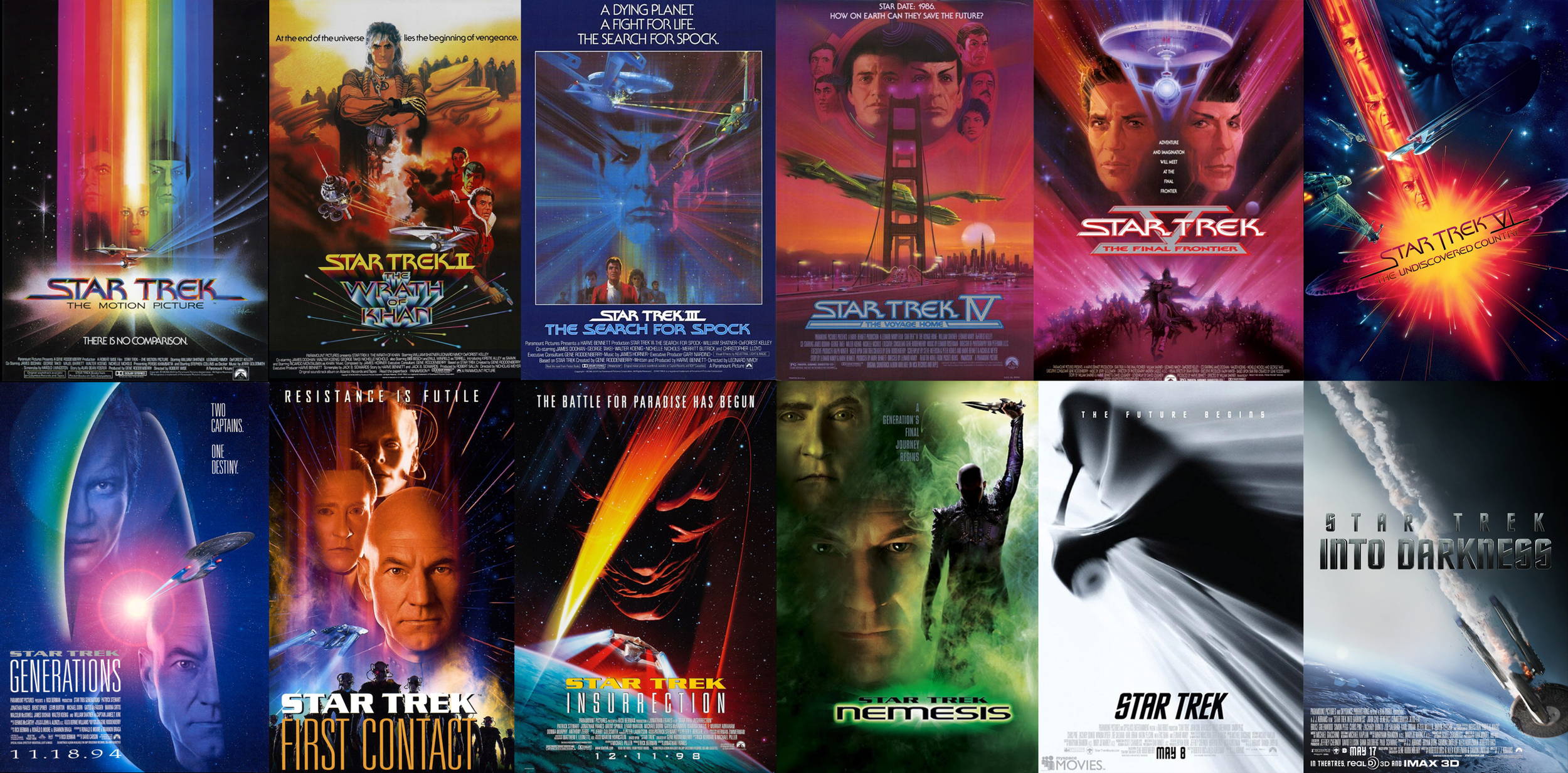
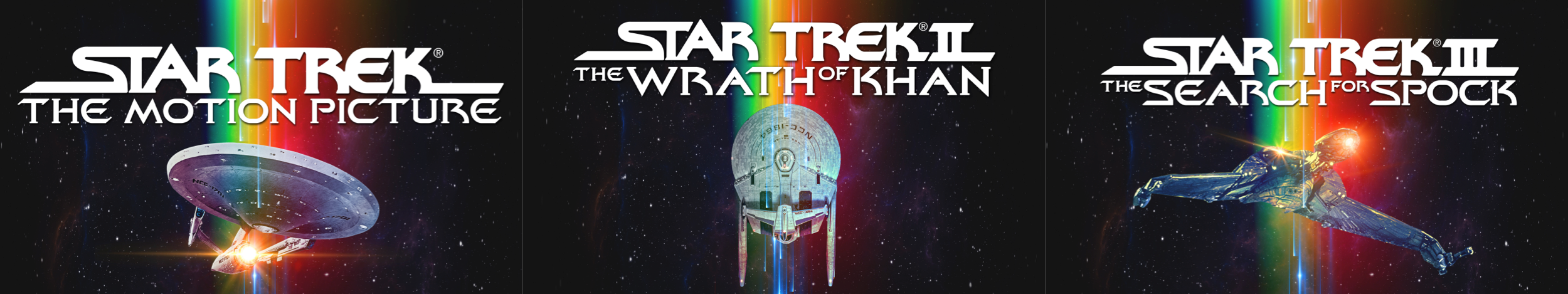
The first set of unified movie artwork uses the prism colours from the theatre poster for Star Trek The Motion Picture (1979,) which was rebooted in the theatre poster for Star Trek Beyond in 2016. This artwork form a coherent set with each film differentiated by the starships used, including the Klingon Bird of Prey from The Search for Spock.
Apple has this artwork available for the original cast movies in several formats including 16:9:
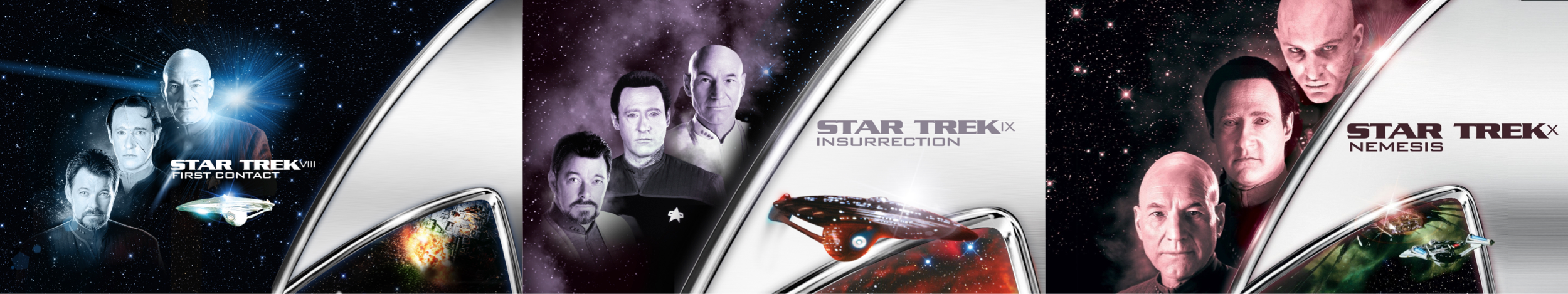
The studio switched to an entirely new design for the next generation series; First Contact, Insurrection, and Nemesis. This set of artwork features the kitchen sink of cast members, ships, space, and the Federation insignia. Even with all those elements, this artwork lacks the charm of either the theatre posters or the set of original cast films. The film titles feel lacklustre and the number in the series is very difficult to read.
Variations of this style is used in various regions and there are also different styles for collections, one-offs, and TV series:

I decided to design my own artwork for the Star Trek films in my collection. My goal was to create a cohesive set with consistent imagery and typography. I wanted to be able to glance at my library and see the order the films were made and I also wanted to see which films featured the original cast and which starred the next generation.

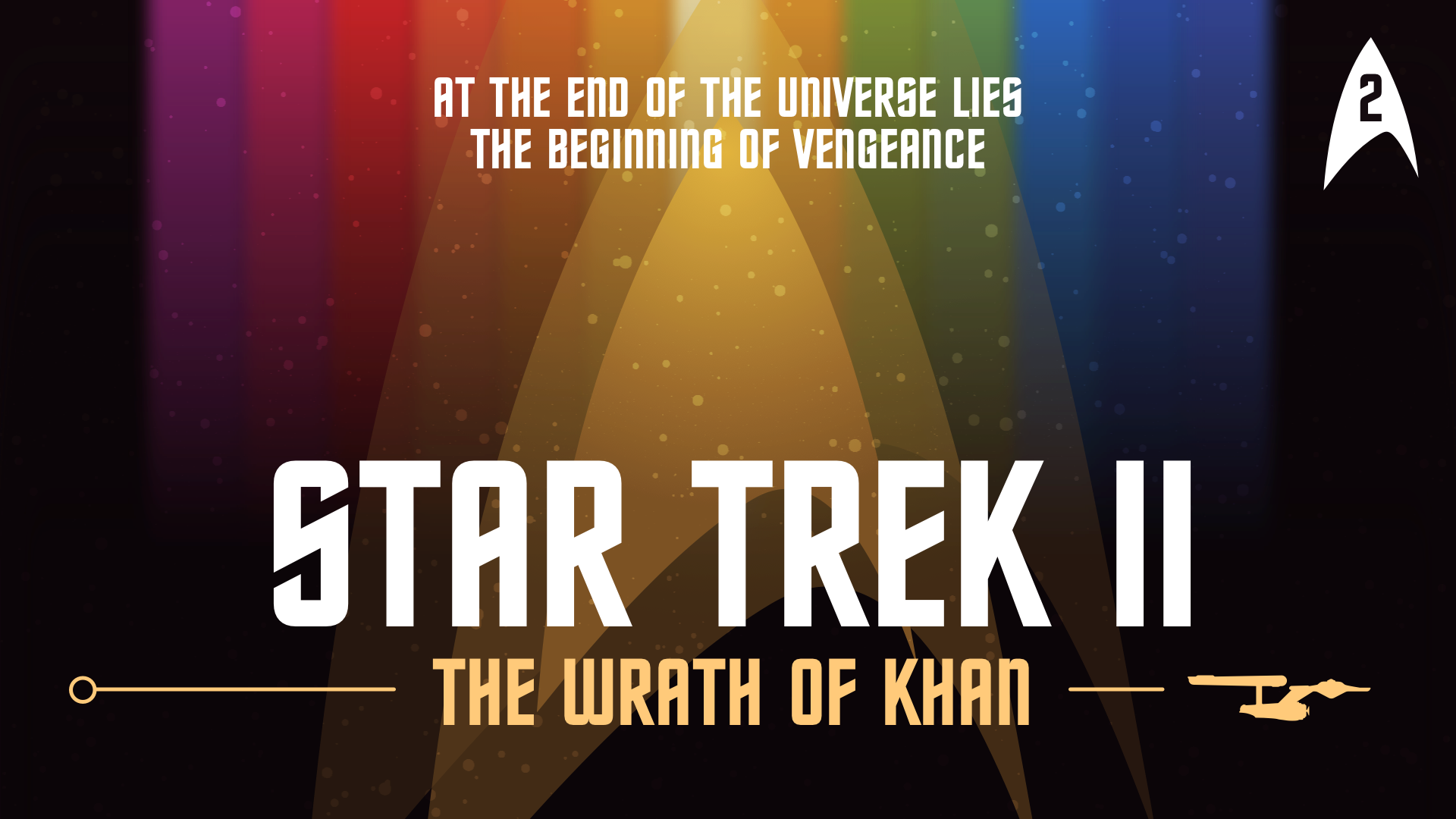

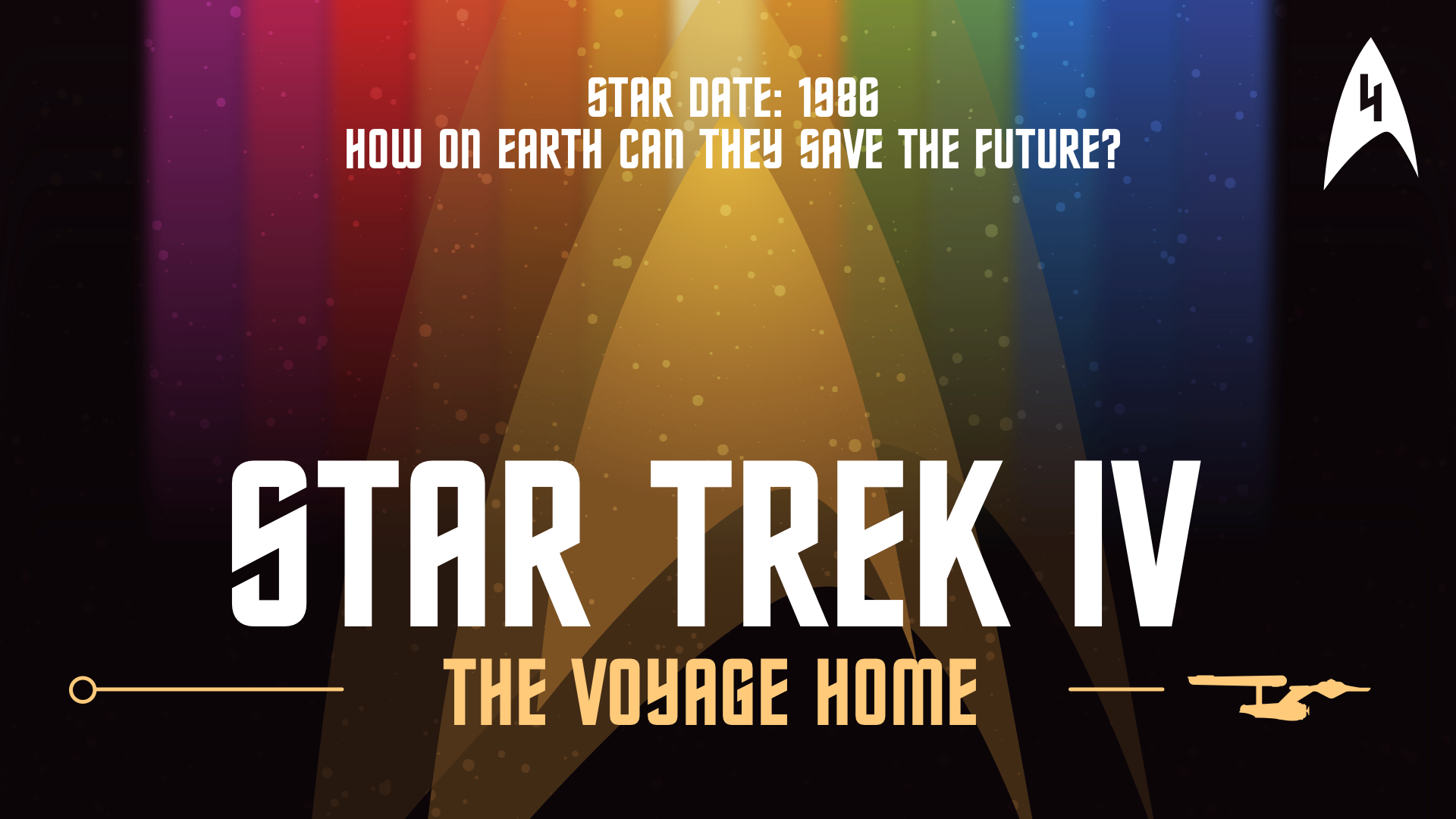


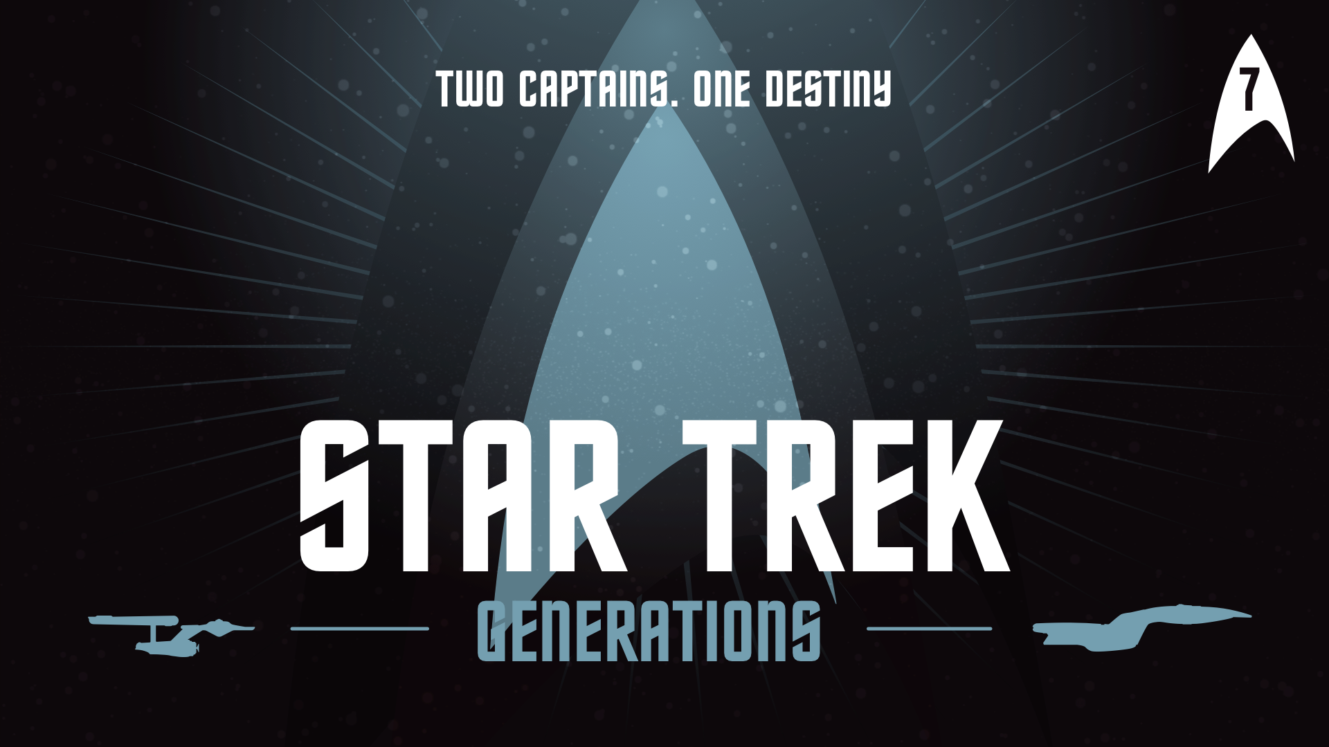
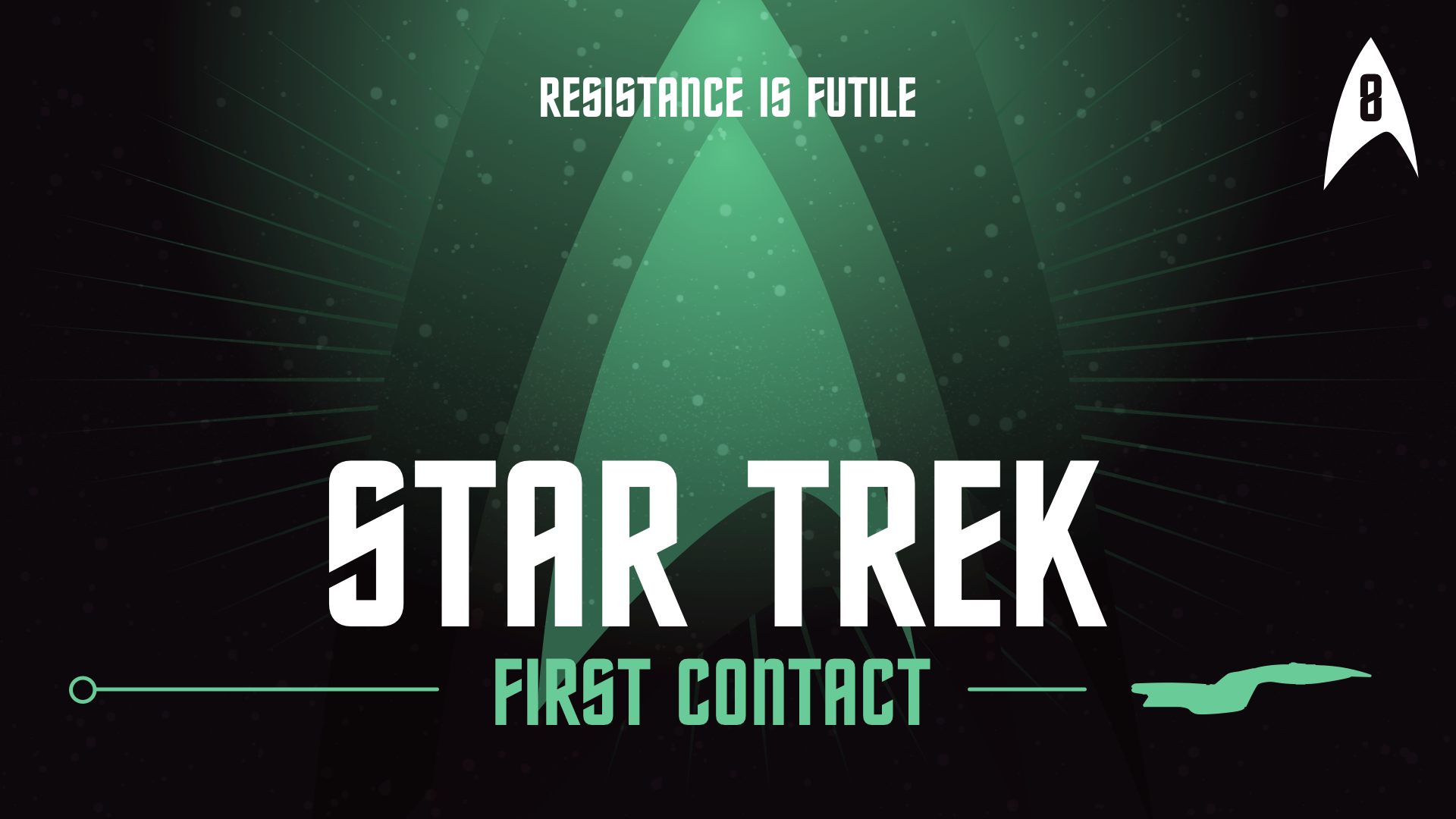


To make this set, I used the Trek typeface for the titles and taglines from the original films. I added a three layered vector or the Federation insignia and blended them with a variety of radial gradients. For the original cast films, I added the prism colours which I sampled from the Star Trek The Motion Picture theatre poster. Finally, I drew a profile of the original and next generation Enterprise and incorporated them into the titles.
I’m really happy with these tar Trek designs and how they form a cohesive set in my Apple TV movie library. If you’d like to use them in yours, you can download them above in WEBP format.