
CSS: Mark-up guides
Whether working alone or as part of a team, there are many separate tasks in any project. If you are working as a team it is important that everybody involved understands the structural requirements needed to implement a design, and even if working alone it can often be tricky (particularly on larger projects) to remember exactly every element or component of a page. That is why at Stuff and Nonsense I have implemented a helpful practise that I call ’Mark-up Guides’.
The concept is simple, but highly effective and helps us make development as efficient as possible. Let’s take a look.
Hey, design dude…
Our general process runs something like this.
- Understanding the goals of the client and the needs of their users
- Determining key content and user tasks
- Paper sketches
- Black and white line-work layouts in Fireworks (I talked about this recently)
- Finished Fireworks layouts as ’production art’
Stages of design are saved as separate ’frames’ in Fireworks to make it simple to back-track to any stage. Saving these revisions, including the black and white line-work is important, as we’ll go on to see.
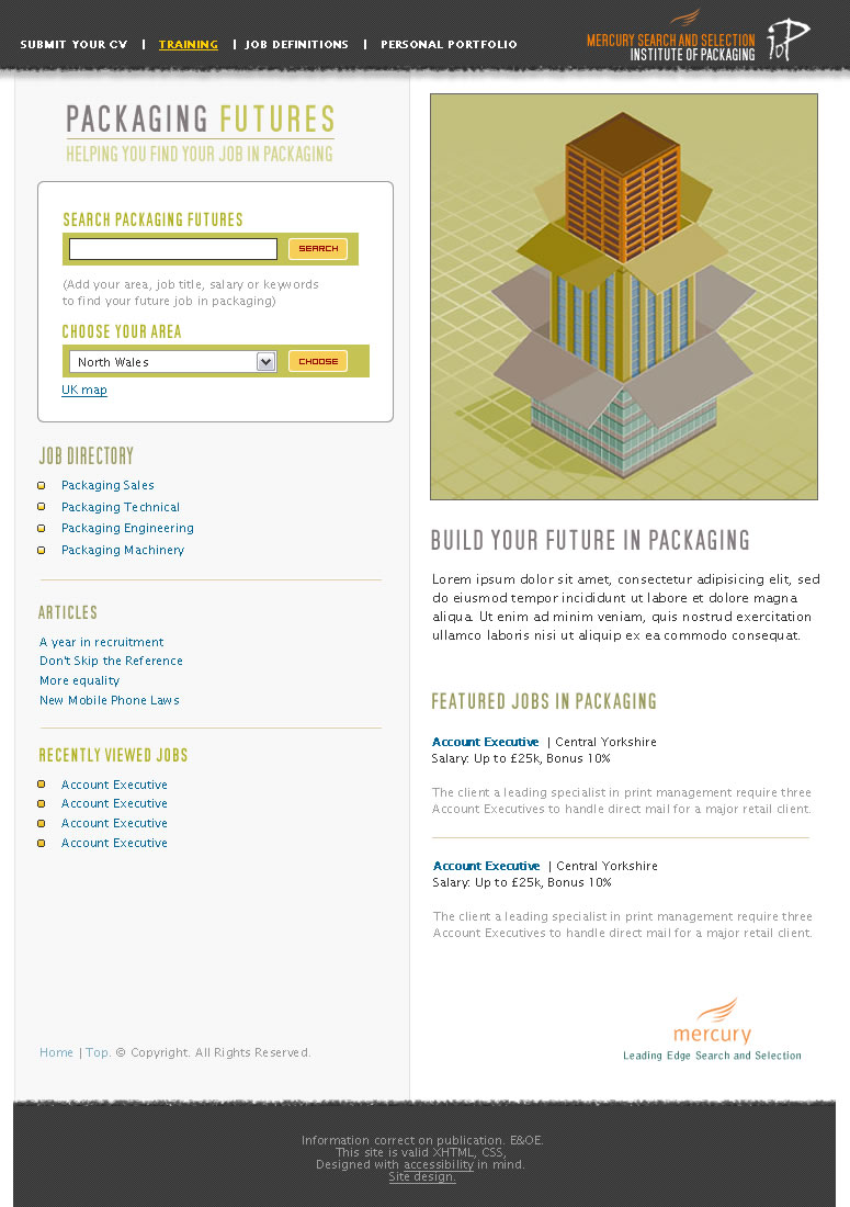 Final production art from Packaging Futures (work in progress)
Back in black
Once a design has been approved by the client at this stage, we can return to the black and white layouts for the next stage. However, often changes are made which take the final layout away from the early stages, luckily Fireworks makes it very simple to create new line-work layouts from fully coloured versions.
 Black and white line-work
Making mark-up guides
Black and white layouts are ideal in helping make guides onto which we note the main structural elements of a page, including any <div> ids or class names which will be required. We mark every element which will be used to style the final page, in a very similar way to my 3d CSS Zen Garden outline. Here is what one looks like.
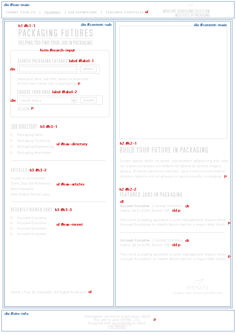 Home page mark-up guide
The mark-up guide not only makes it clear how little in the way of <div> ids or class names are required (with nifty use of descendant CSS selectors), but goes on to serve as a pattern for others to follow.
Regular readers might also spot that the <div> ids etc. follow my preset naming conventions. Implementing this framework across the team has allowed us to develop internal standards and has reduced development times.
They even makes bald men grow hair!
Working this way has had many benefits;
- It helps ’demystify’ structured mark-up for designers
- It gives those writing XHTML code a real head start
- It makes CSS writing more of a process
- Everybody involved in a project can see the end-result before they start
Archiving (yes sometimes we even print and file them (scary, huh?)) these guides also help when coming back to a project weeks or months later and avoids the What is this CSS rule for?
questions which take up so much brain power.
Let me know what you think.
Replies
-
#1 On January 6, 2005 01:20 AM Jason Santa Maria said:
Yep, the same way I work too :D
I also have some pretty decent naming conventions in place for versioning designs and site assets for easy management while working on a project and saving headaches when going through archived files months later.
-
#2 On January 6, 2005 02:00 AM Jeff Croft said:
Great process documentation. As I’ve starting slowlyreplacing Photoshop and Illustrator with Fireworks for web design, I’m moving to a similar process,myself. I still find myself revert to Adobe once in a while (when I get "stuck" in Fireworks due to my relative newbie-ness there), but overall, I’m really starting to see why so many people prefer it for web design comps…
-
#3 On January 6, 2005 02:18 AM Manzell B said:
Maybe I missed the boat, but what advantages does Fireworks have over the illustrator/photoshop combo?
-
#4 On January 6, 2005 09:08 AM Roger Johansson said:
That markup guide does look like something that would help not only designers understand document structure better. Hmm. Will have to take a closer look.
-
#5 On January 6, 2005 09:14 AM John Oxton said:
That is really very useful, I had never thought of using Fireworks frames as a timeline.
Really nice article Malarkey, thanks for sharing this stuff!
-
#6 On January 6, 2005 02:36 PM pixeldiva said:
The early stages of your process are remarkably similar to the way I work, with the exception of using frames as a timeline.
I tend to use different png files (design1, design1a, etc.) and take advantage of the "live effects" features of Fireworks. I then recreate the layout using Topstyle Pro, essentially following the same mental process of dividing up the page and assigning structure and style but I’ve never thought of marking out the structure actually on the wireframe image and I find the idea really interesting.
Granted, I’m not in professional web design or development any more, so a full-blown process isn’t so important because it’s just me working on anything I do, but I might give it a go for the redesign of my blog I’ve been working on for long and weary (minimalism is ace, and a nice sorbet to clear the palate, but I fancy something a bit more visually rich for the next course).
Thanks for the tip.
-
#7 On January 6, 2005 02:43 PM Brent O’Connor said:
I work in the exact same way. However, I didn’t think to use frames for different versions of the project. That sounds a lot more organized. In the past I’ve just used different files for each version of the project. And I don’t put XHTML markup on my actual design. I would be interested in seeing a sample Fireworks file to see how you actually do this.
Also, I was wondering if anyone else has had the same problem I’ve had when trying to replicate HTML text in Fireworks. It seems no matter how I adjust the anti-aliasing, kerning or point size I can’t get text areas in the Fireworks mockup that will be represented by plain HTML in the live web version to look the same. Anyone else had a problem with this?
-
#8 On January 6, 2005 02:51 PM Malarkey said:
@ All: Thanks for the replies.
@ Brent: I normally mock up text in FW using smallish text sizes (10,11,12px) and leave anti-aliasing off altogether. Alternatively make a simple XHTML page with a bit of styled Lorem Ipsum, then take a screen-shot and cut-and-paste bits into Fireworks.
-
#9 On January 6, 2005 09:33 PM Jamie said:
Fireworks makes it very simple to create new line-work layouts from fully coloured versions.
Is it easy enough to explain how Andy? -
#10 On January 7, 2005 09:58 AM Small Paul said:
Ooooh yeah, that is real good. Bingo. Gotta try and start doing this at some point! Much appreciated!
-
#11 On January 7, 2005 10:30 AM Malarkey said:
@ Jamie:
Is it easy enough to explain how Andy?
I might look at doing a separate column on this in the near future.
-
#12 On January 7, 2005 06:10 PM MH said:
Nice idea.
BTW, attempting to print a page from your site hangs Firefox 1.0/Mac…strange. I was only able to print after turning off CSS.
-
#13 On January 7, 2005 10:30 PM Gabriel Mihalache said:
Good stuff, but wouldn’t it be easier to do sketches by hand? Less precise but easier to draw and redraw? Do you use a tablet?
-
#14 On January 8, 2005 01:15 AM patrick h. lauke said:
gabriel, i’d posit that it probably depends on how you use the sketches. if they’re sent/shown to the client for approval, then the slicker, more precise and close to the final product you can get them, the better (having said that, i’ve had quite a few meetings where initial payment was agreed based on a rough sketch on a beermat, but that’s another story …)
-
#15 On January 8, 2005 11:05 PM Jeff Smith said:
Excellent article Malarkey. I always enjoy a little insight into how other designers work through the creative process. Since I’m just starting a new job at a new company, I’m looking to refine my process a little more and this is definitely gives me a good basis to start from as it’s somewhat similar to the way I worked in the past.
The only thing that I find is that sometimes my clients don’t seem to be able to grasp a full comprehension of the site layout from seeing line drawings. Although, it’s definitely a much better place to start from as far as I’m concerned.
-
#16 On January 10, 2005 01:28 AM Regnard Kreisler Raquedan said:
Nice method for collaborative efforts. :)
-
#17 On January 11, 2005 08:19 PM AkaXakA said:
While making a markup guide like that is quite handy for most elements, you must not forget that you can overlap a lot of things due to us now having css to position things, so that a traditional grid layout isn’t always the best.
We should move on from our table-based design implementation thinking to a more flowing understanding of elements on the page.
For instance: you might want to have the light-blue area running the whole height of the page and then postition the nav on top of that.
This makes it possible to have the nav-html in any place of the document so you can choose the place where it’s best suited for screenreaders.
-
#18 On January 12, 2005 02:21 PM Richard Rutter said:
Mark-up guides are an excellent idea, and an approach I used when rebuilding Multimap.com. I took screenshots of each differing page and identified where all the divs, lists, paragraphs, etc would be so that I could rationalize the classes and ids as much as possible.
It’s the old save yourself time by planning up front thing, and it applies to mark-up and CSS strategies particularly well.
-
#19 On January 13, 2005 05:31 PM Mirko said:
I did the same for a few projects, except that I printed out the Fireworks template and wrote on paper… in the end it looked quite messy, so I guess your electronic approach is much better than my old style ink on paper…
Well done!