A quick shot of gradient text and text-shadow
While I was researching typefaces for a new project, I came across Dalton Maag’s case study for Universal TV. The type is beautiful, of course, but it was their graphics which got my attention.

I haven’t seen much in the way of gradients or shadows lately. Flatness still seems de rigueur, but there’s something about type effects like this which makes me happy, so I spent some time reproducing it in CSS. There’s no need to go wild with gradients, even a small shift in background colours can make a big difference:
body {
background-color: #fa691a;
background-image: linear-gradient(135deg,
#fa691a 0%,
#d72263 50%); }
For the first iteration, I chose a solid colour—midway between those two background colours—for my text:
h1 {
color: #e0354d; }
Unless there’s only a single, point light-source, there’s always more than one shadow cast, harder primary shadows and softer secondary shadows. Fortunately, CSS allows for a comma-separated list of multiple box and text shadows. I used five shadows and RGBA colour values to enable a little of the background colour to show through. This helped to create the three-dimensional effect which lifts the text off the background:
h1 {
text-shadow:
-1px -1px 0 rgba(255,255,255,.5),
1px 1px 0 rgba(0,0,0,.25),
3px 3px 3px rgba(0,0,0,.25),
10px 10px 20px rgba(0,0,0,.5),
20px 40px 40px rgba(0,0,0,.5); }
The result was acceptable, but I wanted to use gradient colours in my text. This required mixing a gradient with two vendor prefixed properties, -webkit-background-clip and -webkit-text-fill-color:
h1 {
background-image: linear-gradient(135deg,
#fa691a 0%,
#d72263 50%);
-webkit-background-clip: text;
-webkit-text-fill-color: transparent;
text-shadow: ‹values›; }NB:-webkit-text-fill-color is a non-standard property and not on its way to becoming part of any standard. MDN recommends “Do not use it on production sites facing the Web: it will not work for every user.” But don’t let that stop you using it. It’s currently supported by Android Browser, Chrome, Edge, Firefox, Opera, and Safari on both iOS and OSX, all using the -webkit- prefix.
By making my text-fill-color transparent, colour from my shadows showed through, ruining the effect, so I moved those shadows to a pseudo element with content that’s derived from a data- attribute in my HTML:
‹h1 data-text="Art direction for the web"›
Art direction for the web‹/h1›

h1 {
position: relative;
background-image: linear-gradient(‹values›);
-webkit-background-clip: text;
-webkit-text-fill-color: transparent; }

h1:before {
content: attr(data-text);
position: absolute;
top: 0;
left: 0;
z-index: -1;
text-shadow: ‹values›; }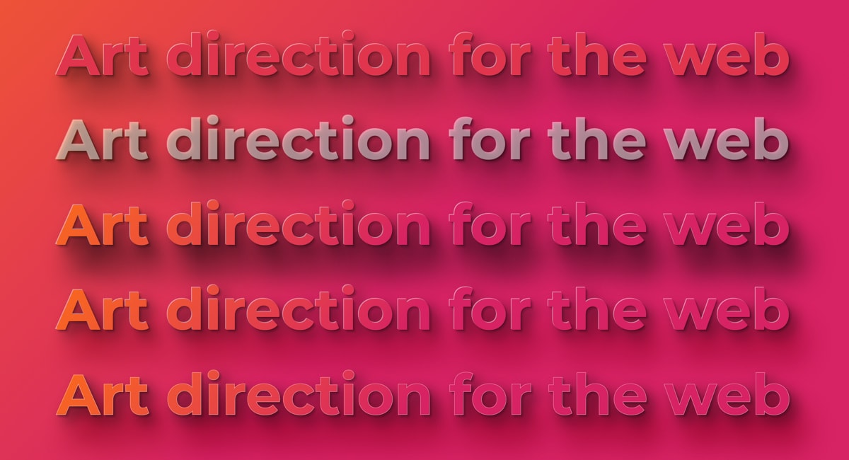
With gradient colours in my text, the result was much closer to what I was aiming for, but the semi-transparent black shadows felt a little cold. To solve the problem, I split my shadows across two pseudo elements. The first included the three primary shadows which create the three dimensional effect:
h1:before {
content: attr(data-text);
position: absolute;
top: 0;
left: 0;
z-index: -1;
text-shadow: -1px -1px 0 rgba(255,255,255,.5),
1px 1px 0 rgba(0,0,0,.25),
3px 3px 3px rgba(0,0,0,.25); }
The second adds two secondary shadows. For the softest shadow, I replaced the black RGBA colour with a darker version of my background colour and blended it with the page background using a mix-blend-mode value of multiply:
h1:after {
content: attr(data-text);
position: absolute;
top: 0;
left: 0;
z-index: -2;
text-shadow: 10px 10px 20px rgba(0,0,0,.5),
20px 40px 40px #a51d50;
mix-blend-mode: multiply; }
I made a Pen so you can see the code in use and experiment with it yourself:
See the Pen A quick shot of gradient text and text-shadow
I hope we’ll see an end to the flat fad this year and a return to deeper designs which include more gradients and shadows. I know I’ll be using them more, even if it’s just to buck the trend.
Mandy Michael is the queen of text effects and has compiled quite a collection of Pens.
More from Stuff & Nonsense
Services I offer
Product UX design
The contract template trusted by thousands of designers and developers to keep their web projects running smoothly.
Design mentorship and teaching
Whether you’re stuck, starting out, or stepping up—Andy’s here to help you become a better designer.
Squarespace templates for sale
Take your Squarespace designs from good to great with my bespoke templates.
Andy Clarke on YouTube
Join Andy on YouTube to learn how you can make better product and website designs.