Art Direction for the Web: Designing standfirst paragraphs
Designers frequently overlook a few design elements if they remember them at all. Recently, I’ve noticed that the styles of typographic details like bylines, citations, dates and times are more often than not pulled from frameworks and pattern libraries and receive very little original thought.
Other typographic elements suffer from the same lack of consideration, and this is not only a missed opportunity to be creative, but to take a moment to consider how they can:
- Bring a design together
- Connect an audience with a brand
- Help to tell a story
As my clients became increasingly concerned with presenting their content in more original ways, I took a close look at designers in other media and applied what I learned to my work for the web. Over the next few weeks, I’ll share my inspiration and show you how to create inspired designs from the most basic elements. In this, the first article in this series, I’ll teach you about standfirst paragraphs.
You can read more about this topic in my upcoming book, Art Direction for the Web, published in October 2018 by Smashing Magazine. Sign up for updates and a discount code.
What’s a standfirst?
In newspapers and magazines, online and in print, a standfirst is the ‘first’ few lines of an article and should be designed to ‘stand’ out.
You might also see standfirst paragraphs referred to as “decks,” “kickers” because they kick readers into the content, “riders,” “summaries” as they often summarise the content of an article, or—my personal favourite—“the sell” because one of its jobs is selling content to a reader.
Don’t confuse a standfirst with a ‘lead‘ (or lede) paragraph though, as a standfirst should stand apart as well as stand out. It should be separate from running text in an article, unlike a lead which is part of it. If you’re looking for a dictionary definition of “standfirst,” Collins offers:
“An introductory paragraph in an article, printed in larger or bolder type or in capitals, which summarises the article.”
Source
While a standfirst paragraph is often “larger, bolder,” or “in capitals,” that’s not necessarily how it always looks. There’s no rule book to dictate its size or style, or even its position. That’s something important to bear in mind when you’re designing layouts for many different devices or screen sizes. The design of a standfirst should help it do its job and should:
- Be designed to catch someone’s eye
- Encourage people to read on
- Give people an idea of what an article contains
- Improve understanding and share-ability
Headlines capture attention, and a standfirst captures the imagination
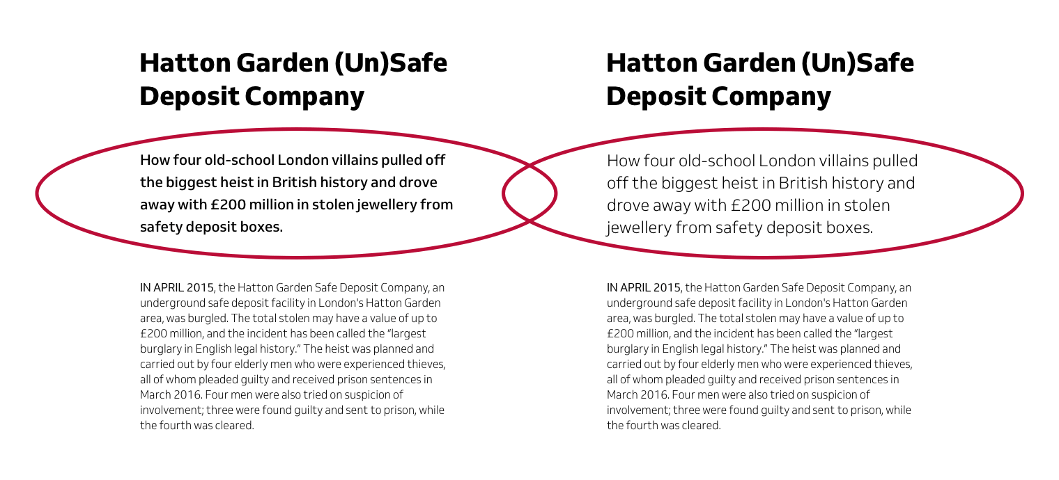
Capturing someone’s attention is also the job of a headline, but a standfirst needs to go further. A standfirst shouldn’t merely repeat what’s in a headline. As “the sell,” its content should capture a reader’s imagination and make them want to read what follows. For example, a headline about Britain’s biggest robbery might read:
Hatton Garden (Un)Safe Deposit Company
It’s common for a standfirst paragraph to be either two, three, or four lines long at most and be brief, containing between 20–50 words. An effective standfirst to follow that headline might say:
How four old-school London villains pulled off the biggest heist in British history and drove away with £200 million in stolen jewellery from London safety deposit boxes.
A standfirst paragraph might also include a question which is designed to engage the reader?
How did four old-school London villains pull off the biggest heist in British history, and drive away with £200 million in stolen jewellery?
Selling is as much an art as copywriting or design, so consider the content of a standfirst carefully. As its job is to sell content, and not all customers are the same, a standfirst paragraph might change to appeal to specific audiences. The tone of this standfirst is intended to attract a younger audience:
Could your Grandad pull off the biggest robbery in British history and get away with £200 million?
Whereas, if the style of a publication is designed to appeal to older readers, that paragraph might read:
How did four career criminals, all in their sixties and seventies, manage to execute the biggest robbery in British history and steal £200 million in jewellery and other valuables?
Remember, the job of a standfirst is to capture a reader’s imagination and to sell an article’s content, so its looks matter as much as what it says.
Designing a standfirst
Collins suggests that a standfirst paragraph can be “larger, bolder,” or “in capitals,” and while you’ll often find those common styles used, they’re not the only way to catch someone’s eye, encourage people to read on and improve their understanding.
When I’m designing a standfirst paragraph, I keep several things in mind:
- Its position and style should be distinct from running text
- How it looks can be determined by the style of a publication
- Sometimes the article’s subject influences its look
There’s an argument that in markup, a standfirst needn’t be a paragraph at all. You should use the most semantically appropriate element including a blockquote or even a lower level headline.
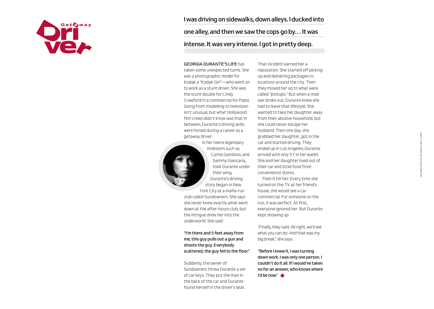
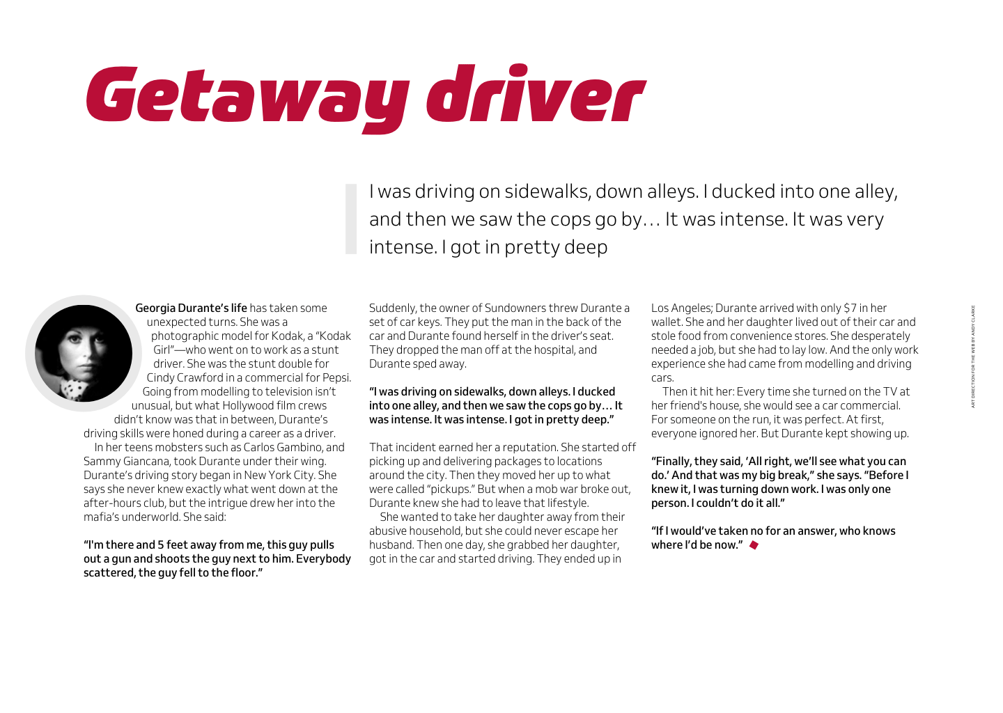
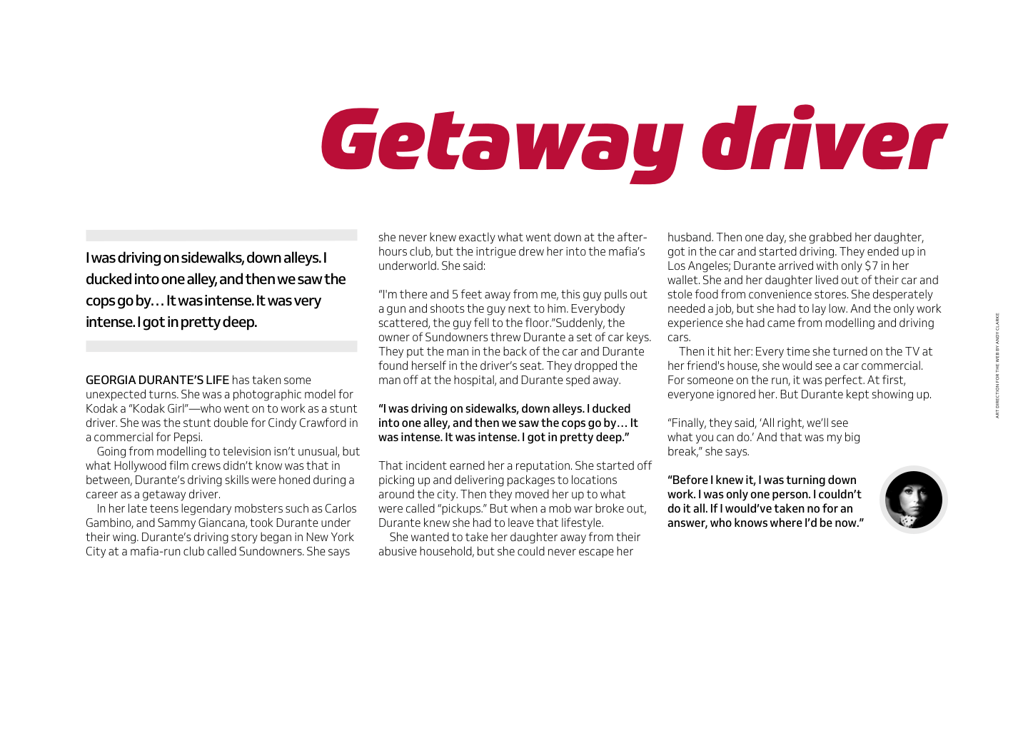
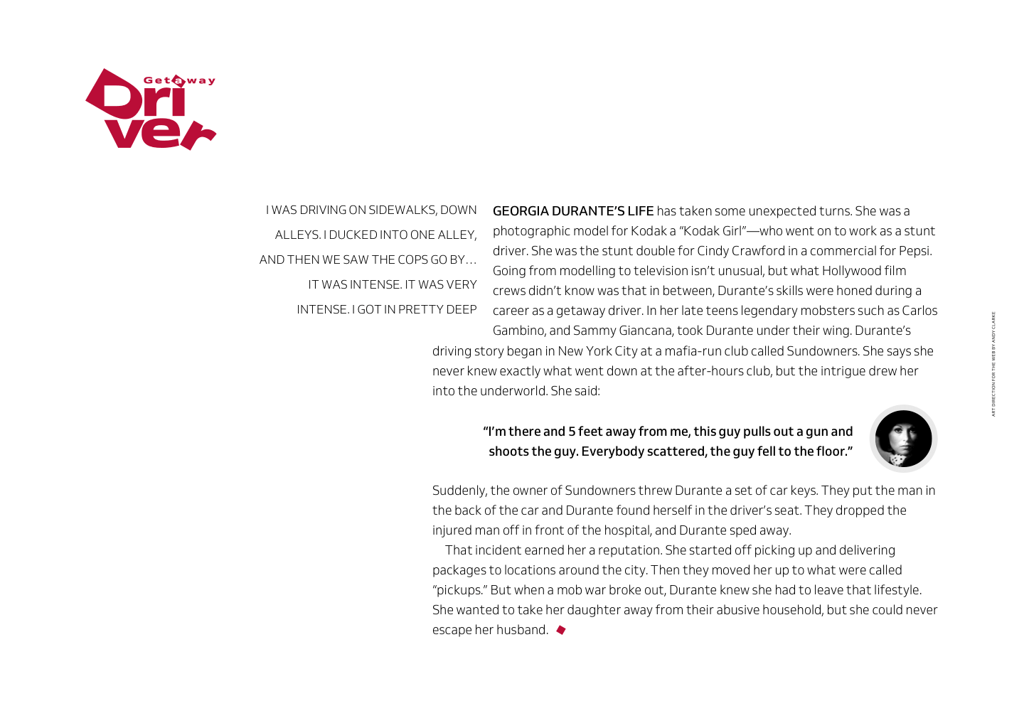
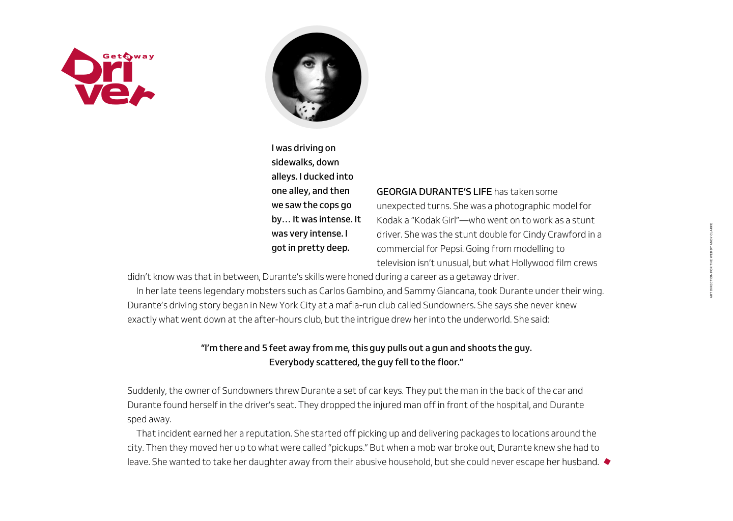
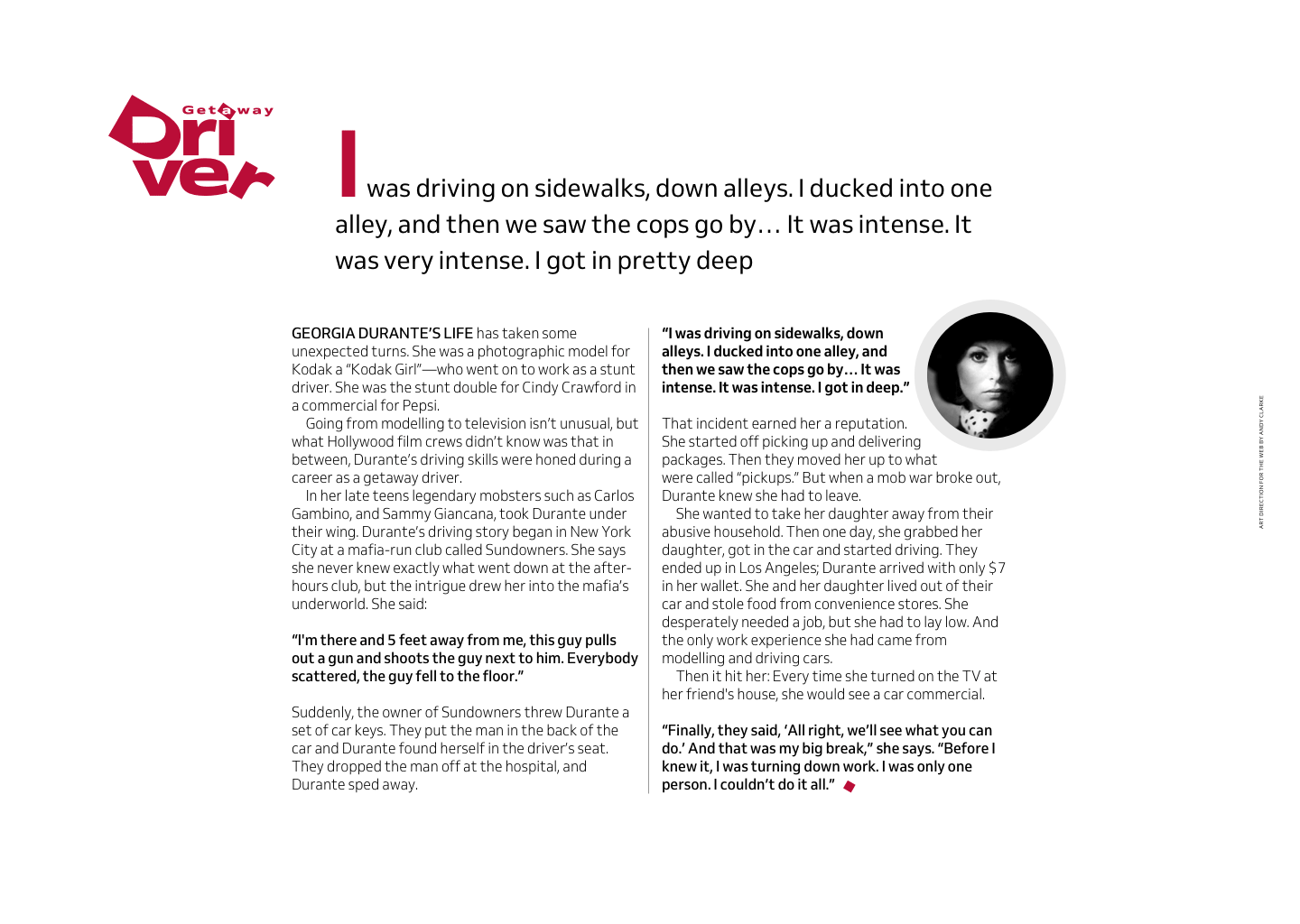
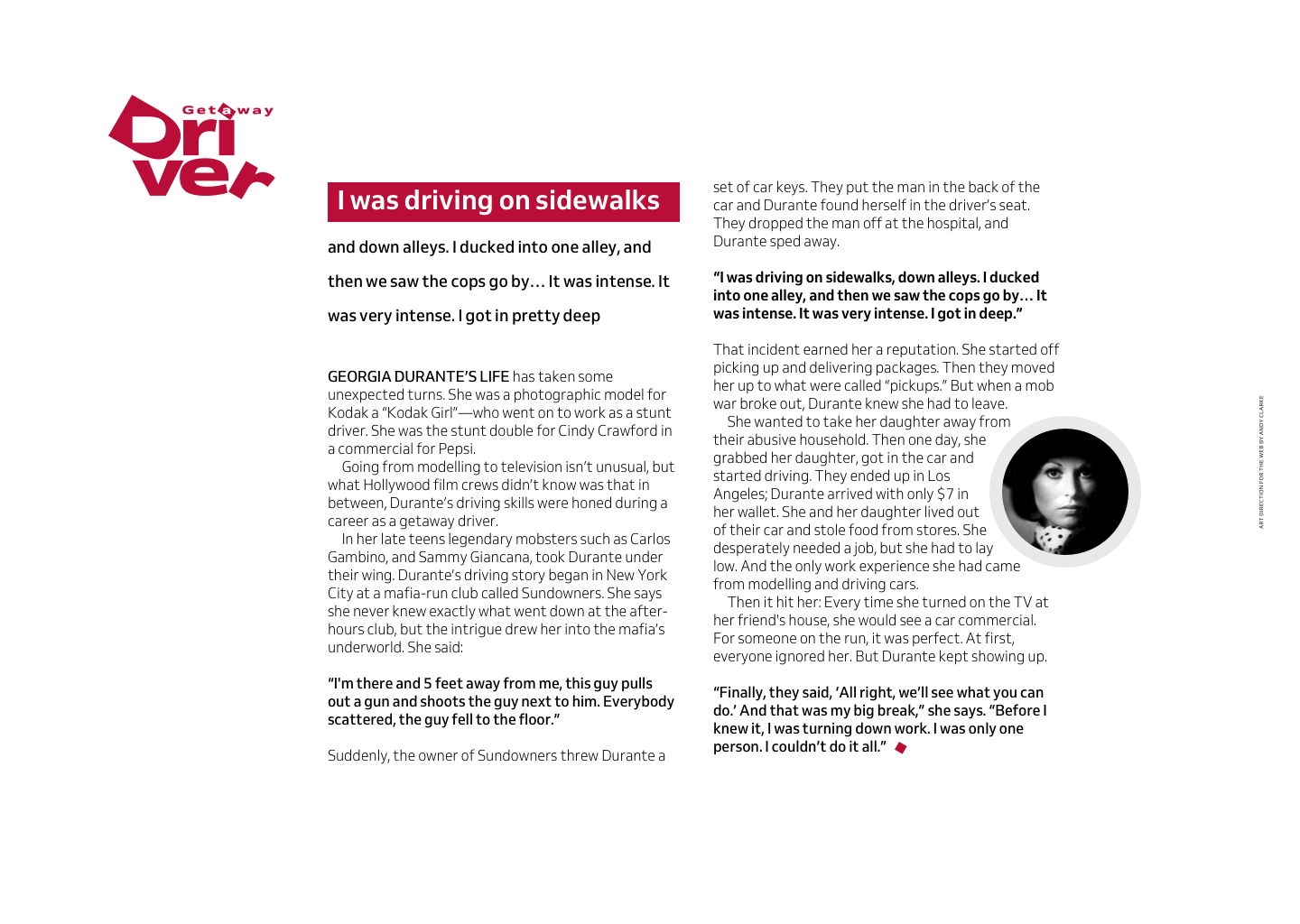
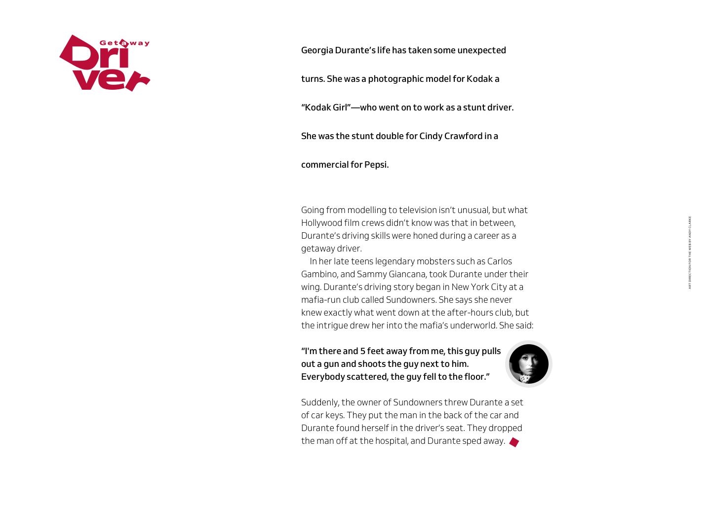
In Art Direction for the Web, to help me describe some of the ways you can style a standfirst, I designed Wheel Man. It’s an app for booking a fast car and a getaway driver, plus a companion website which is chock full of advice on how to get away after a robbery, plus stories about famous getaway drivers. One driver is a former model, and TV stunt driver Georgia Durante who wrote a book about her life as a “model turned mafia wife.”
Inspired standfirst designs
1) Span multiple columns
It’s common to see a standfirst span multiple columns of running text and positioned between an article headline and content. When you’re following that convention, it’s essential a standfirst paragraph be typographically distinct from both a headline and body copy, perhaps by increasing its size or contrast using a heavier or lighter weight.
2) Above a headline
Laws are meant to be broken. To make sure you catch someone’s eye, place a standfirst above, instead of below, a headline. You might also add extra interest by limiting its width to span fewer columns.
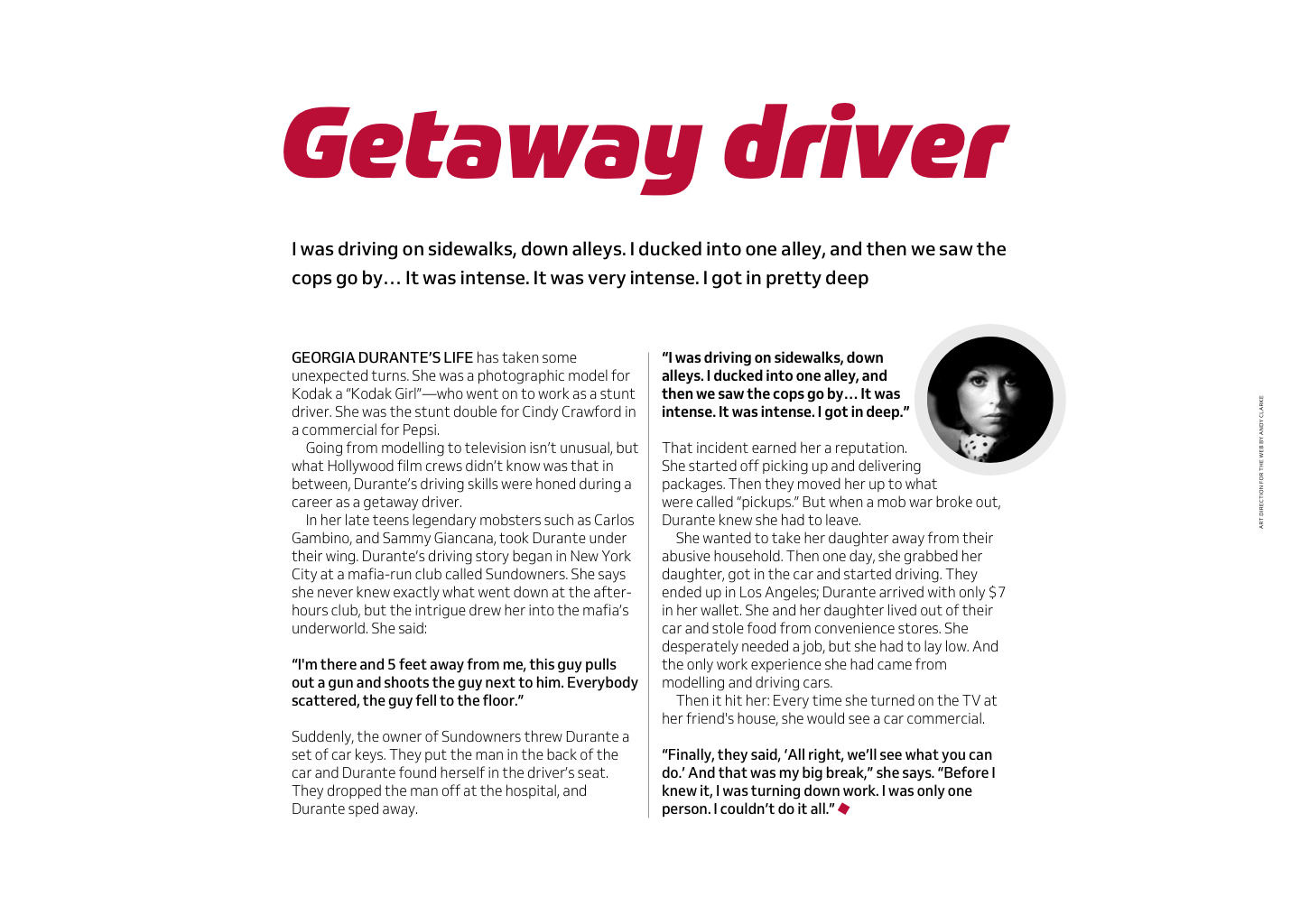
3) Underlines add emphasis
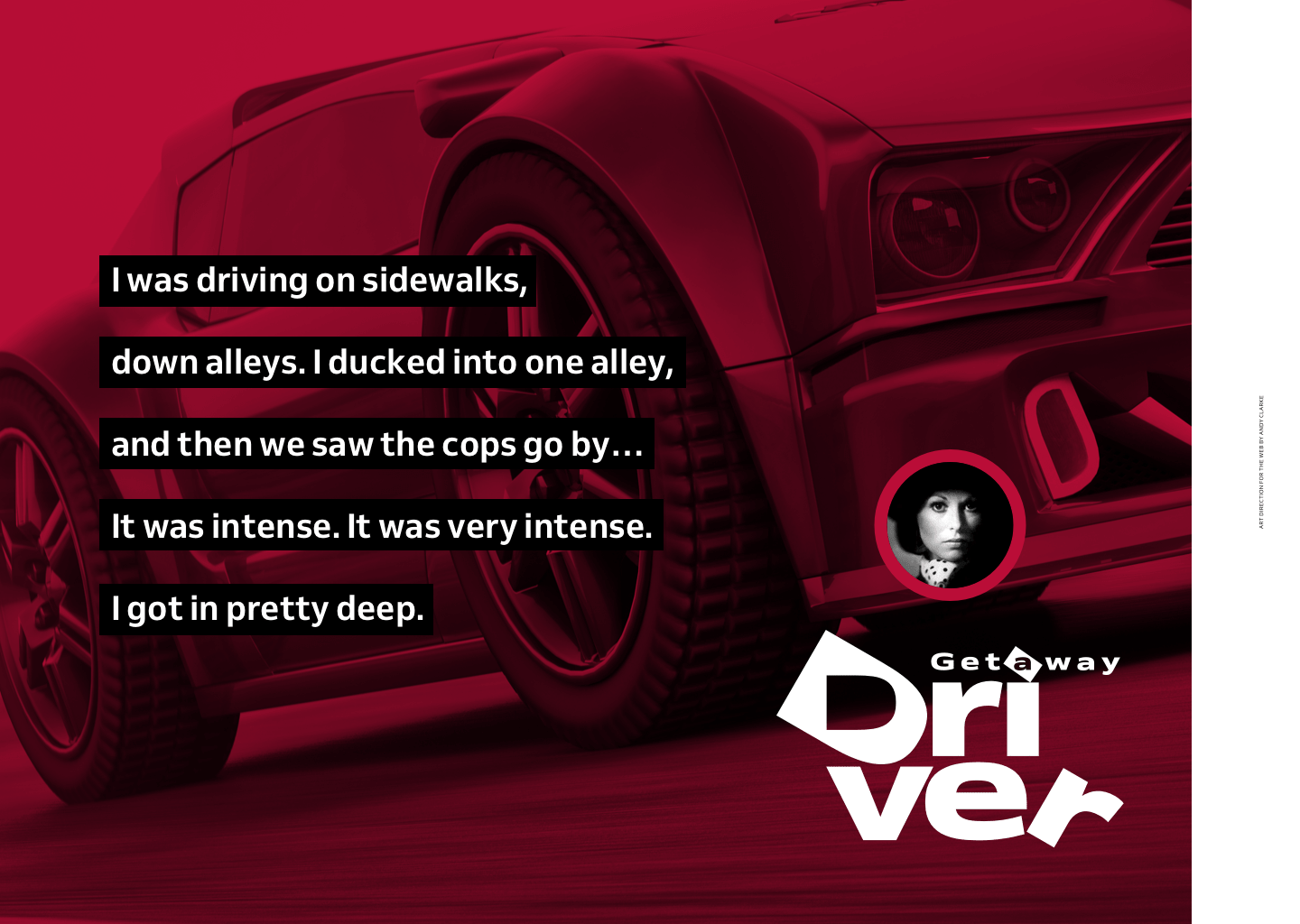
Give a standfirst greater emphasis by adding thick underlines. When the default text-decoration:underline isn’t strong enough, several experimental CSS properties offer greater control over underline styles. These include, text-decoration-color, text-decoration-skip, and text-decoration-style.
Browser implementation of these properties is patchy, so you might use a more reliable background-image technique. This technique uses CSS gradients to create underlines. You can also add background images for a unique underline.
4) Borders add structure
If you’re looking for something stronger, combine thick underlines with even thicker borders. Keep those border widths in proportion to your underlines and your typeface. For example, a bottom border might be two, three, or four times the width of your underlines.
5) Borders define space
Add a thick border to the left of a standfirst to define its position and prevent it from drifting into space. Out-denting this standfirst by the combined border and padding width also means its content align with columns of running text below.
6) Borders stand out
When you position a standfirst close to columns of running text, it needs to look different enough for readers to see the distinction between it and regular paragraphs. As well as increasing the size and weight of standfirst text, add heavy borders to the top and bottom.
7) Floating a standfirst
When a standfirst looks sufficiently different from running text, you can place it close to an article. Float a standfirst into the space created by a wide left margin. Aligning its content to the right helps to indicate where someone should start reading.
8) Oversized margins
To bring an abstract feel to this layout, add an oversized margin to the left of a floated standfirst. This limits its width, forming a column which pulls the eye towards the content. The image at the top of this column provides a focal point.
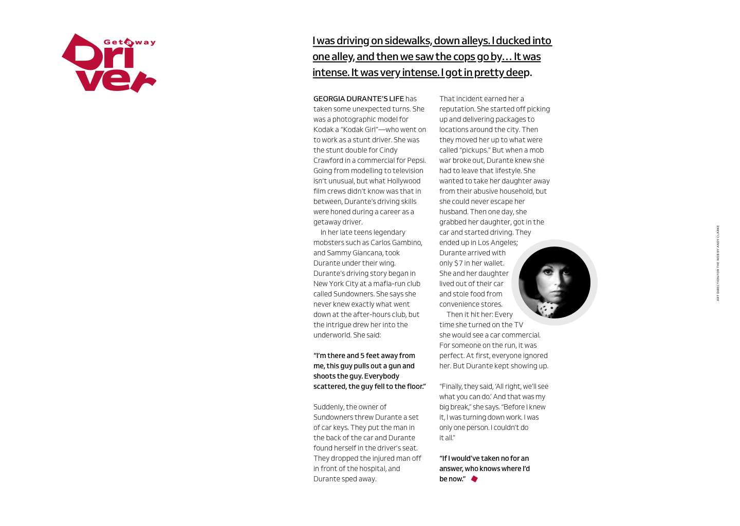
9) Drop and initial caps
Drop and initial caps can be both decorative and useful in that they mark where someone should start reading your text. What’s the difference between them? Initial caps sit on the baseline and drop caps fall below it. You can use initial caps for more than simply indicating the start of running text: they can add personality to a standfirst too.
10) Style the first line
On magazine and newspaper pages, you’ll often find the first word, three or five words, or even a phrase in the first paragraph emphasised in some way. Sometimes set in bold, other times uppercase. You can also use pseudo-class selectors to apply that treatment to the first line of a standfirst, no matter how long or short that is.
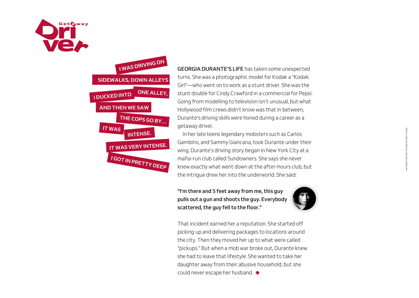
11) Deconstructed text
How a standfirst paragraph is often determined by the overall style of a publication, but it can sometimes by influenced by an article’s subject. This offers a fabulous opportunity to be creative, perhaps by deconstructing its content and rotating each line to turn a standfirst into a strong visual element.
12) Exaggerated leading
A standfirst should look sufficiently different, but that needn’t mean text must be larger than nearby running text. Instead, use exaggerated leading which is much looser than other text in the article and a deeper margin below it to separate them further.
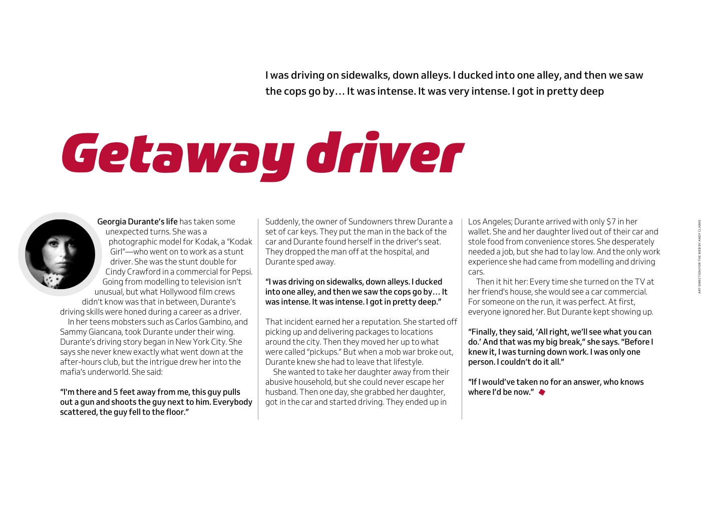
12) Exaggerated leading
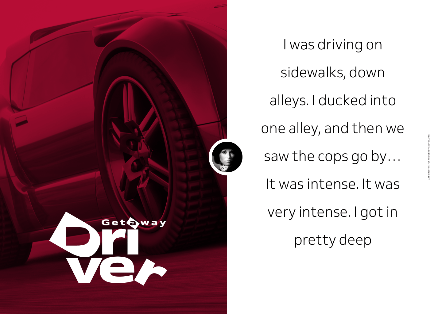
Exaggerated leading can be particularly effective when turning a standfirst into a signature design element. This large, centred paragraph balances the visual weight of a full-height image opposite and its lightweight style makes it look even more distinctive.
14) Standfirst in a banner
An article about a real-life getaway driver deserves a high-impact design. Placing a high-contrast standfirst over an image which fills the screen creates a feature which demands attention and gets a reader’s adrenaline flowing, ready for what comes next.
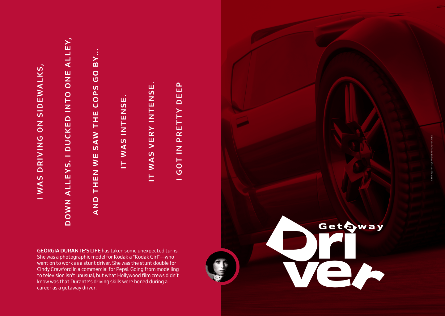
15) Curious rotation
A standfirst should also make readers curious and this design becomes hugely more interesting when I turn this centre-aligned standfirst on its side. The loose leading and uppercase style also turn this paragraph into a strong visual element.
Stand and deliver
There’s no doubt that when written well, a standfirst can connect readers with your content. Its design can also help people understand what‘s coming next, and offers us an opportunity to connect them the brand of a magazine, product, or website. Achieving all that requires both creative thought and inspiration. I hope I’ve encouraged you to think more creatively about the design of your standfirst paragraphs and inspired you to consider them more often.
Were you inspired by this post? Imagine how my mentoring programme could help you to become a better designer.
More from Stuff & Nonsense
Services I offer
Product UX design
The contract template trusted by thousands of designers and developers to keep their web projects running smoothly.
Design mentorship and teaching
Whether you’re stuck, starting out, or stepping up—Andy’s here to help you become a better designer.
Squarespace templates for sale
Take your Squarespace designs from good to great with my bespoke templates.
Andy Clarke on YouTube
Join Andy on YouTube to learn how you can make better product and website designs.