With the 2024 election looming, how do the parties’ websites fair? I took a look.
Finally, the UK general election campaigns are underway, and the parties are pushing their messages to voters. With the Conservatives desperate to cling to power, Labour anxious to seize it, the Liberal Democrats hoping for more MPs, and Reform looking to claim the far-right vote from the Tories, how do I think their website designs are fairing?
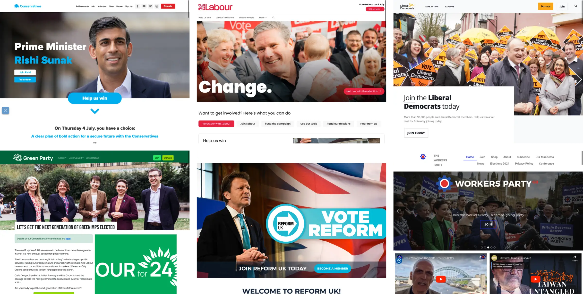
Although there might be fewer differences between the main parties’ policies than perhaps there used to be, the same can’t be said about their websites, all of which include nearly identical layouts, starting with, of course, the obligatory full-width banner image.
Design, layout, and typography are powerful communication tools, and political party websites should use them in different and opinionated ways.
Attention to detail in a design suggests that a party is thoughtful and values taking time to consider the specifics of its policies. Linework, shapes, and texture contribute to a party’s brand and visual identity.
Symmetrical layouts might be seen as predictable, reassuring, and stable, while asymmetry may appear more challenging to the status quo, opinionated, or radical. Symmetry might suggest stability, while asymmetric layouts are more dynamic and energetic.
Typographic design—not just typeface selection—can impact how a party’s message is communicated. Bold type projects confidence, and a steep typographic hierarchy, weighted towards large type, is unapologetic. Small type and a shallow hierarchy are less challenging. Meanwhile, ill-considered, jumbled typography suggests that a party’s policies are less clear, even chaotic.
Sadly, every leading party website is unimaginatively laid out, poorly typeset, and uninspiringly designed. Does this matter? Yes. It’s vital because the purpose of a political party website should be to inspire voters to connect with a message, encourage them to donate, join, or ultimately vote, and stand apart from what other parties are offering. None of the designs of the main parties’ websites do that.
Unsurprisingly, these political party websites feature the ubiquitous full-width banner images I see everywhere. So what’s the alternative?
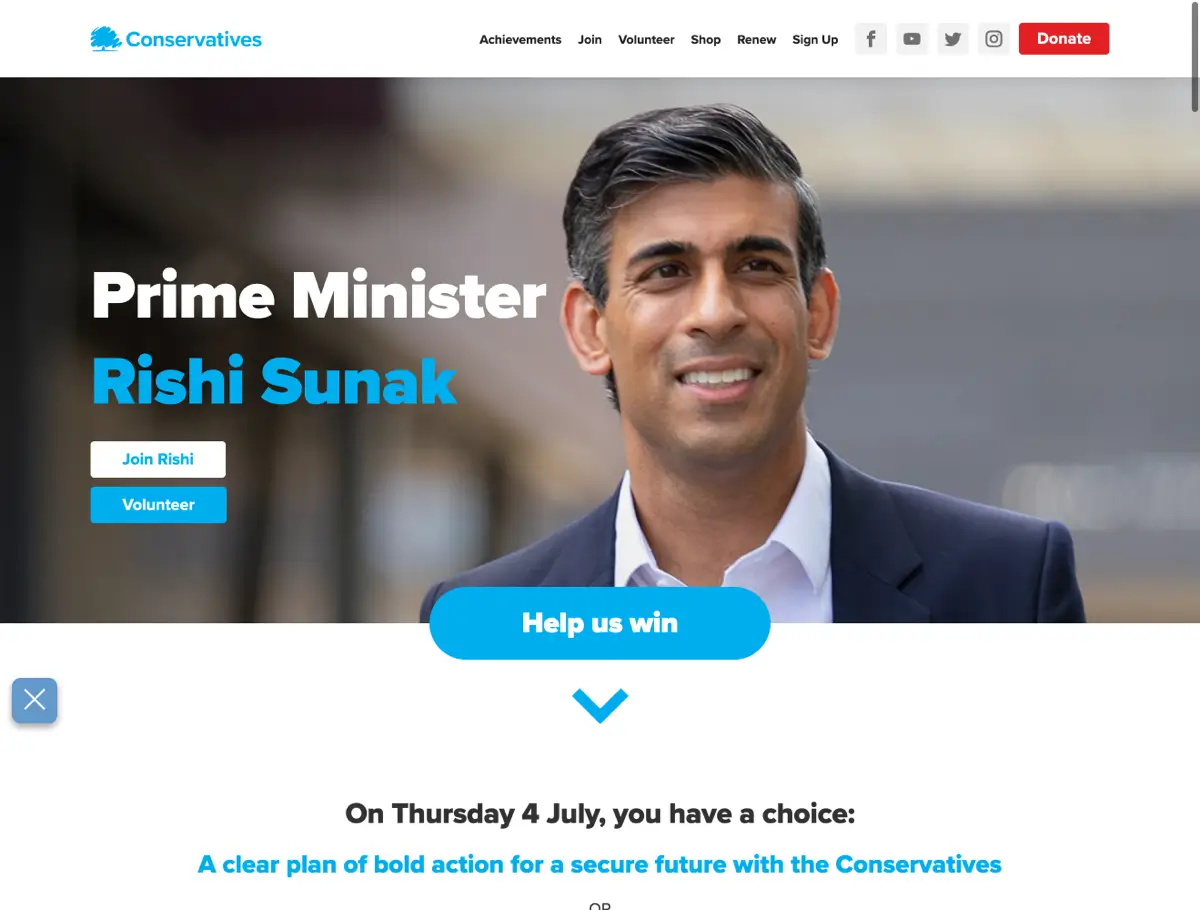
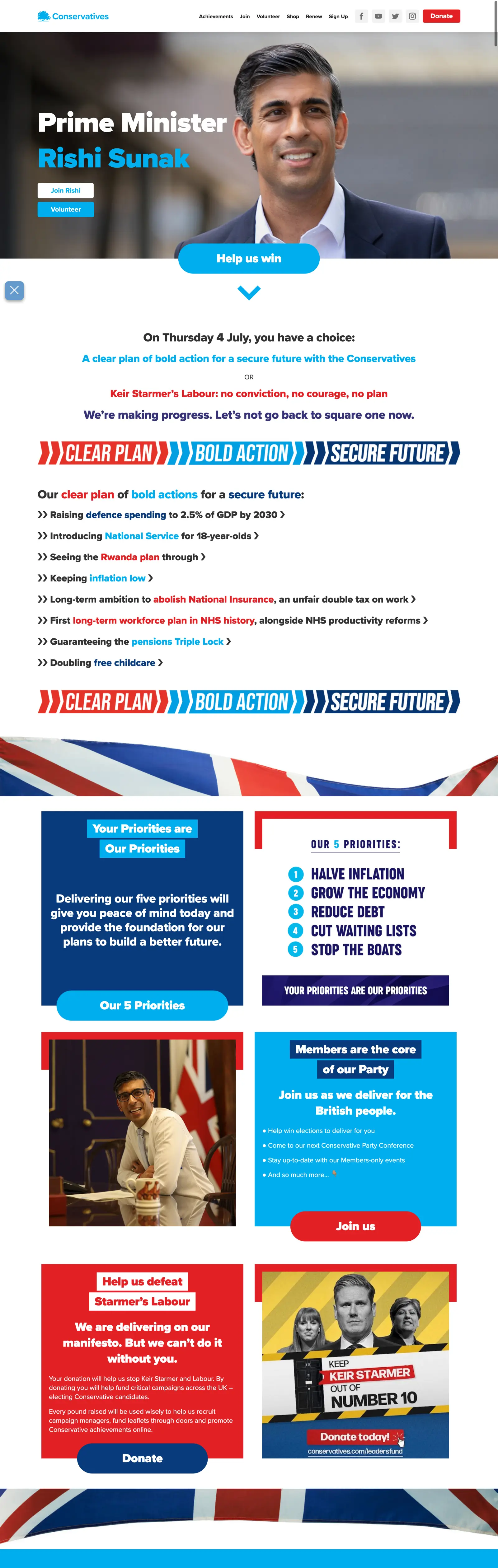
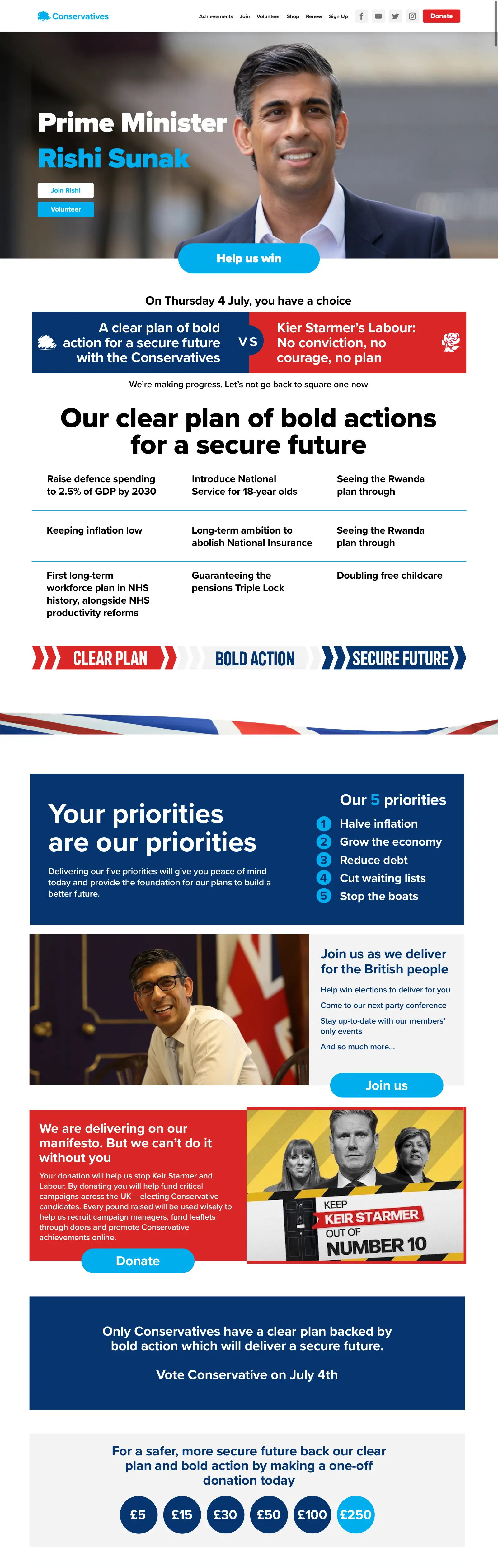
The Conservatives’ home page could be instantly improved by moving the Tories’ key message—that they have a plan whereas Labour hasn’t—from below the scroll into the banner space.
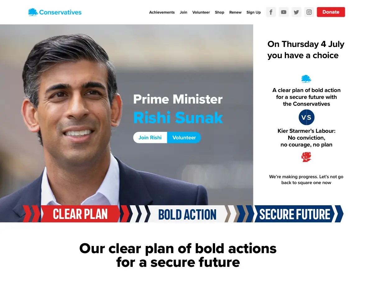
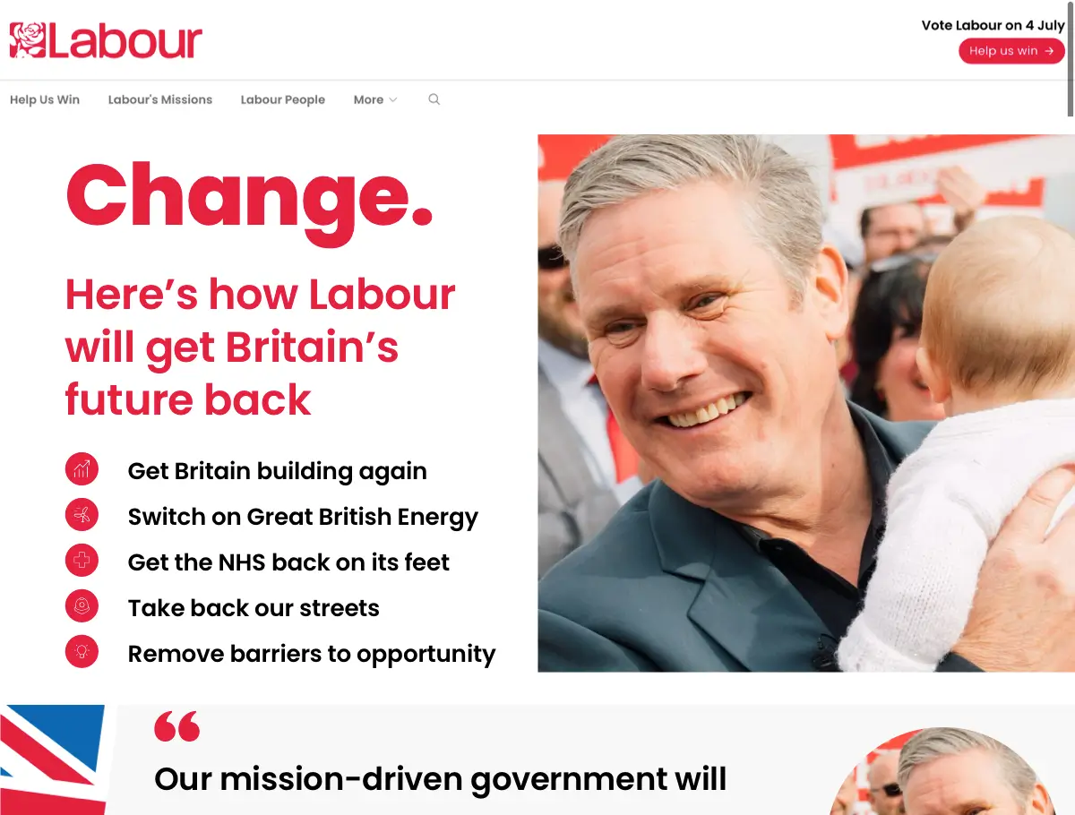
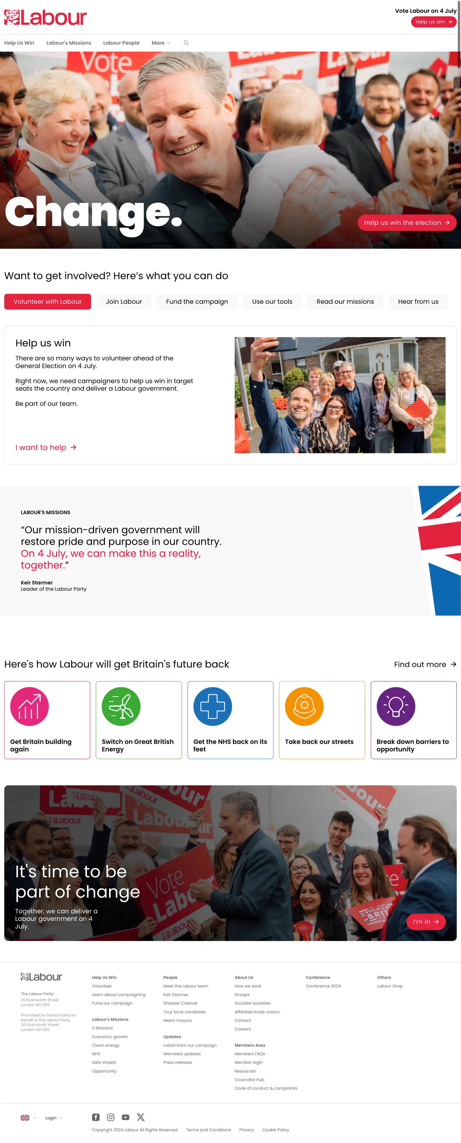
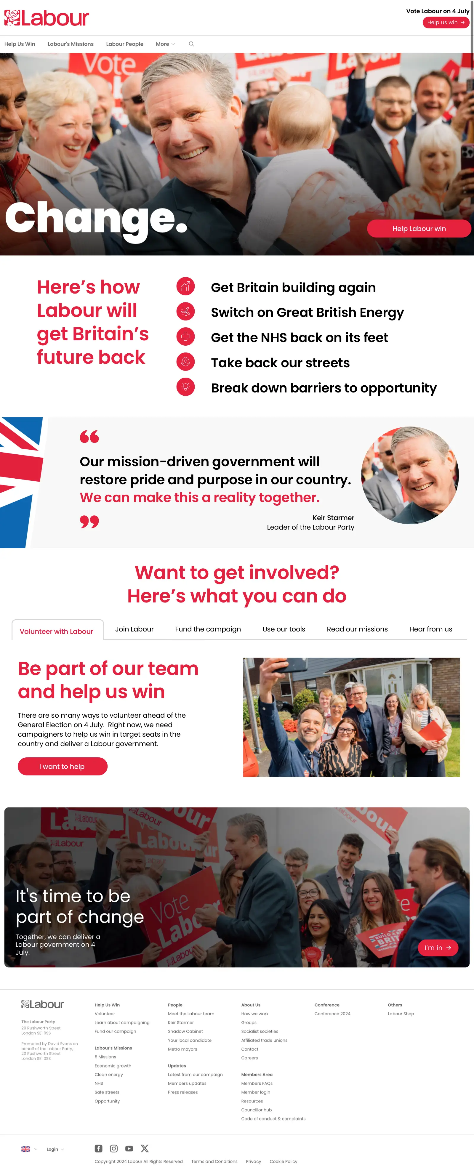
Reducing the width of Labour’s banner image and bringing its five pledges—currently positioned much further down the page—to the top gives them greater emphasis and explains Labour’s tagline, “Change.”
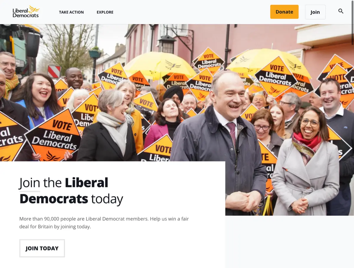
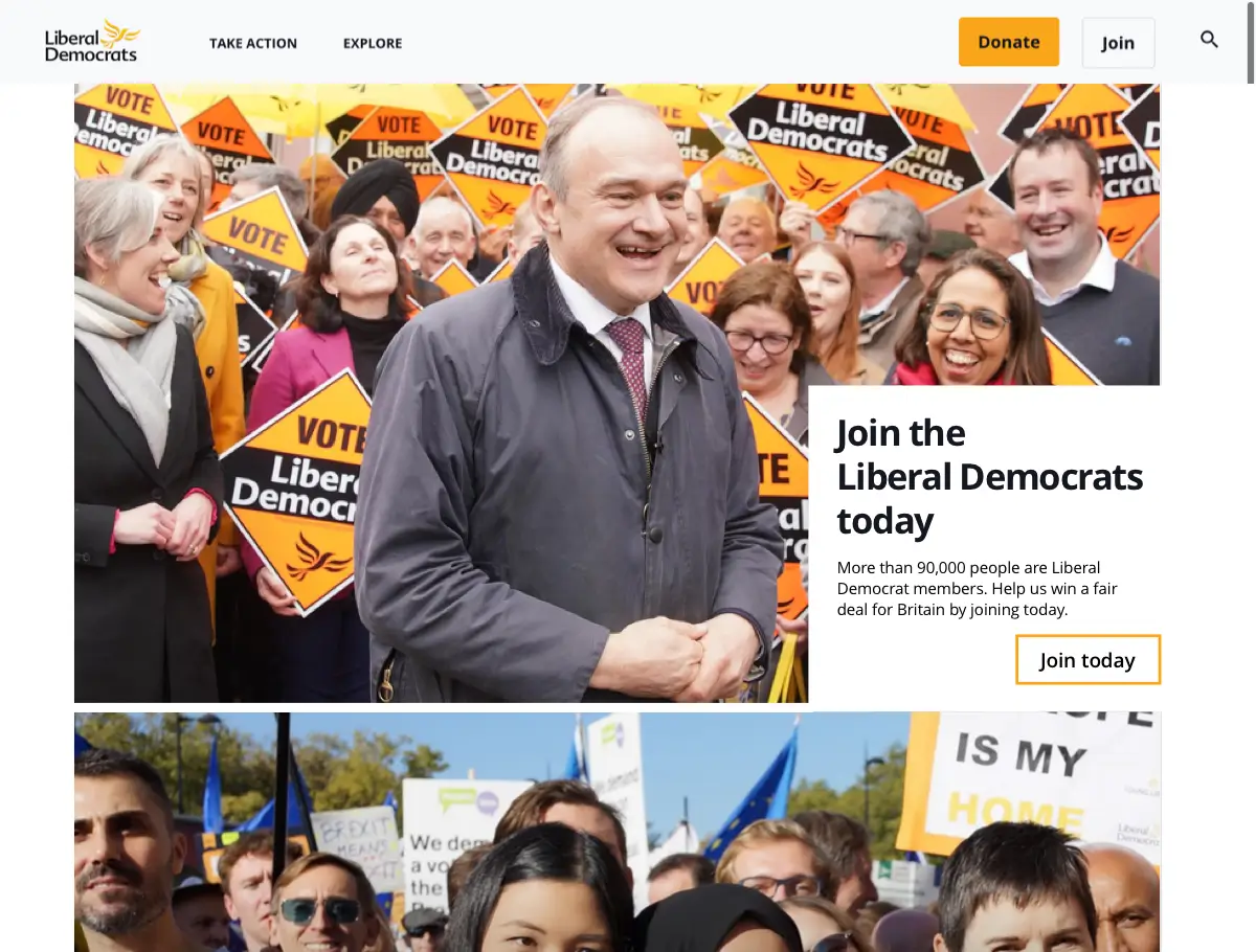
The Liberal Democrats prioritise attracting new members to their party. Their banner needs the least reconfiguring, with only a subtle change in composition and crop needed.
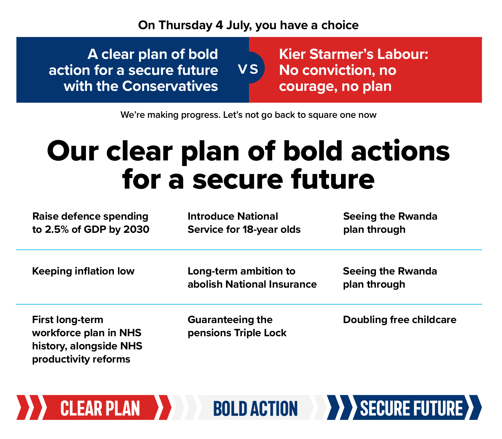
I’m astonished at how poor the Conservative Party website’s typographic design is. This panel containing what they call a “clear plan of bold actions” is frankly anything but. Instead, it’s an incoherent mess of colours, lacking in hierarchy and structure, which fails completely to explain their plan and the differences between themselves and Labour. Using colour meaningfully, adding structure, and a steeper typographic hierarchy immediately transforms potential voters’ impression and understanding of their plan.
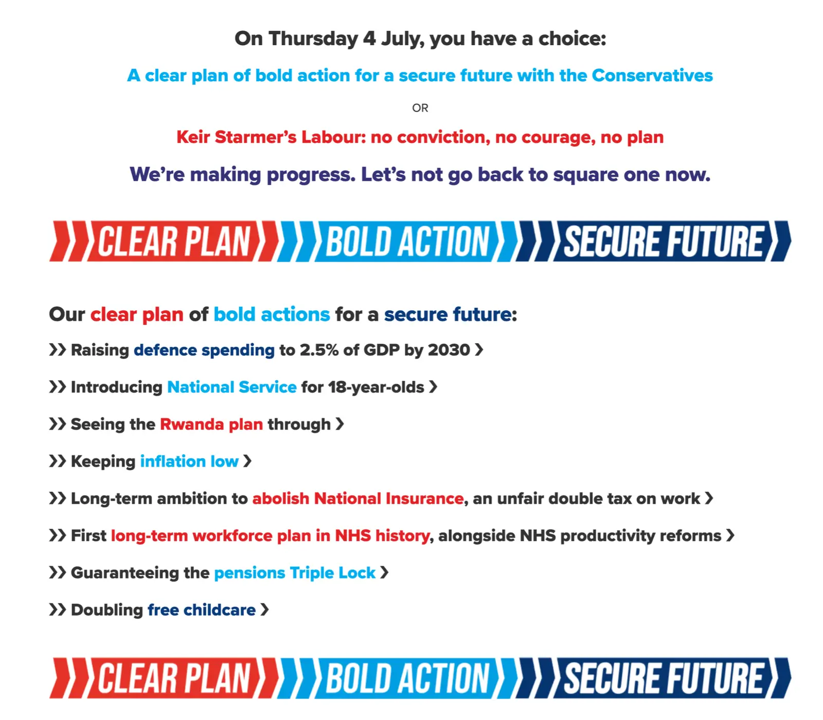
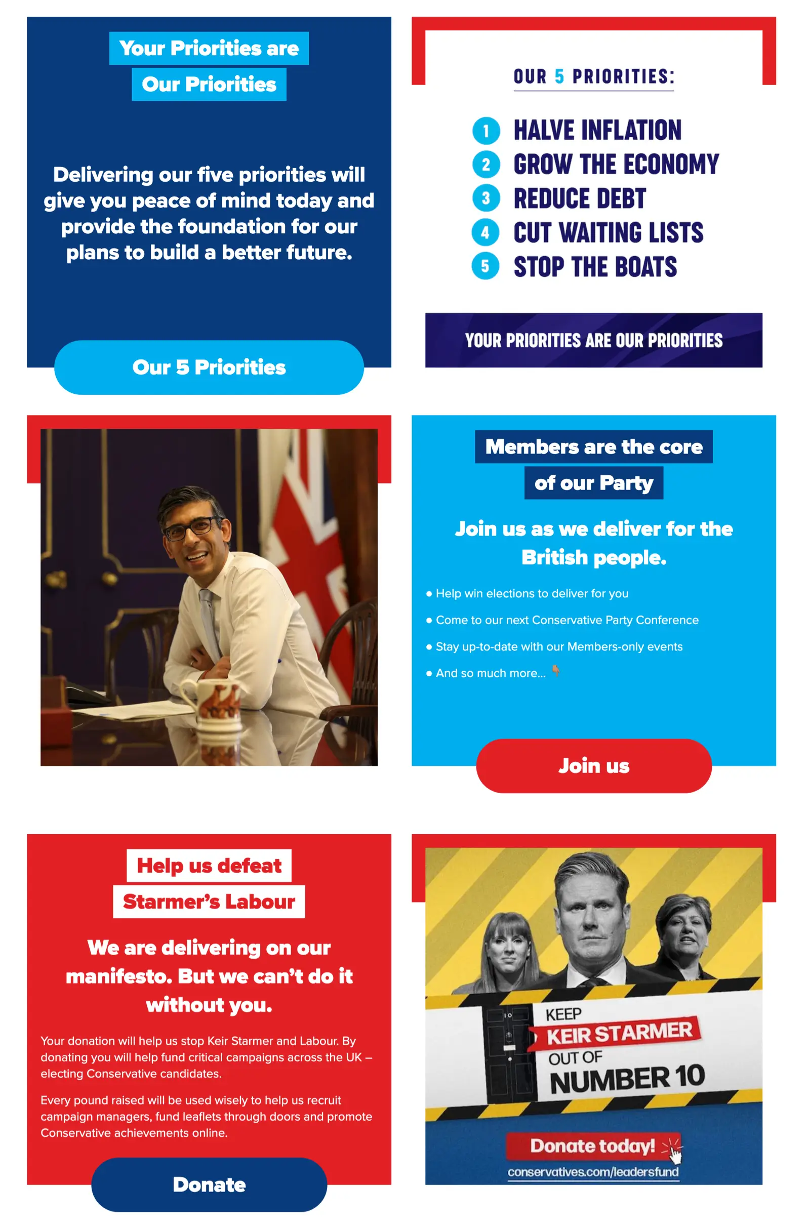
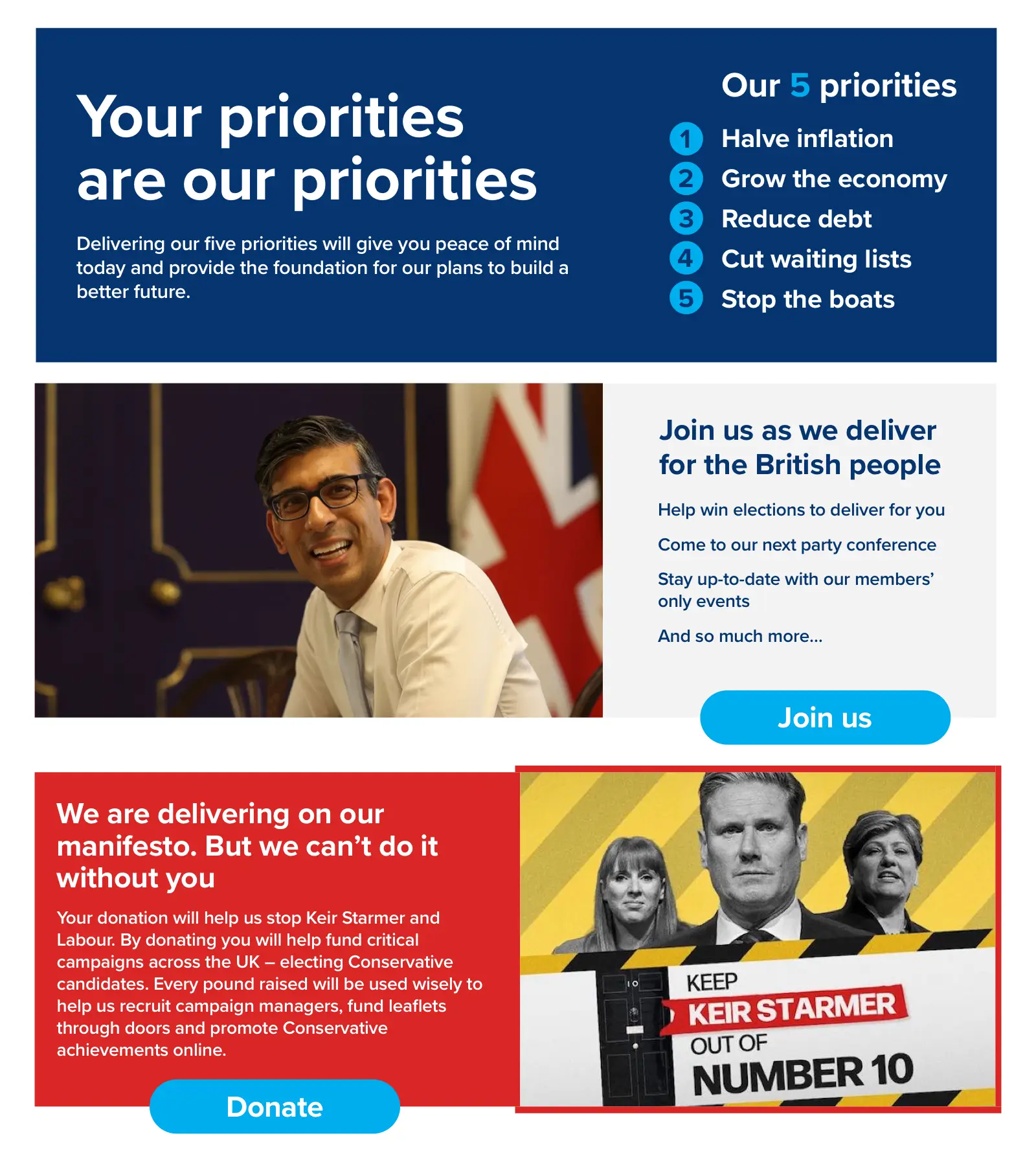
Likewise, the Conservatives’ next content block is equally confused and unnecessarily repetitive. Why are the phrases “Your Priorities are Our Priorities” and “Our 5 Priorities” included twice? Here, the top two blocks, as well as the blocks encouraging people to join or donate, can be combined into a far simpler and more effective design.
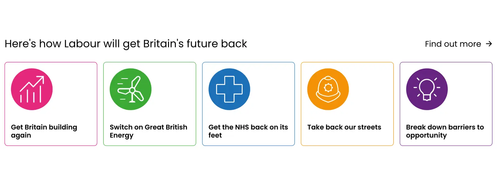
Inscrutably, Labour’s five pledges for “Here’s how Labour will get Britain’s future back” are positioned near the bottom of the page rather than at the top where someone might expect them. Their design, with generic-looking and variously coloured icons, also makes them so utterly innocuous that someone might miss them entirely. Swapping the seemingly randomly chosen colours for Labour’s signature red, adding a confidently large headline, and bolder type gives these pledges the boldness and confidence I suspect Labour wants to present.
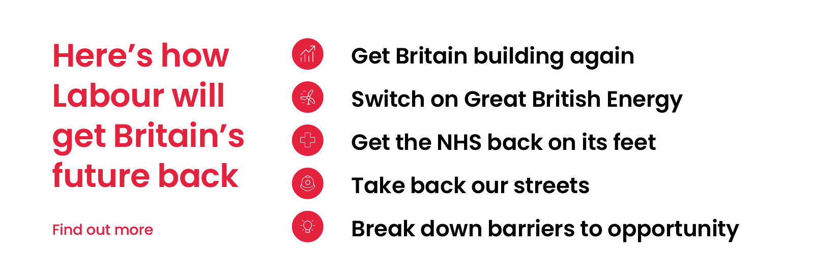
The Conservatives chose Proxima Nova for their type, while Labour selected Poppins, a popular open-source font from Google. I like Poppins and have used it several times recently as it offers a range of weights. Labour could benefit from using those weights and a more confident approach to typography.
Plenty of people are disillusioned with politics, politicians, and political parties. I’m equally disillusioned with the current state of web design, and these political party websites are doing little to give me greater confidence. It wouldn’t take much to improve how they look and, most importantly, how they communicate a party’s message to voters. The Tories might need a miracle on polling day, but an act of God isn’t needed to improve their design.
Likewise, Labour’s design could and should be as ambitious and confident as their campaign suggests. But it isn’t.
Neither Keir Starmer nor (my personal favourite) Angela Raynor have contacted me to ask me to help with their website design, but if they did, I have ideas.
May 31, 2024 • Andy Clarke • design