Labour’s post-manifesto website could have clearer messaging, so I imagined how that could be done
Labour has launched its 2024 General Election manifesto. With a campaign slogan that shouts “Change,” I’d expected they’d replace their lacklustre pre-manifesto website design with something which reflects that message. Today, they released a dramatically different design, which inspires and motivates people to vote for their plans. Just kidding.
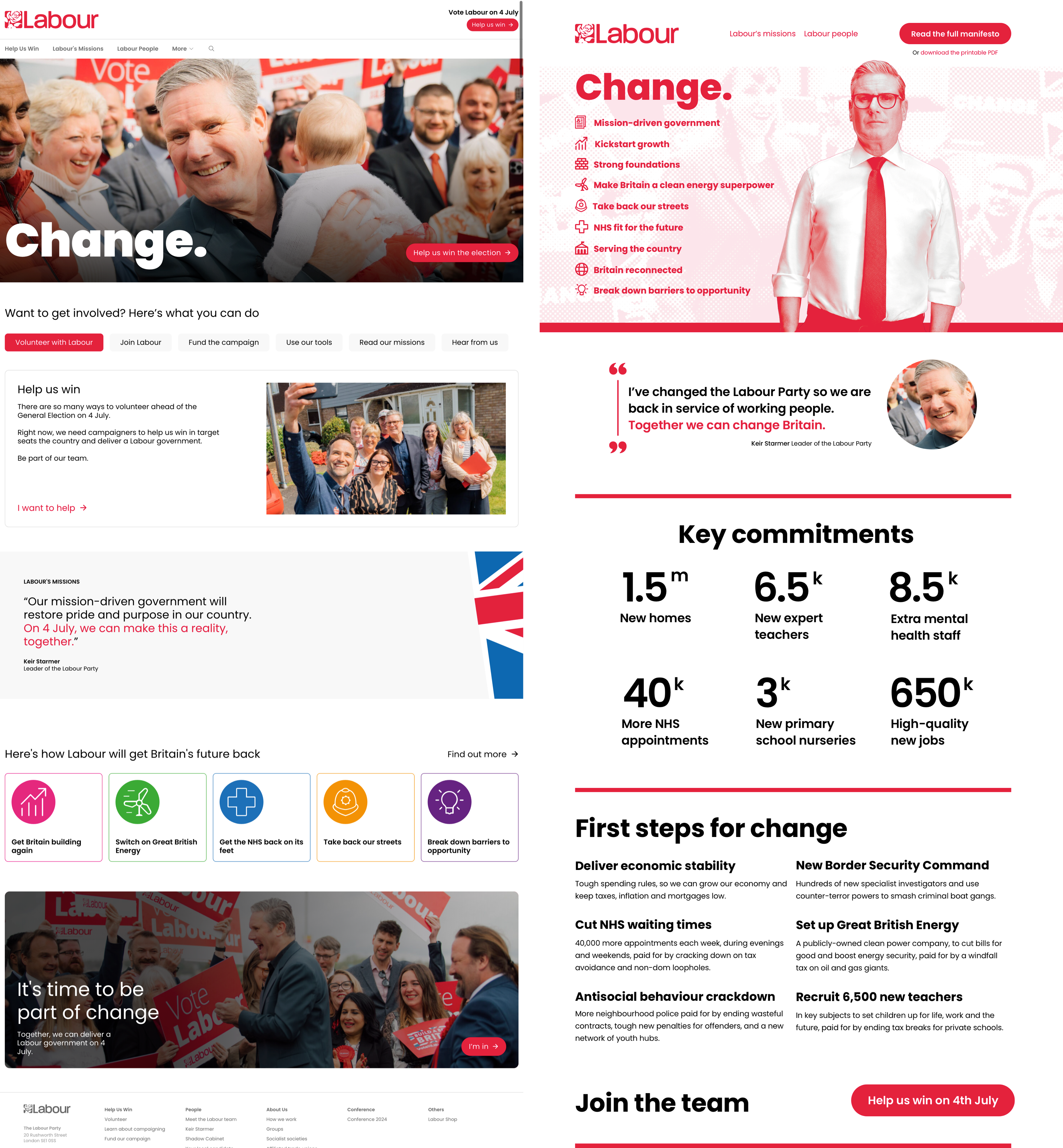
Take a look at Labour’s pre and post-manifesto designs. Can you spot the difference?
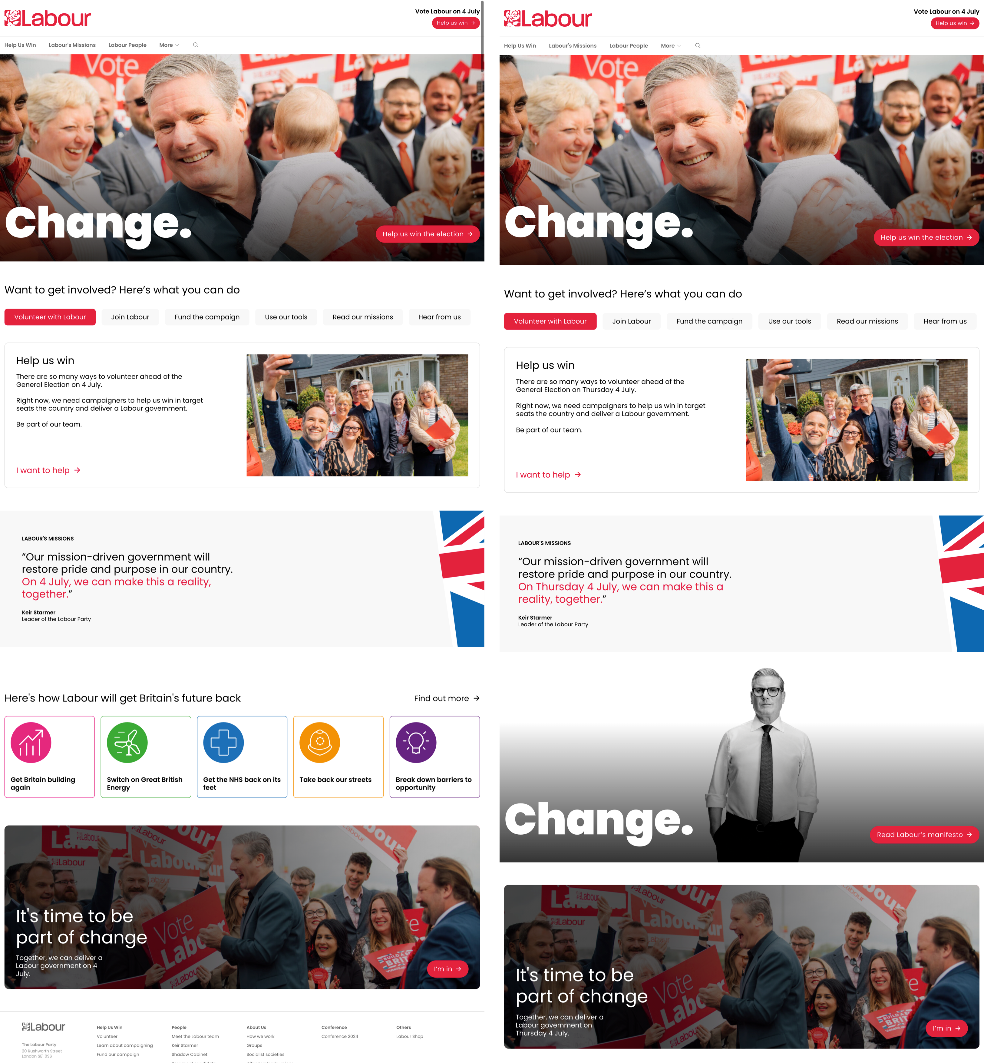
It’s one full-width promotional panel which includes their slogan (again,) a lonely-looking and inexplicably colourless Sir Keir Starmer, plus a blink-or-you’ll miss-it button which whispers “Read Labour’s manifesto.” Worse than the design of this panel is its placement—buried down below the scroll—and that it, and the home page overall, contains not a single hint of what Labour’s policies are.
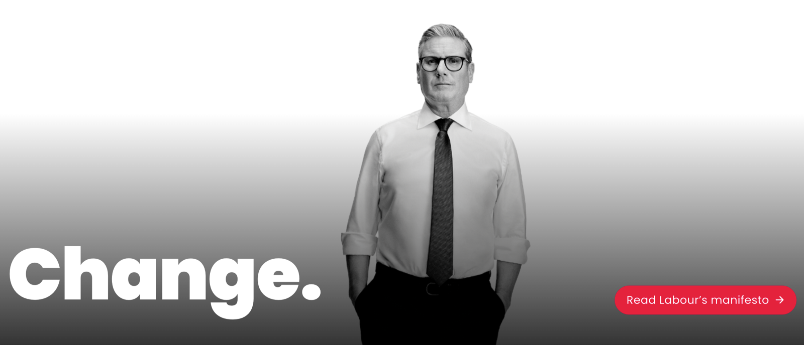
Colour Keir Starmer grey? Colour me unimpressed.
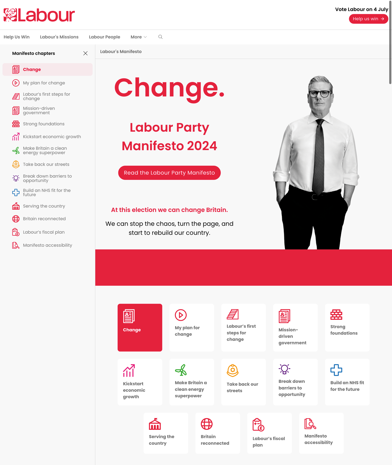
Labour’s team have worked on a web version of their manifesto. However, its landing page also contains no information on Labour’s plans for government. For that, you’ll need to go one page deeper by pressing a link either in the sidebar navigation or duplicated at the bottom of the page underneath a duplicate picture of Keir Starmer.
If Sir Keir or Angela had asked me to design their post-manifesto website, I’d have done things differently, starting by changing the content and purpose of their home page to serve this phase of their election campaign better. On it, I’d de-emphasise their fundraising and recruitment and focus instead on telling voters about the plans in their manifesto. I’d make links to the full manifesto prominent in the page banner and highlight content from deeper-level pages by migrating it to the home page.
Imagining what I might do if Labour came calling, I added the policy titles and summaries, plus their lists of promised actions. This made them visible, but with so much information included, someone could easily become disorientated and lose focus while scrolling down the page.
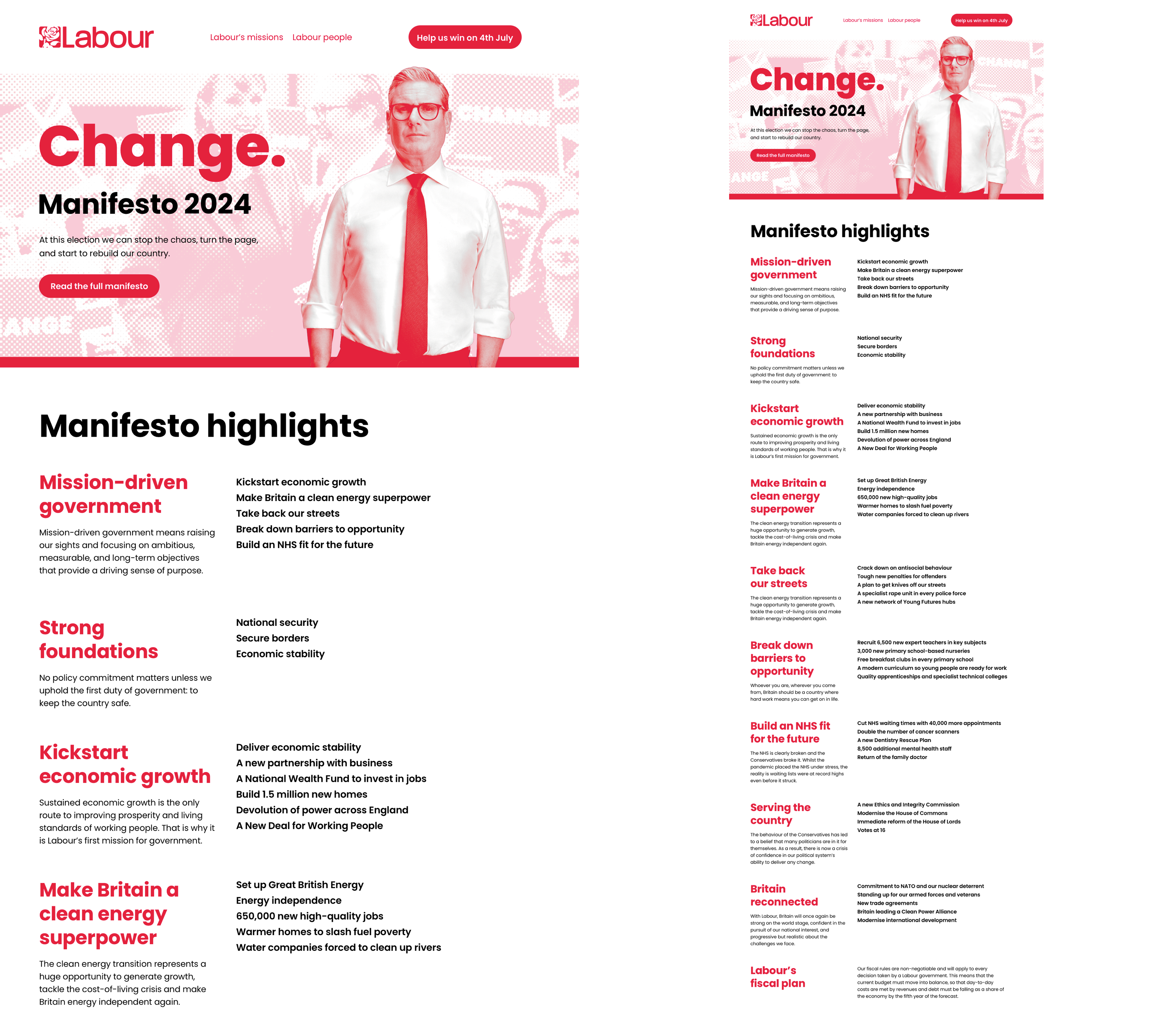
In my next iteration, I removed the actions and arranged the policy titles and summaries in columns. This reduced the height of the panel dramatically. I also reintroduced the decorative icons but coloured them in Labour’s signature red instead of the original multi-colour.
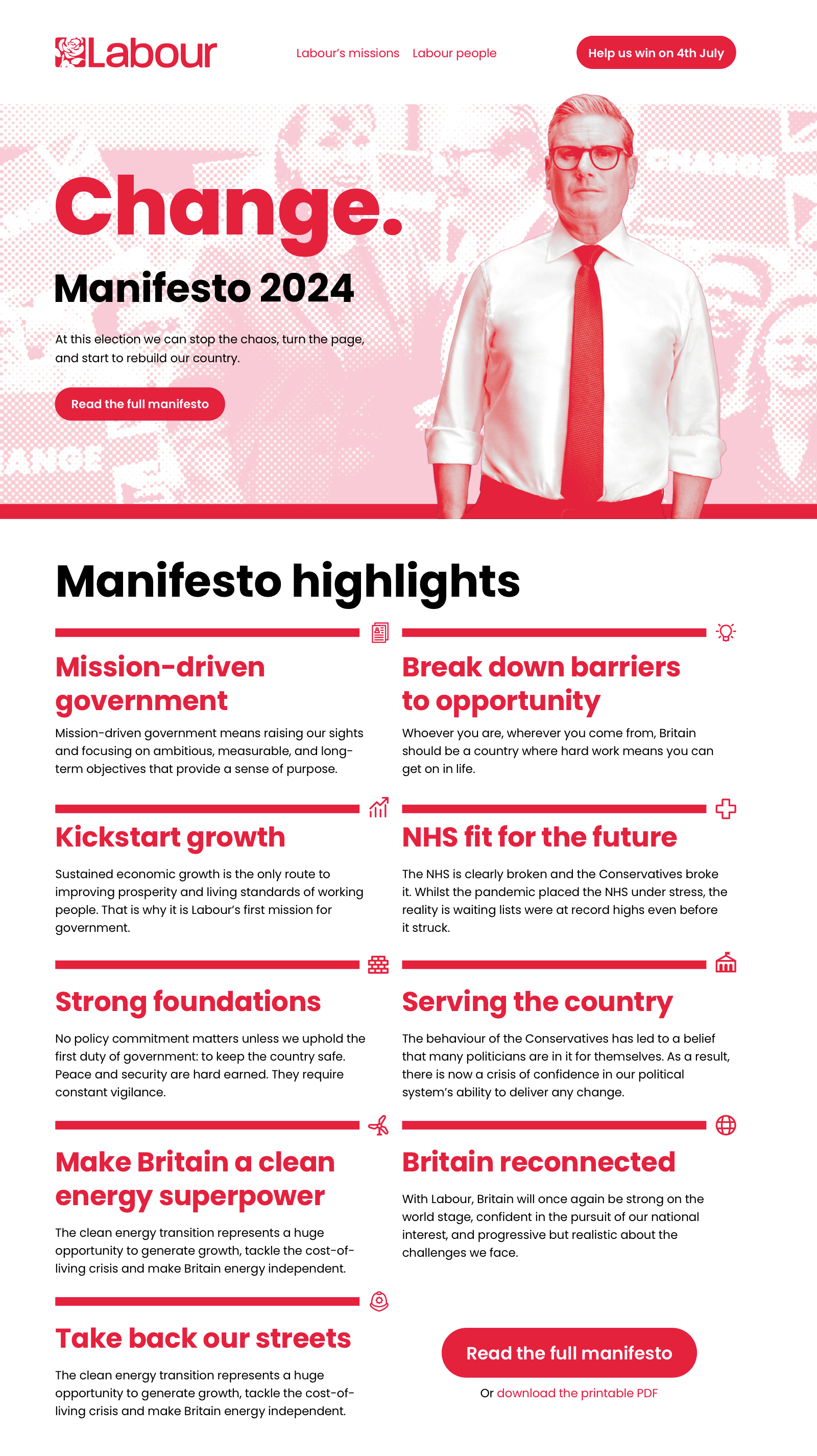
But, even with the actions gone, the number of words and the vertical space they needed still felt excessive. So, I pulled the summaries, again reducing the panel’s height and bringing more content into view.
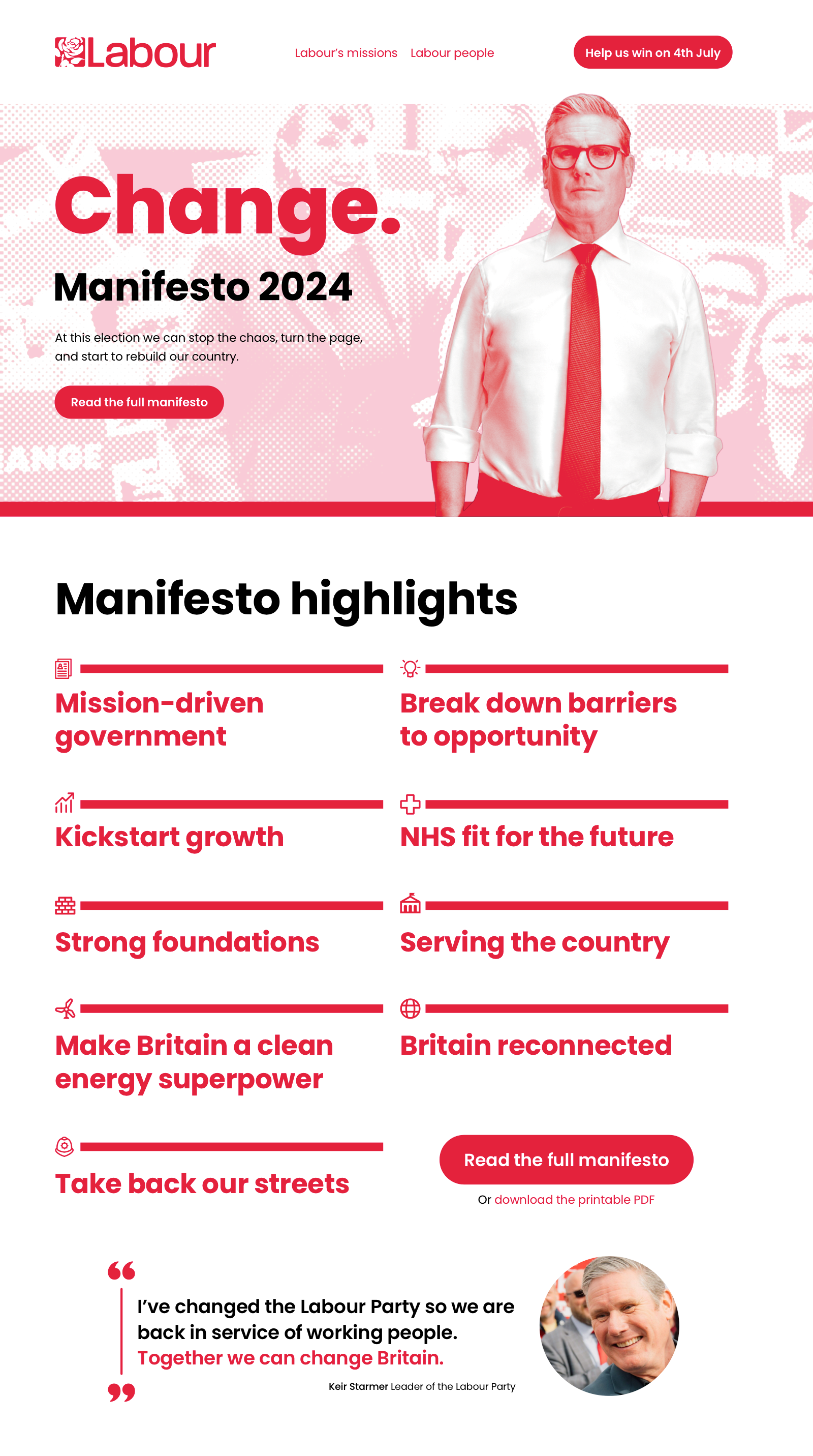
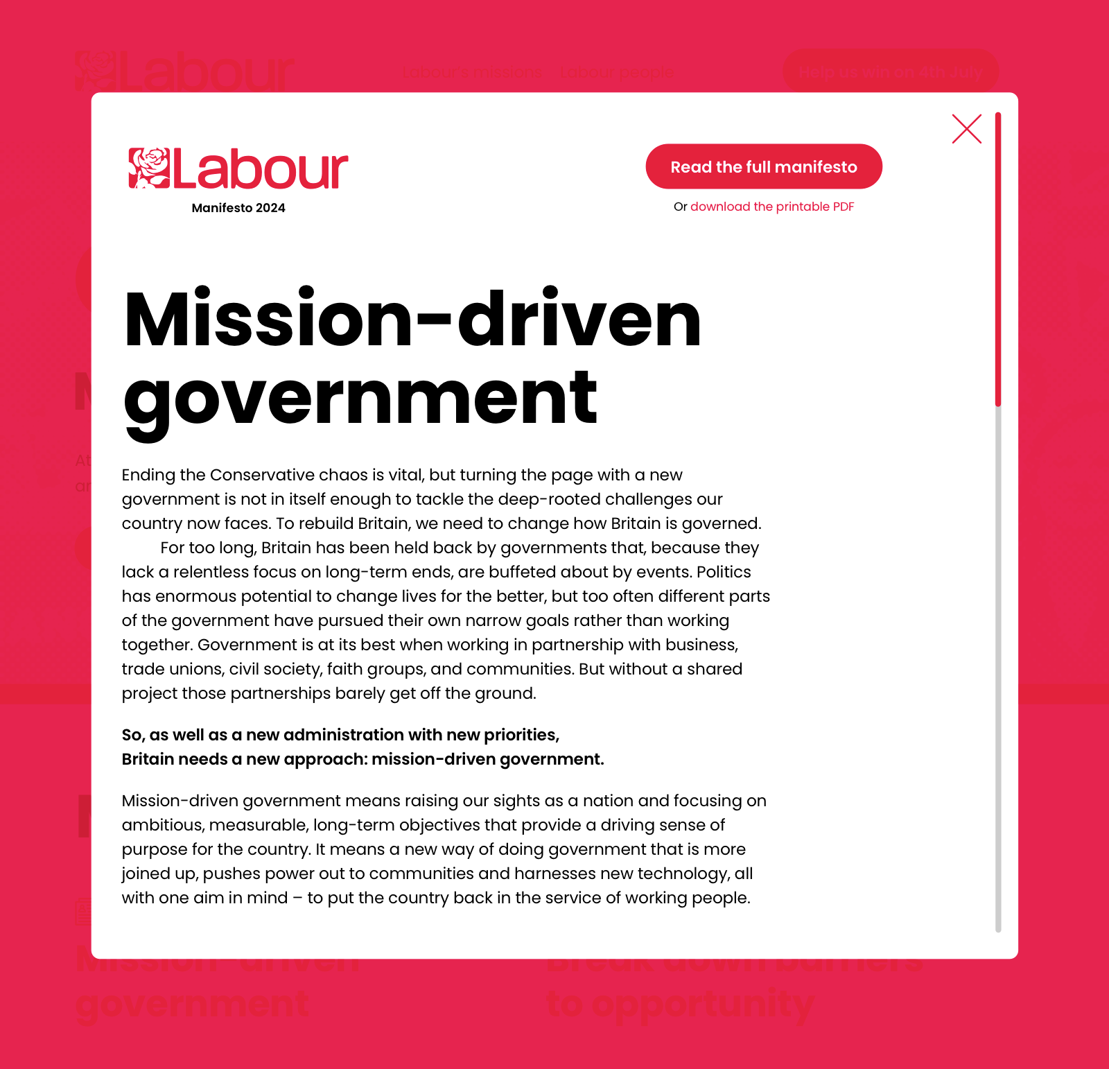
With the actions and summaries removed, I wanted to give someone easy and quick access to information about each policy. It made sense to include some or all of it in a modal to prevent someone from leaving the main page to read about a policy.
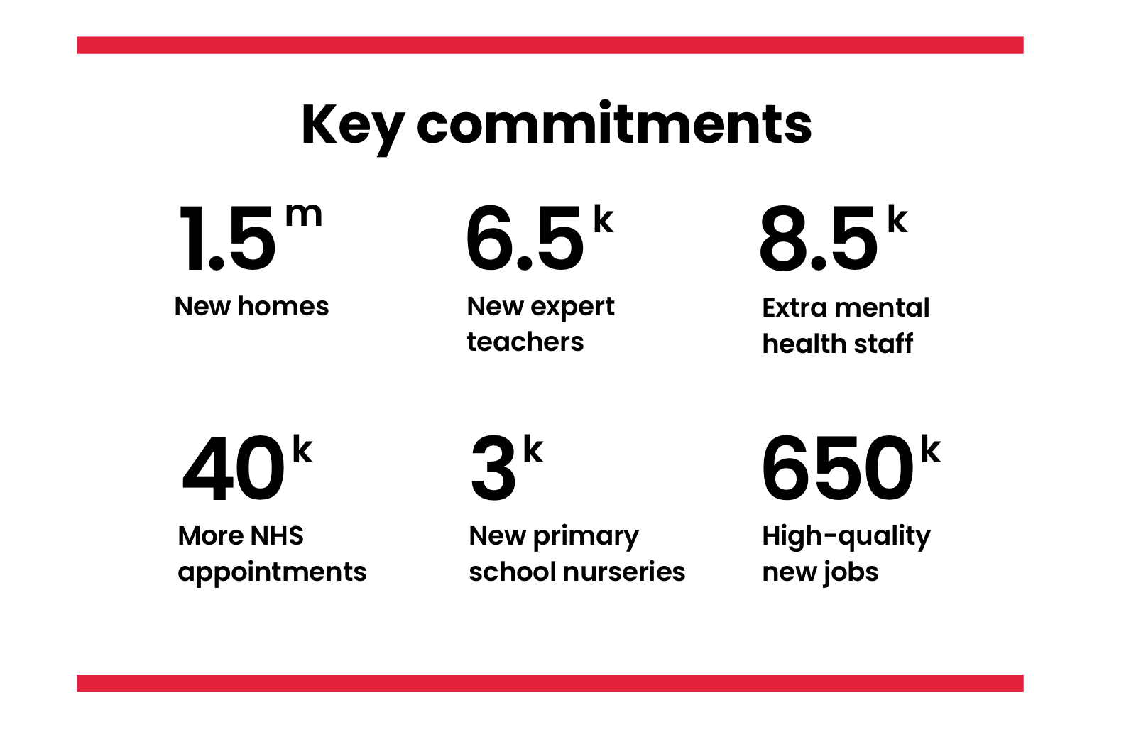
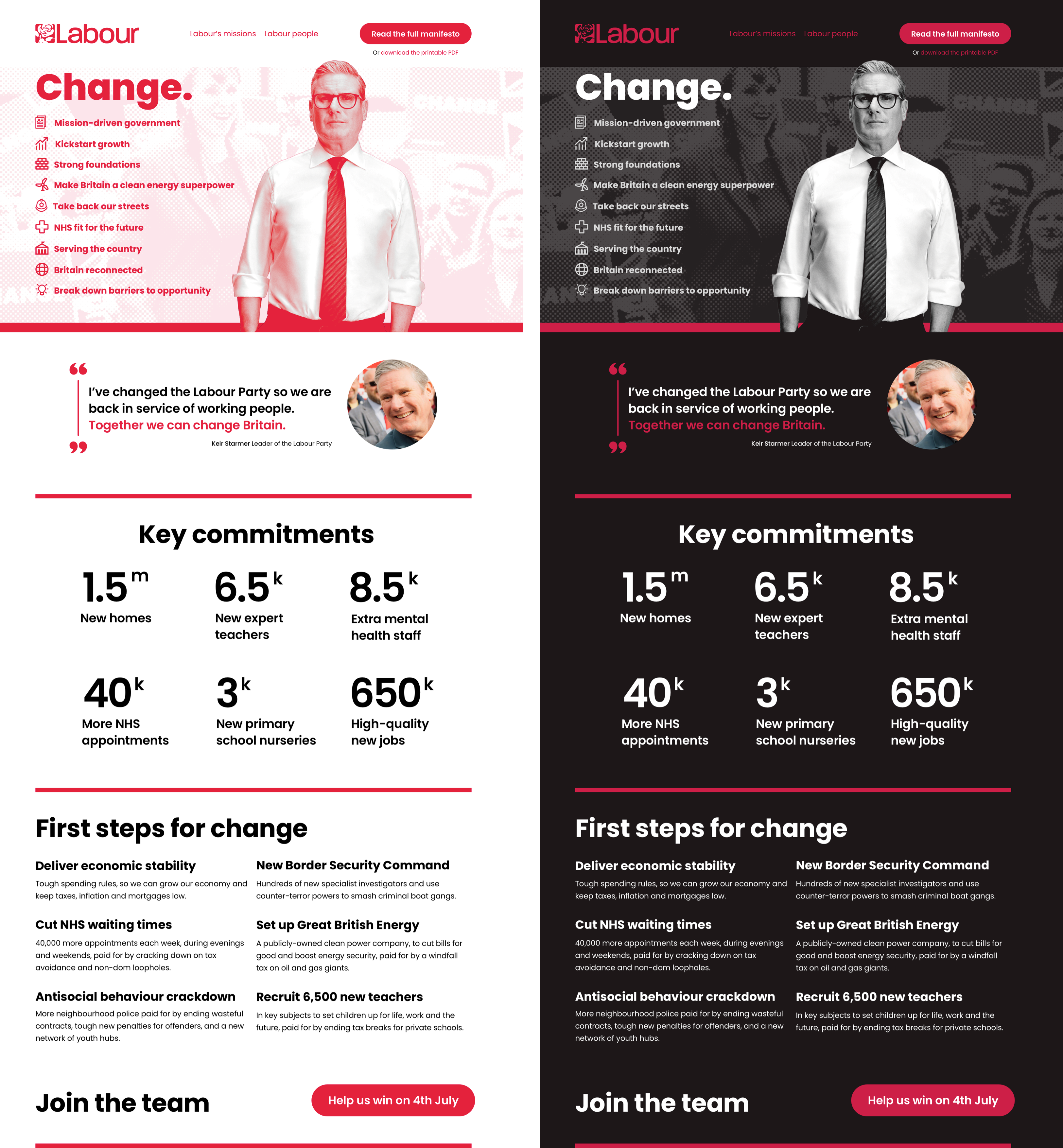
Simplifying the policies panel created space for a new block containing Labour’s key commitments. I extracted the information from the actions I’d removed previously and styled them with bold type and large numerals.
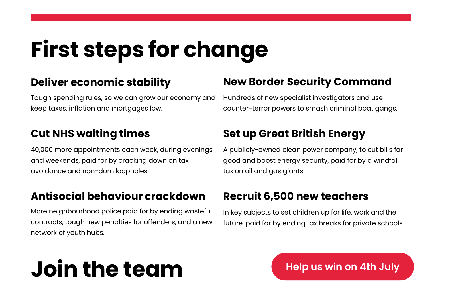
I also brought content from the manifesto’s First Steps for Change page and created a new panel which explains Labour’s priorities once in government.
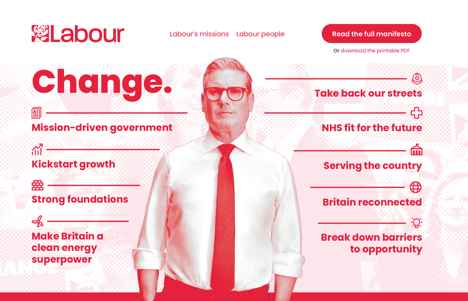
Even though I felt my redesigned banner improved Labour’s original design, I wondered if I could improve it and the page by including more of their content. I also wondered if I could add context to Labour’s slogan by explaining what will change if they’re elected. So, I included my simplified policies design and placed them on either side of the portrait of Keir Starmer. I also flipped the icon orientation for policies on the right so that the adjacent leading lines all point towards Sir Keir.
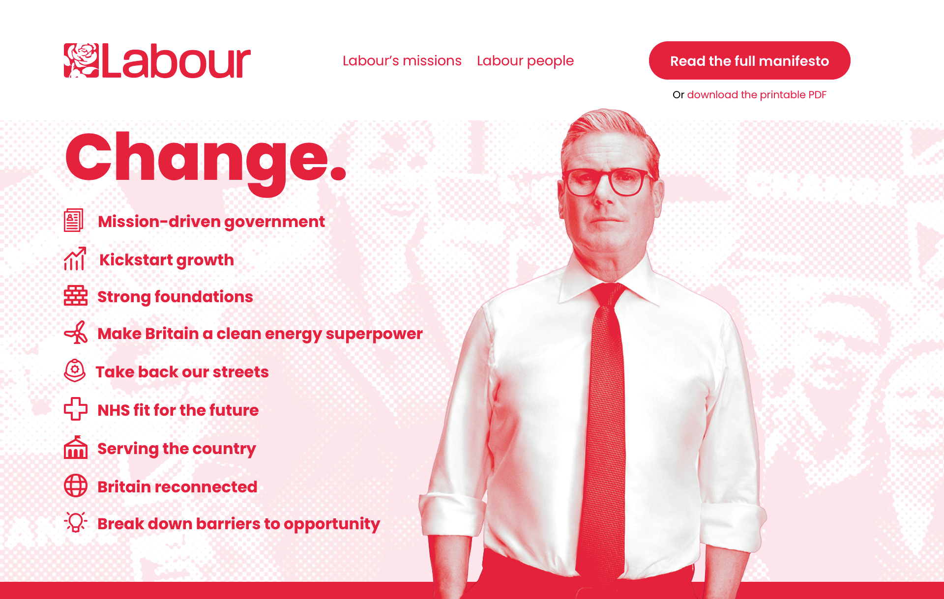
For narrower-width screens, I placed all policies on the left and removed the leading lines to simplify the design.
As I’ve said before, this redesign imagines what I’d make if Labour came calling. I have no insight into Labour’s messaging or strategy. I haven’t had to consider what may or may not be possible with their CMS, and I don’t have to answer to anyone if my assumptions are wrong. Still, I enjoyed spending some time imagining, and I do believe my design is better structured, more comprehensible, and more persuasive than Labour’s original.
And, of course, I made a dark-themed version.
Despite what the polls tell us, this election is far from over, and no votes have been cast. Labour can’t afford to be complacent, and—as an important communication channel for their message—their website design needs to be the best it can be. Sir Keir, Angela, I have the time if you ever need help on your design team.