Go, go, go, rillas! The all new Stuff and Nonsense
If you’re reading this in RSS, switch over to a browser, as we just launched ‘Go, go, go, rillas!’ It’s our late 2013 version of Stuff and Nonsense.
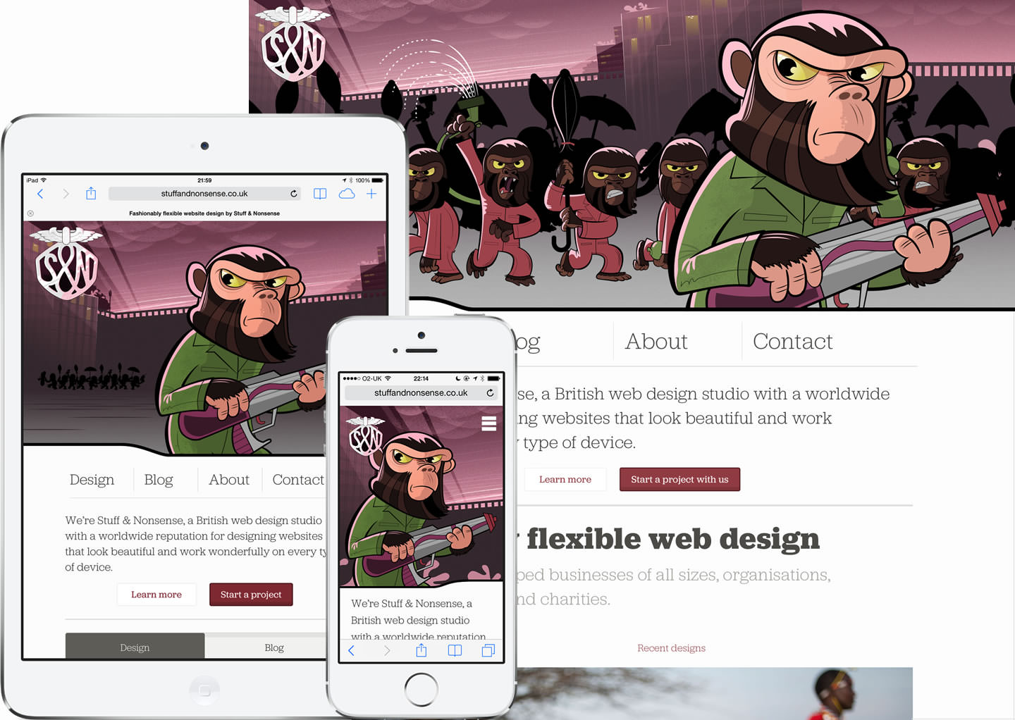
This time we’ve done more than just add a new, responsive, header illustration. We’ve rebuilt our site from the CMS up, with new typography, page layouts and most importantly new content. We’ve added a portfolio section that not only shows off the work we do but explains a little about how we do it.
We’ll add more to our portfolio as the weeks go on. We’ve also made our blog more user friendly with tags, better category navigation, popular post pages and finally a search.
We love our new header but long before we’d thought of it, I’d fallen in love with the Jubilat typeface from Darden Studio. It’s incredibly versatile and has its own strong personality. We’ve used Jubilat in four weights, extra light, light, regular and bold, all served through Typekit who have made Jubilat look especially fabulous on screen. We now also use Jubilat for all our other materials too.
I designed our new layouts this time not by working ‘mobile first’ but ‘tablet first’ and my iPad mini, now retina, became my ‘control’ device. Everything about the new design has been made to look its best on a retina iPad.
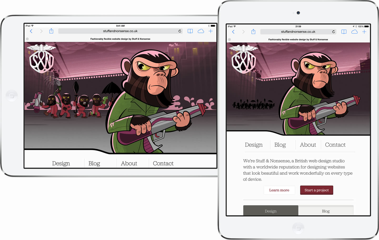
Of course it’s a bonus if it look greats on phones and desktops too.
Speaking of desktop, we’ve made a special effort this time for users with very large screens, with an extra wide breakpoint. Maximise our home page on your 27" iMac and, oh, those apes!
It would be impossible not to mention them, but before I do I think it’s worth explaining why we like to change our header twice a year. It’s because our site has two audiences and two purposes. We want our site to make potential customers smile and remember us when they’d like some work made, but we also like to play responsive gags on our designer and developer friends.
Many web sites play responsive jokes by making things wider as the viewport widens. We did this ourselves with our ‘ageing mods on scooters’ and ‘nutty boys.’ This time I wanted to make changes in the Z axis, so that as your viewport gets wider, our gang of rampaging go, go, gorillas get ‘closer’ to you. The wider the screen, the closer they get. At the 1440 wide breakpoint and above, there are several CSS easter eggs for you to find too.
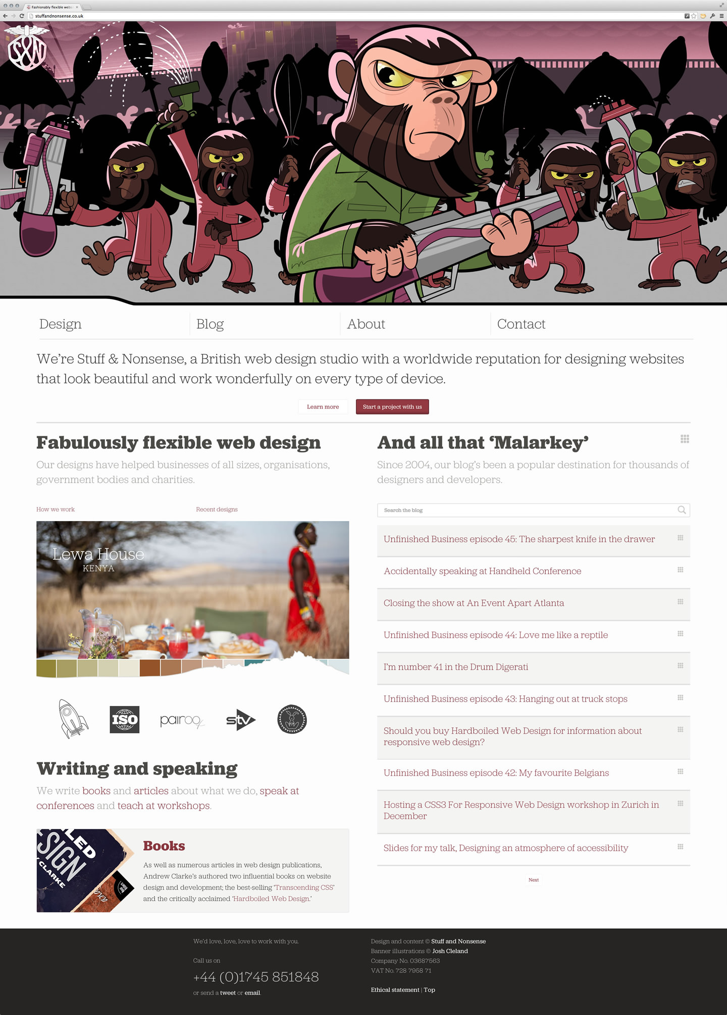
Illustrator Josh Cleland has excelled himself this time. I think that these apes — that are no way at all related to those in Conquest Of The Planet Of The Apes — are his best work for us yet. He nailed the personality of our apes from the very first sketches.
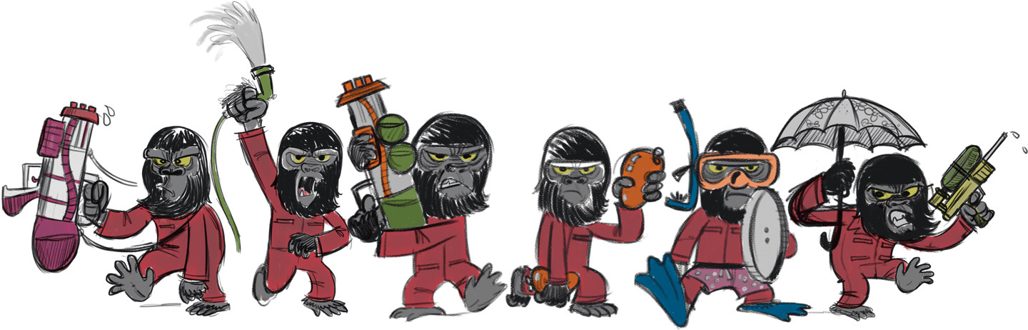
In fact, Josh’s sketches played a vital part in our design process as we used them from the beginning to work out how the rampage of gorillas would go, go, go.
Optimising the apes and other assets was important, starting with Josh using a limited colour palette and minimal shading to make optimising the PNG images easier. (We also tried SVG versions of all the artwork, but the complex vectors meant that SVG images were larger in file size than their PNG equivalents.) We did however use SVG sprite for all the icons instead of the web font icons on the previous version.
Our previous home page weighed 1.3Mb. This one is smaller at 1Mb. We reduced HTTP requests from 54 to 32 and the overall load time has gone down from 3.76 seconds to 1.53 seconds. I’m very pleased with the improved performance although I know we can still do better.
Technically, our site’s still built on ExpressionEngine. There will be a CMS move to Perch, but that’s a job for another day. Steven Grant was responsible for the new ExpressionEngine parts of the site and for moving the site between dev and live servers. I’m hopeless at that stuff. I’m also hopeless with Javascript, but that’s why I love Trevor Morris. He’s the best we know. Both of these fellas are a joy to work with.
We decided to dedicate two weeks away from client work to focus on our redesign, but that didn’t work out exactly as planned. In reality we had just eight days to design, develop and launch, but I think they were days well spent. We now have a better, more responsive and usable site and I like what we made. I hope our customers will like it too.