Layout Love: How a 3+4 compound grid can improve on 12-columns
Compound grids offer exciting and often unconventional layout possibilities. Most importantly, they also encourage us to think differently about the choices we make when we’re designing layouts. If you’re familiar with the grid made ubiquitous by Bootstrap, a 3+4 compound grid is a great place to start learning about compound grids.
First, a quick recap. A compound grid is two or more overlapping or stacked grids of any type—column, modular, symmetrical, and asymmetrical—on one page. They can occupy separate areas or overlap.
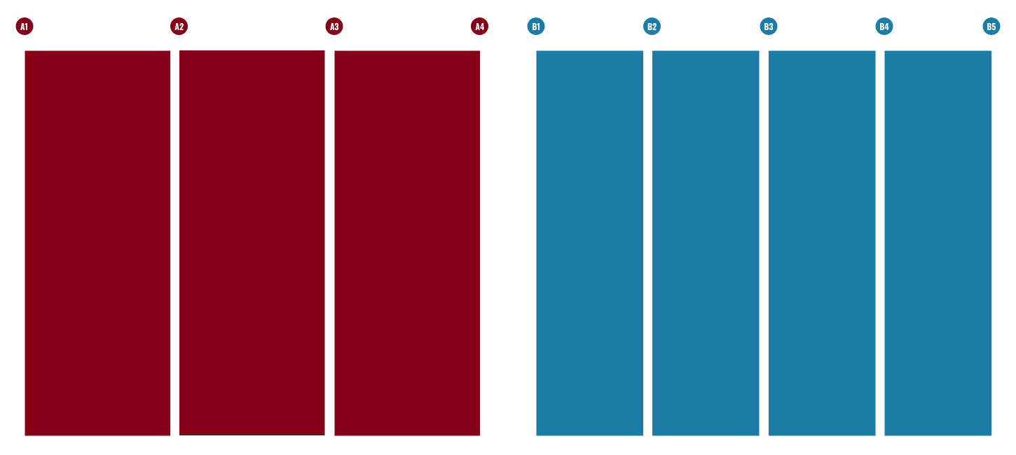
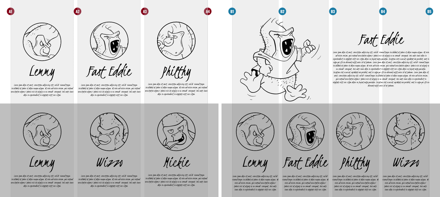
A 3+4 compound is made from overlapping one 3-column and one 4-column grid. Both grids should be the same width and the gutters between their columns identical. It’s the interplay of multiple grids which makes a compound layout more interesting than one grid used in isolation.
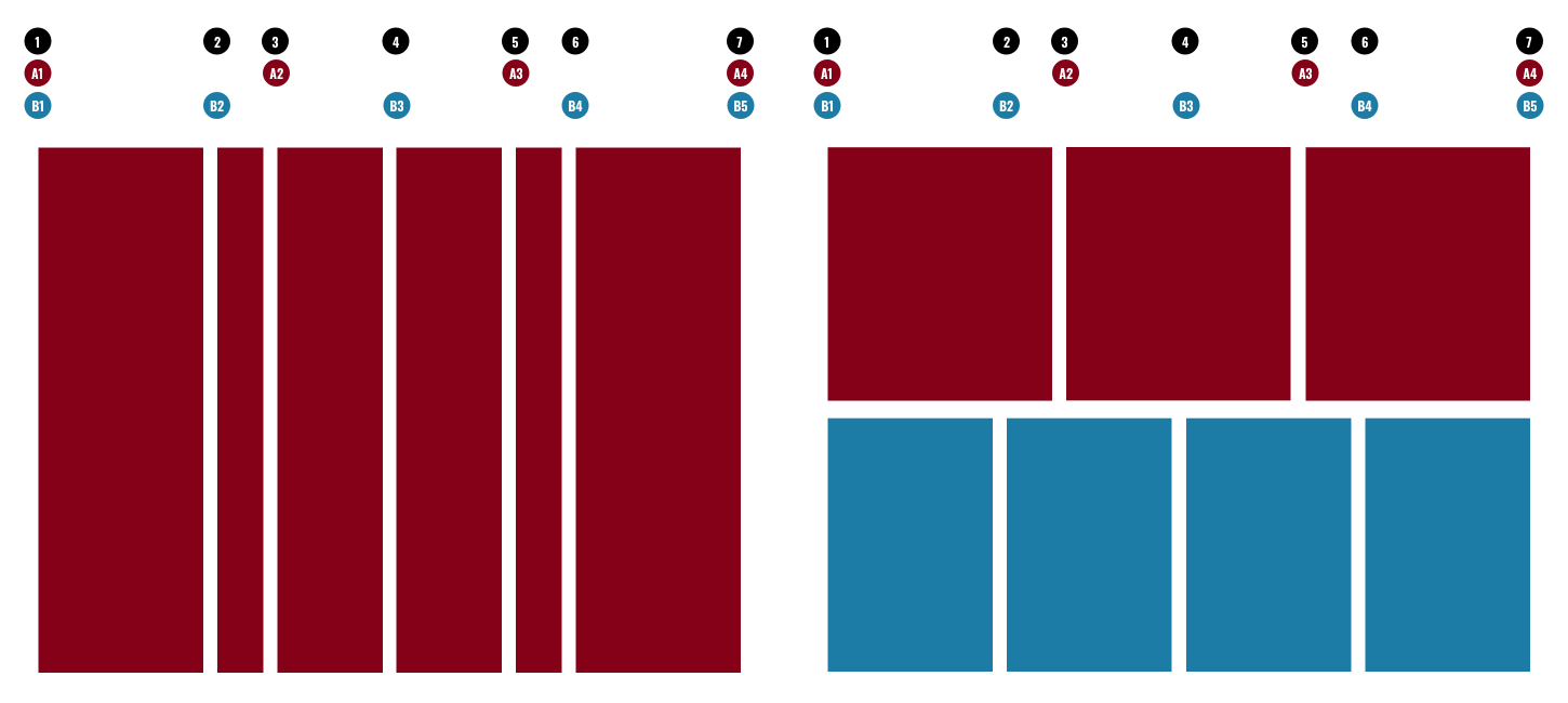
With two grids in this compound, I might choose to use columns from either one to give a design a different personality. A symmetrical 3-column grid has an editorial feel but retains a certain informality. A symmetrical 4-column grid packs running text into tighter blocks. This gives a design a more serious tone.
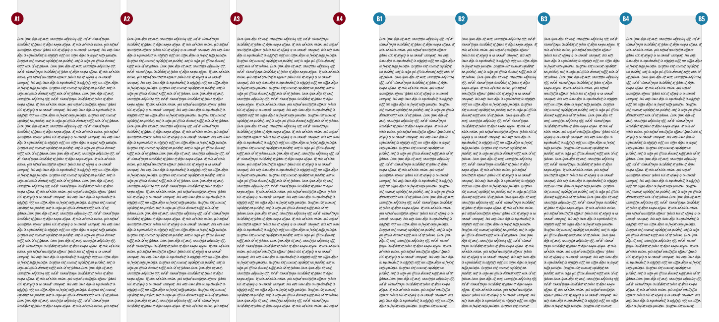
Carefully choosing columns from either of these grids can create interesting layouts. In a 3-column designs, I might devote two columns to my main content and one to supplementary content or an associated article. This hierarchy can be emphasised further by adding a large headline and a standfirst paragraph which span both columns.
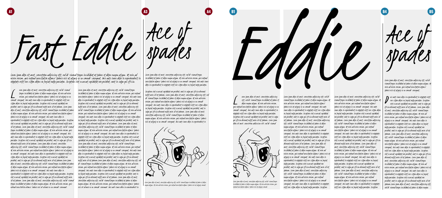
The formality of a 4-column design can be softened by an oversized headline which again spans the width of my main content. Images placed in the running text also make this design’s column structure more obvious.
But—with so many interesting layout options possible—why are the designs we see based on them so often uninspiring? I think the fault lies not with the grids themselves, but in the unimaginative ways they’re used.
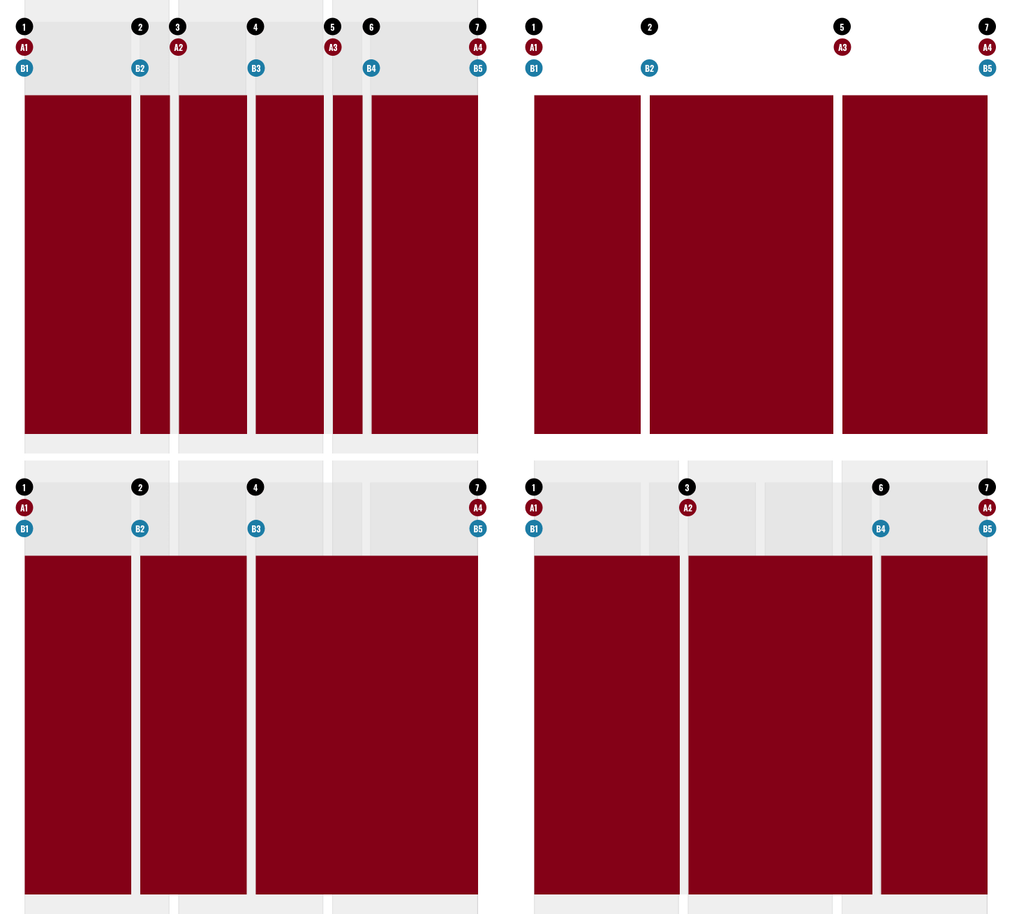
Overlapping 3-column and 4-column grids to create a compound is one way to start creating interesting layouts. This overlap creates six columns with three different widths and has a rhythmic pattern of 3|1|2|2|1|3. It’s this type of rhythmic pattern which helps shift our thinking away from over-used layout patterns influenced by an even twelve columns.
I might combine column widths together to form a layout structure which has three wider columns of different widths. I can reorder and split them to add variety to my layouts while maintaining connectedness across all the pages in my design.
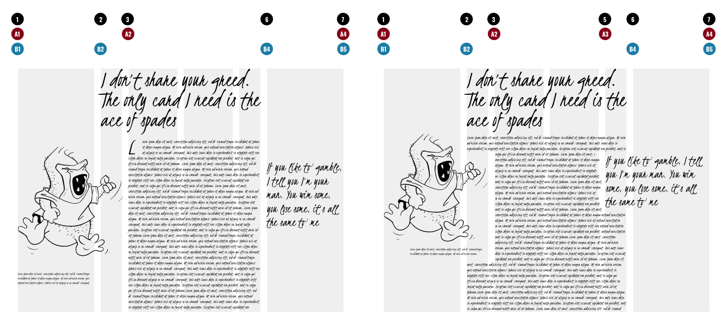
I can utilise those very narrow columns in several ways, perhaps by offsetting a headline to draw a reader into the page. I might also add a skinny column’s width to that of another column and use it to increase the size of an image. This helps form a tighter connection between my content and the image associated with it.
By widening the measure of my running text to include both the narrow columns in this grid, I can use their widths to inform by how much I should indent this this image and pull quote. This placement connects these elements to my running text without interrupting a reader’s flow.
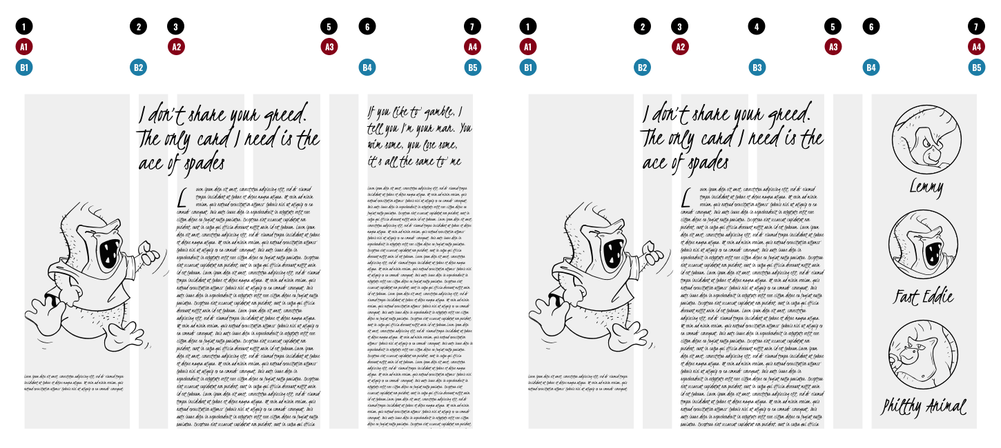
I can also use narrow columns to add precise amounts of whitespace. This unused space can visually separate either two topics or my main content from supplementary information. This can be especially effective when that supplementary information includes a very different set of elements.
Techniques like this are just as applicable to a transactional website as they are for editorial. In this e-commerce page, I placed the main content and image into wider columns. The narrower supplementary content is separated by one column of whitespace to emphasise the hierarchy of content on the page. A large image connects the two content areas. This technique can also add energy to a product’s promotional pages. The main content and can lead to any number of potential creative layouts.
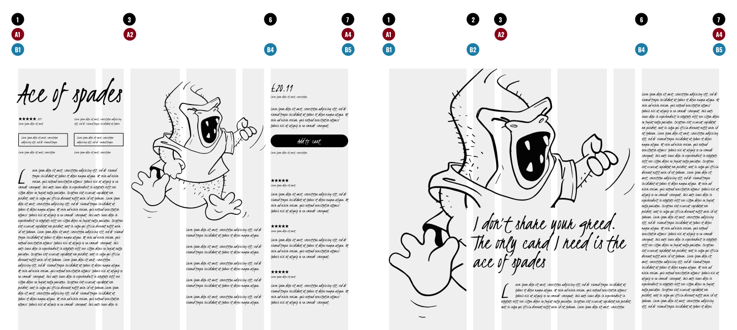
To break the rigid structure often associated with grid-based designs, I might use CSS Shapes to add a more organic feel by flowing my headline text around parts of a large image.
Can the layouts I’ve demonstrated be accomplished using a Bootstrap-style 12-column grid? Yes, they can, because twelve columns are divisible by both three and four.
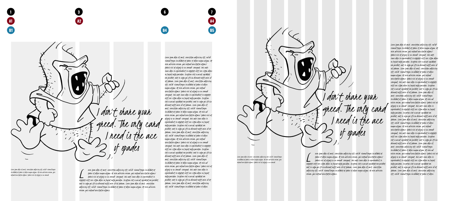
But, would starting with twelve columns have forced the break from conventional thinking? Would a 12-column grid have helped me to avoid those all too common layout patterns? No, I don’t think it would. And that’s one reason why a 3+4 compound grid can improve on 12-columns.
Layout Love
Using modern CSS Grid, I developed five sets of reusable layout components to make prototyping and site development work simpler. I call these Layout Love and rather than keeping them to myself, I’m offering them for everyone to use. You can use Layout Love’s HTML and CSS for any personal or commercial design project. Each set is just £2.99 and all five together are £9.99 which could save you many hours or work.