How I designed an information-rich website for The Shared Homeland Paradigm
I designed an information-rich website for The Shared Homeland Paradigm, using typography and graphics to clearly and visually explain complex political ideas. Here’s how I approached it.
The Shared Homeland Paradigm is a collaboration between A Land for All, University College London (UCL,) and the University of the Pacific. The project aims to develop a new conceptual basis for configuring space and rights in Palestine-Israel. The project came via a recommendation from ClearLeft.
Typography design
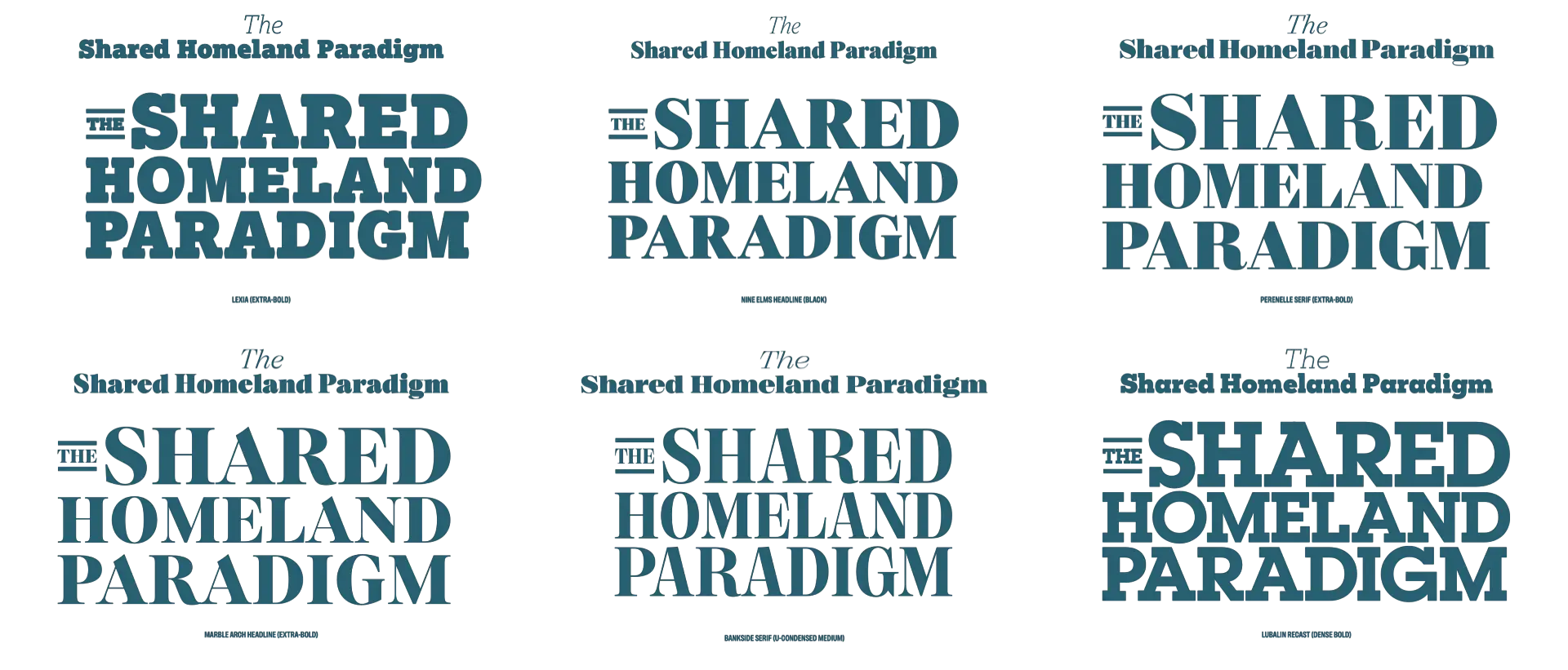
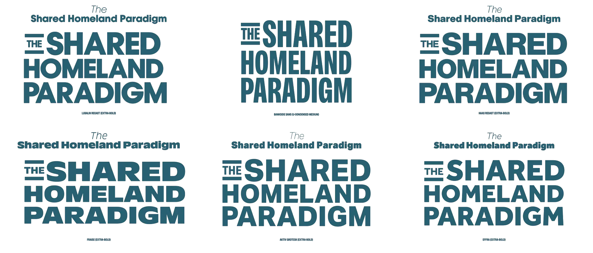
I always start with type, because it sets the tone for everything else, and I’ve developed a process for selecting type that balances personality with readability. For this project, I needed a readable typeface which isn’t overly academic-looking.
That process lets me shortlist a handful of typeface options to present to a client. I don’t ask clients to make the decision, as that’s my job. Instead, I help them respond to how type feels. I asked the team about which typefaces “felt right” to them.
Understanding the voice
Typography isn’t just about readability—it’s about a typeface’s tone of voice. I always demonstrate the characteristics of several typefaces to find out what they say. Are they neutral or opinionated? Approachable but still serious?
I explore how they look in branding, especially an organisation’s name, as that provides the first impression and can set the tone for the rest of a design.
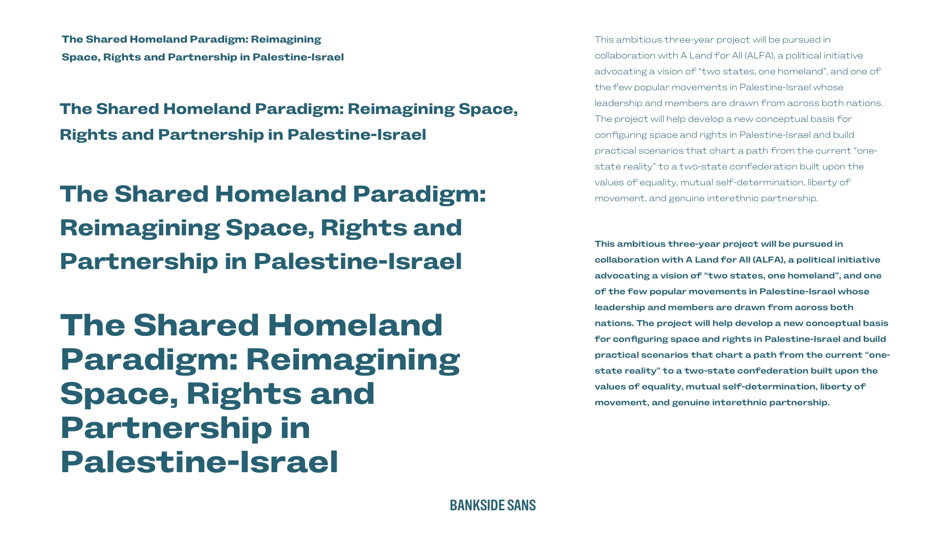
Then, I test typefaces in real contexts—headlines, lists, and paragraphs—so I can see how they behave in the design, not just in isolation. I create what I call type sheets and always use copy as close as possible to what I’ll be setting in the design. If copy’s not available—which it often isn’t at the start of a project—I write my own, rather than use dummy lorem ipsum.
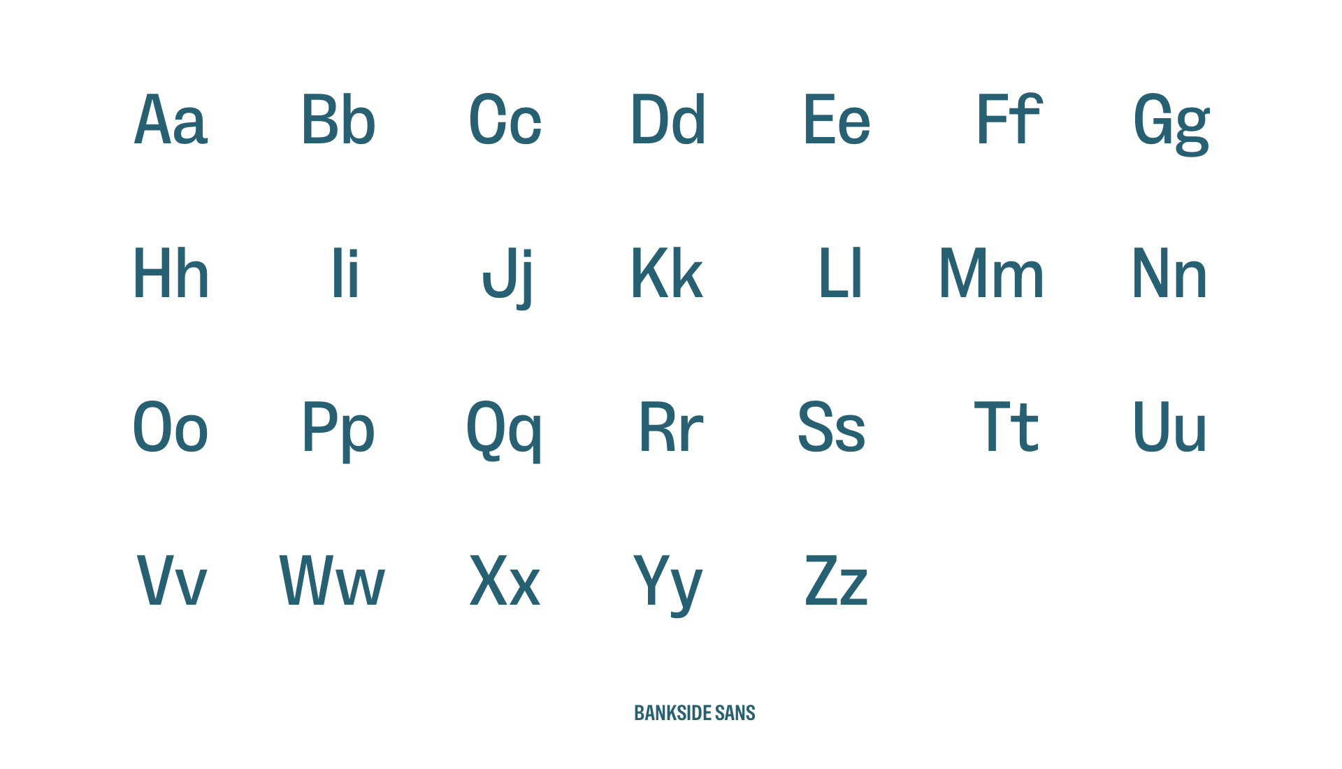
I study individual letterforms, looking for specific characters that can either add personality through a distinctive design or could be dealbreakers if they don’t look or feel right.
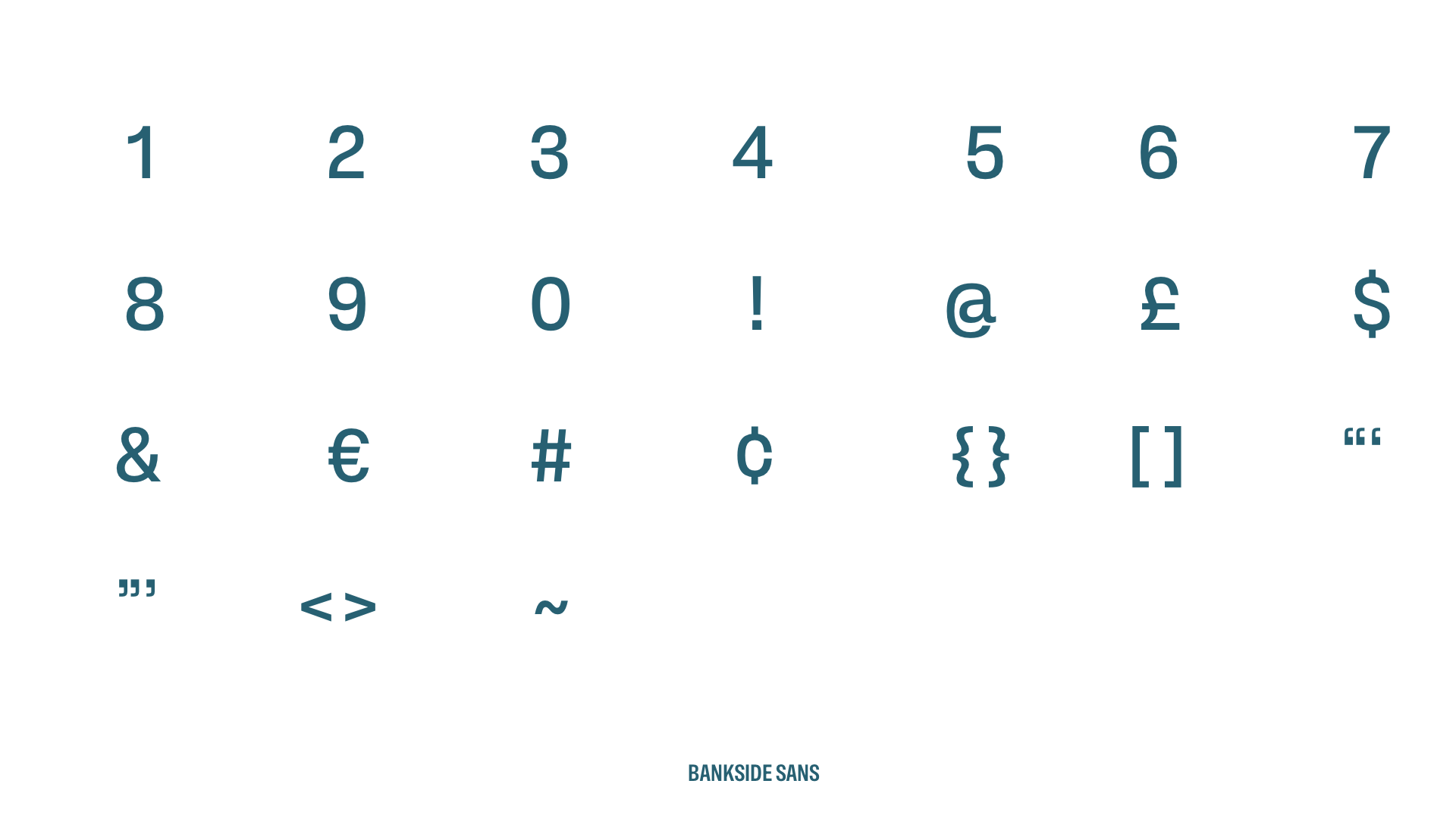
I also look at the design of numerals and special characters, which is important when client content will contain facts and figures.
Finally, I settled on Bankside Sans—designed by Dalton Maag. Bankside Sans has “clear, classic letter shapes (that) convey intent, while its extreme widths deliver impact.” It has a license fee that’s well worth paying for a variable font that perfectly balances approachability and seriousness.
Working through creative concepts
One of the parts of a project I enjoy the most is thinking of creative ways to tell stories through my choice of graphics, illustrations, and photography. Looking back through my folders, I’m reminded how many ideas never make it past a first iteration—and that’s never a failure. Design decisions are often subjective, so every attempt becomes a conversation.
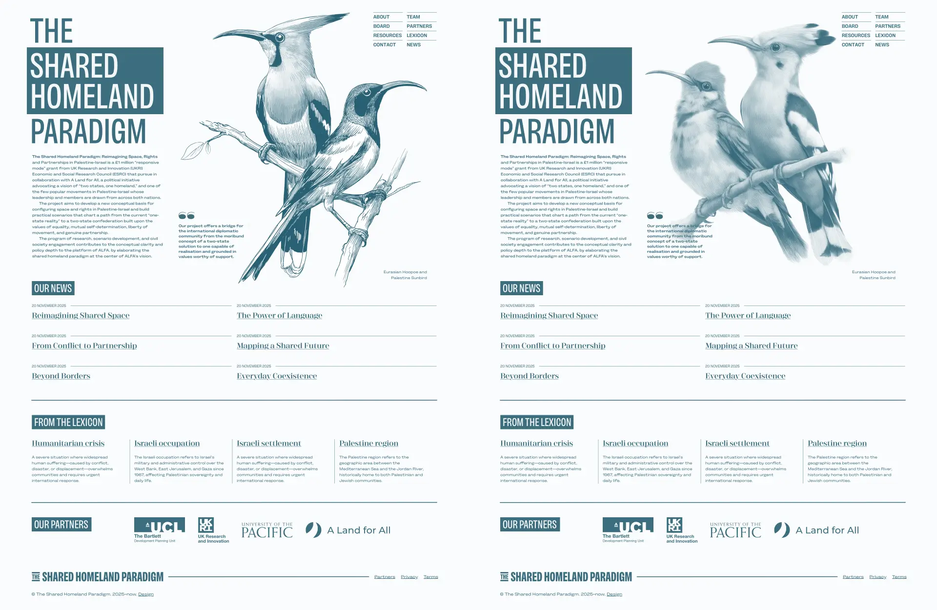
My first creative concept included illustrations of birds which are native to Israel-Palestine, including the Eurasian Hoopoe and the Palestine Sunbird. Birds cross national boundaries, and using them seemed like a concept worth developing. But the Shared Homeland Paradigm team thought differently.
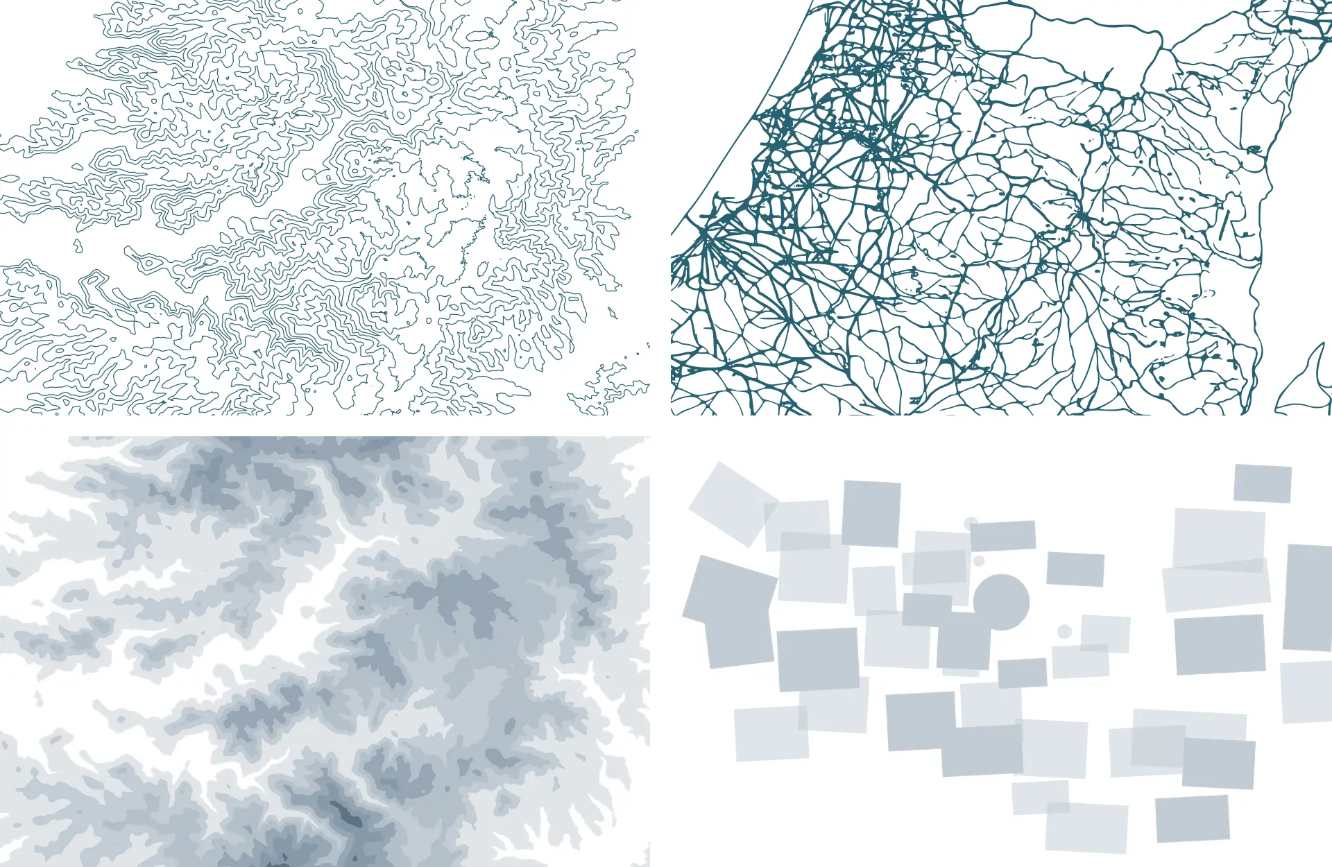
Instead, I incorporated topographical maps of the region and other ancient maps which were drawn before the state of Israel was formed. This idea resonated with the team.
Designing the colour palette
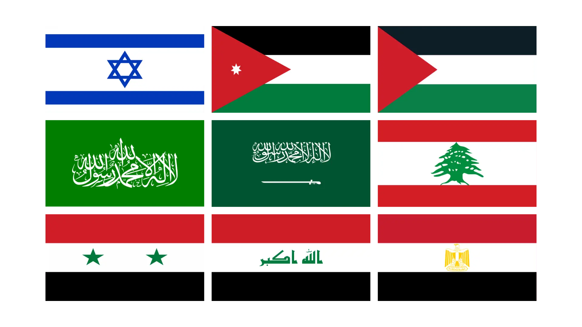
Colour is highly evocative and needs careful consideration, especially when dealing with sensitive subjects like Israel-Palestine. I started by studying the colours in the region’s flags, avoiding Israeli blue, and Arabic green and red.
First, I devised a new set of colours which have cultural associations for people in the region and included:
- Yellow: Happiness, optimism and warmth
- Orange: Love, happiness, humility and health
- White: Absence of colour, represents death and mourning
- Black: Can represent rebirth and mourning
Then, I created a second palette of blues, greens, and greys, which represent the earth, sea, and sky.
This second palette combined well with a set of simplified shapes, which represent populated areas overlaid on a map made before 1948.
Pulling everything together
The Shared Homeland Paradigm team needed a website on which they could add:
- Background papers
- Resources
- Scenarios for peace in the region
- Terms for their Alternative Lexicon
To make that happen, I developed their website using the open source Eleventy CMS (Now Build Awesome.)
When I design content-rich websites, I use layout, typography, and graphics to tell the story—not just the words on the page. This project brought together everything I care about in story-led web design—graphic design, layout, and typography, working together.
My typeface choice echoes their voice, and the SVG graphics help to tell their story. For organisations like The Shared Homeland Paradigm, a website isn’t just about presenting information. It’s about helping people understand complex issues and engage with them. Websites that make more people aware of sensitive subjects, help them understand the issues, and show how we might solve them are always the ones I want to work on.
More from Stuff & Nonsense
Services I offer
Product UX design
The contract template trusted by thousands of designers and developers to keep their web projects running smoothly.
Design mentorship and teaching
Whether you’re stuck, starting out, or stepping up—Andy’s here to help you become a better designer.
Squarespace templates for sale
Take your Squarespace designs from good to great with my bespoke templates.
Andy Clarke on YouTube
Join Andy on YouTube to learn how you can make better product and website designs.