It’s the taste. The all new Stuff & Nonsense
I can’t quite believe that it’s been almost two years since we launched the previous, Go, go, go, rillas! design of the Stuff & Nonsense website. Today, I’m very pleased to present our next design, ‘It’s the taste.’
‘It’s the taste’ isn’t just a change of banner, it’s a top-to-bottom redesign and rebuild of the entire site. We’ve designed it to reflect our current taste, where we are and where we want to be as a creative business.
Our work today’s less about developing websites and much more about art-direction, content creation, responsive website design, user friendly design and visual identity design. We spend almost all our time making creative work and we tried to capture that in our new website design.
No more case studies
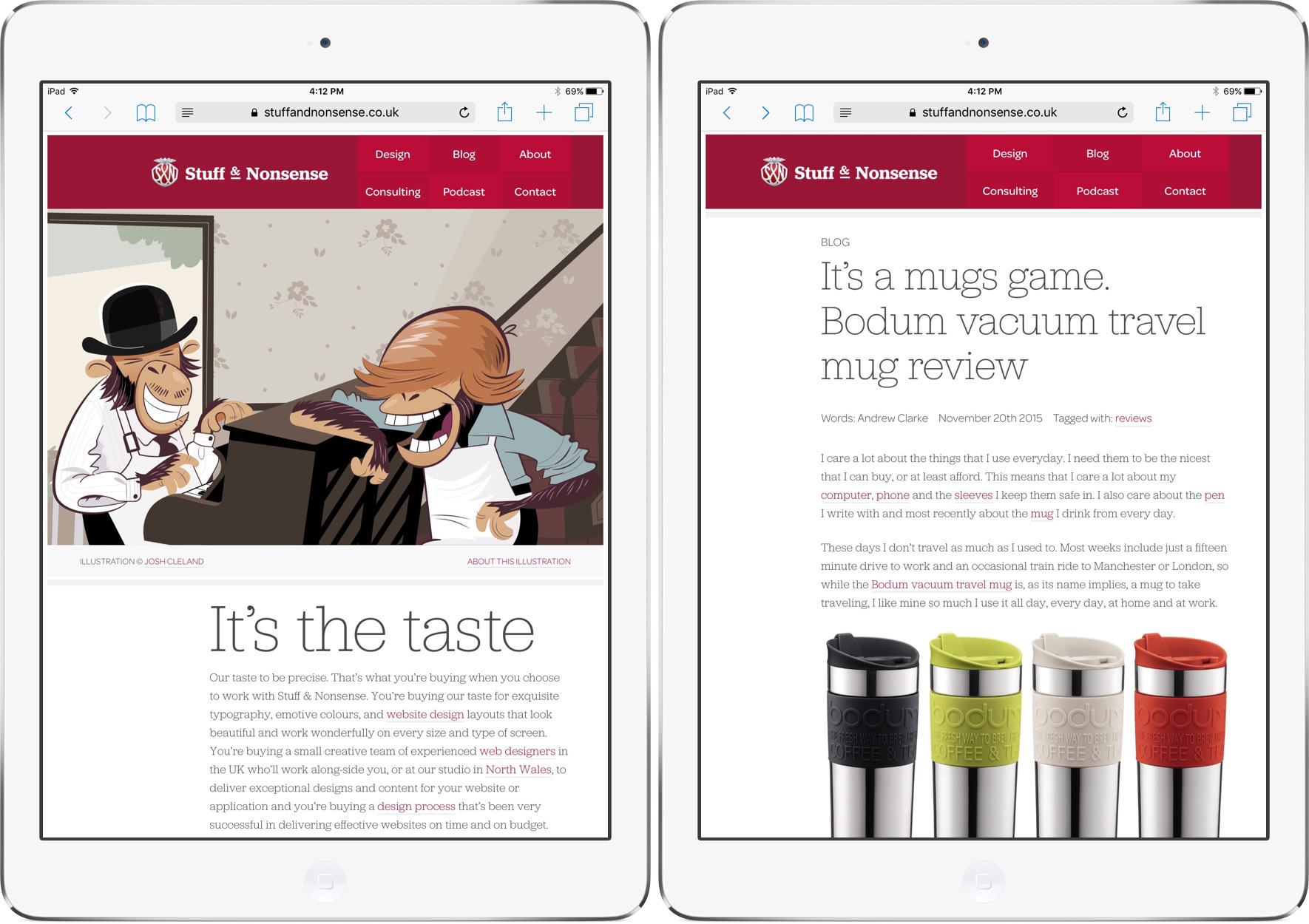
Case studies can be the death of a creative portfolio. Writing them always feels like a major production and in a busy studio like ours, there’s rarely enough the time to write them. We’ve done away with case studies altogether and replaced them with a feed of our design work that we’ll update several times a week.
We’re making creative work all the time, so we’ll be posting that work to our feed as we make it. I know that clients love to see the process involved in making visual identities and website designs, so we won’t just post finished work. Instead we’ll post it as we make it, sketches, iterations, even rejected concepts. We’ve even changed the terms of our contract with clients to enable us to post work at every stage of a project.
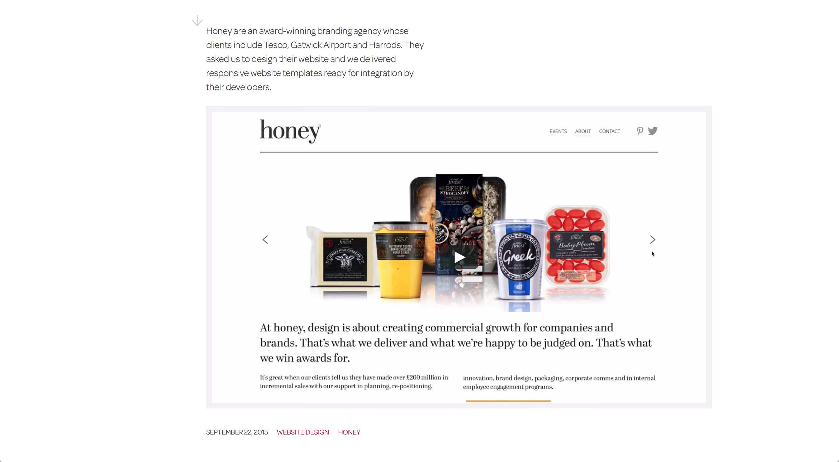
Screen capture videos
I researched hundreds of agencies and looked at how they presented theirs, but I didn’t find anyone demonstrating the interactive nature of website design well. Screenshots of a website design comped into photographs of iMacs, MacBooks, iPads and iPhones are almost ubiquitous, but I wanted to do something better.
We’re using screen capture video to show our website design work. I know that we can, and will, improve the quality of these videos in the weeks ahead, but already they show more of our work than static screenshots ever can. Next month we’ll add videos of our responsive designs and I’ll write about the process of making those when we release them.
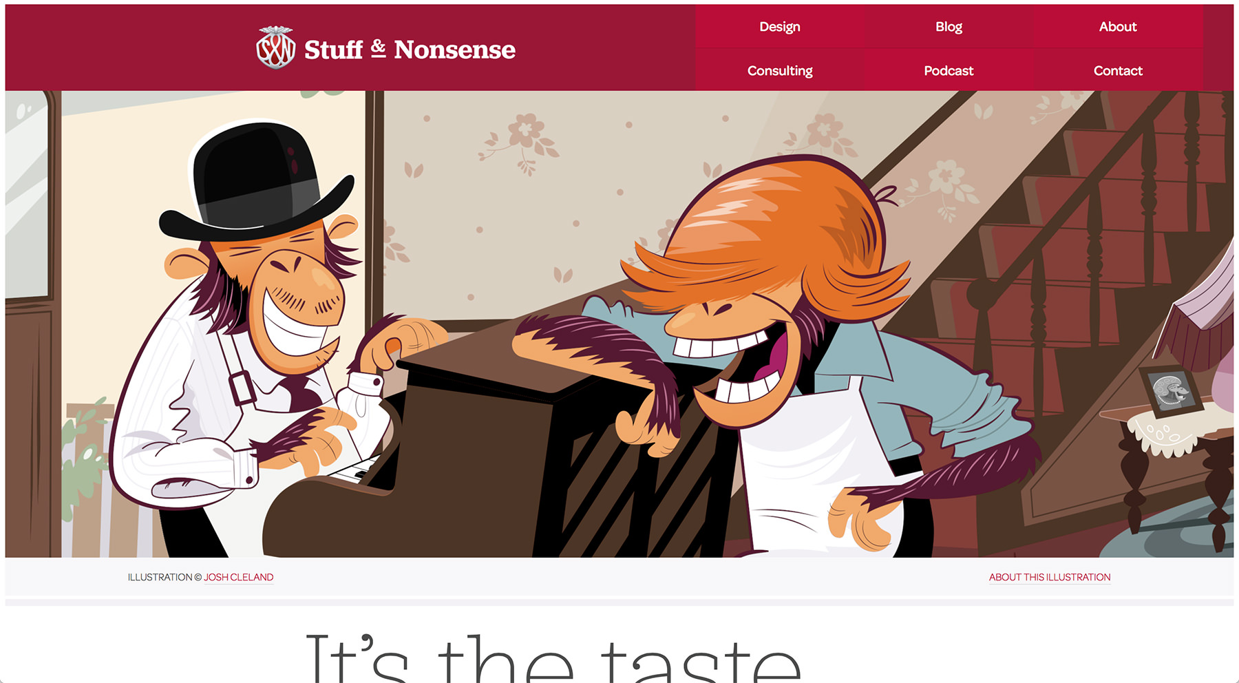
Our latest illustration
We hired our good friend and regular illustrator Josh Cleland to create the artwork for this vintage PG Tips inspired banner. This is the fourth time that we’ve worked with Josh on our banners. This time we asked him to make his illustration with scalable vector graphics (SVG) in mind as we wanted to improve our site’s performance.
Who better to collaborate with us to bring Josh’s illustration to life than my friend and ‘Net Awards Developer Of The Year 2015’ Sara Soueidan? Sara not only adapted Josh’s illustration across responsive breakpoints, she also helped us introduce the new responsive easter egg. (I’ll leave it up to you to find that.) We also implemented almost all of the site’s icons using an SVG sprite, helped by tutorials that Sara had written.
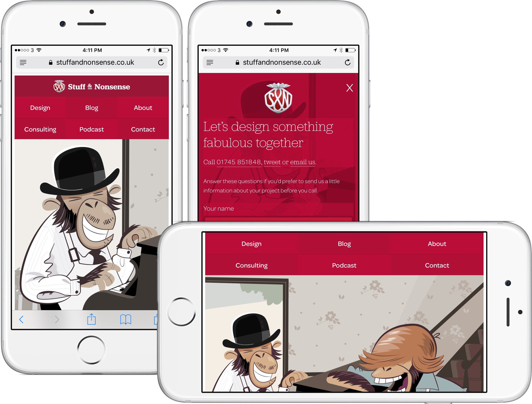
Simplified responsive web design
One of our goals with this new design was to avoid complexity. That meant meaningful HTML, simple CSS and using Javascript only when we needed it. Sadly we still needed Modernizr to test support for Flexbox and SVG. We used Picturefill for the responsive images we’ve implemented and Jonathan Neal’s svg4everybody to make our SVG sprites available to older browsers.
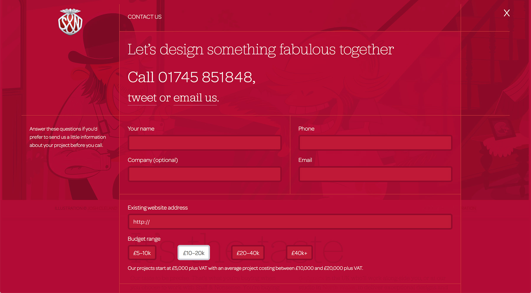
We threw out off-screen patterns and fish finger icons and used Flexbox CSS for our navigation. Flexbox is used across the website in lots of different ways including the figures and captions of our design feed items. You’ll also find it enhancing many design elements from the list of social icons in our footer to layout of our contact overlay.
Content changes
We’’ve moved our Unfinished Business updates from our blog and into their own podcast section. Hopefully this will make them easier to find and it may also encourage me to write blog entries more regularly.
We have a new page that lists all of the workshops we’ve given over that past ten years and we’ll be adding slides and materials to these events. We’ve also added video to our speaking page and over the coming months we’ll add links to audio recordings and slide decks making this a complete archive of the conference talks I’ve given for the past decade.
I’m sure that I’ll write more about our new website design over the coming weeks. There’s still plenty of work to be done. Until then, I’d like to say a massive thank you to our two Sues, Steven Grant and Joe Spurling who helped me with technical implementation and Josh Cleland and Sara Soueidan for their work on our SVG banner.