Eleventy in a Box
A premium Eleventy starter kit for designers and developers who want to spend less time setting up the same project structure and more time designing distinctive websites.
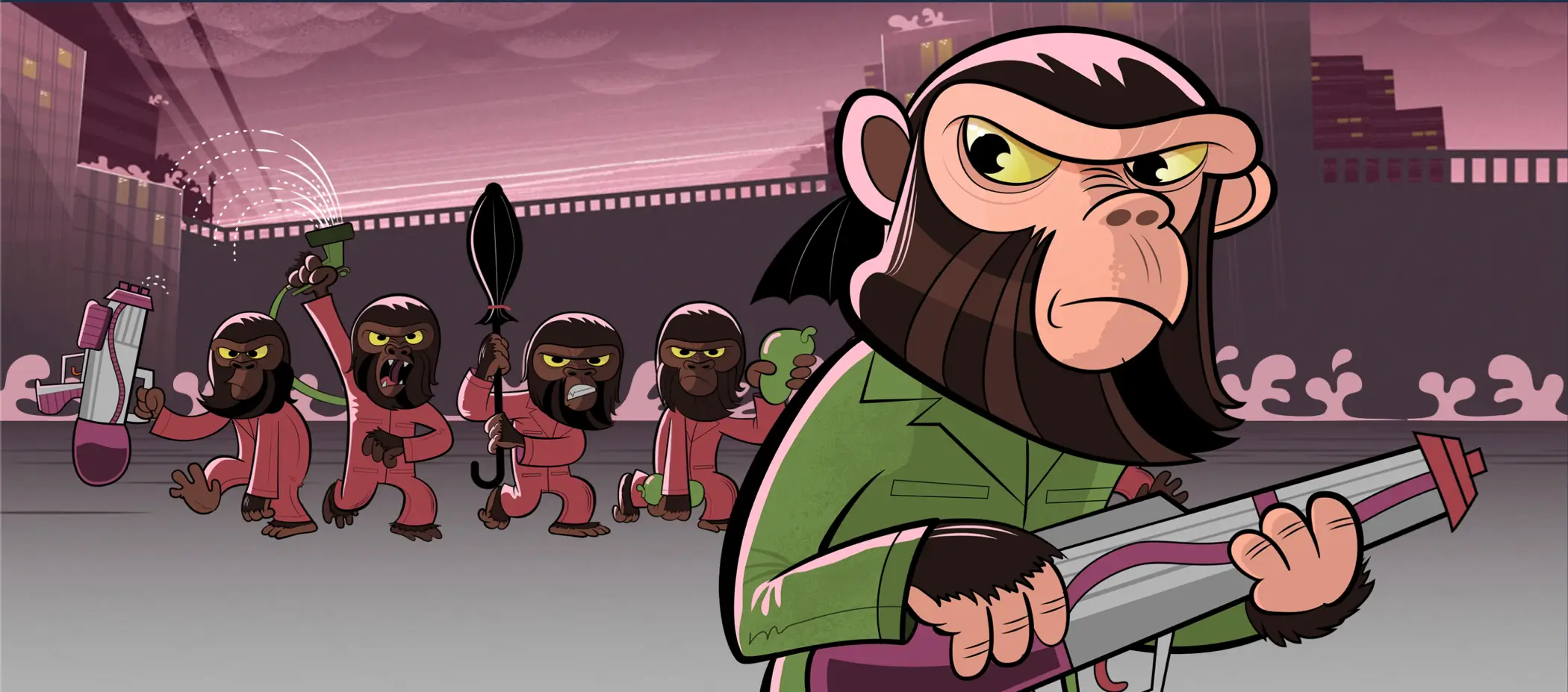
Kingdom of the Planet of the Apes is out, and I’m so excited that I decided to update one of my responsive easter egg headers— Kerfuffle on the Planet of the Apes —with more efficient, modern code. Today, I’ll explain how I made the layout using a combination of container queries, Flexbox, and grid.
The CSS and implementation I used a decade ago seem clumsy now with its complicated layout changes using media queries at 48em, 64em, 80em, 89em, and 140em widths, plus image swaps for 2x display resolutions.
It’s hard to believe I thought this amount of code was acceptable for just one of the seven ape images:
.chimp {
position: absolute;
top: 50px;
left: 50%;
width: 300px;
height: 415px;
margin-left: -150px;
background: transparent url(chimp-mobile.png) no-repeat 0 0;
transition: all 250ms 0 ease-in; }
@media (min-width: 48em) {
.chimp {
top: 50px;
right: 50px;
left: auto;
width: 440px;
height: 600px;
margin-left: 0;
background-image: url(chimp-tablet.png);
background-size: 440px 600px; }
}
@media (min-width: 64em) {
.chimp {
top: 40px;
right: 50px;
width: 542px;
height: 740px;
background-size: 542px 740px; }
}
@media (min-width: 80em) {
.chimp {
top: 20px;
right: 70px;
width: 667px;
height: 910px;
background-size: 667px 910px; }
}
@media (min-width: 86.375em) {
.chimp {
z-index: 2; }
}
@media (min-width: 89em) {
.chimp {
top: 20px;
right: 20px;
width: 835px;
height: 1140px;
background-image: url(chimp-desktop.png);
background-size: 835px 1140px; }
}
@media (min-width: 140em) {
.chimp {
top: 10px;
right: 20%;
width: 1026px;
height: 1400px;
background-size: 1026px 1400px; }
}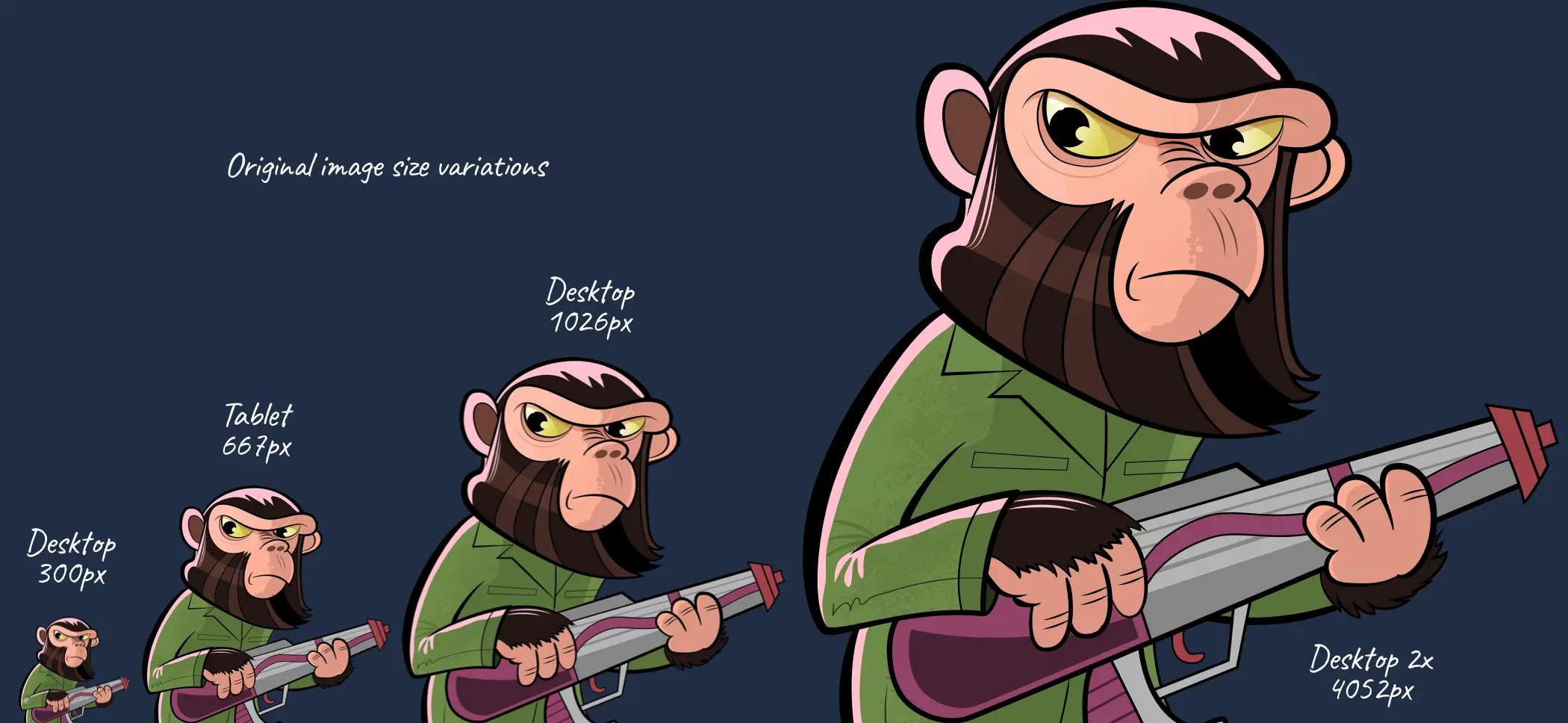
I was determined that this version would use a fraction of the code and modern techniques, including SVG, would make those media queries and image swaps unnecessary.
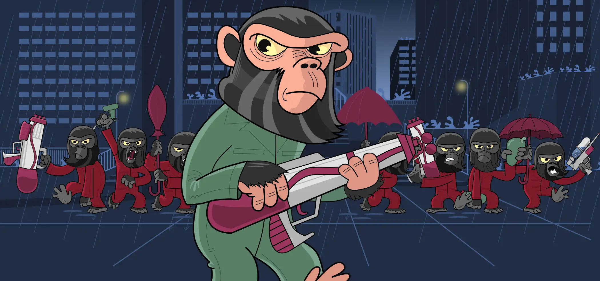
The HTML for Kerfuffle on the Planet of the Apes isn’t dissimilar to the markup I used in 2013. Inside the kerfuffle container are three divisions, one for the Century City background, another for the gorillas in the middle, and one more for the large image of Caesar in the foreground:
<div id="kerfuffle">
<div id="century-city">
<svg>…</svg>
</div>
<div id="gorillas">
<div id="gorillas-1">
<div><svg>…</svg></div>
<div><svg>…</svg></div>
<div><svg>…</svg></div>
</div>
<div id="gorillas-2">
<div><svg>…</svg></div>
<div><svg>…</svg></div>
<div><svg>…</svg></div>
<div><svg>…</svg></div>
</div>
</div>
<div id="cornelius-zira">
<svg id="caesar">…</svg>
</div>
</div>
Whereas in the past, I might’ve used positioning to stack these three layers, today I use CSS Grid, first establishing a grid container with a single column and row:
#kerfuffle {
display: grid;
grid-template-columns: 1fr 1fr;
align-items: start; }
Then, the background, middle, and foreground layers are stacked in the same space. Using the same row number ensures that all three divisions appear on the same line:
#century-city,
#gorillas,
#cornelius-zira {
grid-column: 1 / -1;
grid-row: 1; }
#century-city {
z-index: 1; }
#gorillas {
z-index: 2; }
#cornelius-zira {
z-index: 3; }
To allow me to use container queries to size its descendants, I added an inline query to the parent division:
#kerfuffle {
container-type: inline-size; }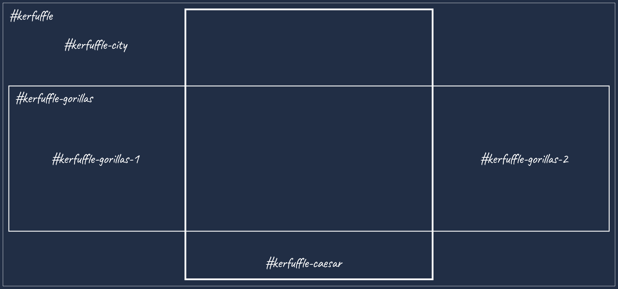
In this layout, two groups of gorillas in red boiler suits create havoc in Century City. To place them on either side of Caesar, I turned the middle layer into a Flexbox container with an inline container-based gap value:
#gorillas {
display: flex;
gap: 25cqi; }
#gorillas-1,
#gorillas-2 {
flex: 1; }
As I knew I’d want to animate each gorilla, I included them as separate SVGs instead of combining them into a group. I placed gorillas by first turning their groups into Flexbox containers with an inline query added:
#gorillas-1,
#gorillas-2 {
display: flex;
align-items: end;
container-type: inline-size; }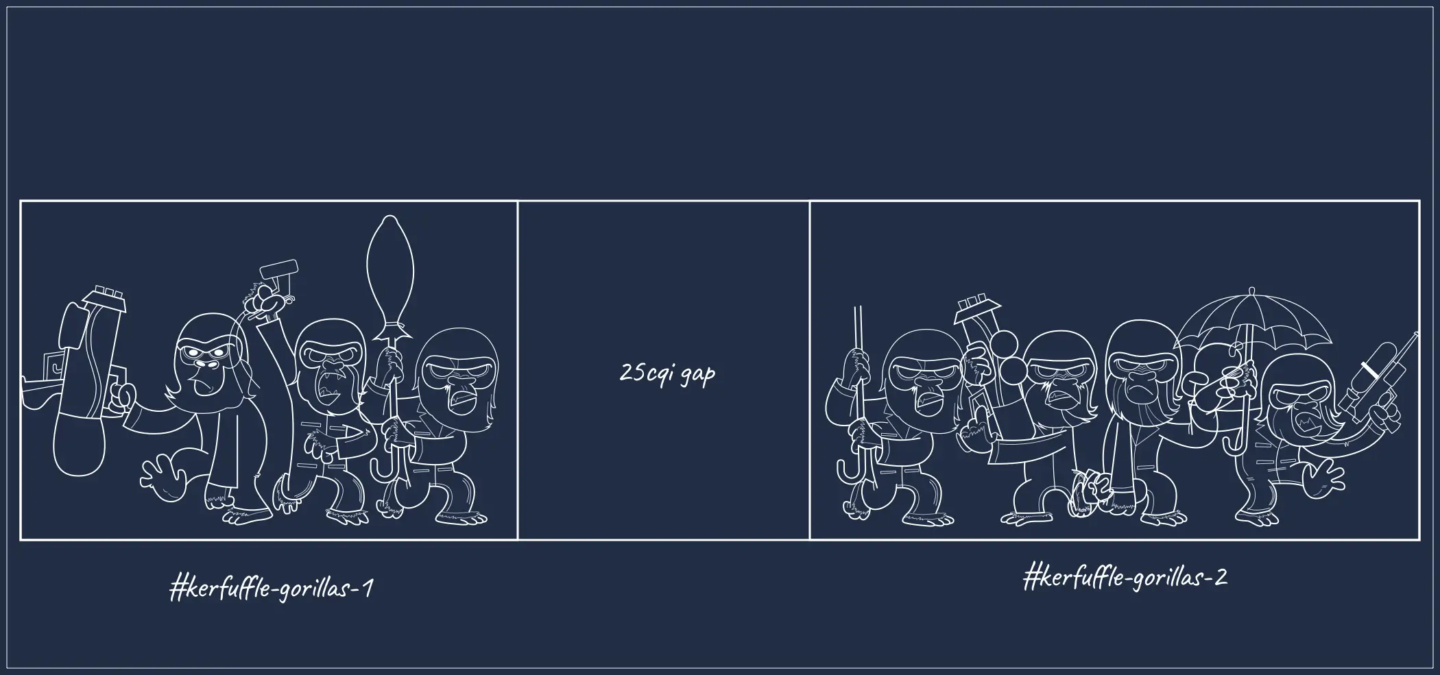
This inline container-based query then allowed me to apply a flexible but precise size to each gorilla, based on how much of its group it occupied:
#gorillas-1 > :nth-child(1) {
inline-size: 47cqi; }
#gorillas-1 > :nth-child(2) {
inline-size: 42cqi; }
#gorillas-1 > :nth-child(3) {
inline-size: 25cqi; }
For a final touch, I set the size of the main Caesar character in the foreground to fill 40% of the container’s inline size:
#caesar {
display: block;
margin-inline: auto;
max-inline-size: 40cqi; }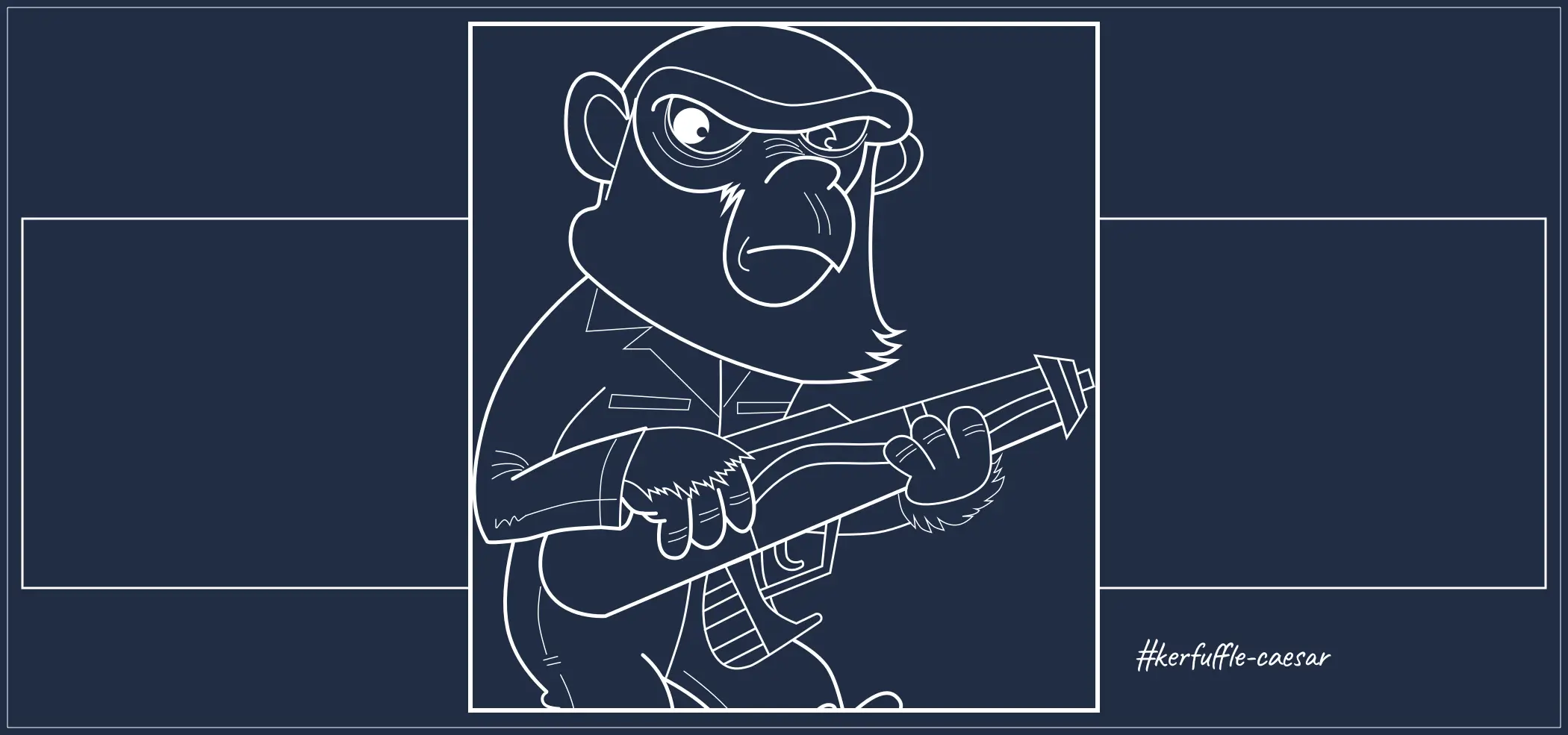
Although Kerfuffle on the Planet of the Apes feels similar to the 2013 original, there are differences in how the header now responds to window sizes.
But, the biggest difference is in the size of my assets and the length of my code. Even optimised, the original set of PNG images weighs in at an enormous 3.5Mb, whereas the new SVGs weigh less than 300kb. Without width-based media queries, changes to the layout are also no longer jumpy. I like how close this new version looks compared to the original, but I’m even more pleased with how much faster it is.
The fun I had in mind for this updated header didn’t stop there, as I intended to use animations and transitions to bring it to life. But more about that next time.
A premium Eleventy starter kit for designers and developers who want to spend less time setting up the same project structure and more time designing distinctive websites.
Contract Killer is plain and simple and there’s no legal jargon. It’s customisable to suit your business and has been used on countless web projects since 2008.
Free compound grid and modular grid layout generators, plus a set of HTML/CSS layout templates you can call on to make more interesting layouts, available to buy.