My new Inspired Design Decisions series of articles and webinars for Smashing Members
I’ve written plenty of times before about how important it can be to look offline for inspiration to improve the things we make online. Last year, a few friends and I met in London for an inspiring visit to the Photographers Gallery.
No trip to The Smoke is complete without a stop at Magma, and I bought several new magazines. As I explained my inspiration addition, my friend Al Power suggested I write about why I find magazine design inspiring and how they influences my work.
That conversation sparked the idea for an article and webinar series on making inspired design decisions. Every month, I’ll choose a publication, discuss what makes its design distinctive, and how we might apply that distinctiveness to do better work for the web. As an enthusiastic user of HTML and CSS, I’ll also explain how to implement new ideas using the latest technologies; CSS Grid, Flexbox, and Shapes.
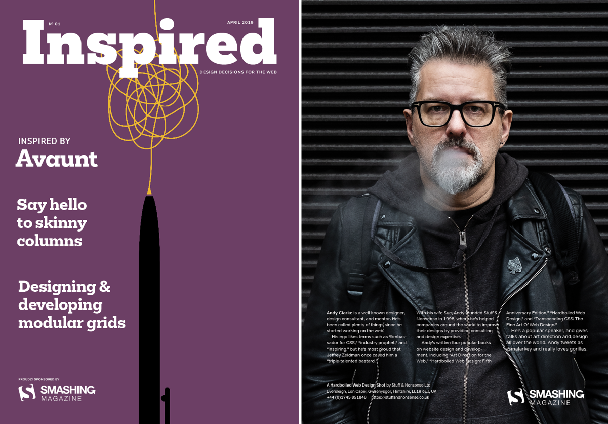
In the first edition of Inspired Design Decisions, I “Say hello to skinny columns,” a technique which adds one extra narrow column to an otherwise conventional column grid. I explain how to design with, then implement skinny columns using meaningful markup and efficient CSS. I also explain how to design using modular grids to fill your designs with energy.
Throughout this year, Inspired Design Decisions will:
- Examine an influential designer or piece of work
- Teach the principles which make it exceptional
- Apply those principles to design for the web
- Describe the code someone would need to implement it
Each month, there will be:
- A beautifully art-directed article (HTML/CSS and PDF)
- Full code examples
- A one hour webinar
The first Inspired Design Decisions webinar will be held on Smashing TV today (9th April 2019). There will be a 45 minute talk, plus 30 minutes of Q&A. Save your seat here.
I’d like to say thanks again to Al Power for the inspiration, and to Smashing Magazine for making this Inspired Design Decisions series possible.
More from Stuff & Nonsense
Services I offer
Product UX design
The contract template trusted by thousands of designers and developers to keep their web projects running smoothly.
Design mentorship and teaching
Whether you’re stuck, starting out, or stepping up—Andy’s here to help you become a better designer.
Squarespace templates for sale
Take your Squarespace designs from good to great with my bespoke templates.
Andy Clarke on YouTube
Join Andy on YouTube to learn how you can make better product and website designs.