New branding for Code Enigma
Our friends at Code Enigma relaunched their website at DrupalCon in Amsterdam. The launch included the branding we designed for them.
Code Enigma are well-known in the Drupal community and we felt that changes to their brand needed to be incremental and not a complete departure from their previous, familiar branding.
While we worked on the logo redesign, we focussed on three areas:
- Evolving the motif
- Making better use of colour
- Choosing a new typeface
Evolving the motif
No one at Code Enigma could tell us the story behind their original motif. The best answer was that it was an enigma, “something mysterious or difficult to understand.” We didn’t feel this definition fitted a company who’s job is, in part, making complex software simple.
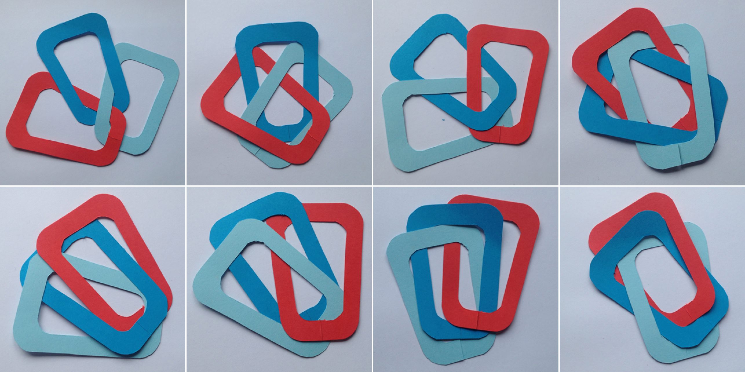
The original motif reminded us of ‘separate and join’ puzzles found in Christmas crackers. We started by making physical shapes to help us solve the puzzle of the updated motif.
Making better sense of colour
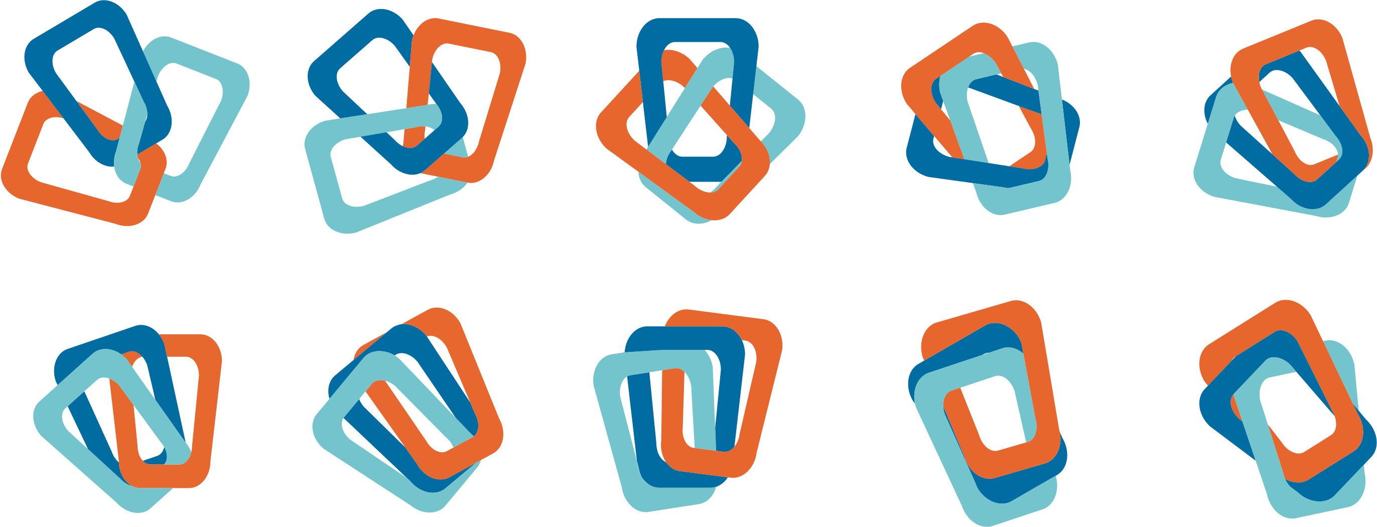
Code Enigma’s original motif contained a rainbow of colours. One early idea combine three of these colours but lacked the clarity we were striving for;

We sampled four and added a neutral grey, then used tints of each colour to form a set of new motifs. These can be used on either light or dark backgrounds and will stand out even when set on top of photographs.

Choosing a new typeface
While there were attributes of the original logotype we thought were worth retaining, the typeface and arrangement needed updating as logos that are comprised of two words that have been treated differently are a sore point for us.
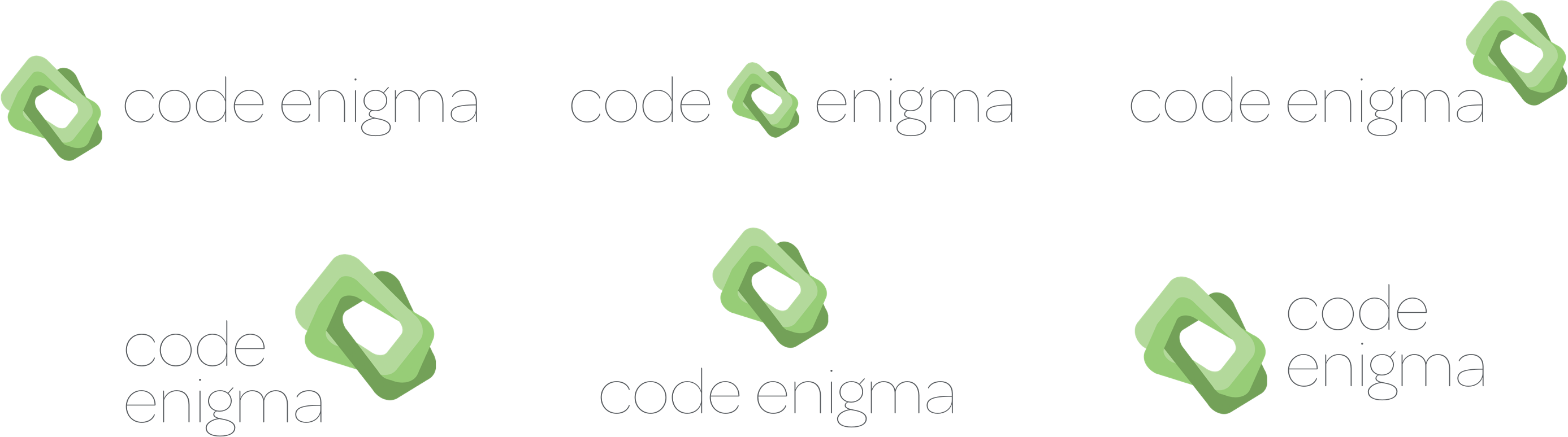
We searched for a new typeface with similar characteristics to the original. One that would be useable in both branding and website content. After experimenting with a half-dozen alternatives, we settled on Omnes Pro from one of our favourite type designers, Darden Studio.

It’s a great honour when someone in our industry trusts us with the look of their business. We loved working Code Enigma and we’re very proud of what we made with them. So we sent them a gift for DrupalCon, a set of prints of their new logo—printed by our favourite letterpress printers, Blush Publishing—to give away to their clients and staff at the conference.
We’ll write more about our other work for Code Enigma next week, including our process for design their new website.