New relative colour functions in CSS
Safari Technology Preview is my every day browser. When the latest version dropped, a feature in the release notes interested me. It was experimental support for three new relative colour CSS values. So, I tried what’s possible now.
NB: If you want to try these relative colour values, you’ll first need to enable them in the Develop > Experimental Features menu in Safari Technology Preview Release 127 (or later.)
CSS colour modifiers
First up, CSS colour modifiers and a very quick primer on the RGB and HSL colour spaces I use in these examples. The RGB colour model comprises three colours: R (Red,) G (Green,) and B (Blue.) To define a colour, we assign a value between 0 and 255:
--color-brand: rgb(165,35,55);The HSL colour model comprises three values: Hue, Saturation, and Lightness. Hue is the angle on the colour wheel and ranges from 0 to 360. Saturation is expressed as a percentage and ranges from 0 (grey) to 100% (full colour.) Lightness is also expressed as a percentage; 0% is darkest, 100% is lightest:
--color-brand: hsl(350,65,40);Got that? Now, I can use CSS colour modifiers to adjust any of those values. In RGB, I could swap any of the three values for any other value. Or I can leave some as they are. If I need less red in my red brand colour, I can replace its original R value:
.element {
background-color: rgb(from var(--color-brand) 120 g b); }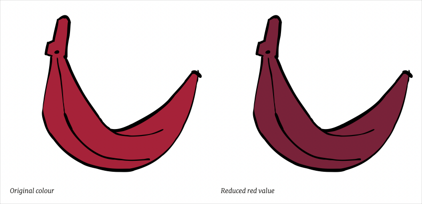
I can also swap any of the three HSL values. If I need to change the brand colour from red to blue—as I’ve done for the dark mode theme on my website—I can adjust the hue degree on the colour wheel from 350 degrees to 200:
.element {
background-color: hsl(from var(--color-brand) 200 s l); }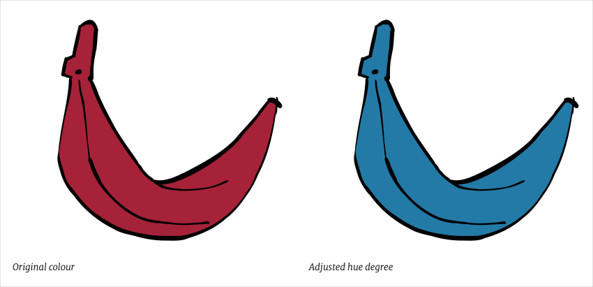
I quite often make subtle changes to a brand colour when implementing a dark mode theme by adjusting its lightness. Now, I can do this in CSS:
.element {
background-color: hsl(from var(--color-brand) h s 45%); }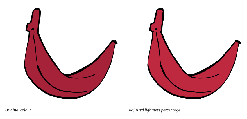
At this stage, it’s important to point out that I can define my origin colour using any values I like (HEX, RGB, HSL, etc.) and they don’t need to be the same colour model as my background-color values. I can also make these adjustments using calc(). For example, instead of specifying a new absolute value for HSL Lightness, I can simply specify by how much I want it to change:
.element {
background-color: hsl(from var(--color-brand) h s calc(l + 10%)); }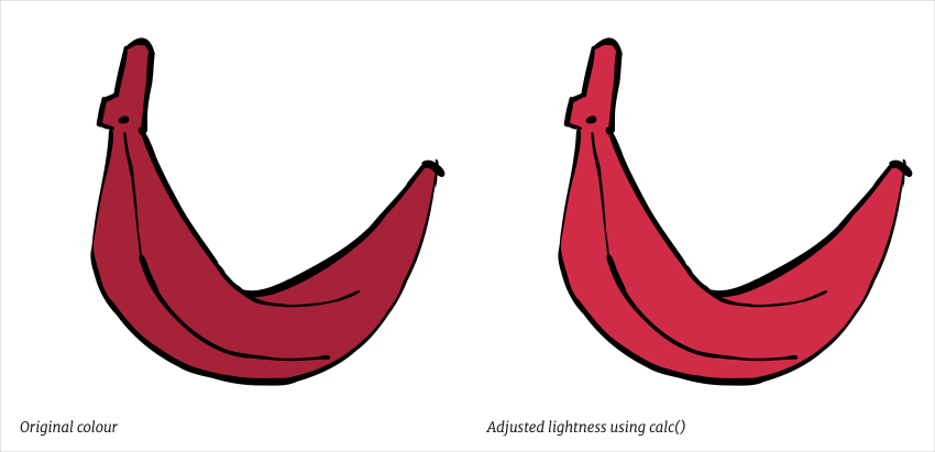
You won’t be surprised to know that these relative colour values aren’t widely supported (yet,) so I would quarantine these styles and provide an alternative for other browsers:
@supports not (background-color: hsl(from black h s l)) {
.element {
background-color: var(--color-brand); }
}

@supports (background-color: hsl(from black h s l)) {
.element {
background-color: hsl(from var(--color-brand) h s 45%); }
}
Mixing CSS colours
One of my earliest blog entries, all the way back in May 2004, was about a favourite technique for creating colour palettes. It was a technique which I’ve used for years and involves placing various opacities of a colour over either black or white to create tints. Now I can achieve the same results with CSS and the new color-mix value.
With my alternative CSS principle, I keep colour variations to a minimum, so if I need to create darker or lighter variants of my brand colour, I can mix it with black or white using the color-mix function:
.brand__light {
background-color: color-mix(in hsl, var(--color-brand) 75%, white); }

.brand__dark {
background-color: color-mix(in hsl, var(--color-brand) 75%, black); }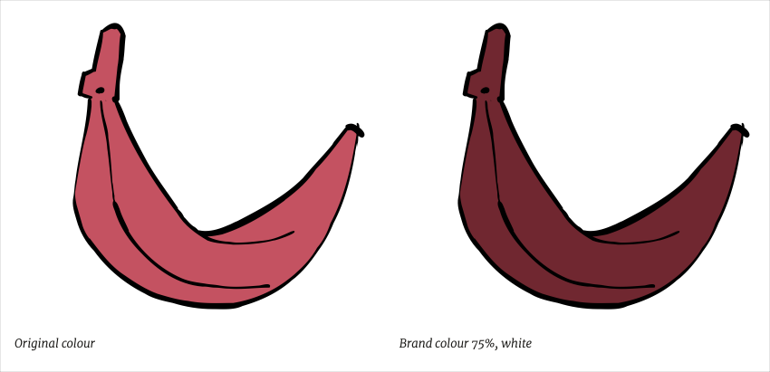
Using this method, I can mix any two colours with different percentages of each, as if I am mixing paint:
.brand__mix {
background-color: color-mix(in hsl, var(--color-brand) 15%, #efcb20 50%); }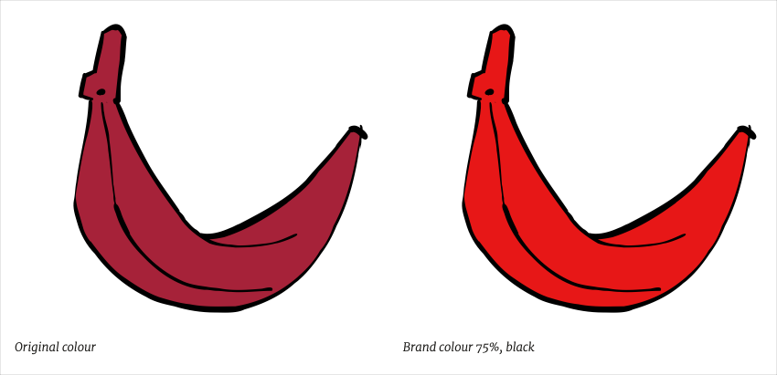
As I’m using a CSS Custom Property for my brand colour, any time I change that custom property, all my styles based on it will be updated automatically. Again, I would quarantine these styles and provide an alternative for other browsers:
@supports not (background-color: color-mix(in hsl, white, black)) {
.element {
background-color: var(--color-brand); }
}

@supports (background-color: color-mix(in hsl, white, black)) {
.element {
background-color: color-mix(in hsl, var(--color-brand) 15%, #efcb20 50%); }
}
CSS color-contrast
Perhaps the most interesting of these three relative colour functions is a browser’s ability to choose from two colour options (for example black or white) to deliver the best contrast between foreground and background colours. This is a challenge I ran into recently when implementing risk warnings for my main client’s new product. Text in these warnings needs to stand out from several background colours ranging from red, through amber, to green. The CSS color-contrast function now makes this much simpler:
First, I define a background colour, then the browser automatically compares that colour with my foreground colour options and chooses the one with the best contrast:
.element {
background-color: var(--color-warning);
color: color-contrast(var(--color-warning) vs white, black); }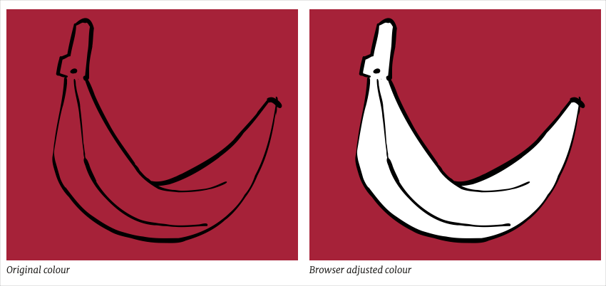
One more time, I quarantine these styles and provide an alternative for other browsers:
@supports not (color: color-contrast(grey vs white, black) {
.element {
background-color: white;
border-color: var(--color-warning);
color: black); }
}

@supports (color: color-contrast(grey vs white, black) {
.element {
background-color: var(--color-warning);
color: color-contrast(var(--color-warning) vs white, black); }
}
Animations, transitions, and scripts
These new relative colour CSS values might not be widely supported yet, but I already know they’ll make my CSS implementations simpler in the future. As they use vanilla CSS—and don’t rely on a pre-processor—they also offer easier ways to add interactions as they’re all animatable, can be transitioned, or even scripted.
There’s more to all these relative colour values than I’ve described, but still very little available online to describe or demonstrate them. So, dig into the proposed specification and show me what you come up with.
References:
More from Stuff & Nonsense
Services I offer
Product UX design
The contract template trusted by thousands of designers and developers to keep their web projects running smoothly.
Design mentorship and teaching
Whether you’re stuck, starting out, or stepping up—Andy’s here to help you become a better designer.
Squarespace templates for sale
Take your Squarespace designs from good to great with my bespoke templates.
Andy Clarke on YouTube
Join Andy on YouTube to learn how you can make better product and website designs.