Inspiration and insights #3 — Richard Hollis, 20 years blogging, and more
From the newsletter: I missed the exact date, but a few days ago, my blog turned 20. I’m not up there with Jeffrey or Jeremy, who’ve blogged consistently for even longer—I neglected my blog for periods of time, and posting was often irregular—but still, here we are. It’s twenty years since my first post.
Honestly, I started my blog because I wanted to do what other people I admired were doing. Before conferences and social media, those of us who were interested in standards-based design interacted by leaving comments on each other’s blogs, and I wanted to join in. So, I rolled out the welcome mat on May 13th 2004, with a design which was inspired by vintage scooter adverts. The colour palette was sepia-toned and included images I cut from magazine advertisements.

To celebrate the 20th anniversary of this blog, I’ve recreated how the home page and a few choice posts looked when I launched it in 2004. It’s not a pixel-perfect recreation, but it will give you an idea of how the design used to look.
Inspiration spotlight
Richard Hollis

Born in London in 1934, Richard Hollis is a British designer and teacher, and author of several books on graphic design. Throughout his long career, Hollis has built an enviable and substantial body of creative work and has educated younger designers through his writing.
I need to confess that shamefully I only discovered Hollis and his work a few years ago, while learning about David King. Hollis was credited by King and many other designers of the time as influential, but it’s only in the past twenty years that his work has received more widespread attention with the book about his designs for the Whitechapel Gallery and an exhibition in 2012.
Hollis was influenced by the modernist Swiss style but his work hasn’t been defined by it and in many ways feels very British. Alongside his teaching at London College of Printing and Chelsea School of Art in the early 1960s, Hollis produced work which reflected his interests and outlook. He made work for CND—which I was a member of in the 1980s—New Society magazine, and Pluto Press, a left-wing publisher. For Hollis, content and message are more important than a designer’s distinctive style. He said:
The ideal situation is where you sit with the client and design with them. If anything is emphasised, it’s what they want to emphasise. So often you’re left with no guidance as to what to give prominence to. I much prefer collaborative effort to doing what I want to do. It’s diametrically opposite to being an artist. Artists are free to put things into any form they like, which may or may not be comprehensible in the way they hope. For me, working with the person whose message it is is the most comfortable.
But that approach didn’t mean designers should be subservient to their clients. When asked about clients who say “Move that type a little to the left… now let’s see it in green…” Hollis replied, “I’d tell them to fuck off.”

As well as his design work for clients, Hollis wrote two influential books on graphic design: About Graphic Design and Swiss Graphic Design: The Origins and Growth of an International Style. It’s his work for the Whitechapel Gallery between 1969 and 1985 for which Hollis is most well known. I hope that I can make more people aware of Richard Hollis by sharing my fascination for him and his work.
Design Chatter: Friendly feedback
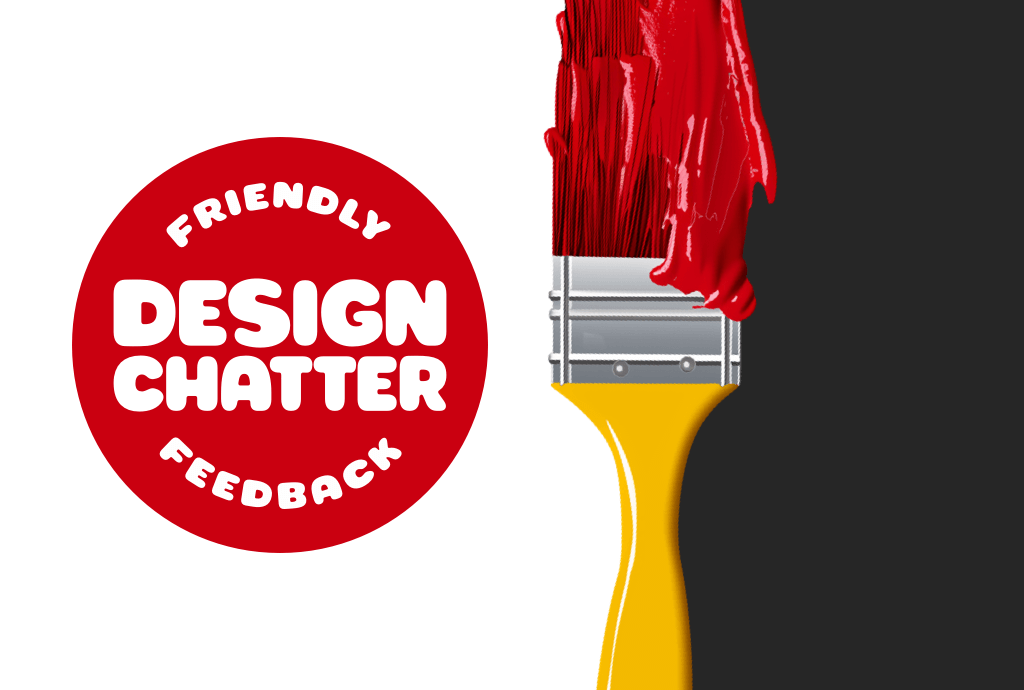
Design Chatter is my weekly one-hour Zoom call where a small group of no more than 20 designers can show their work in progress and talk about design challenges. It’s a space to bounce ideas off other designers, talk about design problems and hear feedback on how to solve them.
The meetups are going well and the next Design Chatter is on 29th May at 3pm UK time and I’ll hope you’ll join in.
Book of the month
Richard Hollis Designs for the Whitechapel

“Richard Hollis Designs for the Whitechapel” by Christopher Wilson is a fascinating exploration of Hollis’ work for the Whitechapel Gallery between 1969 and 1985. If you haven’t bought a design book this month—and even if you have—this book deserves a place in your inspiration collection.
This is an Amazon affiliate link, so I earn a tiny amount from your purchase.
Around the web
Kerfuffle on the Planet of the Apes
Kingdom of the Planet of the Apes is out, and I’m so excited that I decided to celebrate by updating another of my responsive easter egg headers—Kerfuffle on the Planet of the Apes—with more efficient, modern code.
Ana Tudor: Monochrome me with SVG filter magic
I’ve been a huge fan of developer Ana Tudor for years. Recently, she’s been busy creating experiments using SVG filters on images and text. Here’s an example of SVG filters in use to turn a colour image into monochrome. But honestly, her entire CodePen is worth digging into.
Stephanie Walter: Dark mode & accessibility myth
“There’s a myth that dark mode is good for accessibility, because it improves text readability (among other things). As always, when it comes to accessibility, it’s not black or white (haha, color pun intended).”
Robert McCormick: Look Mum, No Breakpoints!
“I always found responsive design challenging. I’d start with two designs, one for mobile and one for desktop, but I then needed to work out how to get from the mobile design to the desktop version. Which involved creating designs for each breakpoint between the two main designs. It was a slow and frustrating process.”
Thanks for reading, and please press “reply” if you’d like to nerd out about any of the above. I always respond.
— Andy