Re-coding Apple Black Friday dates
Most parts of Apple’s website are fabulously flexible. But today, I was browsing for Black Friday deals and found a fixed-width design element which I was determined to make flexible.
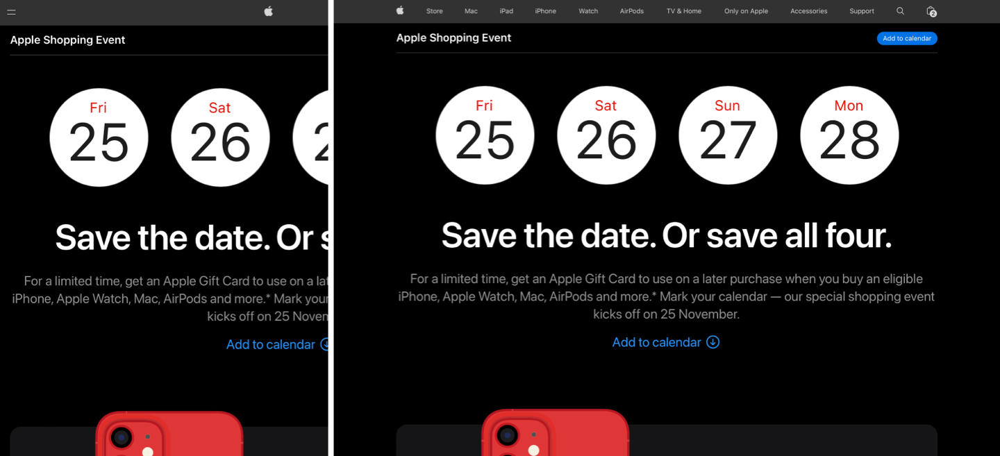
Here are screenshots of Apple’s Black Friday deals page. It includes a lovely looking calendar-style design for the four days of their sale:
While inspecting their code to discover how Apple had implemented their design, I found plenty of unnecessary and non-semantic HTML elements. There’s an outer division (announce-dates) and an unordered list (dates.) There are class attribute values on every list item (date,) an additional division grouping two paragraphs (text), and a purely presentational division ( circle ) to create the circle. I knew I could improve the semantics and reduce the number of elements and attributes:
<div class="announce-dates">
<ul class="dates">

<li class="date twenty-five">
<div class="text">
<p class="day">Fri</p>
<p class="number">25</p>
</div>
<div class="circle"></div>
</li>

…

</ul>
</div>(See my CodePen example for a breakdown of how Apple implemented their design using CSS.)
Apple’s CSS includes pixel-based units for their font sizes, heights, and widths:
.announce-dates .dates {
width: 838px; }

.announce-dates .date {
height: 178px;
width: 178px;
line-height: 25.000032px; }

.announce-dates .text {
height: 179px; }

.announce-dates .day {
top: 17px;
font-size: 26px;
letter-spacing: -.025px; }

.announce-dates .number {
top: -90px;
height: 141px;
font-size: 96px;
letter-spacing: -1px;
line-height: 141.176636px; }
Apple’s CSS and HTML seemed a little over-complicated for such as simple-looking design element. My first task was to remove the superfluous outer division and move its class attribute to the list.
I removed the extra text division and the circle. I also changed the unordered list to a more semantic ordered list which describes its content better:
<ol class="announce-dates">

<li>
<span>Fri</span> <span>25</span>
</li>

…

</ol>
Apple marked up their days and numbers using semantically dubious paragraphs. But, by definition, a paragraph is more than just one word. The browser stylesheet gives paragraphs margins and I would need to remove those defaults. That seemed inefficient, so I replaced them with more appropriate time elements which contain span elements around days and dates:
<li>
<time datetime="2022-11-25"><span>Fri</span> <span>25</span></time>
</li>
Apple made their announcement dates inflexible, with fixed units for the list and the dates, but I wanted to make my version flexible. Flexbox is the obvious choice to make the items in my list flexible, adding a viewport-based gap to the ordered list:
.announce-dates {
list-style-type: none;
margin: 0;
padding: 0;
display: flex;
gap: 0 3vw; }
And a flex-grow value on the list items means that my list items will grow and shrink to fit a container or page width:
.announce-dates li {
flex-grow: 1; }
Just like Apple, I used Flexbox for my list items as its ideal to horizontally and vertically center elements:
.announce-dates li {
display: flex;
flex-direction: column;
justify-content: center;
align-items: center; }
Whereas Apple added a division with the sole purpose of creating a circle–something for which an SVG circle might be much more appropriate–I simply added a white background-color and a rounded border-radius to each list item to create my circles:
.announce-dates li {
padding: 2vmax;
background-color: #fff;
border: 1px solid #494949;
border-radius: 10rem; }
In the past, maintaining the aspect ratio of a flexible element involved a nasty-looking padding hack. Now, we have the aspect-ratio property which I used to make sure my flexible dates stay circular, no matter how big they grow or small they shrink:
.announce-dates li {
aspect-ratio: 1 / 1; }
Next, I added text styles to the list items. These cascade and avoid the repetition in Apple’s day and number styles. I replaced the pixels which Apple uses with vmax units for font size and em units for negative letter-spacing. Now, the text size will adapt as the circles grow or shrink:
.announce-dates li {
font-family: SF Pro Icons, AOS Icons, Helvetica Neue, sans-serif;
font-size: 11vmax;
font-weight: 400;
letter-spacing: -.05em;
line-height: 1;
color: #1d1d1f; }
Finally, I changed the default display property of a span from inline to block, then added a larger viewport-based text size and letter-spacing to my day styles. I used an :nth-child() pseudo-class selector instead of a class:
.announce-dates li span {
display: block; }

.announce-dates li :nth-child(1) {
font-size: 3vmax;
letter-spacing: .05em;
color: #e30000; }
Considering how well the flexibility of Apple’s website has improved since they adopted responsive techniques, I was surprised to find an inflexible layout for their Apple’s Black Friday announcement. Flexibility is incredibly important, as are semantics and efficient, minimal code.
It’s easy to pick fault in someone else’s work—especially when you have no insight into the decisions which were made—but nevertheless I think there’s always room for improvement. Plus, I enjoyed re-coding Apple’s Black Friday dates and I learned a few new things while doing it. Can you optimise this even more?