Retro Reboot: What ’90s web design can teach us today
Website design in the ’90s was messy, but it was also magical. It was frequently fraught with accessibility, performance, and usability problems that took us years to solve. But while we addressed them, we discarded much of what was captivating about early websites and replaced them with conservative, commodity designs.
DIYers and professional webmasters who made the first business websites were unencumbered by conventions, so the early web was a playground of creative expression and ideas. Yes, lots of little animated men dug plenty of pixel-sized holes, and backgrounds clashed with text and repeated like bad wallpaper. But, as designers came to terms with what was then a new medium, the results were charmingly personal and often delightfully unpredictable.
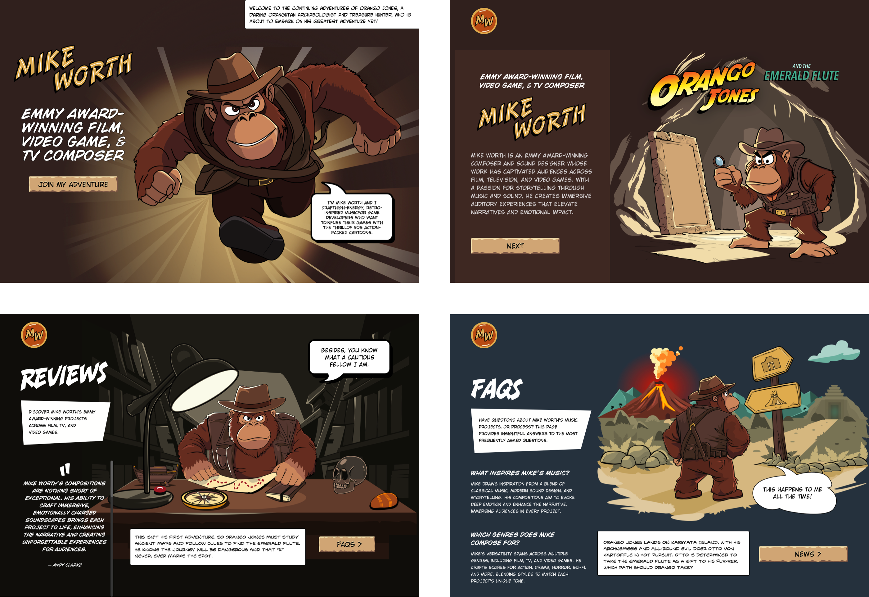
I’ve mentioned before that game composer Mike Worth hired me to create a highly graphical design that showcases his work. Mike loves ’90s animation, and he challenged me to find a way to incorporate a retro style into his design without making it a pastiche. But that wasn’t my only challenge. I also needed to achieve that ’90s feel by using up-to-the-minute code to maintain accessibility, performance, responsiveness, and semantics.
Pretty much every reference to web design in the ’90s–when I designed my first website–mentions Warner Brothers’ SpaceJam from 1996.
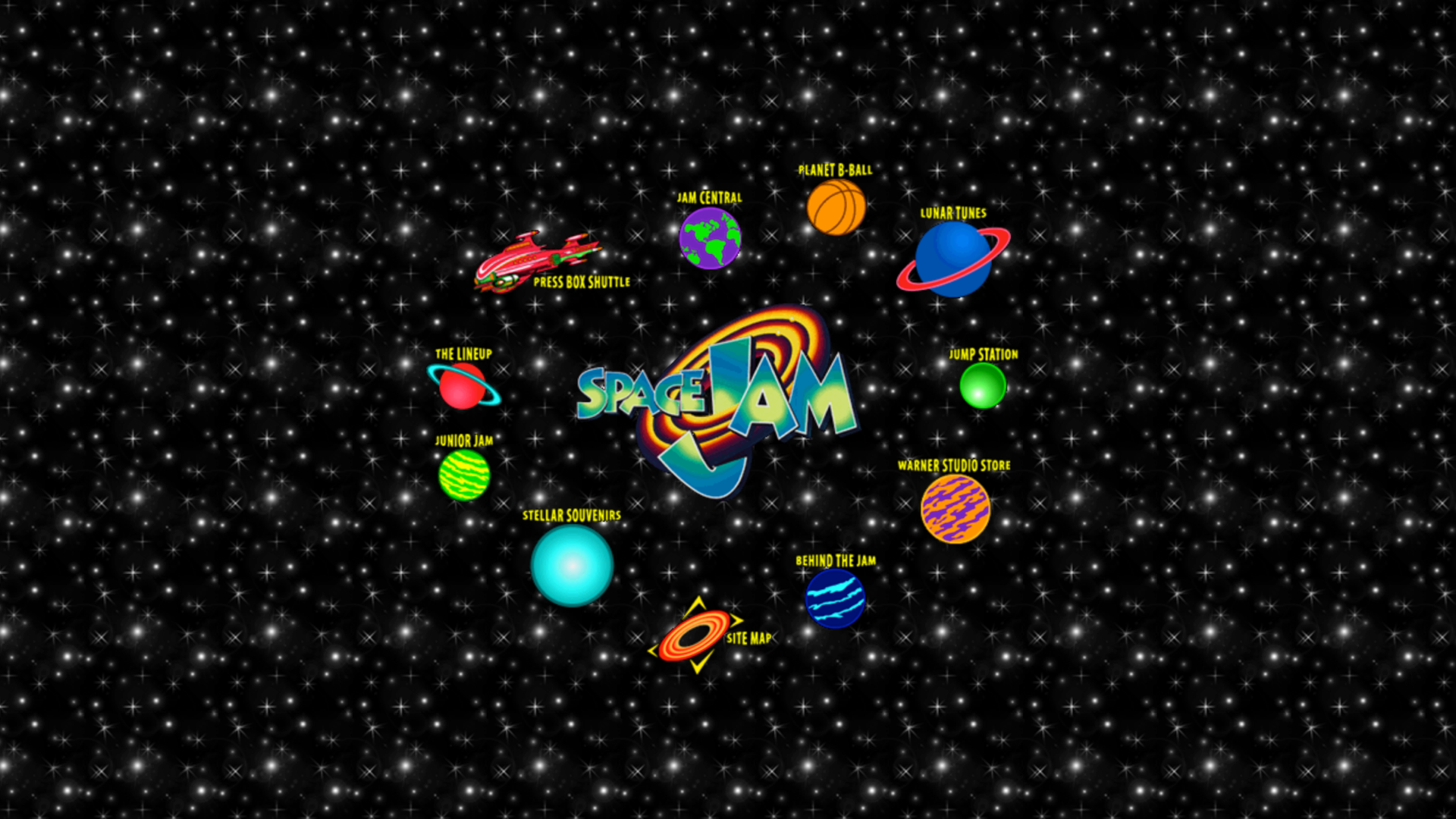
But I’m not going to do that.
Artificial colours and hyperactive design
SpaceJam was cheesy but nowhere near as much as Cheestrings from 1998, the year I started my studio.
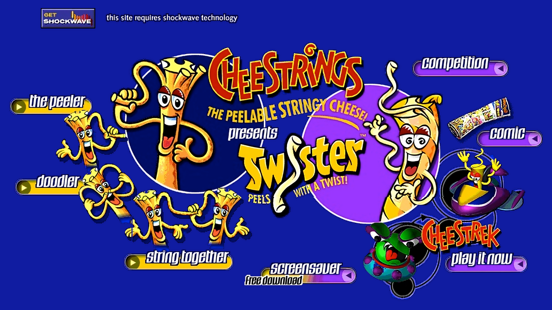
This Cheestrings homepage is what we’d now derisively describe as a splash screen. It had no real content or navigation–just clickable graphics. Its layout was fixed at 723 pixels, small by today’s standards but not far off a mobile screen.
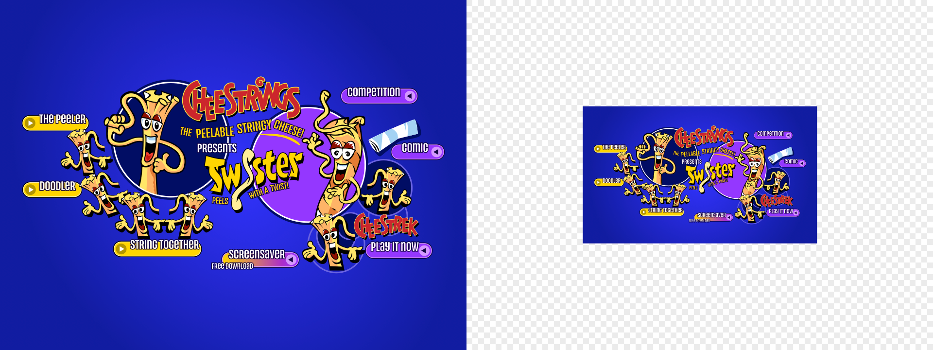
Like many heavily branded designs of the time, the whole page was one big sliced-up graphic, laid out with tables. But forget the limitations for a moment: Cheestrings was pure fun. The design was playful, colourful, and full of character. Navigation buttons orbited the mascots in a circular pattern, echoing the brand’s mischievous energy. The sunken buttons, deep shadows, and twisty typography gave it energy and depth.
Like the brand, the Cheestrings home page was (artificially) colourful and hyper-energetic. But most of all, it was fun! That makes me wonder why we don’t see sites designed like this today.
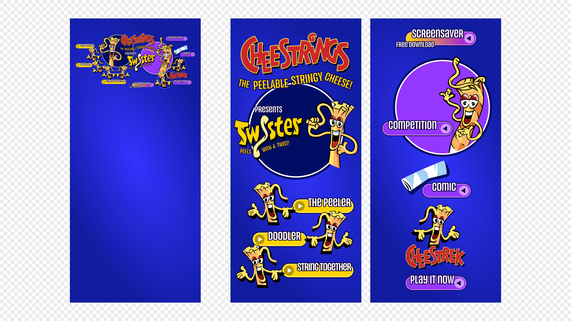
Of course, Cheestrings didn’t have a flexible layout at the time. But then, why would it have? Squeezing that design down for modern mobiles wouldn’t be clever. But what we’re now smart enough to know about making designs which deliver fabulous experiences across screen sizes.
Sure, accessibility was non-existent, but today, we know how to improve that using meaningful markup and CSS layout. Yes, text was set in images, but now, HTML text and web fonts deliver the style without sacrificing accessibility. Load times could be excruciatingly long, but since then, SVG illustrations animated with CSS or JavaScript have eliminated that problem.
So when a brand demands a design which is as engaging and fun-filled as Cheestrings, one which breaks with convention and uses design to tell its story, there really is nothing to stop it.
Giving me Goosebumps
Goosebumps was a children’s horror series in the '90s. I can’t say I remember watching it, but I do remember being haunted–in the best way–by its gloriously garish website.
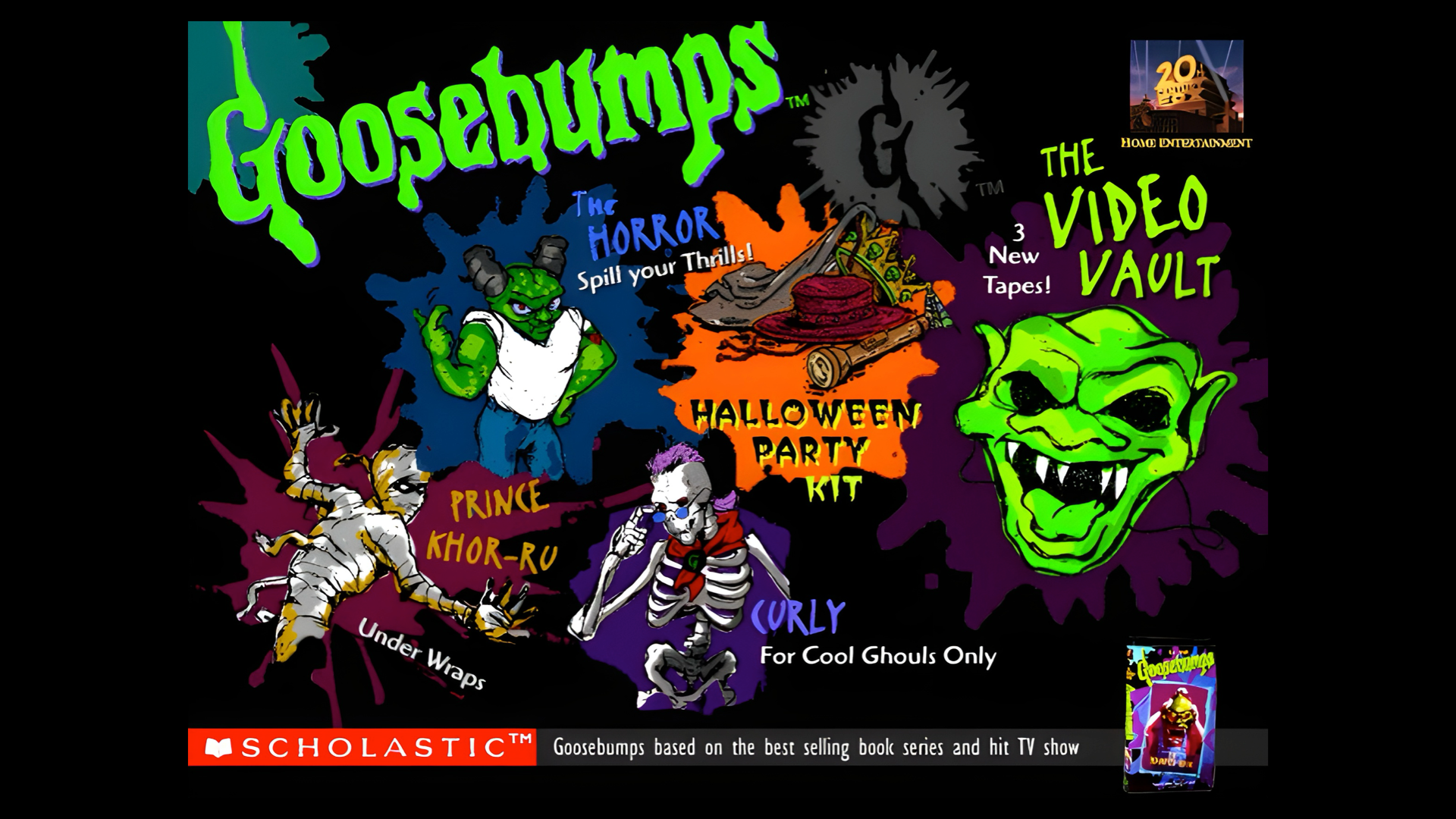
Before those ubiquitous full-width header images bewitched web designers, websites frequently included banners that combined branding with navigation. The Goosebumps banner attracted attention with its neon colours–set against a dark background–and hand-drawn character illustrations. Its navigation to The Video Vault, Under Wraps, and Spill Your Thrills created a fun-filled narrative. And its mix of theatrical type styles gave its typography an energetic style that reflected the Goosebumps brand.
Yes, that text was set using images without alt text, and no, that wasn’t very accessible. Screen readers struggled, and keyboard navigation was non-existent. But today, we have ARIA, semantic HTML elements, SVG, and web fonts to create similar experiences without compromising accessibility. Most importantly, we know how much accessibility matters and what we should do to improve it.
Modern design, in contrast
Fast-forward to today, and the predominant design style looks very different. It’s cleaner-looking and flatter, with more whitespace. Typography looks more refined, and there’s often a clearer hierarchy. Thanks to the rise of mobile, websites are more accessible, frequently faster, and almost always responsive, something we couldn’t have imagined during the ’90s.
However, a generation of designers has learned to rely on frameworks and platforms. They’ve been taught that a good design fades into the background and makes content and functionality someone’s focus. They’ve been brought up performing research, creating user journeys, and making endless usability tests to shape someone’s experience.
The web has matured as an industry and a platform. But in solving those early problems, we’ve also lost some of the web’s early spark. Today’s sites are safer–but often, they’re also duller, less expressive, and ultimately less memorable.
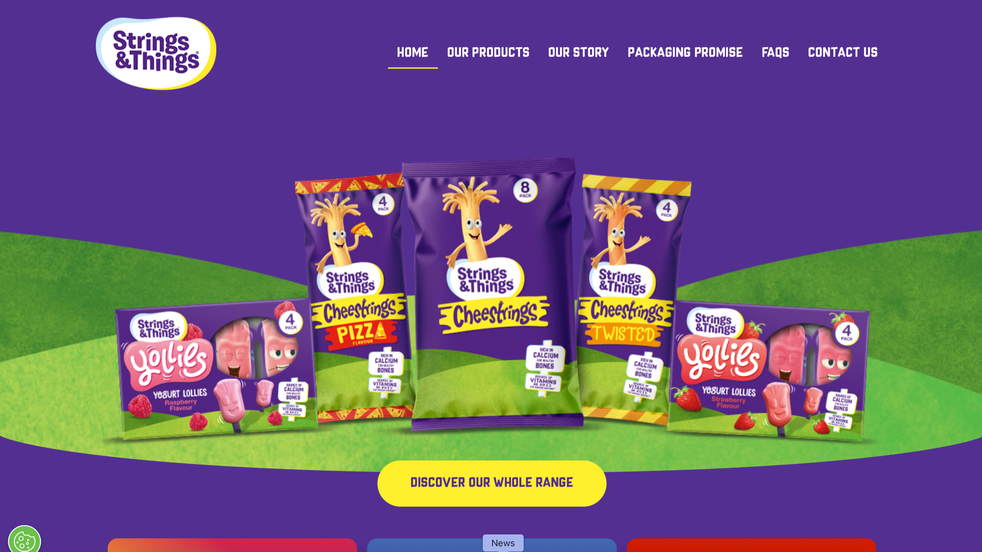
Cartoon Network doesn’t just have an unbelievable catalogue of characters; they have an almost unimaginable source of visual material to draw from. But, despite this incredible variety, today’s UK Cartoon Network website lacks the originality and personality of its sites from the ’90s.
With its symmetrical layout of content cards and scrolling panels, Cartoon Network’s home page is neatly arranged but instantly forgettable. It’s like a library full of stories. It offers plenty for someone to explore but nothing that begs them to turn the page.
Today’s Cartoon Network layout is conservative and conventional. But, in 1998, it was a terrific example of how early websites could be filled with content without appearing chaotic or cluttered. Colourful blocks looked hand-placed and more like a patchwork than a grid, with sections stitched together with angled lines and almost no padding or spacing. It used clickable cartoon character images, novelty fonts and text effects, and sticker-style graphics so that no two sections looked alike.
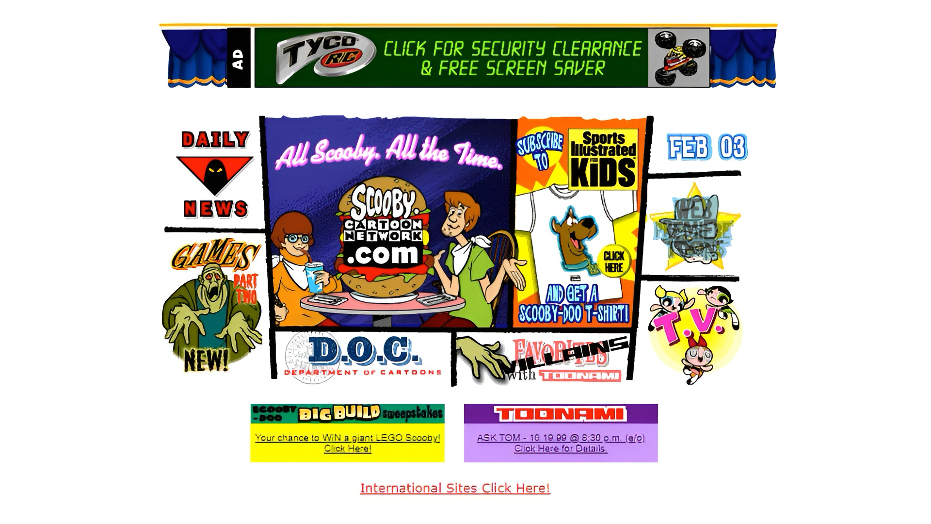
Which brings me back to Mike Worth and the designs I made for his website–the perfect excuse to bring a bit of the ’90s back to life.
I love to hide Easter eggs in my client work, and Mike’s project was the perfect opportunity to reimagine the Cartoon Network layout from the era Mike loves so much.
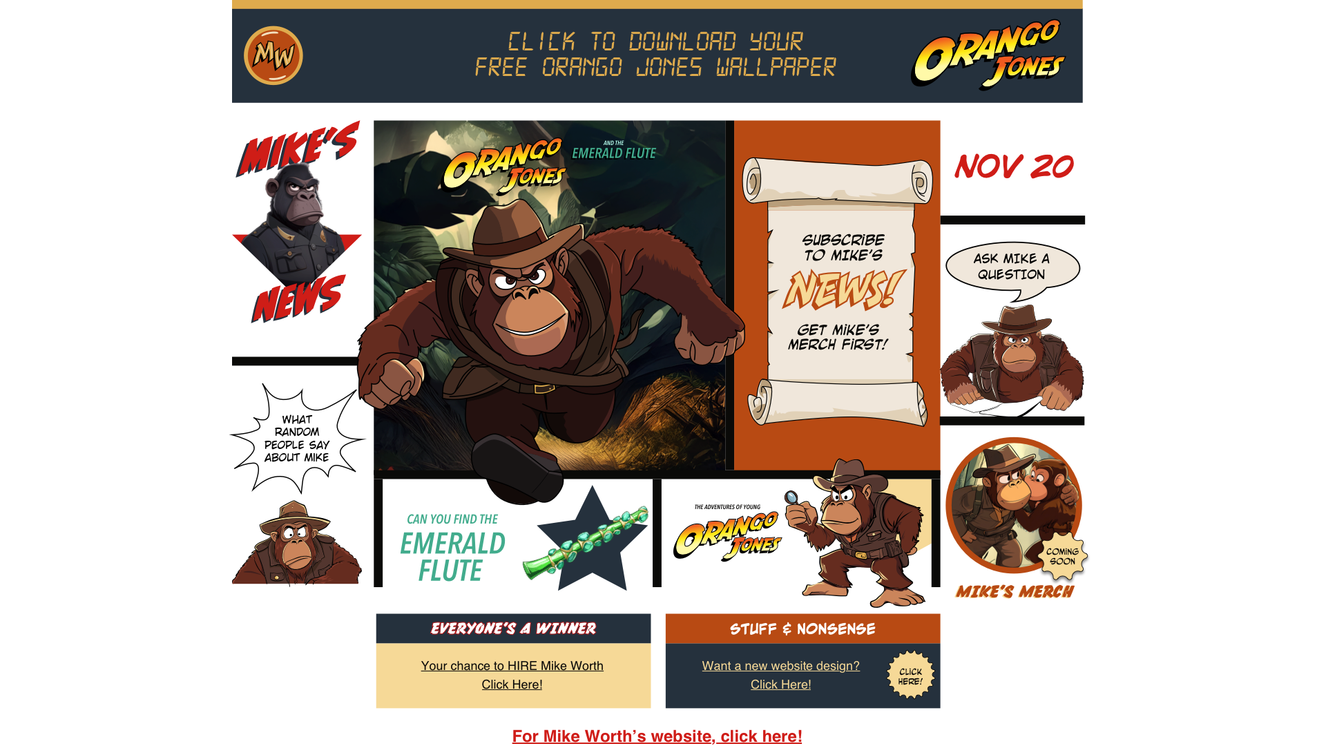
Back then, the original homepage was just a 642-pixel-wide image, sliced up and dropped into table cells. For a moment, I was tempted to do the same. But I wanted to show how far we’ve come–and how modern tools can recreate that retro feeling without sacrificing performance or accessibility.
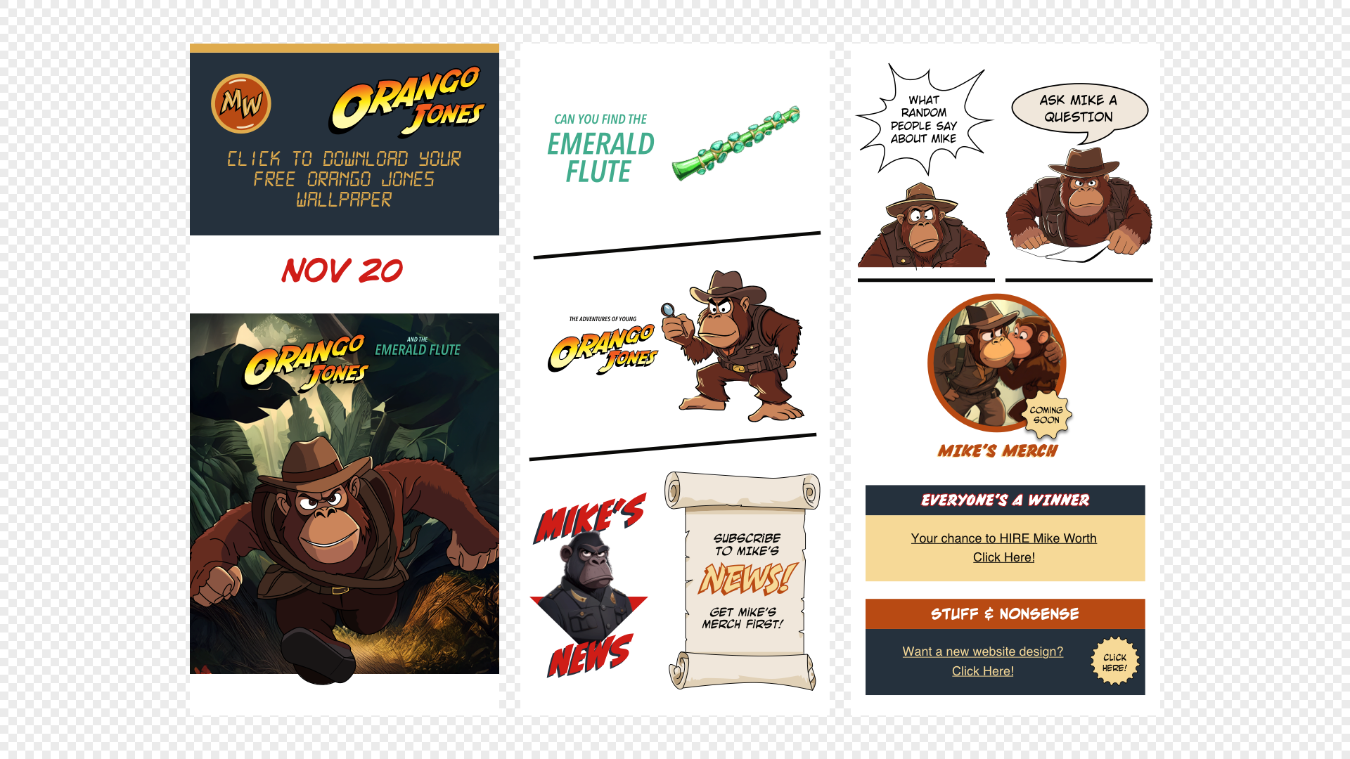
Reboot the retro
Web design today is more polished than ever–but in all that polish, we’ve smoothed out a lot of the personality. We’ve traded quirks for conventions and spontaneity for systems. And while there’s no denying the importance of accessibility, speed, and structure, it’s also worth remembering what made the early web so engaging.
Those neon colours, jagged layouts, and pixel-perfect oddities weren’t just products of technical limitations–they were expressions of creativity unburdened by rules. They were joyful. Surprising. Fun.
So, let’s design pages that invite people to explore, not just scroll. Let’s create experiences that don’t just work–but stick in someone’s memory. The past doesn’t need to be a blueprint–but it can still be a brilliant source of inspiration.