RSPCA rebranded, but does its website make the best use of its new look?
In my latest Design Chatter video, I talked about how the RSPCA rebranded and asked if its website makes the best use of its new look. Here’s a written version of that, plus the full versions of my redesigns.
Charities, NGOs, and non-profits are among my favourite clients. I’ve been fortunate to work with Greenpeace and WWF, to name a couple. In both projects, I used storytelling to engage the audience and encourage them to support the charity. I find this balance between creative direction and user-experience design fascinating.
The RSPCA rebrand
One of my favourite charities is the Royal Society for the Prevention of Cruelty to Animals (RSPCA.) This year, the charity unveiled its first rebrand in 50 years, marking its 200th anniversary. The work was done by London-based branding agency Jones Knowles Ritchie (JKR.)

The previous RSPCA logotype was tightly tracked and trapped in an octagon. The new logo uses a custom typeface called Wilberforce Sans, designed exclusively for the RSPCA by type foundry Studio DRAMA and inspired by protest signs they found in the charity’s archives.
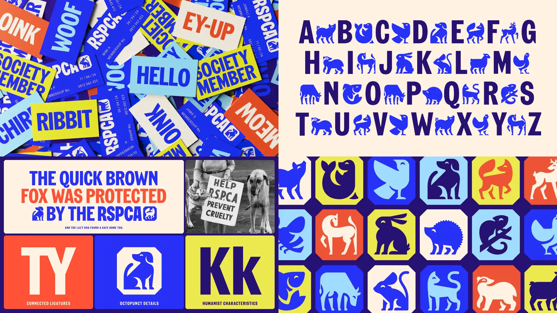
Its tracking is now open, and JKR cleverly kept the octagon for the period in the logo and used it again for the animal icons, which blend beautifully with the style of the brand typography.
The RSPCA has always been associated with blue, but JKR introduced a brighter, more saturated Swallow Blue plus a suite of supporting colours, with names like Butterfly Blue, Fox Red, Lizard Green, and Rabbit White.
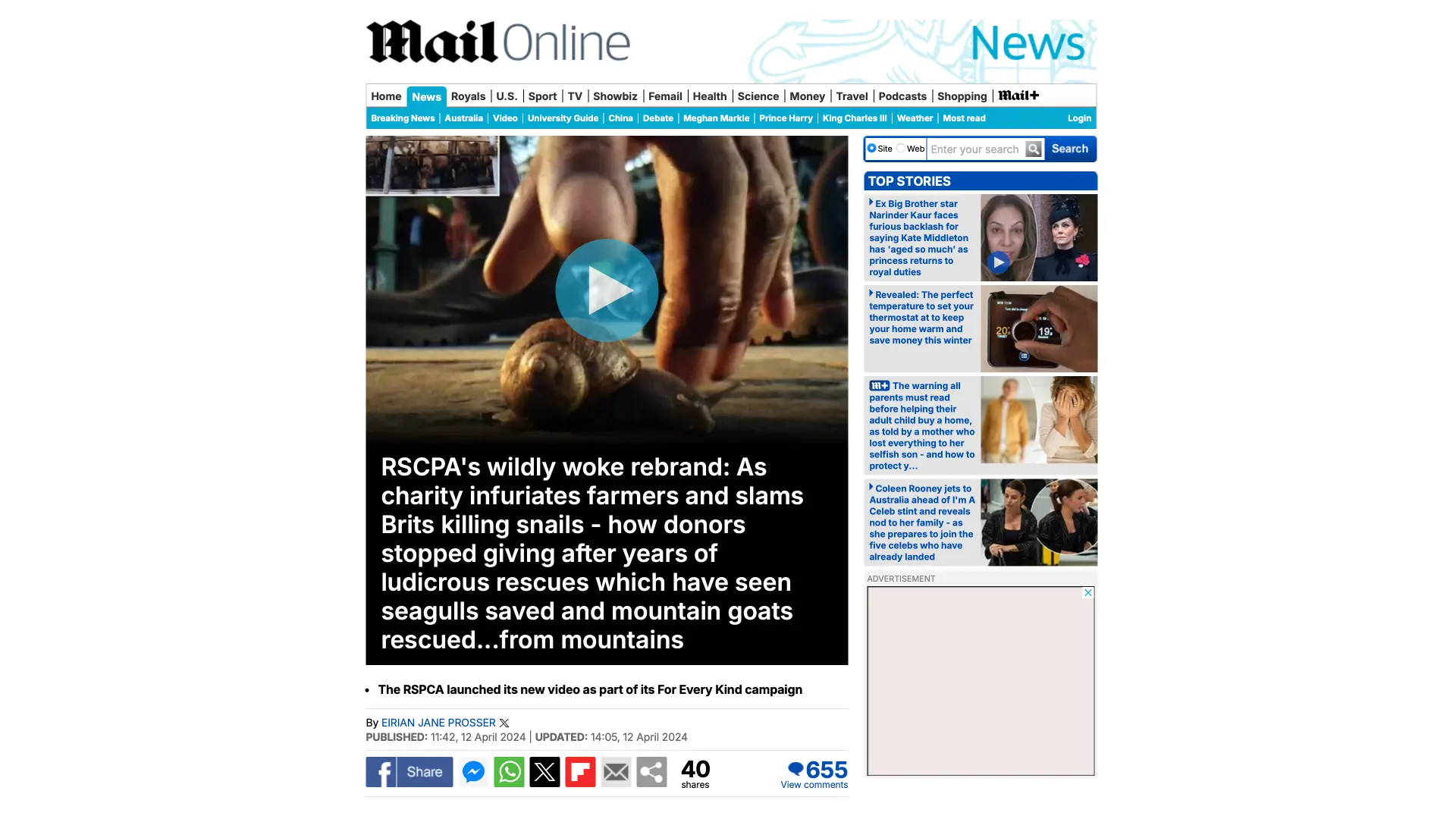
Rebrands are often controversial, and The Daily Mail described the RSPCA’s rebrand as “wildly woke.” However, I was keen to see if JKR’s distinctive design translated to the RSPCA’s website design.
(Here’s a spoiler. I didn’t.)
What’s up with the RSPCA website?
Sadly, although the RSPCA’s website design includes all the elements designed by JKR and Studio DRAMA’s Wilberforce Sans, the implementation leaves plenty of room for improvement.
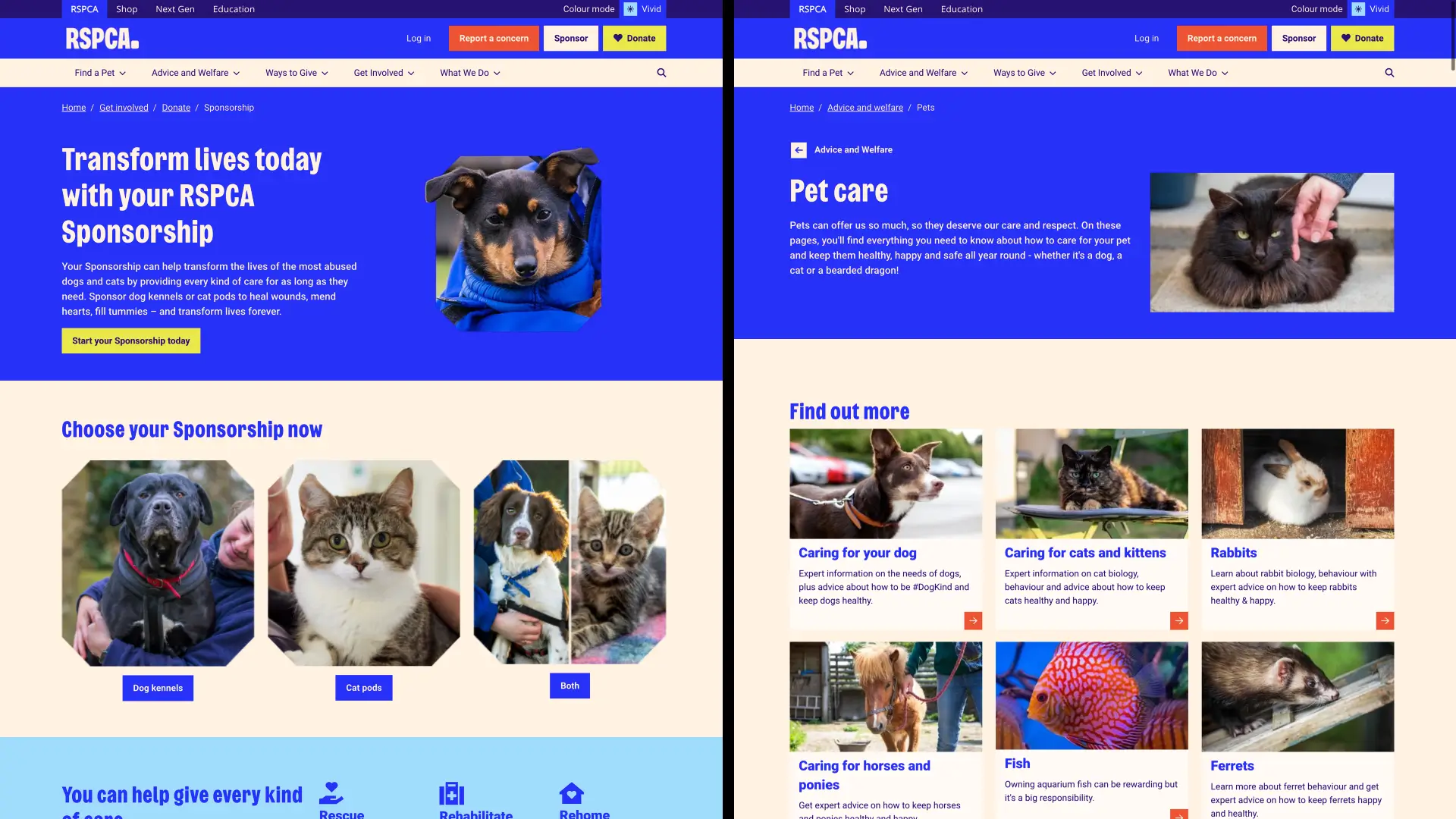
What’s up with the RSPCA website? Well, despite its boldness, the RSPCA’s new typeface plays only a supporting role. The bulk of their typography is carried by Roboto–one of the intentionally least characterful fonts anyone can choose–designed by Google for its products and available free from Google Fonts.
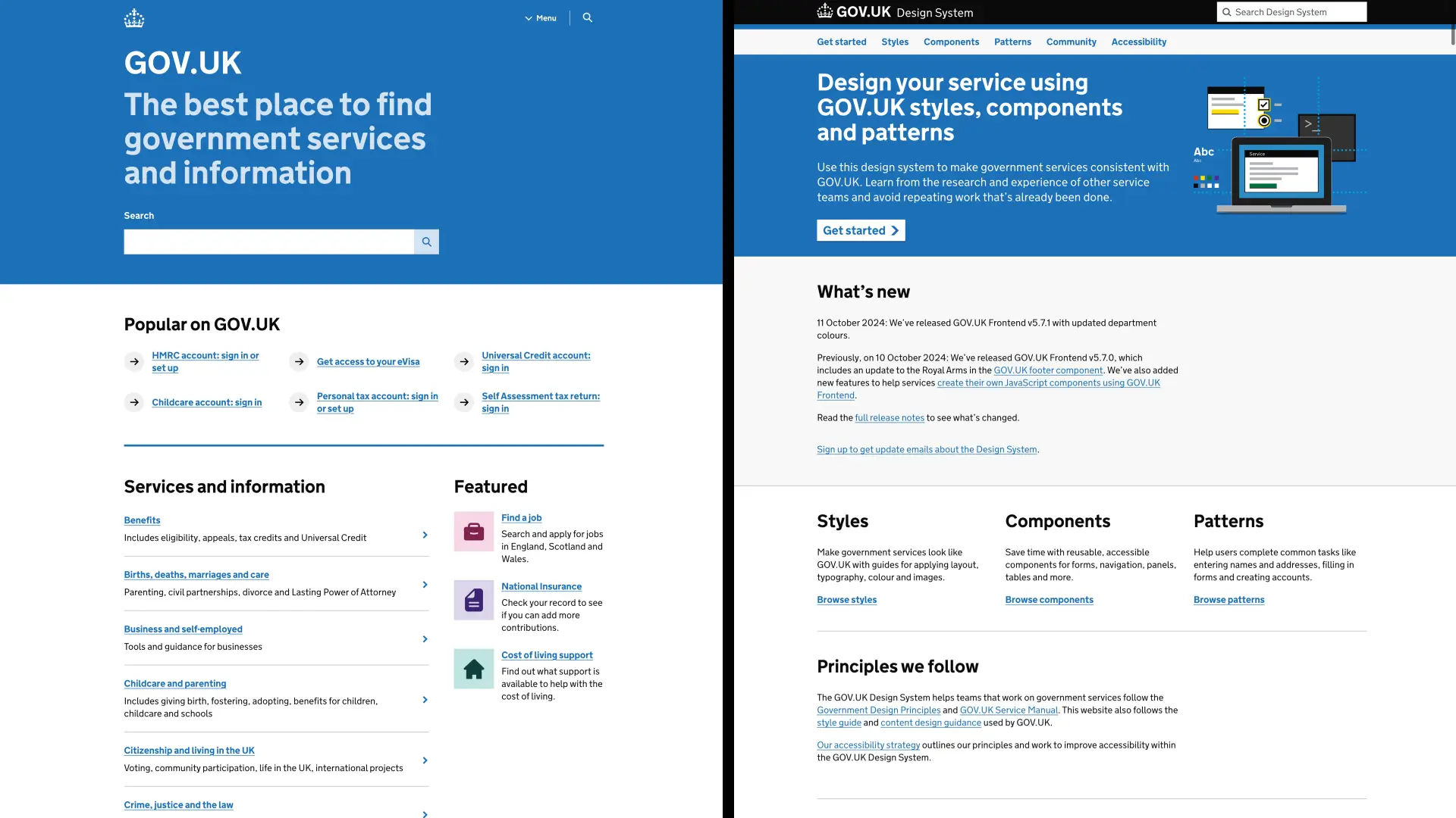
Then there’s the website’s layout. With its generic 12-column grid, ubiquitous full-width banners, and two-, three-, and four-up components, it bears more than a passing resemblance to GOV.UK, a website hardly known for its flair for storytelling.
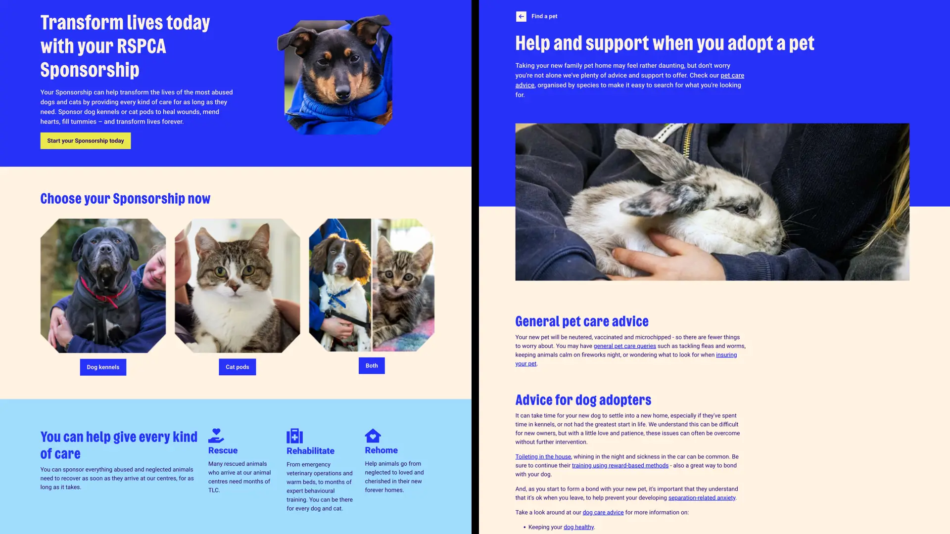
Its index pages lack hierarchy, and its article pages lack cohesiveness, which results in an unfocused reading experience.
I was especially interested in these charities’ story pages, which should be designed to draw readers in, capture their imaginations, tug on their heartstrings, and encourage their support.
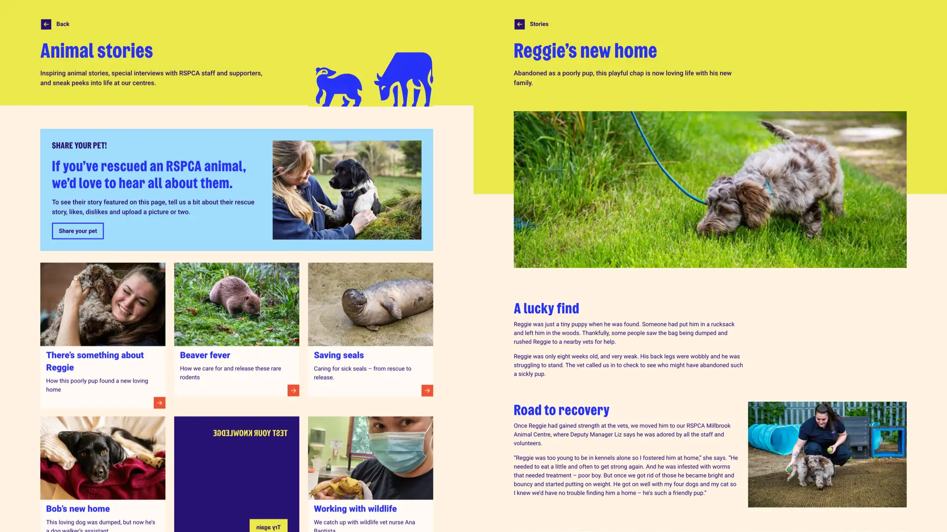
The RSPCA stashes its stories in the Next Gen section, implying they’re primarily for younger readers. However, the cookie-cutter content cards on the index page do little to capture anyone’s imagination, and the article layout is anything but engaging.
Look, I mustn’t come down too hard on the RSPCA. This lack of originality is hardly unique. Browsing other animal charity websites reveals the same generic layouts and components.
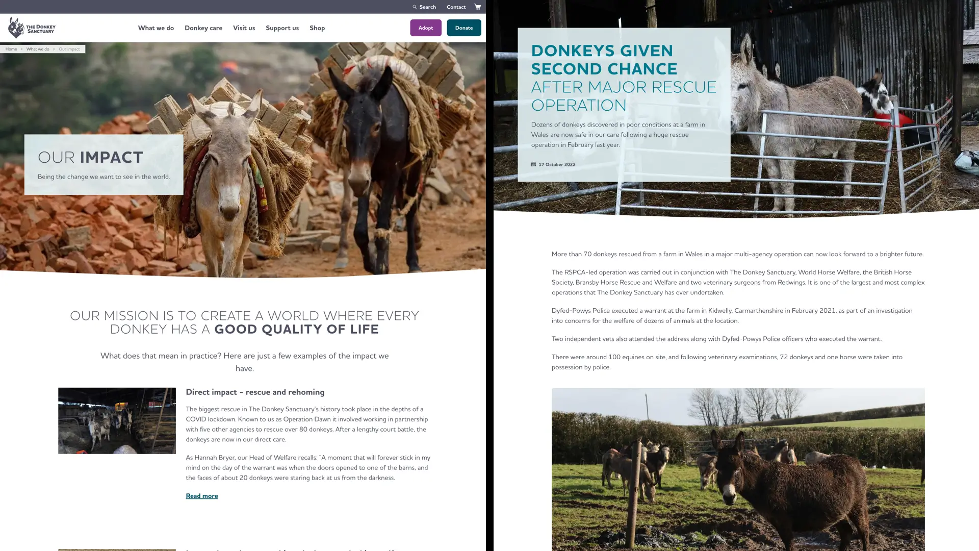
The Donkey Sanctuary’s full-width banner and left-right lock-ups can be found on countless websites. Single columns are many designers’ standard solutions to solving responsive design challenges, but these long lines of text combined with exaggerated paragraph spacing produce a particularly unpleasant reading experience. That’s hardly helped by the seemingly randomly placed images interrupting the copy flow.
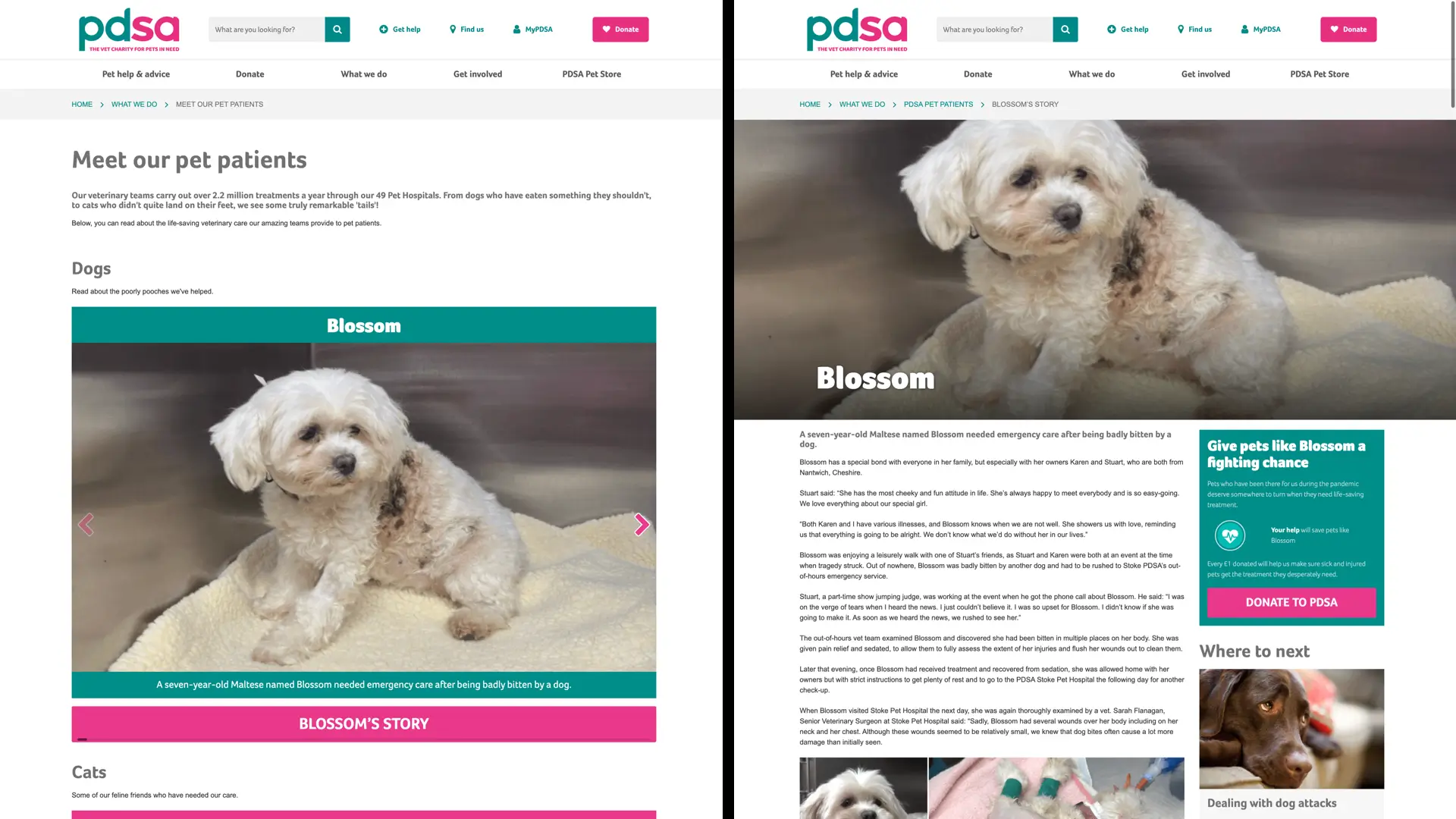
Sadly, things are not much better at The People’s Dispensary for Sick Animals, where the pet patient stories start on a seemingly unstructured index page. Its single-column full-width images and text are stacked to form a scrolling skyscraper. Without a hierarchy of headlines, blockquotes, or, in fact, any typographic design, the PDSA’s article pages do little to tell their stories through type. It’s a problem I frequently find when clients add content to their CMS without it being designed to tell an engaging story.
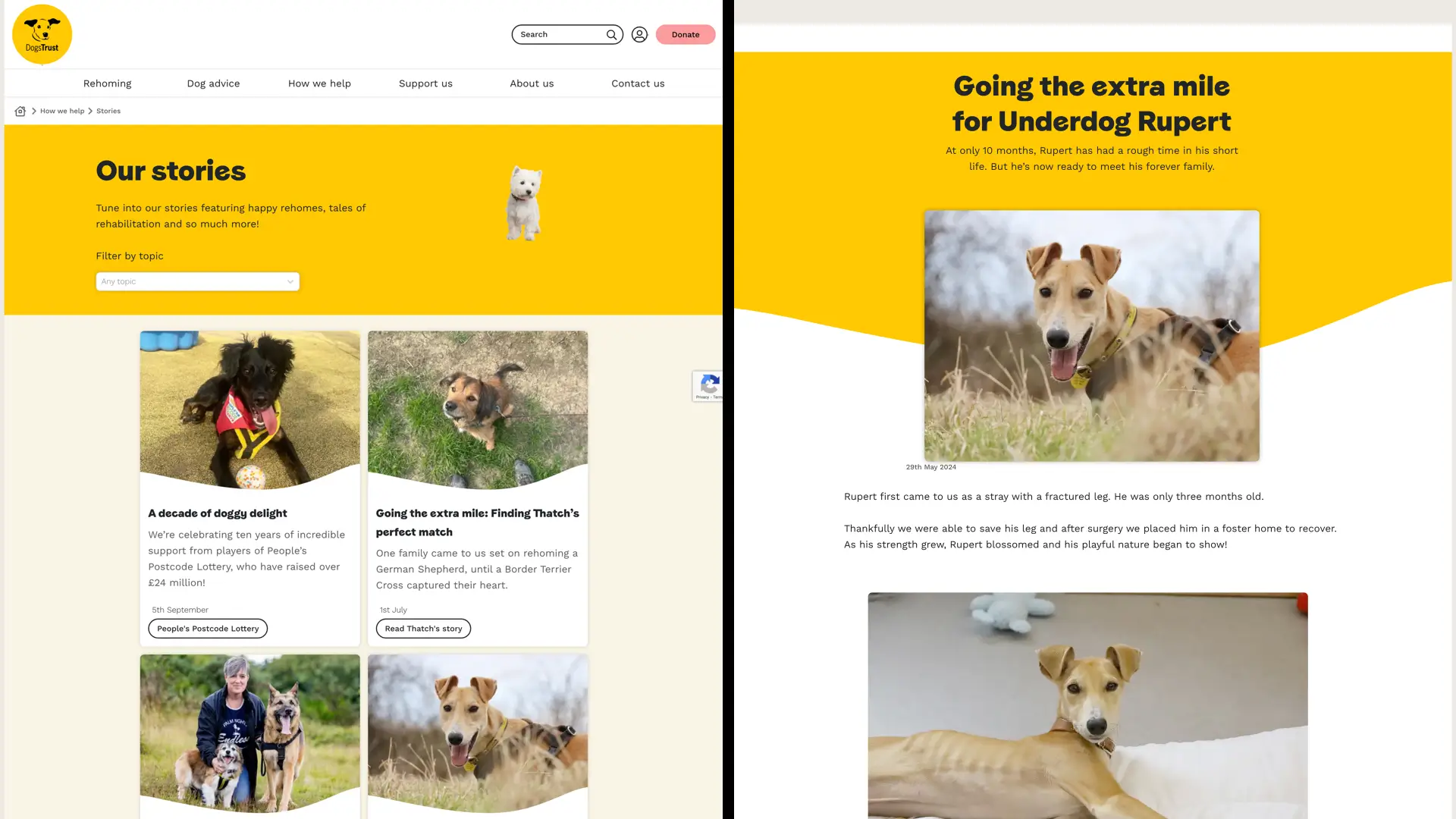
Stories on The Dogs Trust website start with a yellow-branded panel, which introduces but is otherwise detached from the rest of the page design. There are 70 stories in their archive, but this index page shows just six, stacked two up in cards. I’d put money on only the most diehard doggy lovers going further than this initial page. Except for its blockquotes, The Dogs Trust article pages are absent any actual typographic design and, just like the PDSA, full-width images and text are stacked to form a single-column scrolling skyscraper.
Look, I get it. Frameworks and templates make web design easy. Conventions often mean there’s no incentive to design something distinctive. Designing systems for non-designers who input content is challenging, and maintaining it in the long term is even harder. Been there, done that. But honestly, is this the best we can do?
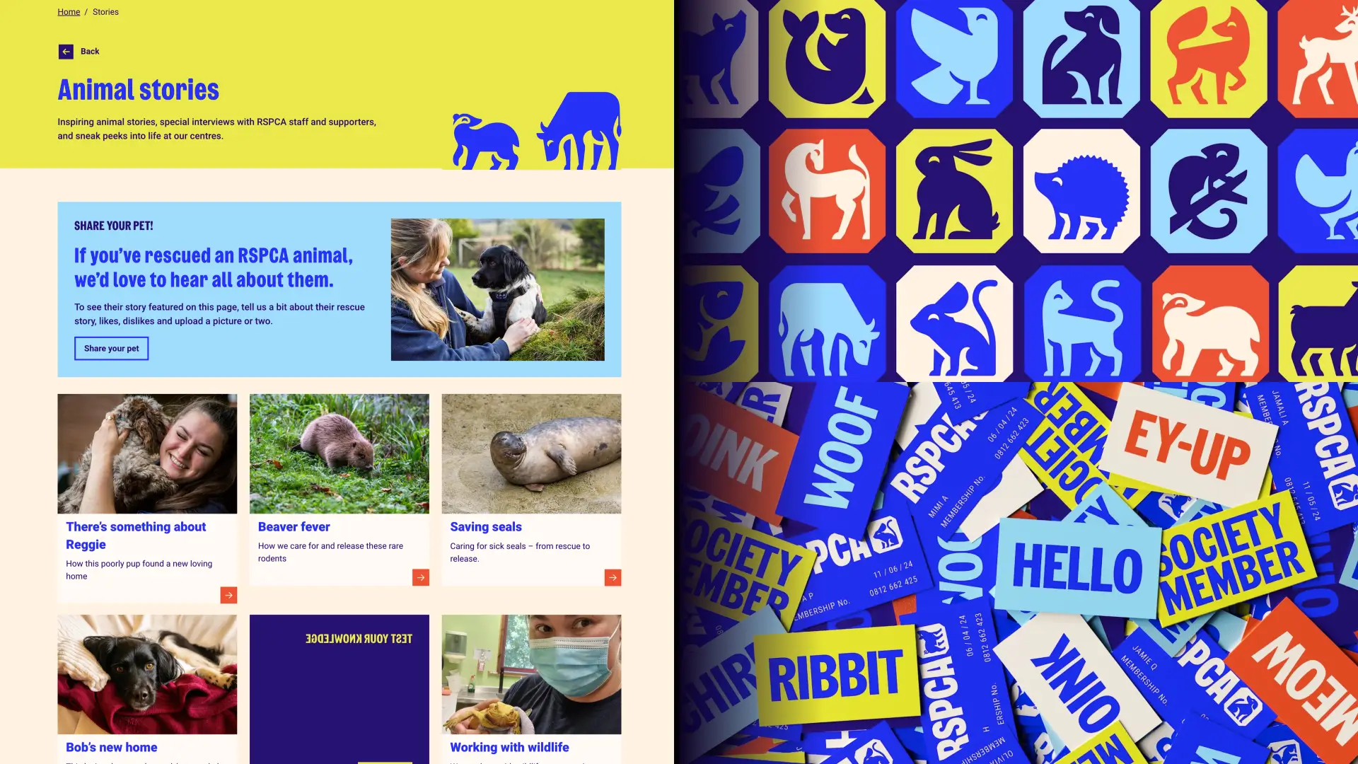
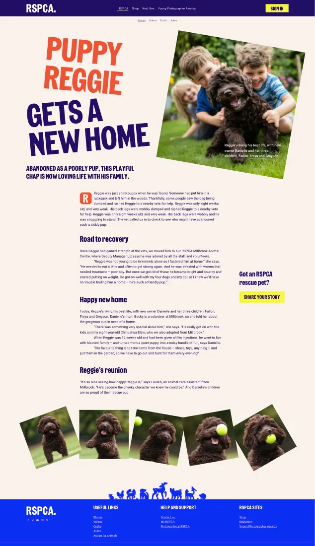
Back at the RSPCA, their story pages have all the ingredients of a sensational story design. JKR’s colour palette and graphics are present, and The Wilberforce Sans typeface evokes those protest placards which inspired the rebrand. But there’s literally nothing else in this design which contributes to that narrative.
I challenged myself to redesign RSPCA stories
How would I approach this project if the RSPCA called Stuff & Nonsense? How could I improve their website design and get the most from JKR’s rebrand work? I challenged myself to redesign their stories using their content, images, and graphic assets and keeping their colours and typefaces the same.
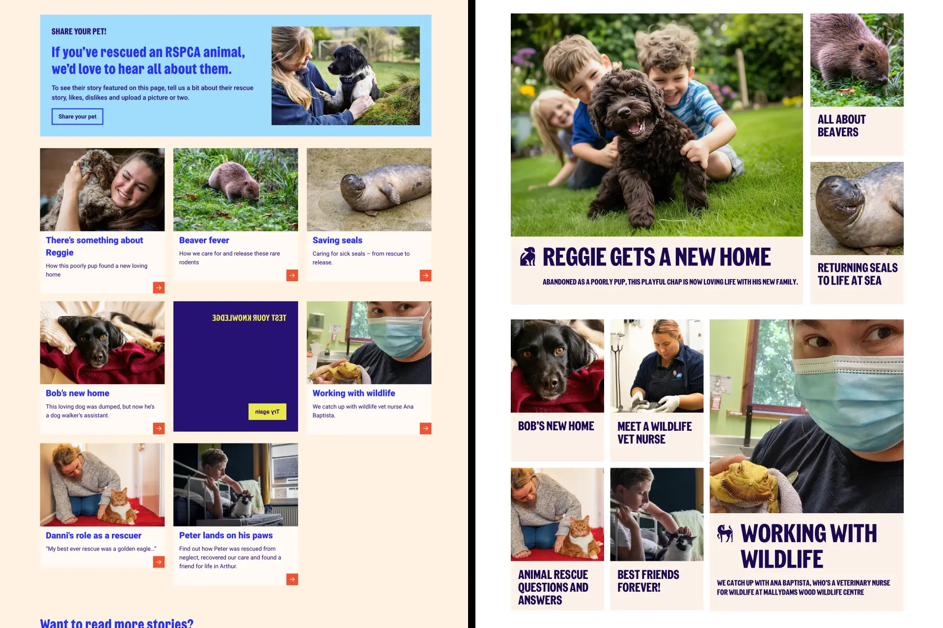
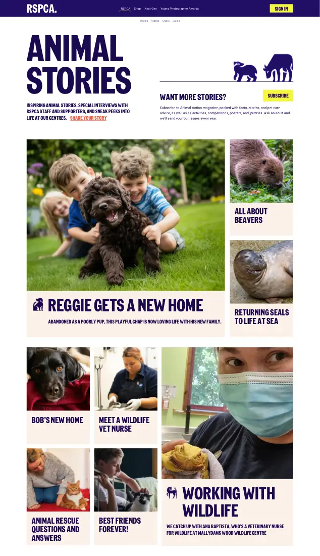
The RSPCA’s stories index page contains three rows of three columns. But while this creates the appearance of structure, it doesn’t deliver a hierarchy, tell people which are the most important or recent stories, or suggest which story they should read first.
The modular grid
I replaced this arrangement with a modular grid and used module size and a typographic scale to add hierarchy and structure. What’s a modular grid? Modules are rectangles or square units, and modular grids arrange them horizontally and vertically.
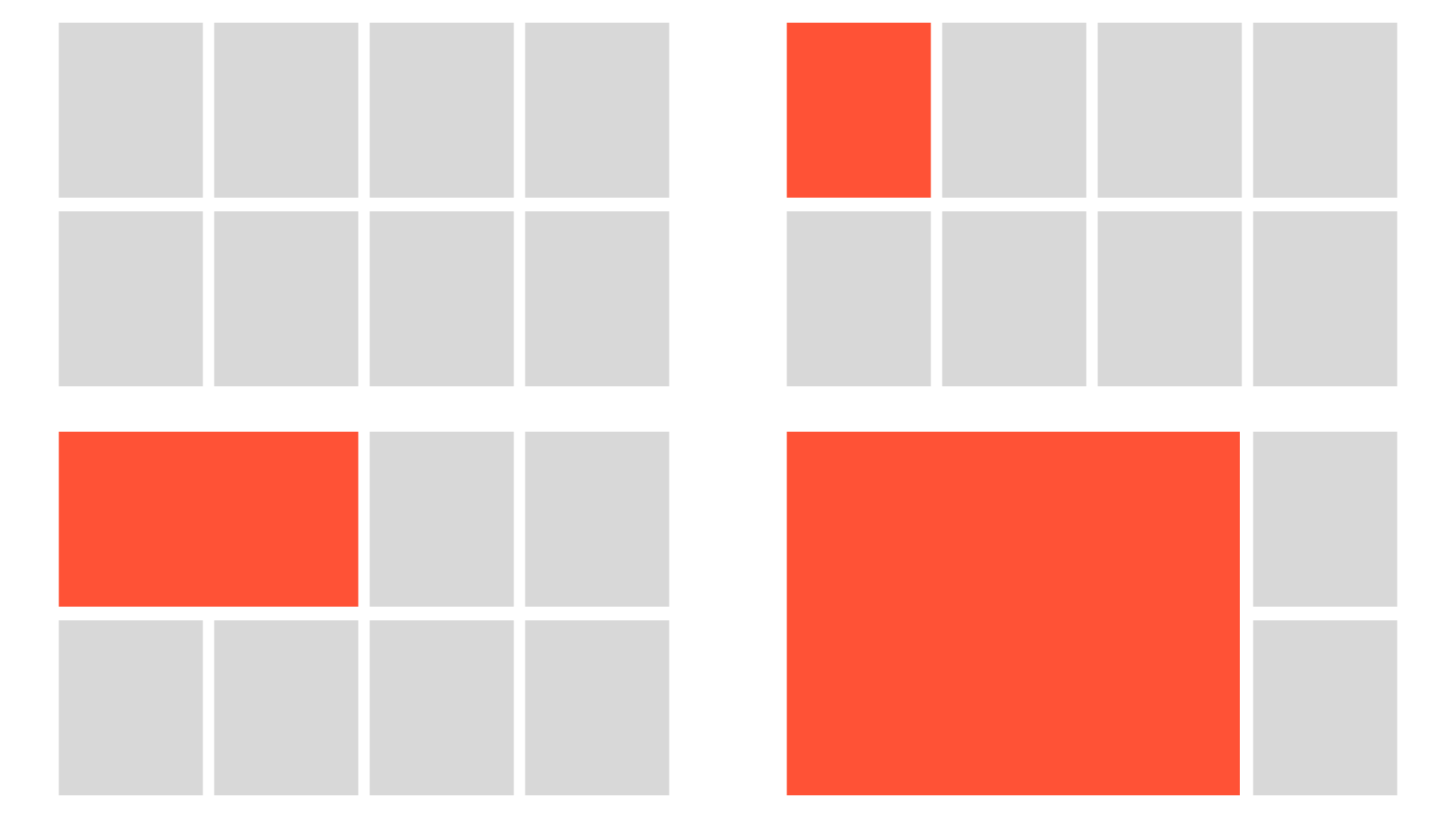
I can use each module independently or combine them to form what is known as a “spatial zone.” Devoting more space for content using spatial zones creates a hierarchy, with the largest units at the top and progressively smaller units further down.
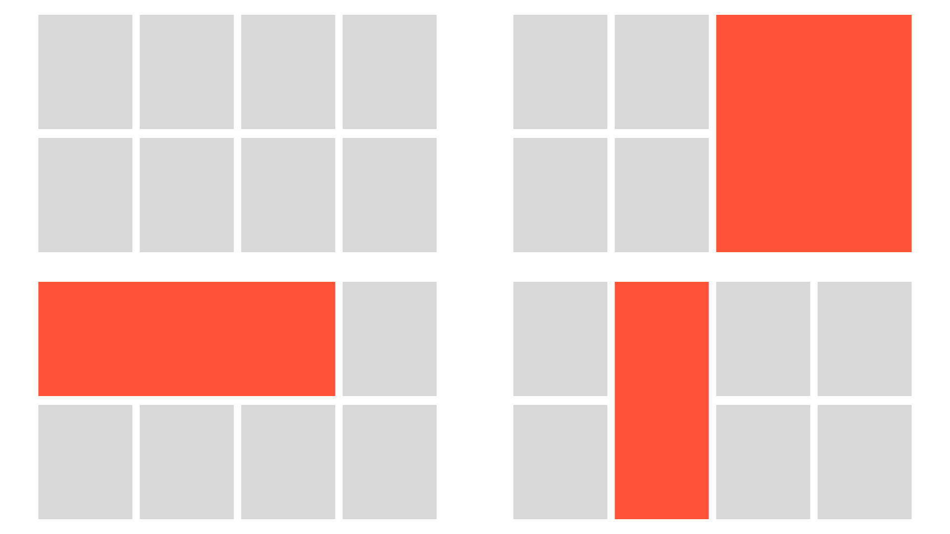
I can make more exciting compositions and add rhythm to a design by incorporating wider or taller spatial zones.
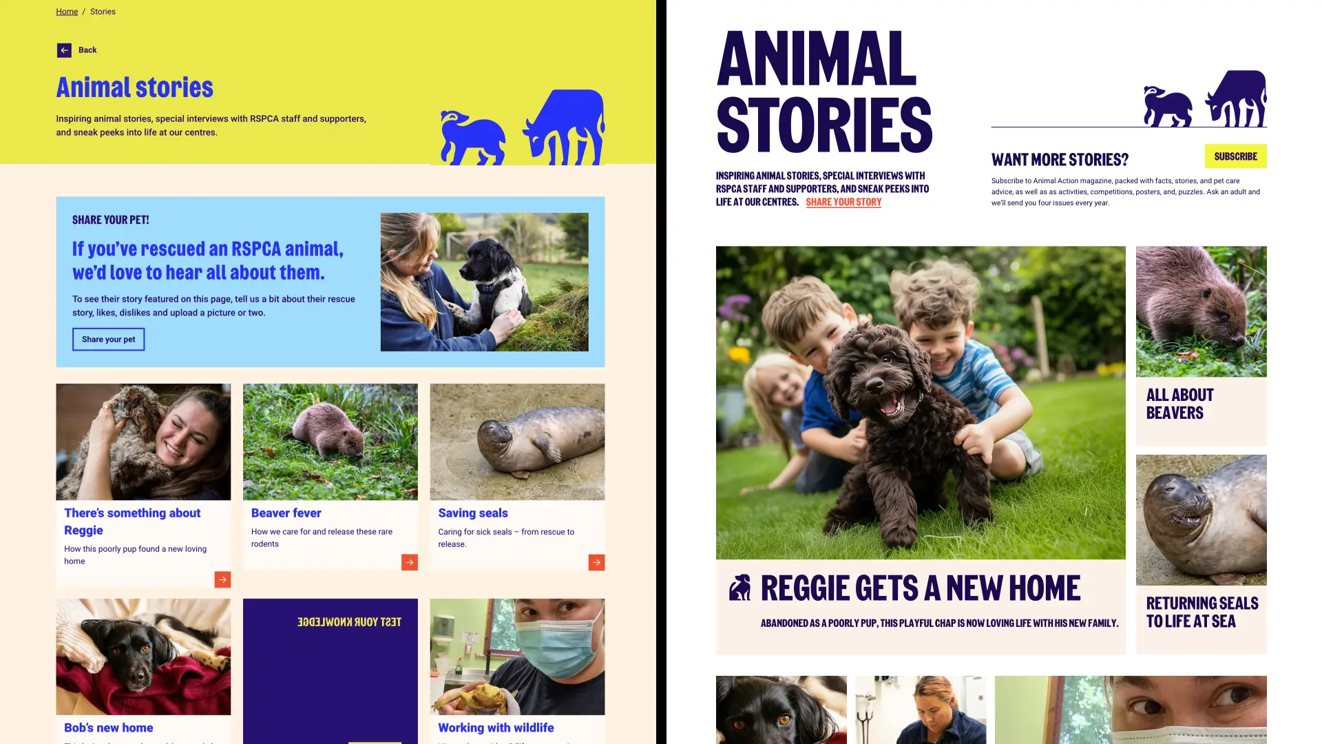
I removed the introduction’s yellow background and incorporated the magazine subscription to integrate that section into the composition. Without a background, the eye can wander more freely towards the stories’ grid.
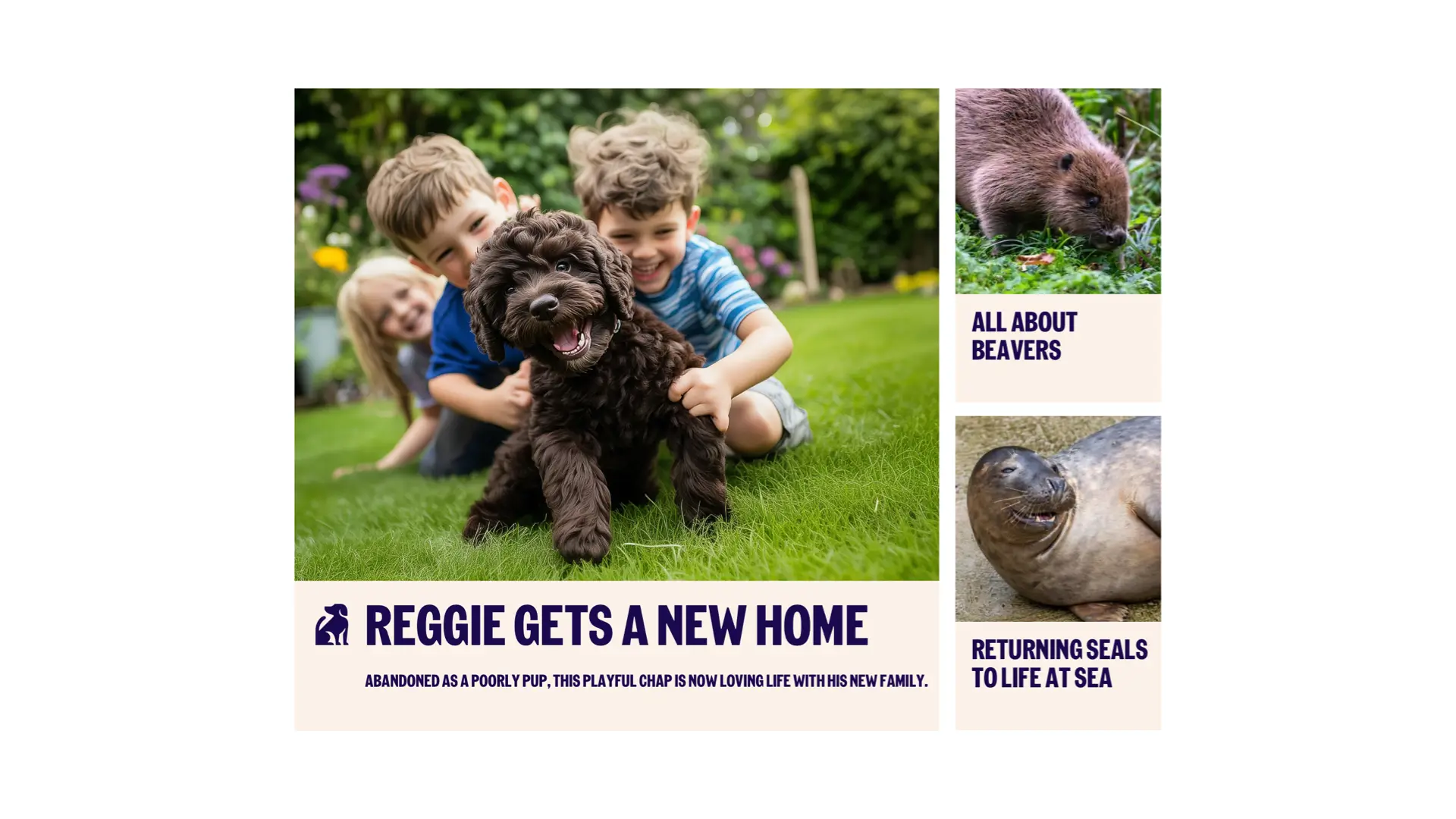
Most stories in this grid occupy a single module, but “How Reggie the Puppy Got a New Home” is the most-read story in this collection, so I set it in six of the eight columns in that upper field to create the largest spatial zone. Reggie’s story is at the top of the hierarchy, so I should only use this pattern once per page. Articles about beavers and seals–neither as cute as puppies–sit neatly alongside.
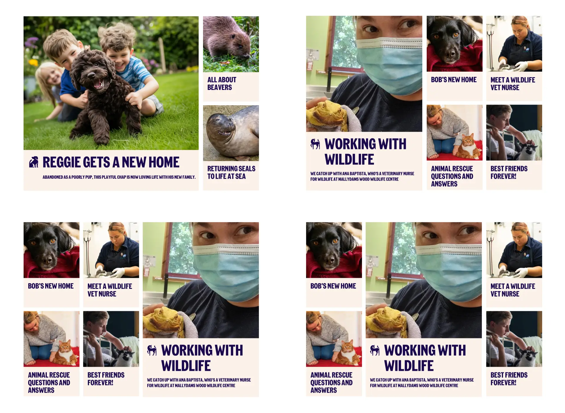
Other spatial zone sizes can define their stories’ place within the hierarchy, so second-level stories occupy four of the eight columns in this field. I can vary the position of the larger story, putting it on the left, on the right, or in the centre to create an interesting flow as the reader scrolls down the page. The article order was unclear in the original RSPCA design, but this redesigned layout uses its modular grid to define a hierarchy. It looks orderly and structured, but most importantly, it feels intentional.
Teen magazines
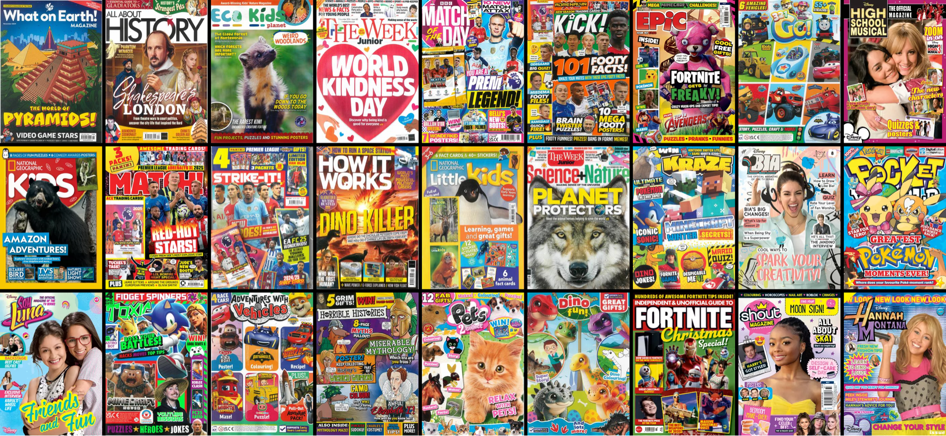
I couldn’t get out of my head that the RSPCA had organised these stories into a section intended for kids. I’m not a regular reader of teen magazines, but I have been known to pick one up on those irregular trips to the supermarket. Their covers look chaotic and crammed, but their energy is contagious.
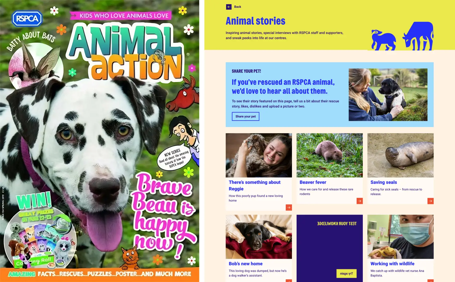
The RSPCA produces a quarterly magazine called Animal Action, which could be fun. But nothing about the current story section could be described as fun.
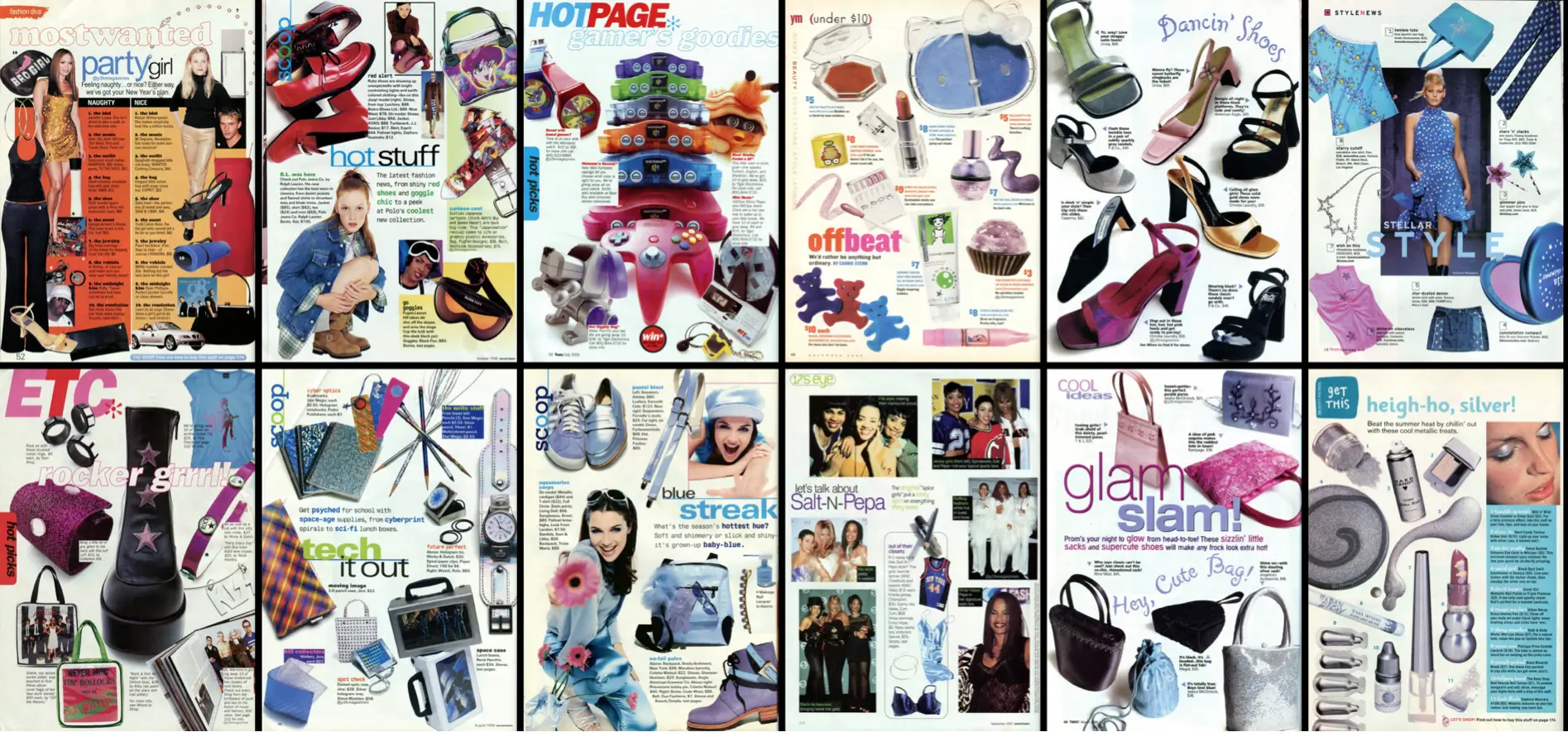
“Keeping consistent doesn’t mean things must look the same, but they must feel connected.”
Inside pages of teen magazines aren’t any less energic and frequently feel like the designers have thrown any rule book out of the window. But, how can this approach possibly coexist with the RSPCA’s visual identity? Keeping consistent doesn’t mean things must look the same, but they must feel connected. That connection might come from the colour palette, the grid you use, or the suite of typefaces. Not all of these things need to stay the same across every application, but there must be a thread that stitches them together.
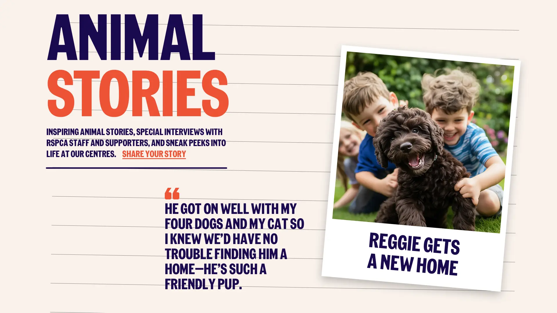
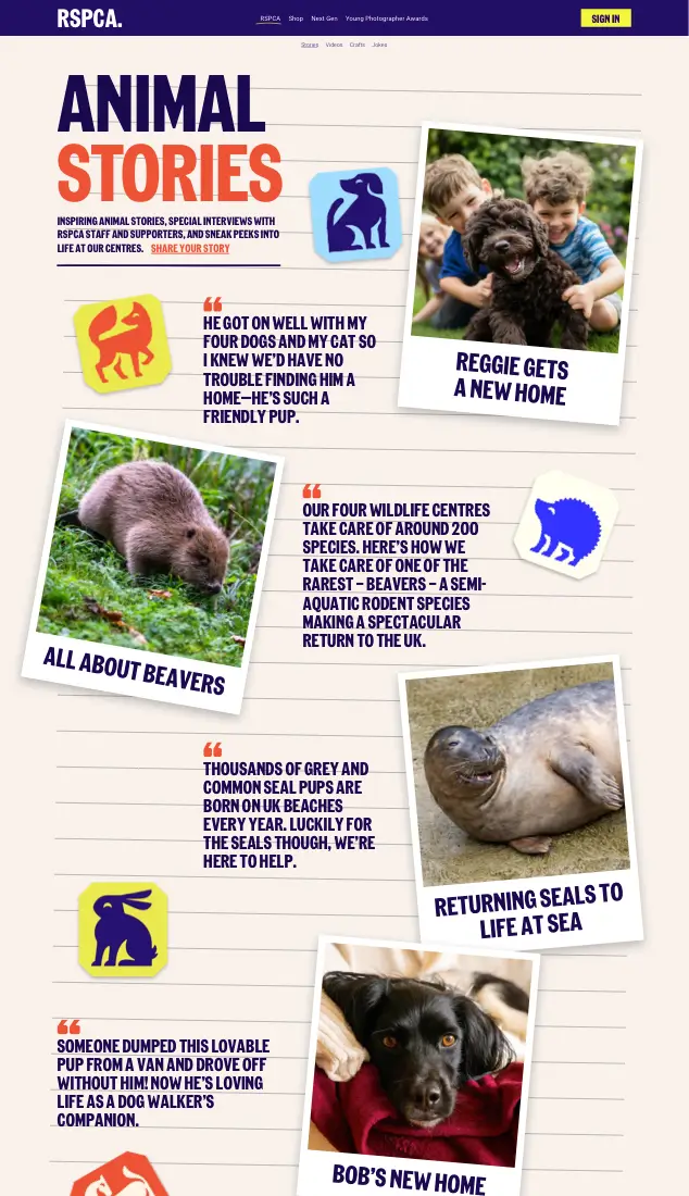
Take those content cards on the RSPCA’s stories index page. They would look more fun if they were transformed into instant photos scattered across the page. [img-38] Although the arrangement appears random, the grid still defines the placement and size of these photos and pull quotes.
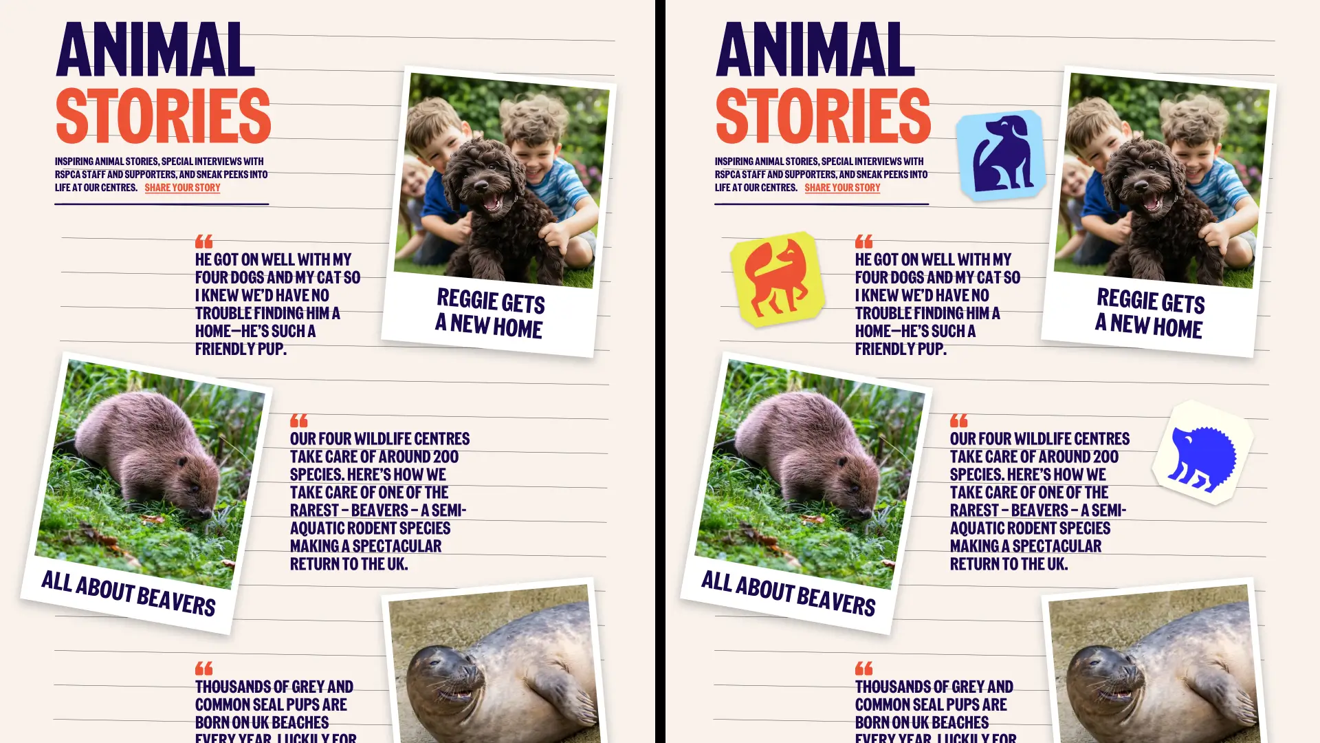
Flat colours, a lack of texture, and sharp edges have made much of the web design look two-dimensional. This is in stark contrast to magazines read by the young people who are the audience for the RSPCA’s stories. I could add lines to the background to introduce depth and then scatter the RSPCA’s new animal icons to add interest and lead someone’s eye down the page.
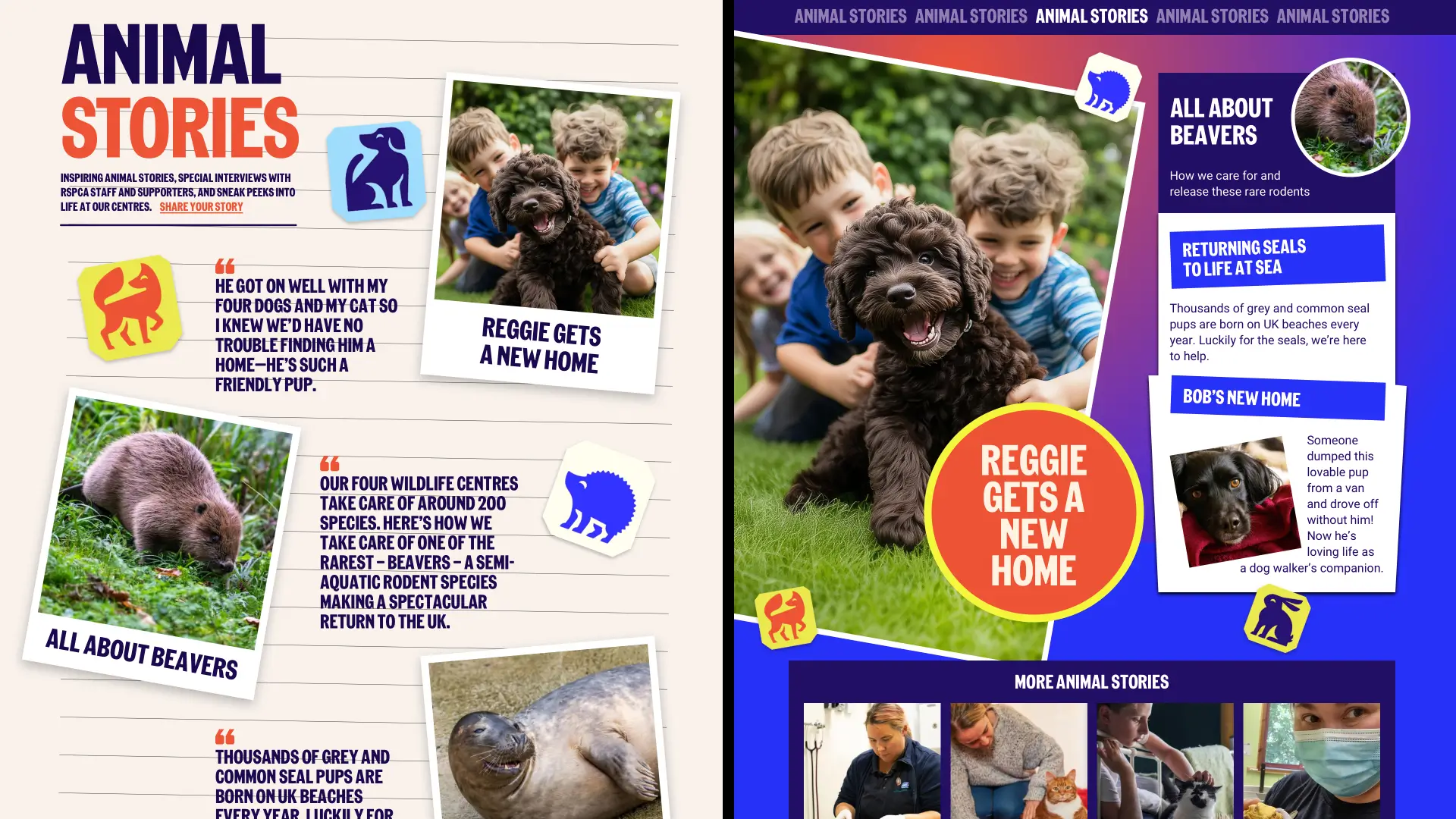
Maybe it’s their energy? Perhaps it’s because they don’t look like they follow the rules, but there’s something optimistic, even joyful, about teen magazine design. If I were responsible for inspiring young people to read RSPCA stories and possibly even subscribe to their magazine, I’d want some of that joy and optimism in my design.
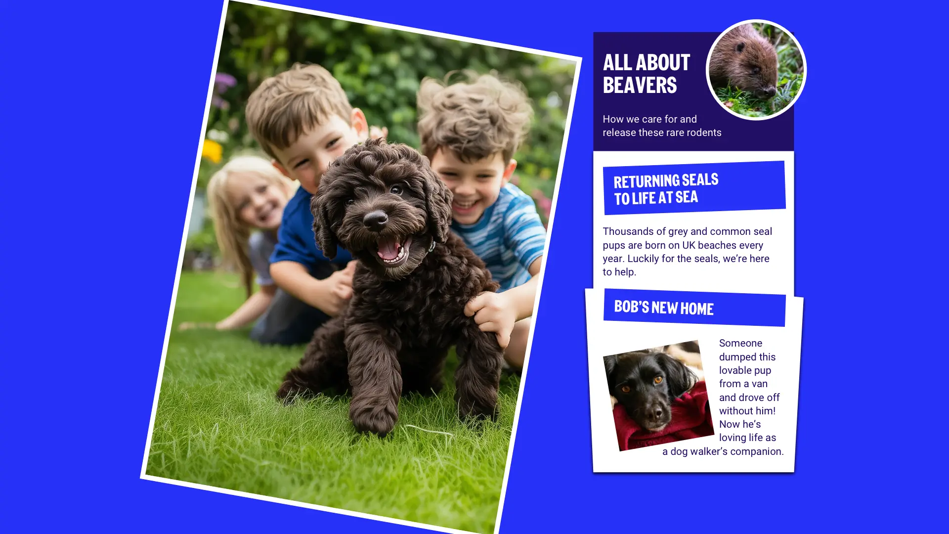
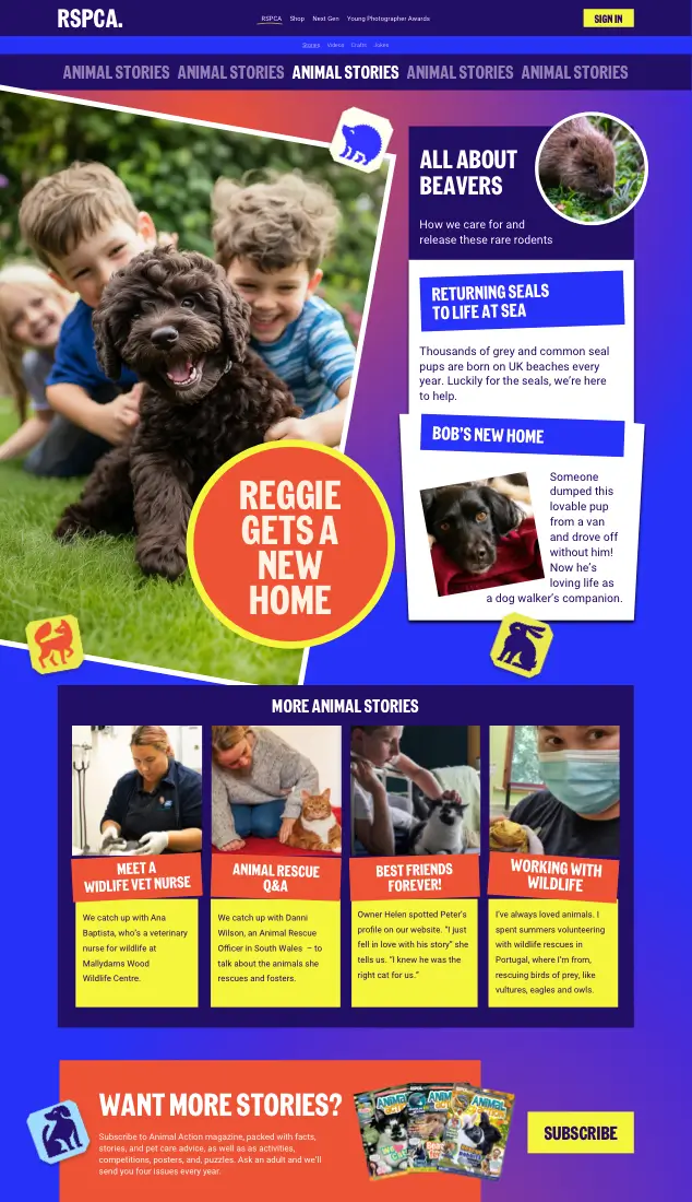
By rotating elements and using a mixture of irregular shapes, I could add energy to this design without altering the colour palette or changing the typefaces.

Layering elements–like this sticker-style headline–can add depth. Introducing a gradient background made by mixing two brand colours reduces the flatness, and scattering those animal icons gives the design an energetic feel.
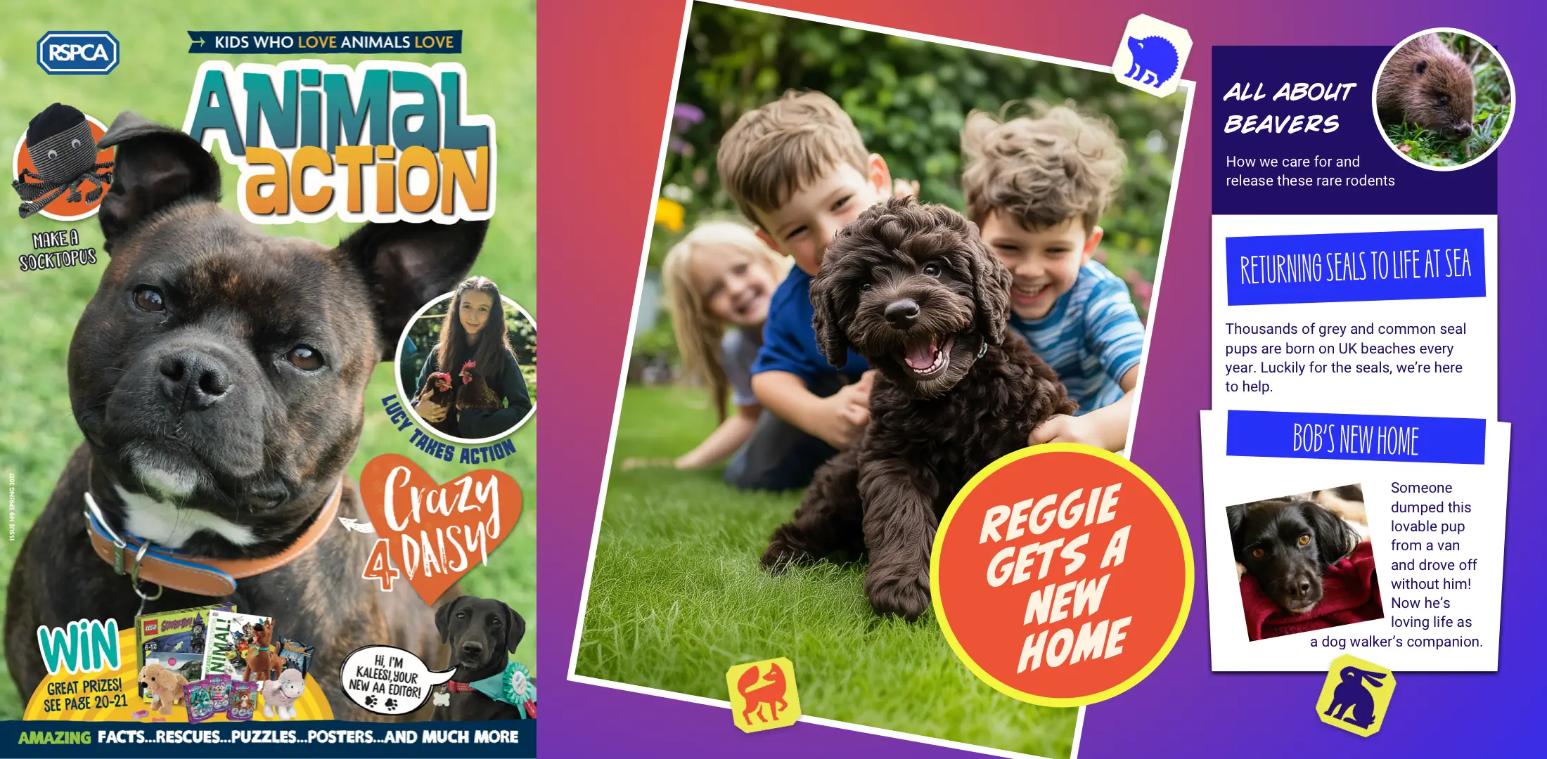
So far, I’ve stuck religiously to the RSPCA’s new typography palette, but sometimes, an eclectic mixture of typefaces is what’s needed. The RSPCA uses this approach in its Animal Action magazine, and it can instantly transform a design.
Crafting a reading experience
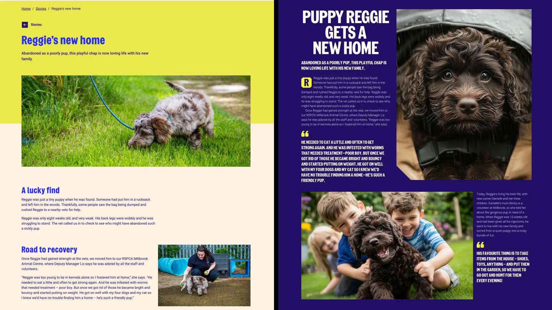
Reading an article on many animal charity websites is a thoroughly unpleasant experience, and that’s true of the RSPCA. Far from being immersive and allowing someone to settle into reading, this single column of disjointed, unstructured, and unappealing-looking text is simply off-putting.
The compound grid
Restructuring the content into sections and using a compound grid of four and five columns can transform someone’s reading experience. So, what’s a compound grid?
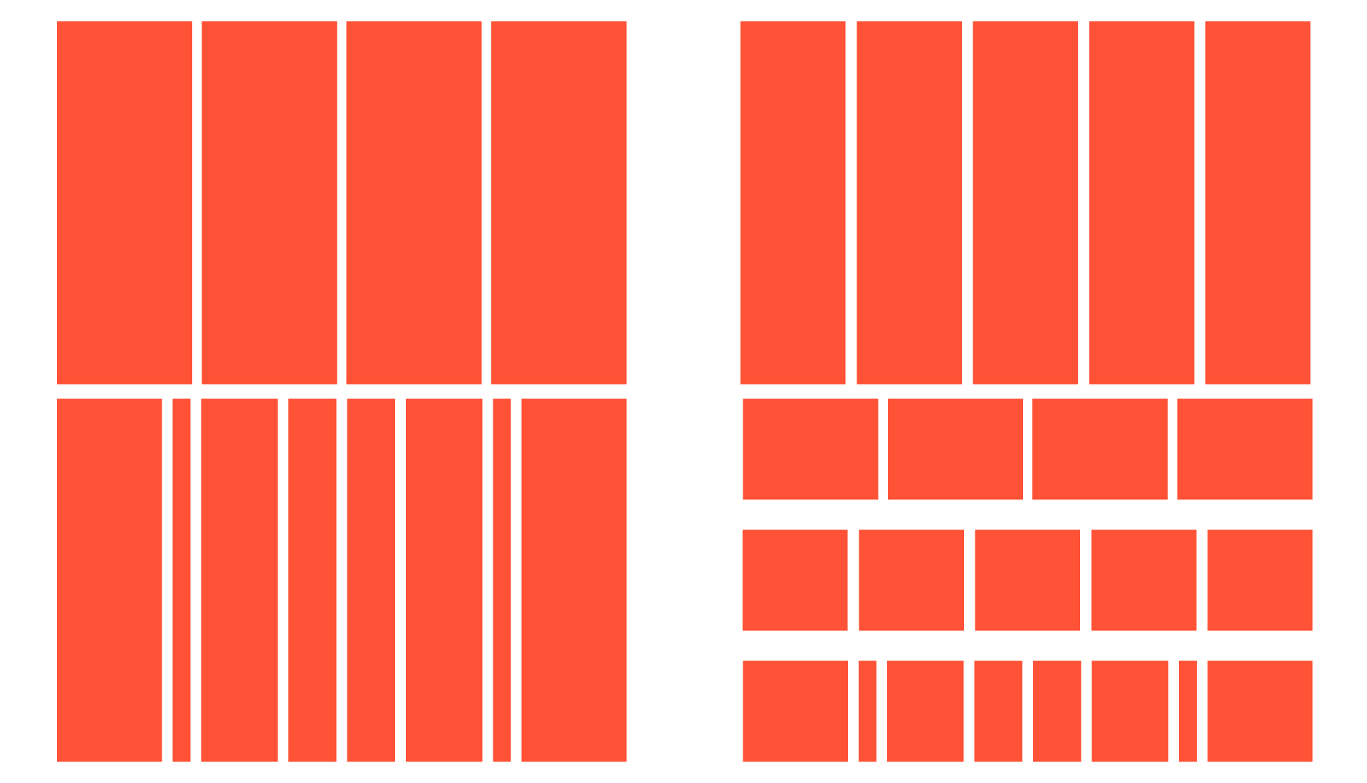
Simply put, they’re two or more grids that overlap or stack on the same page. The familiar 12-column grid the RSPCA uses gives us four even-width columns. Odd numbers of columns are less frequently used online but can be helpful, especially when it overlaps four columns, creating a compound grid with eight columns and a rhythmic pattern of 4,1,3,2,2,3,1,4.
So now I have three options for laying out the RSPCA’s content: the familiar four columns, the flexible five columns, and a combination of the two. I can use one or more of these on a page to create a variety of layout patterns that all feel connected.

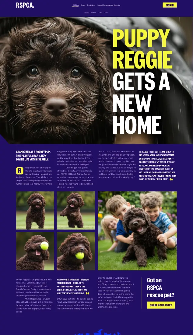
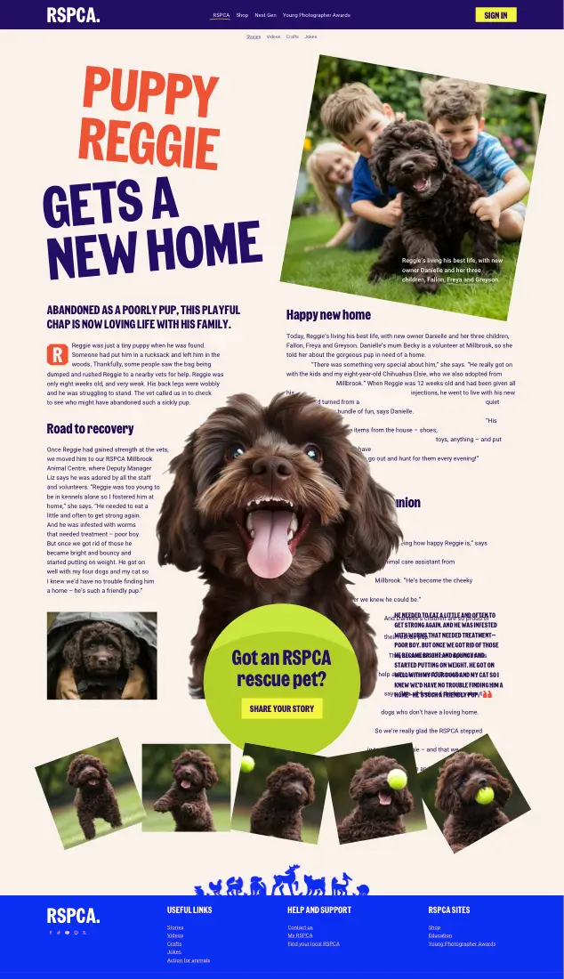
For this redesign of the story about Reggie finding a new home, an asymmetrical layout from the five-column grid adds tension to the introduction, emphasising the sad look in this bedraggled puppy’s eyes. It draws someone into Reggie’s story and makes them want to discover what happens to him.

Beneath that introduction, the balance from a four-column grid feels reassuring, just like the sight of Reggie playing with his new family.

The five-column grid is perfect for this sequence, showing Reggie chasing and catching his ball. Rotating those images and making them progressively and playfully larger injects energy into Reggie’s story.
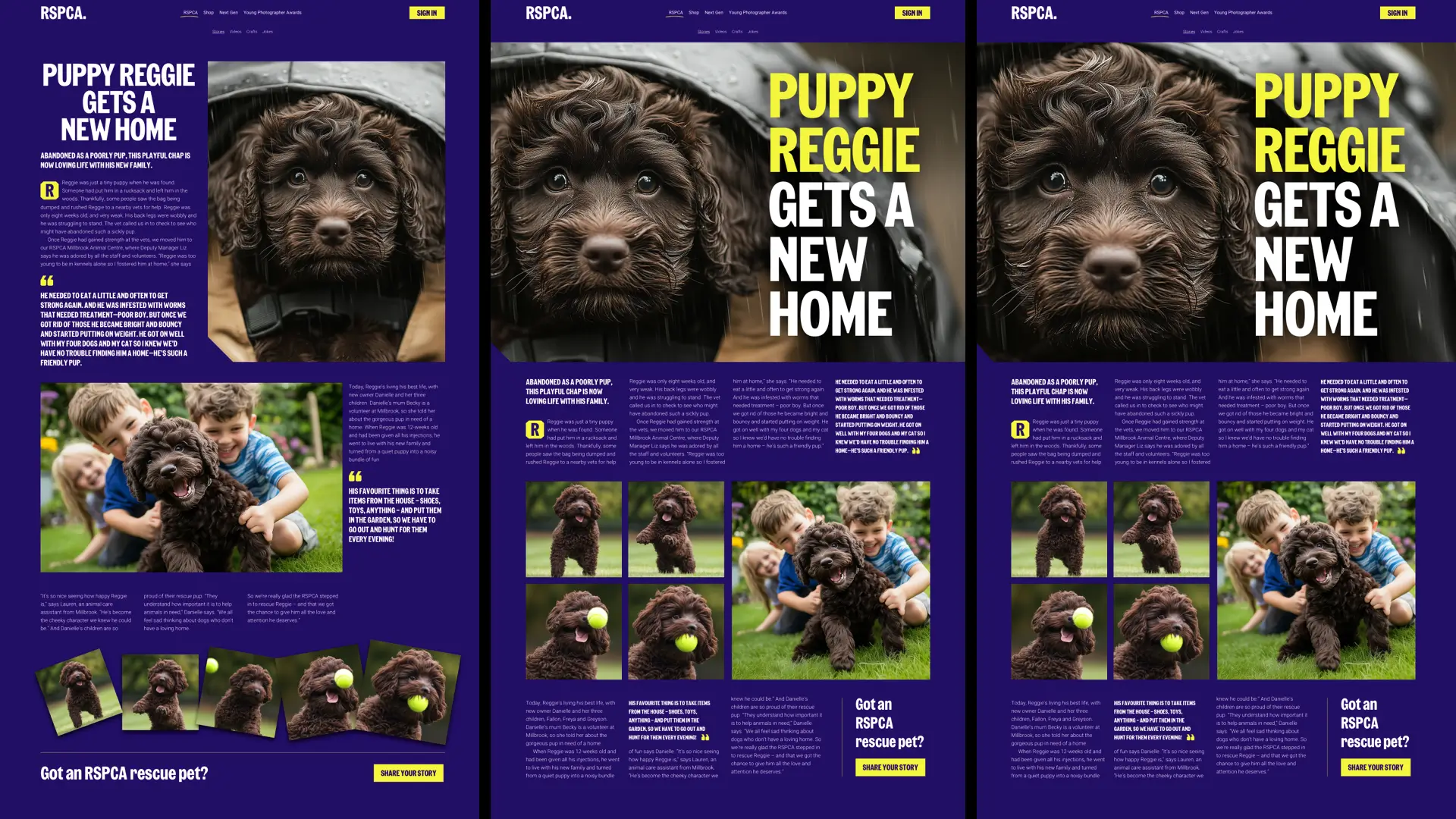
Zooming into Reggie’s eyes helps someone connect with his plight. It amps up the drama and our pathos. Re-cropping images to tell a story better is often an opportunity to rearrange the text in a banner, dramatically enlarging the headline and moving the introduction into a new four-column block below.
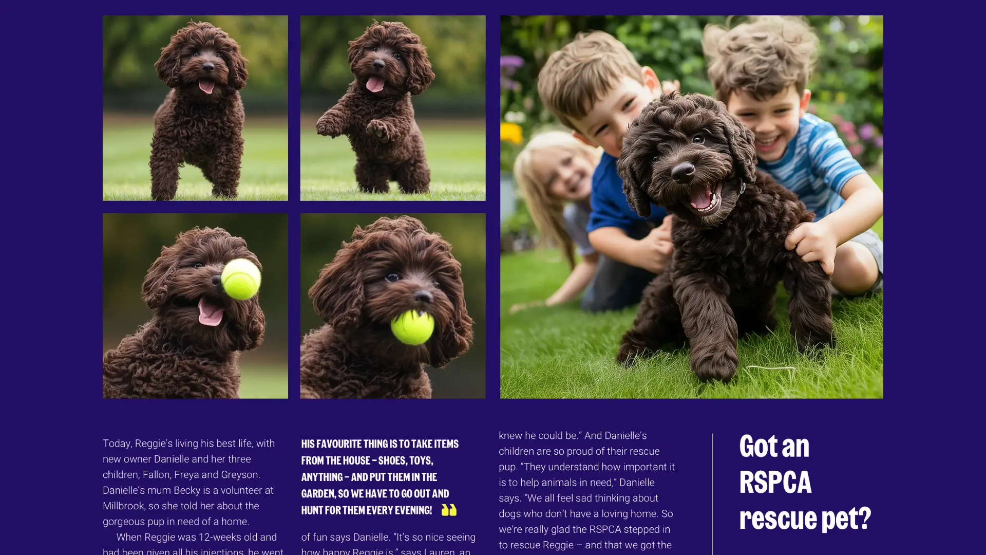
Then, to connect this article’s layout with the previous index page, I reintroduced the modular grid, this time for the sequence of images which ends with Reggie and his happy family.
Creative direction and the CMS
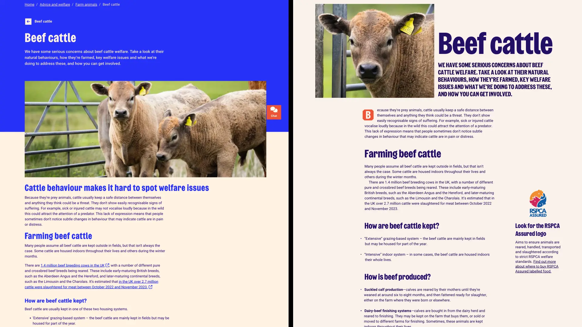
Only some pages need creative direction. For example, this RSPCA page about beef cattle welfare could be improved dramatically just with better typography, but otherwise, it needs only a light touch.
One of the challenges developers at organisations like the RSPCA face is integrating the flexibility needed for creative direction into their content management software. I know it’s a complex problem, but some organisations have succeeded.
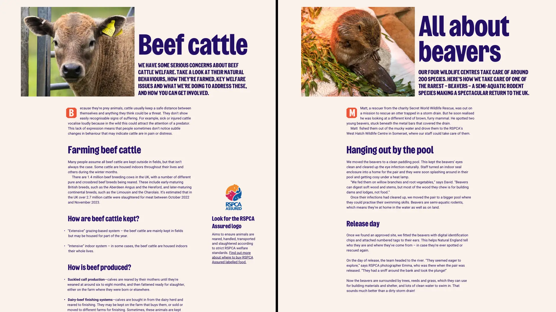
This RSPCA story about beavers could share the standard template, which already looks better thanks to its improved typography. Like the developers at ProPublica, the RSPCA could create CMS templates containing regions that can be adapted for an art-directed design. These regions allow ProPublica to swap out standard components like this article’s introduction for an alternative design.
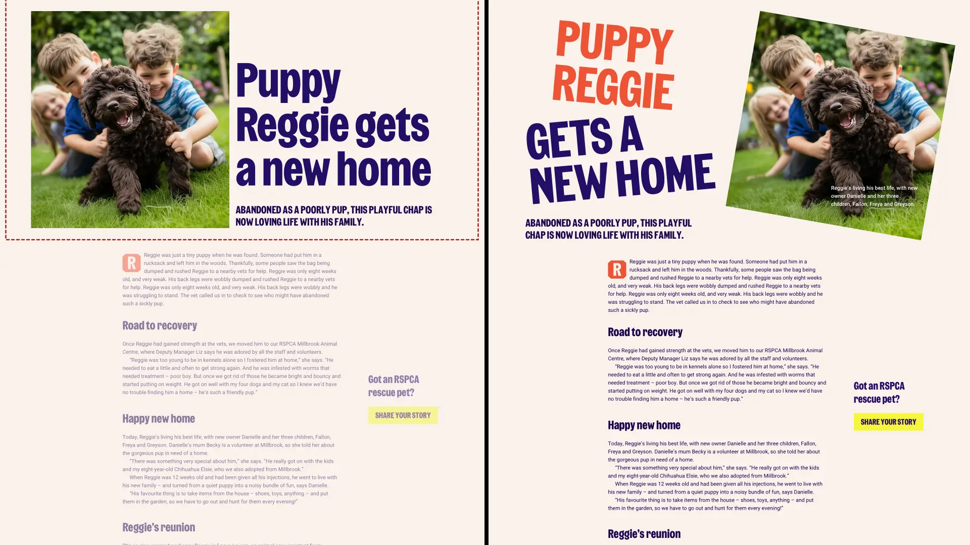
Adding a custom introduction design to Reggie’s story elevates it above articles developed using the default template. Another adaptable region could be used for images showing Reggie chasing his ball.
The more flexible RSPCA’s developers make their CMS, the more possible it could be for their content creators, designers, and editorial teams to create pages which bring their stories to life in engaging and imaginative ways. I understand this takes effort, but if a job’s worth doing… and all that malarkey.
Full versions of my designs
Of course, this redesign was just me imagining what I’d do if the RSPCA came calling. I realise I have no insight into their CMS, design, development, or editorial processes, and I haven’t had to consider their unique challenges. Most of all, I don’t have to answer to anyone if my assumptions are wrong. Still, I enjoyed spending some time imagining.
What do you think? Does my imagined redesign make better use of the RSPCA’s new brand? Does it make their stories more compelling? And if you’re reading this from the RSPCA, I’d love to work with you.
