SVG experiments for Emma’s website (part two)
Emma Bodger is a film/television producer, and recently, I’ve spent time working on her visual identity and a new website. It’s been a lot of fun, and I also learned more about SVG while working on it. I’m digging into the details this week, and today I’ll explain how I made experimental banner images for Emma’s home page using SVG masks.
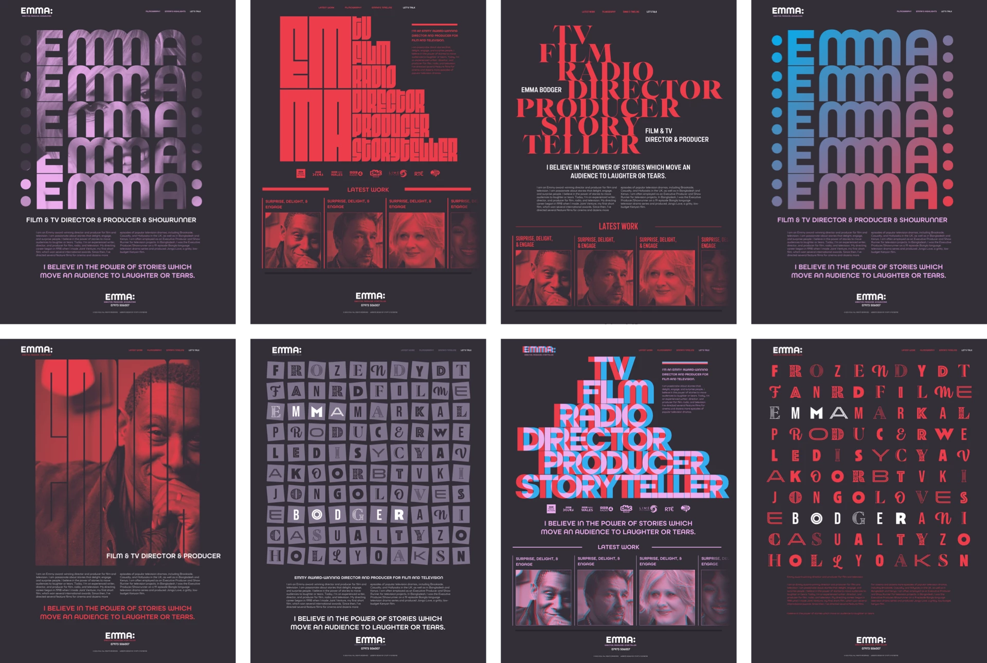
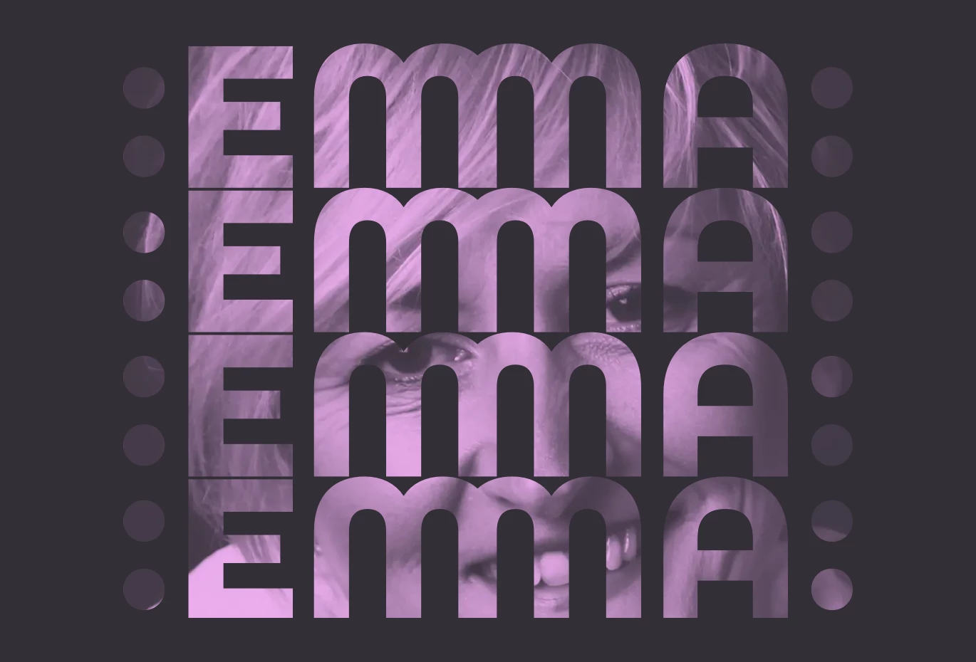
Emma gave me creative freedom while designing her website and I worked through plenty of ideas for its direction. One of the concepts for her home page included graphic type with a colon before and after Emma’s name to represent the sprocket holes in film stock. I liked this concept and wondered if it would work as a mask for stills from Emma’s filmography.
SVG masks define an object’s visible area and can be either fully opaque or contain areas which are partially transparent. You can either mask content within an SVG, or even reference an SVG mask from a stylesheet. For my graphic banner, I started by defining a mask element in my SVG. I gave this mask an ID of “image-mask.” It’s this ID which I used to reference the mask later:
<svg xmlns="http://www.w3.org/2000/svg">
  <defs>
  <mask id="image-mask">
  …
  </mask>
  </defs>
</svg>
There are two mask types, alpha and luminance. Alpha takes its values from an image’s alpha channel. Content behind areas of a mask which are fully transparent (0) will be invisible. When content is behind a fully opaque area (1), it will be fully displayed. Then there are the transparency values in between.
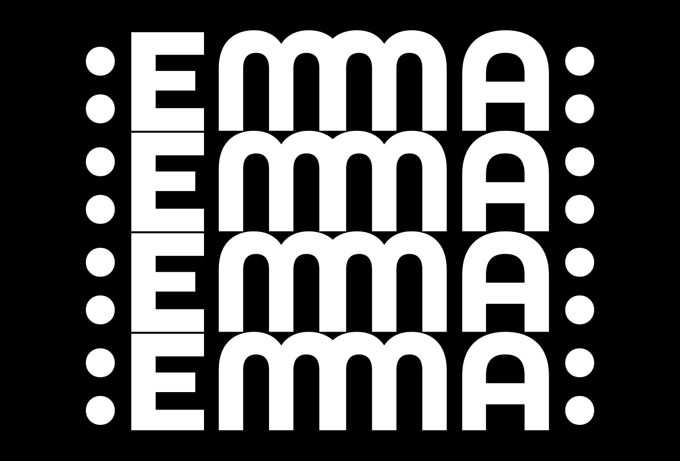
Luminance is the default value and is best used for masks made up from black and white elements. When an area is white, content will be visible. When the area is black, content will be hidden. My concept uses a luminance mask.
Masks can be made using basic shapes—circles, ellipses, and rectangles—and even complex polygons. To create the shapes for my mask, I converted the text to paths and combined them into one in Sketch. Then, I optimised the output using SVGOMG. I added this path to my mask element:
<mask id="image-mask">
  <path fill="#fff" d="…"/>
</mask>
With the mask made, I have two options. The first is to apply it to an image inside the same SVG as the mask:
<image width="100%" height="100%"
preserveAspectRatio="none"
xlink:href="" mask="url(#image-mask)"></image>
My second option is to reference a mask within an external SVG from a stylesheet:
img {
mask-image: url(mask.svg#image-mask); }
Applying an SVG mask using CSS is especially interesting as there are several mask-related properties which add flexibility to a design. These properties include mask-repeat, mask-clip (which specifies which area of a box is affected by a mask,) mask-position, and mask-size (which usefully accepts cover and contain values:)
img {
mask-image: url(mask.svg#image-mask);
mask-position: 50% 50%;
mask-repeat: no-repeat;
mask-size: contain; }
My idea for this concept was to mask still images from Emma’s filmography, but I could mask other design elements, including SVG gradients.
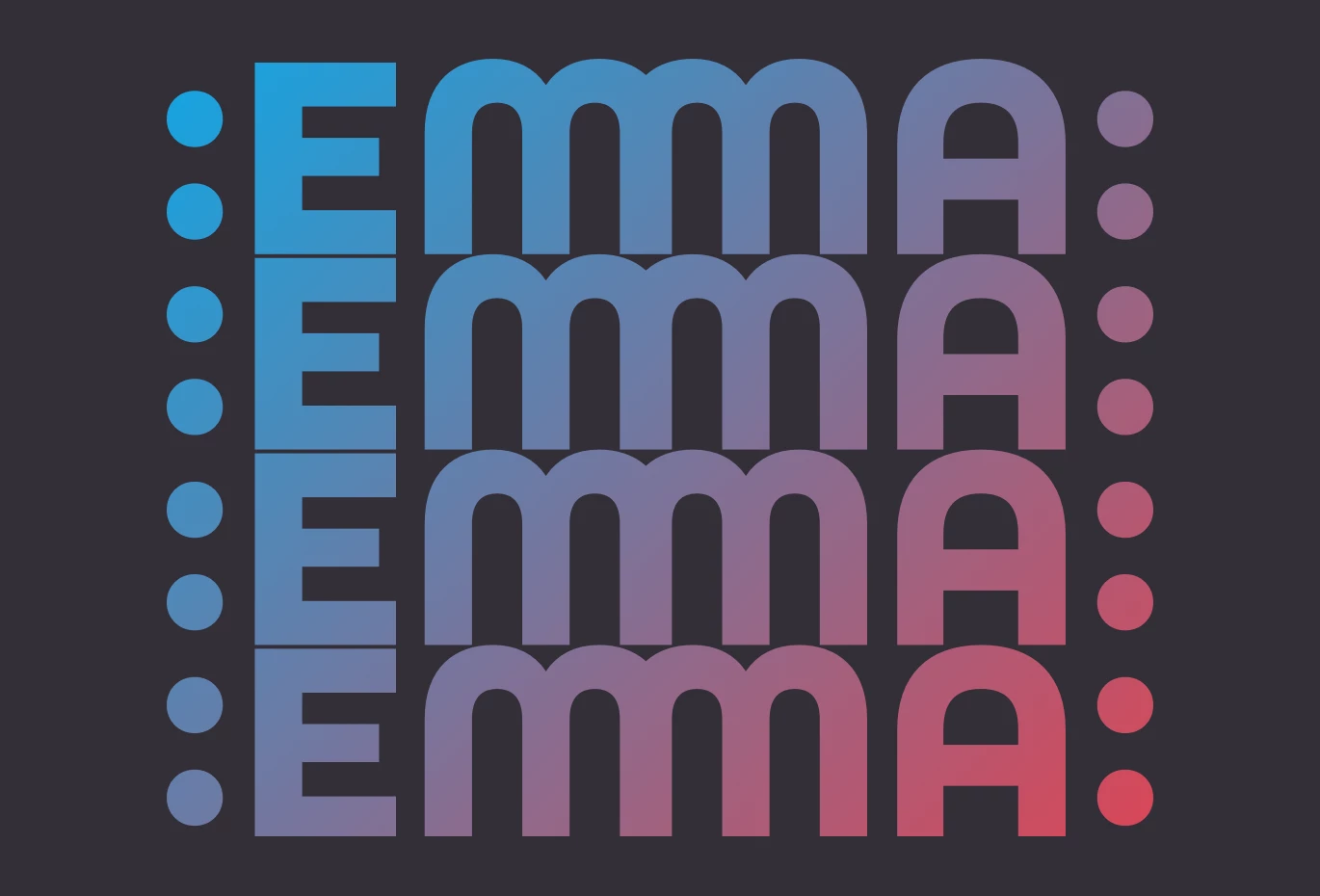
For this alternative version of Emma’s banner, I first defined a gradient which blends her red and cyan colours. To make this gradient easily, I used FFFlux, which is my favourite SVG gradient generator:
<defs>
<linearGradient id="clip-gradient" x1="0%" x2="100%" y1="0%" y2="100%">
<stop offset="0%" stop-color="#00aeef"/>
<stop offset="100%" stop-color="#ed3d4a"/>
</linearGradient>
</defs>
Then, I specified the same path I used previously for my mask as an SVG clipPath and gave it an ID of “clip-text”:
<defs>
<clipPath id="clip-text">
<path fill="#fff" d="…"/>
</clipPath>
</defs>
And finally, I added both that clipPath and the linear gradient to a path:
<path clip-path="url(#clip-text)" fill="url(#clip-gradient)" d=“…”/>I thoroughly enjoyed working on Emma’s new website. Not just for the creative control she gave me and the distinctive results we achieved, but because it gave me an opportunity to experiment and learn more about what’s possible with SVG. You can look at these experiments here and here.
Next time, I’ll tell you about the Easter Egg design I hid in Emma’s website.