We are the mods, we are the mods, we are, we are, we are the mods
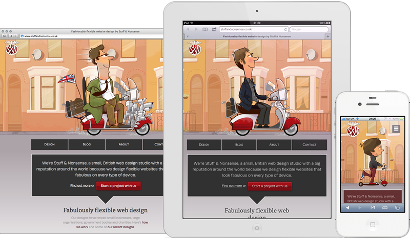
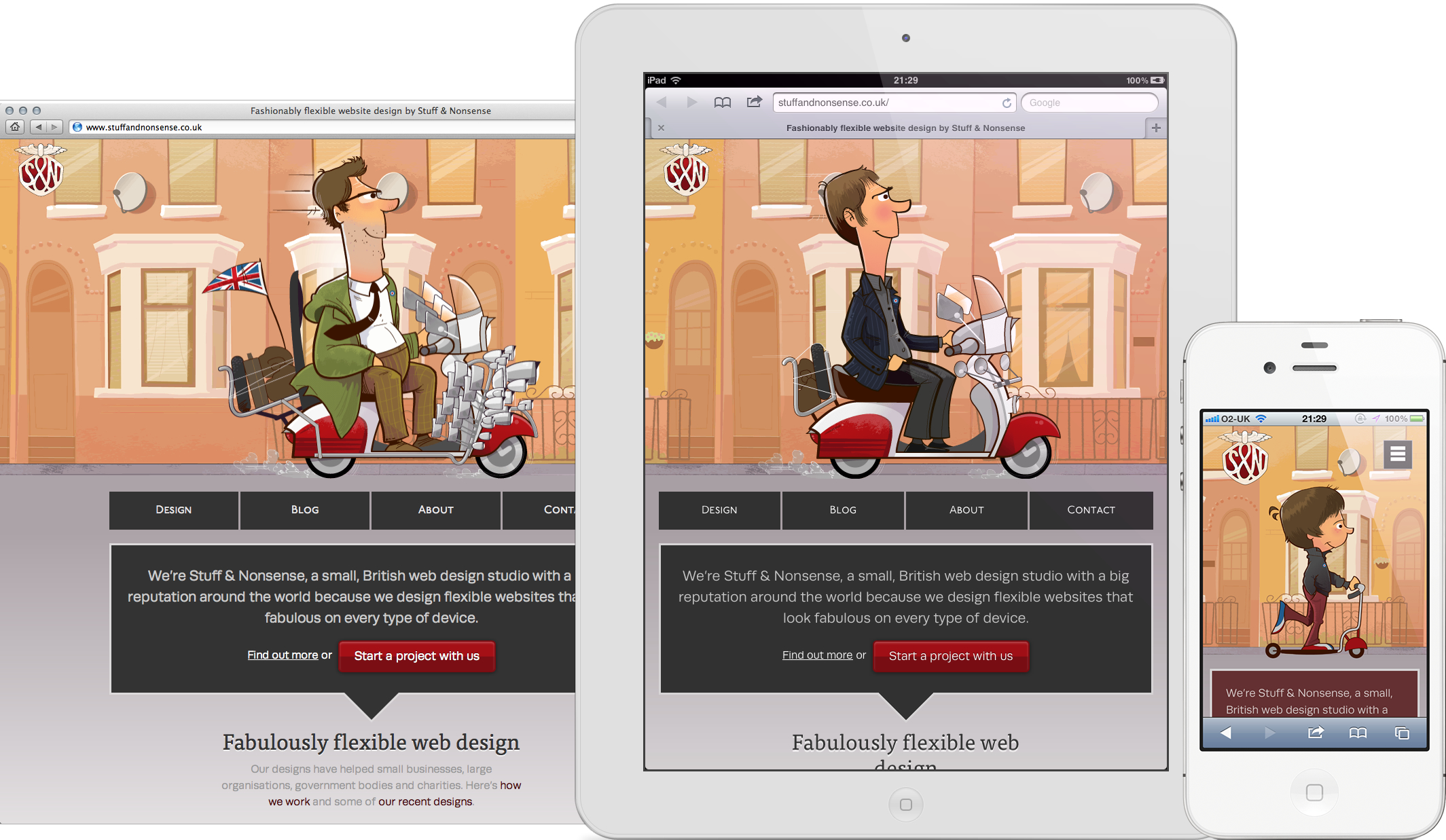
If you’re reading this in anything other than a browser, open Chrome, Safari or Firefox (if that’s your thing,) because I’ve designed a new website for Stuff & Nonsense.
A new design’s been a long time coming. Last October I replaced our long-standing design with what was then supposed to be a temporary version. I limited its scope to my blog, and because I then had three months client work booked and wasn’t then looking for more, I omitted not only our portfolio, but even a description of what we do. You’d think that wouldn’t have been good for business, but it didn’t seem to do us any harm. Work kept rolling in.
Just over a month ago I got the itch to redesign again. I’d had several ideas too. I wanted to bring back the mod theme that’s been associated with us since the beginning. I wanted to show off responsive design in a way that makes people smile and strike a balance between reflecting my personality and the needs of our business. I hope I’ve done all those things.
So here’s the new Stuff & Nonsense.
Some notes about the new design and it’s technical development:
The mods
Those fabulous mods were illustrated by Josh Cleland.
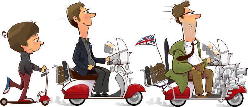
I found Josh on Dribbble. Being from near Portland, Oregon, Josh wasn’t overly familiar with sixties British mod sub-culture, so I primed him with plenty of reference photos, Quadrophenia and most bizarrely, a drive around Liverpool terraced streets on Google Maps Street View.
The logo
The version of the Stuff & Nonsense logo I’ve used on iOS bookmark icons and the favicon is by none other than Jon Hicks. Jon did an incredible job of taking the previous watercolour logo painted by Kevin Cornell and bringing it up to date. Add the site to the home screen of your iOS device to see it.

Responsive design testing
It’s built on 320 and Up. I chose breakpoints at 600px, 768px and 992px. I’ve tested the site on desktop browsers, plus:
- Safari on all iPhone models1 and Chrome on iPhone 4S.
- The default browser on every Android phone I could
prizeprise from its owner’s hands2 - Safari and Chrome on the original and new iPad
- Chrome, Firefox3 and Opera Mini on Google Nexus 7. Don’t get me started on how bad Opera Mini renders this site.
- The default browser on Samsung Galaxy Tab 10.1
- The experimental browser on Kindle Touch. Yes, that one behaves a little strangely when it encounters CSS animations like the scrolling banner.
- Internet Explorer 9, which needed only one line to fix a minor issue, IE8 which required a lot more than one line and IE7 that, well, wasted an afternoon.
All CSS background images include retina versions. Making screenshots in HiDPI mode on an iMac involved stitching several high-resolution images together in Fireworks, because there just aren’t enough pixels on a current 27" iMac.
If you spot anything wonky on any browser or device, please let me know. I’d really appreciate that.
Typography
Fonts are from Typekit. They are: P22 Underground Small Caps used in the navigation, Runda for body text and FF Tisa Web Pro on a select few headings.
Comments
I’ve not enabled comments on this new design as I’ve noticed a gradual reduction in the number of genuine comments and real increase in the amount of comment spam. So, for now at least, conversations move to Twitter and I’ll revisit the subject in the new year.
The new design’s inspiring me to work more on content. Over the next month or two I’ll add more detailed work case studies, as well as uploading all my past presentation slides to my Speaker Deck.
Finally
I want to say thank-you to the few close friends and family who helped me with excellent feedback, as well as to Josh (again) and Trevor Morris for his script writing skills when I needed them.
So that’s the new Stuff & Nonsense. I hope you like it and I’d love to hear what you think.
- Remember when iPhone’s Safari browser didn’t support webfonts in iOS3? Me neither, so I have a few related bugs to fix.
- Memorable ones; an HTC One X, Samsung Galaxy S3
- Firefox has a different viewport size to all other browsers on the Nexus 7, so its users see styles I designed for up to 600px. This is a great example of why not to rely on display size and when to test actual browsers on actual devices. I’ll work on fixing that in the coming weeks.