Stuffed with SVG. Combining SVG graphics with text
Given that SVG makes it possible to create cool compositions of images and text, I’m surprised I rarely see designers and developers using it for more than just icons.
This new Stuff & Nonsense website is jam-packed with SVG, from the Fast Eddie illustrations to key headlines and data visualisations. Learning about developing with SVG was one of the best parts of implementing this new design. I want to explain a few things I learned.
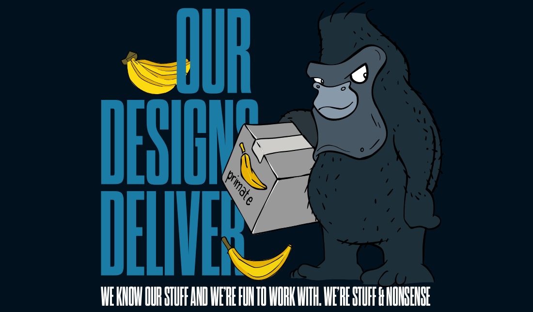
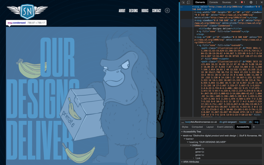
Let’s start with this hero panel from the Stuff & Nonsense home page. There are five parts to this panel:
- 1. A big gorilla. (His name’s Fast Eddie)
- 2. Eddie’s bunch of bananas
- 3. One loose banana
- 4. A large headline, “Our designs deliver”
- 5. The “We know our stuff and we’re fun to work with” tagline
These elements are stacked on the z-axis:
- Back: Bunch of bananas
- Middle: Headline and tagline
- Front: Eddie and the loose banana
Aligning text and placing it in combination with the graphic elements precisely are key to making this design work. In the distant past, I would’ve shoved all these elements into a single bitmap image. There are plenty of ways to develop this design using HTML text, CSS, and SVG. But it could be tricky to keep those elements in their correct positions and maintain their proportions within a flexible layout. Using SVG for the entire panel is a much more sensible choice, so I need to:
- Make optimised SVG graphics
- Add SVG <text> elements
- Nest SVGs and position each element
- Add class attribute and CSS styles
- Consider accessibility
Make optimised SVG graphics
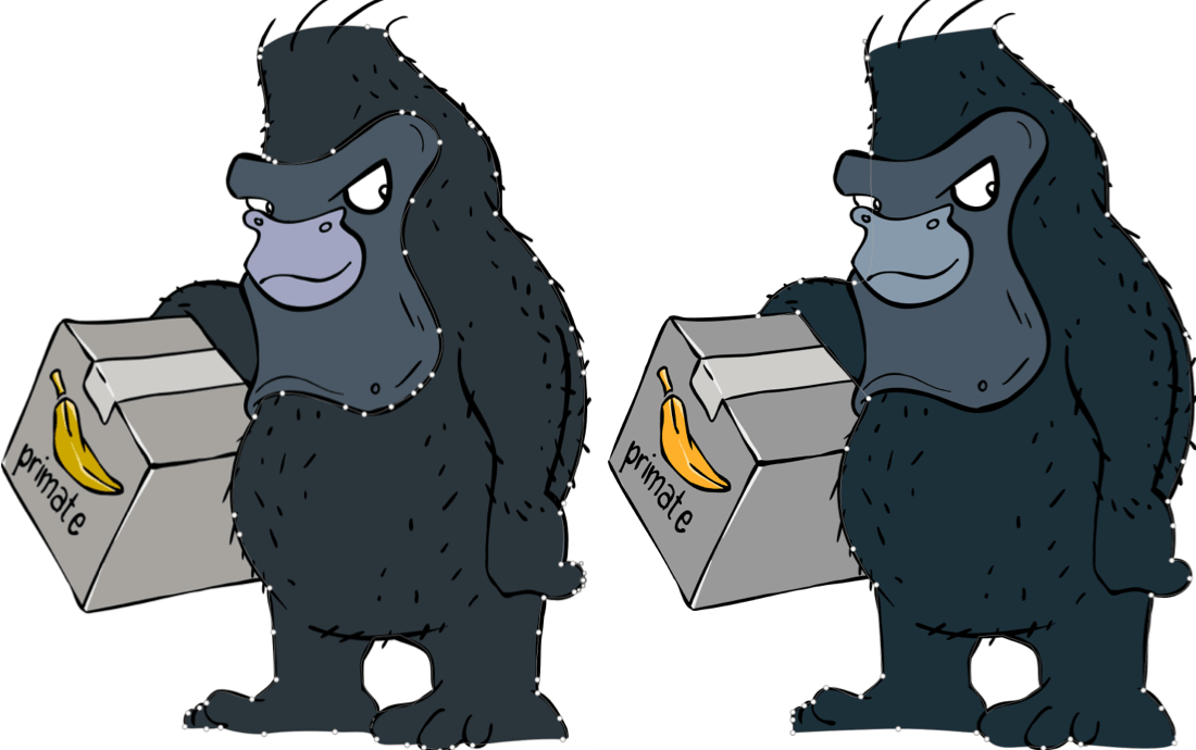
Markus Freise sketched Fast Eddie and his bananas using Adobe Fresco. Then, he produced the finished artwork in Illustrator and exported it to SVG. Brilliant though the artwork looked, the way Illustrator exports SVG is famously flabby. Dozens of paths contained hundreds of points which all contributed to the overall file size.
I took Markus’ Illustrator SVGs and deleted every colour-filled path, leaving just his hand-drawn outlines. To reduce the overall file size, I added eight new filled paths behind those outlines with as few points and curves as possible.
(Watch out: I’ve intentionally simplified the code in these examples by including attributes only if they’re relevant.)
<svg>
<!-- Fast Eddie -->
<path> … </path> <!-- Gorilla hair -->
<path> … </path> <!-- Gorilla skin -->
<path> … </path> <!-- Gorilla face -->
<path> … </path> <!-- Gorilla eyes -->
<path> … </path> <!-- Box dark -->
<path> … </path> <!-- Box light -->
<path> … </path> <!-- Banana dark -->
<path> … </path> <!-- Banana light -->
<path> … </path> <!-- All outlines -->
</svg>

<!-- Banana -->
<svg>
<path> … </path> <!-- Banana darkest -->
<path> … </path> <!-- Banana dark -->
<path> … </path> <!-- Banana light -->
<path> … </path> <!-- Outlines -->
</svg>
I exported new SVGs from Sketch with these simpler paths, then optimised the new files using using Jake Archibald’s SVGOMG! online tool. These files are now a fraction of Illustrator’ original file size.
Add SVG <text> elements
In the past, I often converted text to outlines before exporting it to SVG. This presents obvious accessibility concerns, and changing the text meant replacing an SVG file. By setting text in SVG using the <text> element, my text has better accessibility, can be changed more easily, and is searchable and selectable. SVG text also makes it possible to:
- Use any webfont and style it using CSS
- Fill text with any flat colour, gradient, or pattern
- Apply strokes to create outlines
- Add masks or filters; including blurs and shadows
You can add as many text elements as you need, but my next panel needs only two:
<svg>
<text>Our designs deliver</text>
<text>We know our stuff and we’re fun to work with</text>
</svg>
Only content inside SVG text elements is rendered by browsers, and they ignore anything outside them. SVG text elements won’t wrap like HTML text. HTML has its span element and SVG includes a similar element which is useful for separating text into smaller elements so they can be styled uniquely. To break my headline across three lines, I divide it into three <tspan< elements, one per line:
<svg>
<text>
<tspan>Our </tspan>
<tspan>designs </tspan>
<tspan>deliver </tspan>
</text>
</svg>
By splitting my headline into multiple elements, I’m able to position each line. SVG uses a coordinates system where the origin is at the top left of a viewport (0,0). A positive value on the x-axis places an element horizontally from the left, while a positive value on the y-axis places it vertically from the top.
xis the horizontal starting point for the text baseline;yis the vertical starting point for the text baseline;dxshifts text horizontally from a previous element;dyshifts text vertically from an earlier element.
(Sara Soueidan has a much more thorough explanation of the viewport coordinate system.)
I use both x and y values on my tspan elements to place each one and allow space before the first element for the bunch of bananas. Because one unit equals one pixel, I needn’t specify the unit type:
<svg>
<text>
<tspan x="155" y="215">Our </tspan>
<tspan x="10" y="395">designs </tspan>
<tspan x="10" y="575">deliver </tspan>
</text>
</svg>
tspan elements are useful for precise positioning and individual styling, but they’re not without accessibility concerns. Assistive technology pronounce tspan elements as individual words and even spell them when a tspan wraps a single letter. For example, a screen reader will pronounce this series of tspan elements:
<tspan>S</tspan>
<tspan>t</tspan>
<tspan>u</tspan>
<tspan>f</tspan>
<tspan>f</tspan>
As “S”, “t”, “u”, “f”, “f”.
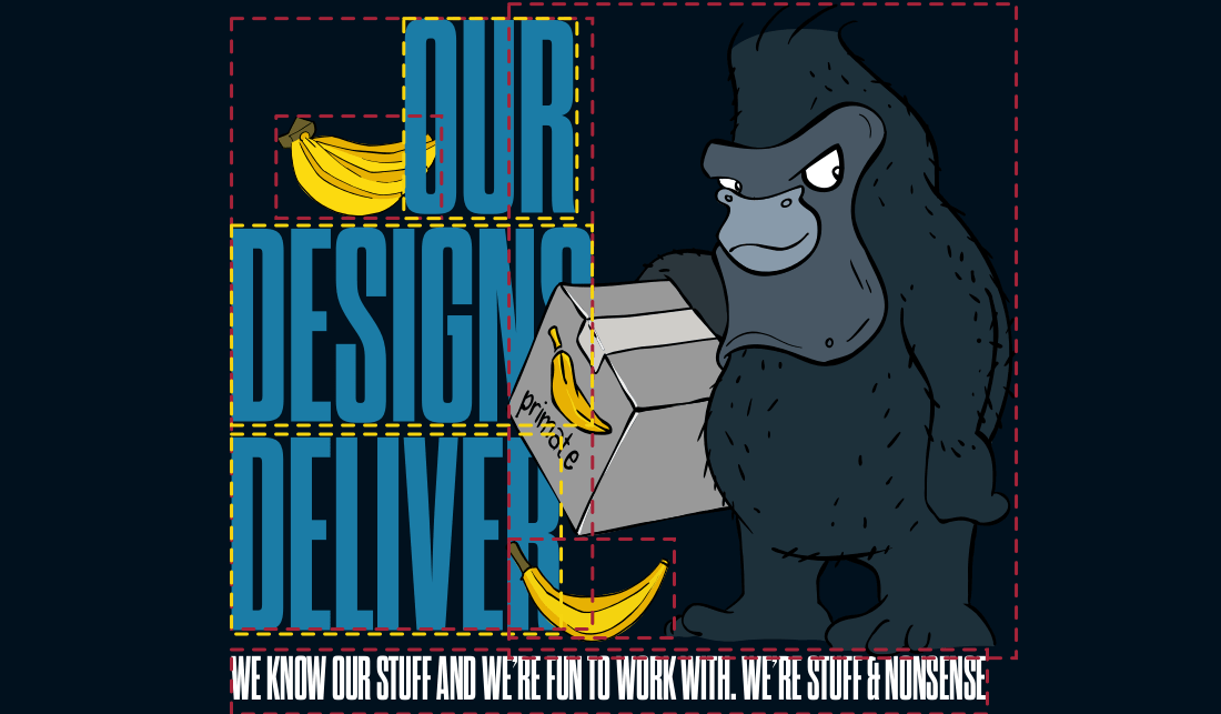
Nest SVGs to position each element
In SVG, the <g> element allows paths and other elements to share common properties, including fill and stroke. But whereas it’s possible to position child elements using x and y coordinate values, it’s impossible to position the g element itself.
While developing my panel, I learned it’s possible to overcome this limitation by splitting it into separate SVGs, one for each of the major elements; banana bunch (back,) headline and tagline (middle,) Fast Eddie (front,) and the loose banana (front.) By nesting these within a container SVG element,I can use their x and y coordinate values to place them precisely where I need them within my composition.
<svg>

<!-- Banana bunch -->
<svg width="150" height="95" x="50" y="130">
</svg>

<!-- Headline and tagline -->
<svg x="0" y="0">
</svg>

<!-- Fast Eddie -->
<svg x="120" y="15">
</svg>

<!-- Loose banana -->
<svg width="150" height="95" x="250" y="500">
</svg>

</svg>
(Yet again, Sara Soueidan has written a much more comprehensive explanation of mimicking relative positioning inside an SVG with nested SVGs.)
Like HTML source order, SVG elements are stacked back to front in the order they’re written. The same is also true of nested SVGs, so the banana bunch is lower down the z-index order, allowing the headline and tagline to overlap it. Fast Eddie comes next and is placed in front of my text, followed by that loose banana.
Add class attribute and CSS styles
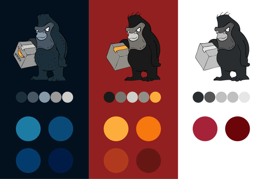
This new design includes a theme with a light background, a dark theme with a blue background, plus an Easter egg theme with an orange background. I use CSS to change the fill colours to match each theme. I use CSS, so first add class attributes to every element. There are three colours for Fast Eddie and two for the box he’s delivering. His bananas and outlines are the same colours on all themes:
<svg>
<!-- Fast Eddie -->
<path class="ill-col-1"> … </path> <!-- Gorilla hair -->
<path class="ill-col-2"> … </path> <!-- Gorilla skin -->
<path class="ill-col-3"> … </path> <!-- Gorilla face -->
<path class="eyes"> … </path> <!-- Gorilla eyes -->
<path class="ill-col-4"> … </path> <!-- Box dark -->
<path class="box-lght"> … </path> <!-- Box light -->
<path class="ban-dk"> … </path> <!-- Banana dark -->
<path class="ban-lght"> … </path> <!-- Banana light -->
<path class="outlines"> … </path> <!-- All outlines -->
</svg>

<!-- Headline and tagline -->
#60;svg>
<text class="ill-t-brand" >Our designs deliver</text>
<text class="ill-t-fill">We know our stuff…</text>
</svg>
First, I change the headline and tagline fill colours to fit each theme. Then, I adapt colours in the Fast Eddie illustration to subtly blend them with each theme’s background. I use CSS Custom Properties to define these colours and make changing them between themes easier:
.ill-t-brand { fill: var(--color-brand); }
.ill-t-fill { fill: var(--color-text); }

.ill-col-1 { fill: var(--ill-col-1); }
.ill-col-2 { fill: var(--ill-col-2); }
.ill-col-3 { fill: var(--ill-col-3); }
Using the prefers-color-scheme media query then allows me to specify a set of custom property values for each theme:
:root {
--ill-t-brand: #a62339;
--ill-t-fill: #1b1a18;
--ill-col-1: #272d30;
--ill-col-2: #565656;
--ill-col-3: #bfbfbf; }

@media (prefers-color-scheme: dark) {
:root {
--ill-t-brand: #1b7ca6;
--ill-t-fill: #fff;
--ill-col-1: #1d303a;
--ill-col-2: #485764;
--ill-col-3: #889aaa; }
}
Consider accessibility
SVG images which contain text outlines can be made more accessible by using alternative text and ARIA properties. So, when linking to an external SVG file, I should add alternative text as I should with any non-decorative image:
<img src="header.svg"
alt="Our design delivers">
SVG text is accessible and selectable when embedded in HTML, and the best way to help people who use assistive technology is to add an ARIA role and a descriptive label. Screen readers will treat the SVG as a single element and read the label description aloud. If I wanted to refer to this panel as an image, I would specify the img role:
<svg role="img" aria-label="Our designs deliver">
…
</svg>
Adding a title element helps assistive technology to understand the difference between several blocks of SVG and this title will be displayed as a tooltip by most browsers:
<svg>
<title>Our designs deliver</title>
</svg>
I need a more comprehensive approach for my panel’s more complex combination of graphical and text elements. First, I add a heading ARIA role to the container SVG, plus a heading level of "1" as this represents the top-level heading on this page:
<svg role="heading" aria-level="1">
…
</svg>
Then I add a title element to the nested SVG, which contains my headline and tagline and add aria-labelledby to help assistive technology understand the difference between several blocks of SVG:
<svg aria-labelledby="headline-title">
<title id="headline-title">Our designs deliver. We know our stuff…</title>
</svg>
For Fast Eddie and the two decorative banana graphics, I add a presentation role plus short descriptions of each image:
<svg role="presentation">
<desc>Fast Eddie is the Stuff & Nonsense gorilla mascot</desc>
</svg>

<svg role="presentation">
<desc>A bunch of bananas</desc>
</svg>

<svg role="presentation">
<desc>A loose banana on the floor</desc>
</svg>
Accessibility and performance matter as much as style in this design. I tried to pay close attention to accessibility. While I haven’t (yet) tested its accessibility with people and assistive technologies, I plan to do just that over the next few weeks.
Heather Migliorisi wrote a more thorough explanation of SVG accessibility on CSS Tricks.
Wrapping up
Learning about developing with SVG was one of the most enjoyable parts of implementing this new design. Given how SVG makes it possible to create accessible, flexible, and high-performance compositions like my home page panel, I’m surprised I rarely see designers and developers doing that more often. I hope posts like this might spur you on to use SVG in more creative ways.