Crisis aims to be bold and impactful. But does their website live up to those goals?
In my latest Design Chatter video, I talked about how the homelessness charity Crisis aims to be bold and impactful and asked if their website design lives up to those goals? Here’s a written version of that, plus the full versions of my redesigns.
Balancing creative direction and user-experience design
Charities, NGOs, and non-profits are some of my favourite clients. I’ve been fortunate to work with Greenpeace and WWF, to name two. In both projects, I used storytelling to engage the audience and encourage them to support the charity. Balancing creative direction and user-experience design is one of my favourite things to work on.
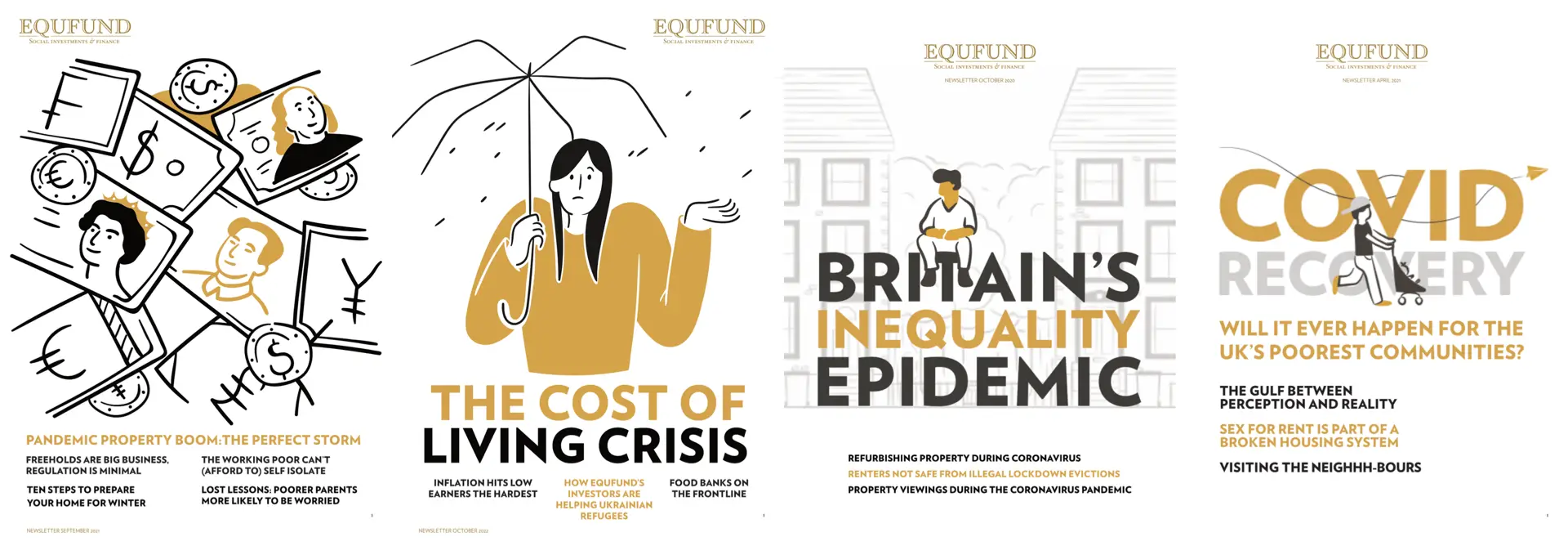
For over a decade, I’ve worked with Equfund. That organisation provides affordable accommodation to people in Liverpool.
I’ve made their websites and designed their quarterly supporters’ newsletter.
The scandal of homelessness
It’s a scandal that homelessness exists in this country or any other in the 21st century. It’s unacceptable that charities like Crisis are left to solve the problem.
Crisis has been a campaigning voice for homeless people for almost sixty years. Last year, they supported a new bill in Parliament to root out rogue landlords, and the year before, they succeeded in their campaign to repeal the Vagrancy Act.
Crisis aims to be bold and impactful
Crisis strategy documents and mission/vision statements present them as being “bold” and “impactful.” They talk about “not being afraid to try new things,” “taking risks,” and sometimes failing.
Well, that attitude isn’t clear from their website design, which is neither bold nor impactful. Look, I mustn’t come down too hard on Crisis. This lack of strong design isn’t unique to them. Take a cursory look at other homelessness charity websites; you’ll find the same generic layouts and typography.
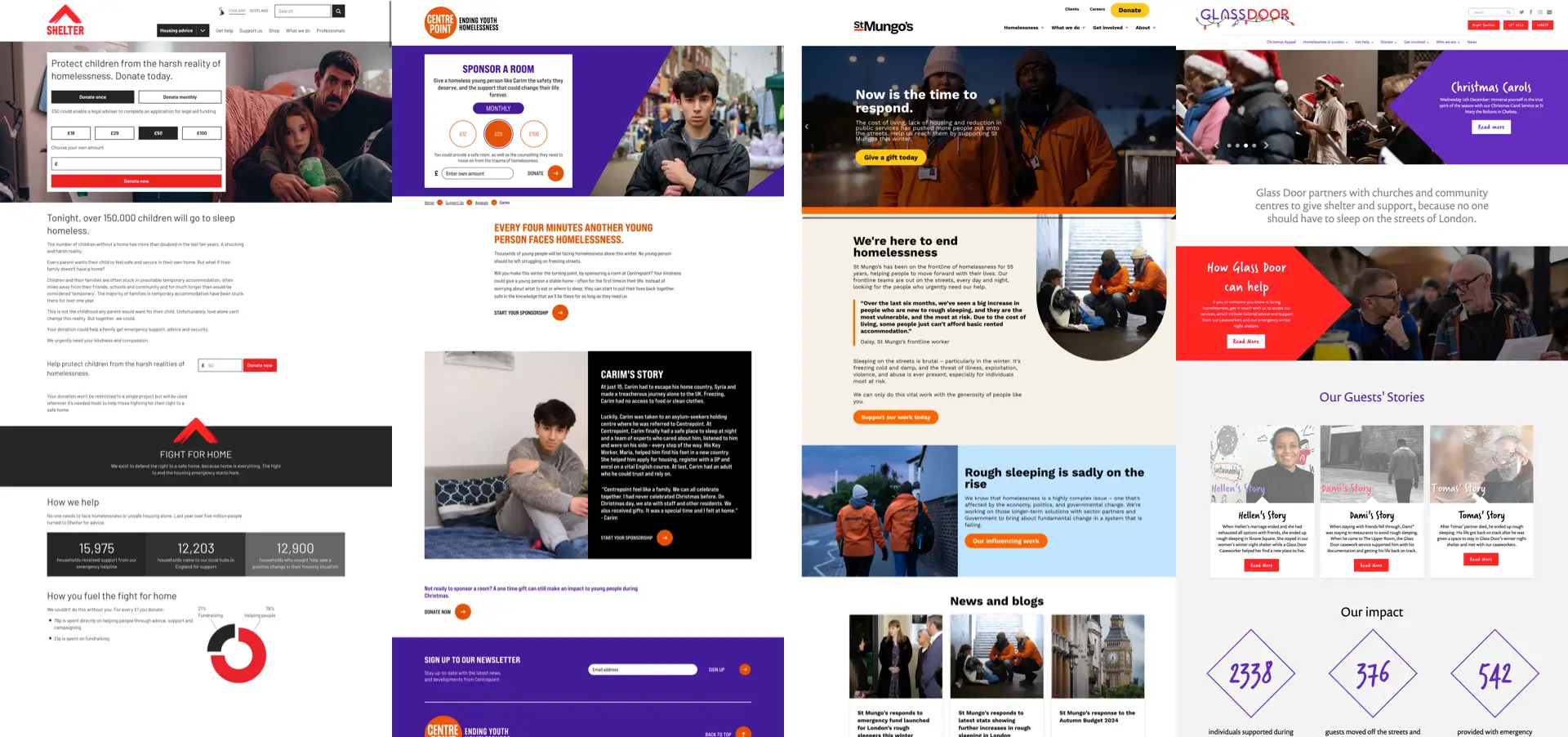
Shelter is one of the best-known homeless charities, and its website design suffers from the same issues. After asking people to donate, it explains that 150,000 children will go to bed homeless, but its content design leaves a lot to the imagination.
Likewise, Centerpoint leads with a request for donations inside—yes, you guessed it—another full-width banner. Their powerful message—that another young person faces homelessness every four minutes—isn’t matched by their content design.
St. Mungo’s approach is conventional, but its design adds personality to its messaging. Still, I’m baffled why their eye-catching new “We’re here” campaign posters aren’t included in the website design. (I’d love to work on integrating those assets, but that’s probably a topic for another video.)
Glassdoor includes facts about the impact of their work, but they’re placed far, far down the page beneath the scroll and aren’t links to ways people can support Glassdoor. Like many homelessness charity websites, including Crisis, Glassdoor includes stories about their work and its impact.
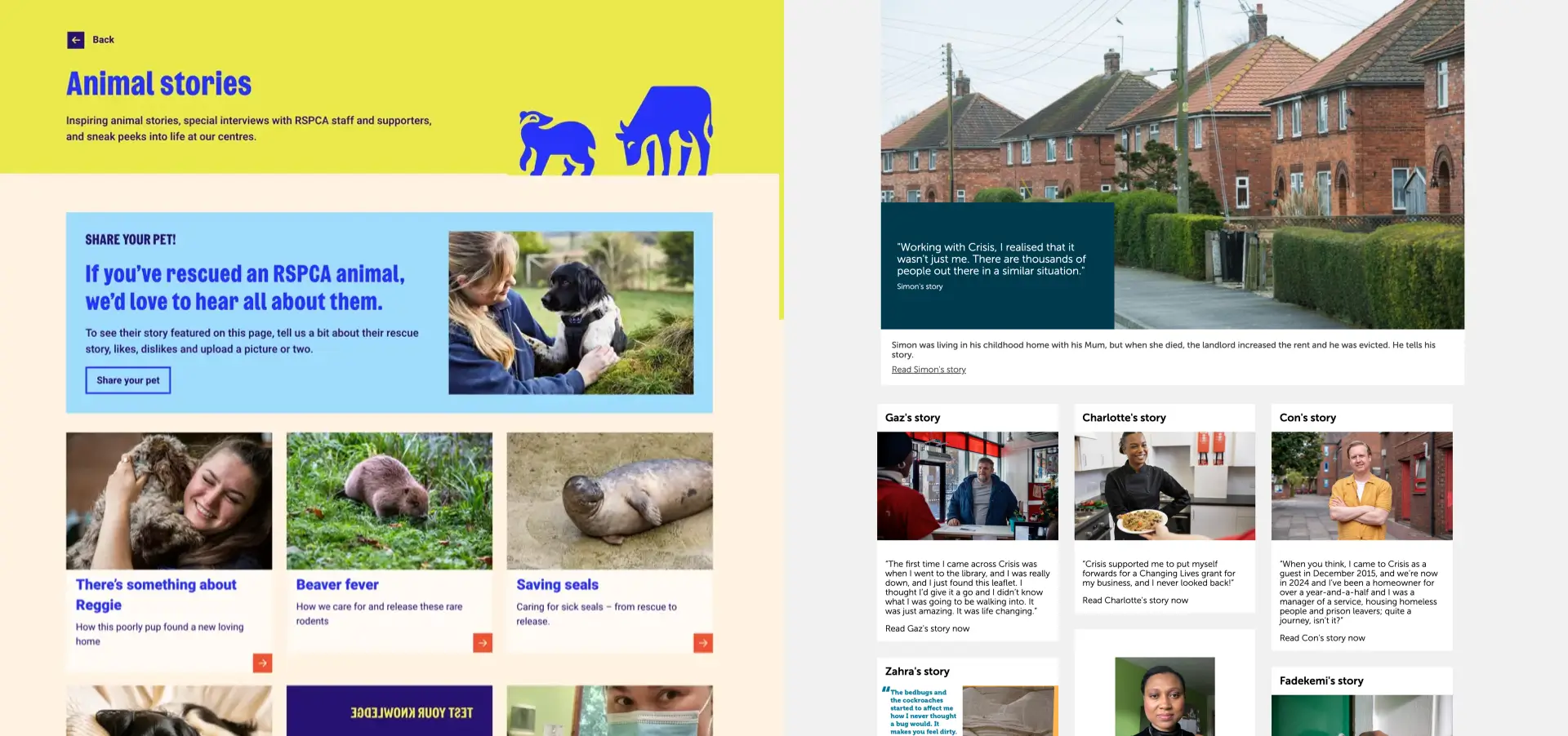
Like the RSPCA’s stories I spoke about in a previous video, the Crisis stories section lacks clarity, direction, and a hierarchy that draws people in and encourages them to engage. It leaves me with questions:
- What story should someone read first?
- Why choose Gaz’story over Charlotte’s?
- How many people scroll as far down as Stuart’s story or Mohammad’s?
These are essential questions to ask before beginning a redesign. The design of these stories isn’t especially inviting. They’d benefit from an upgrade to the article template to improve its typography or an editorial overhaul to tell those stories better.
Redesigning information about homelessness
But this video isn’t about Crisis stories; it’s about how the charity’s website can be bolder and how redesigning its information about homelessness can make it more impactful.
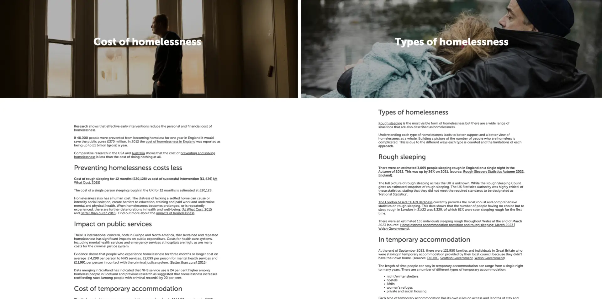
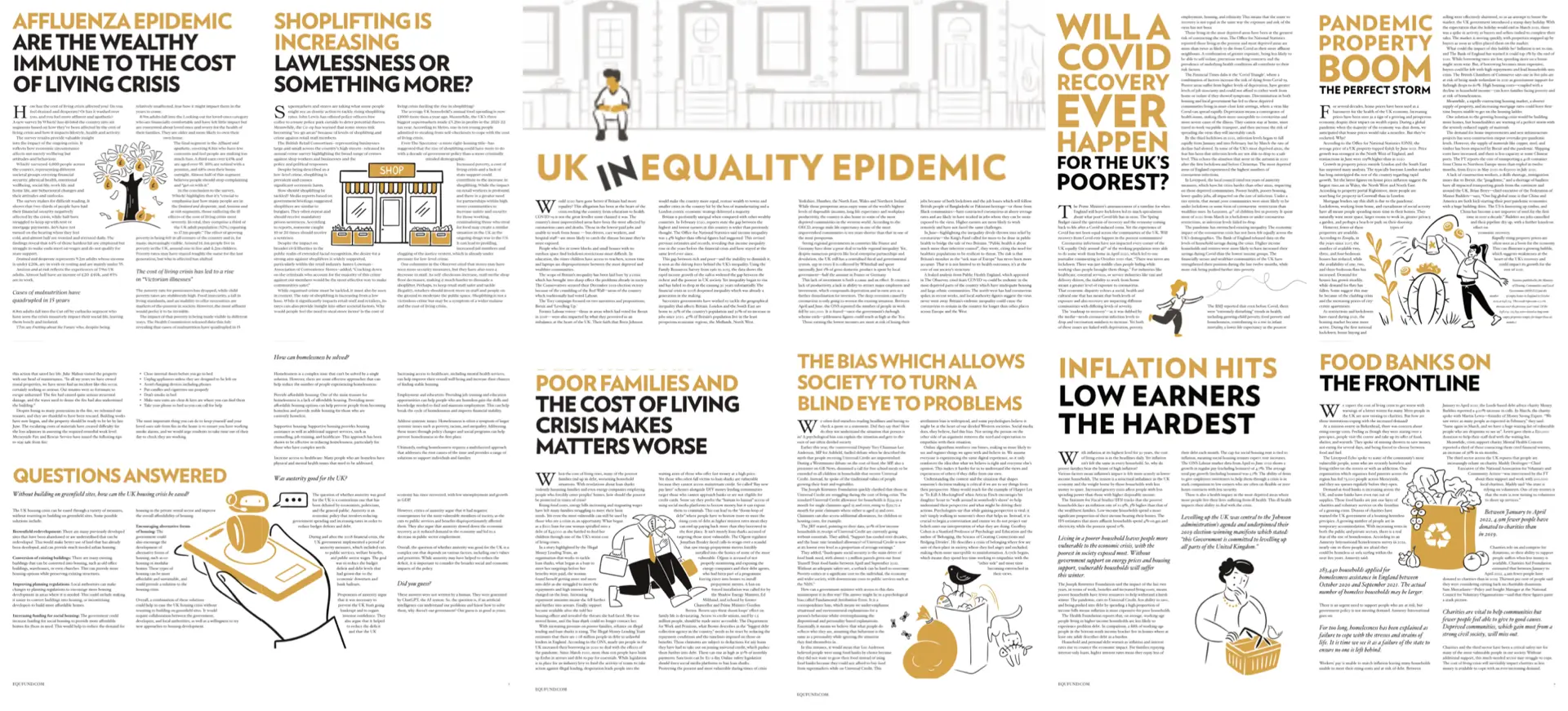
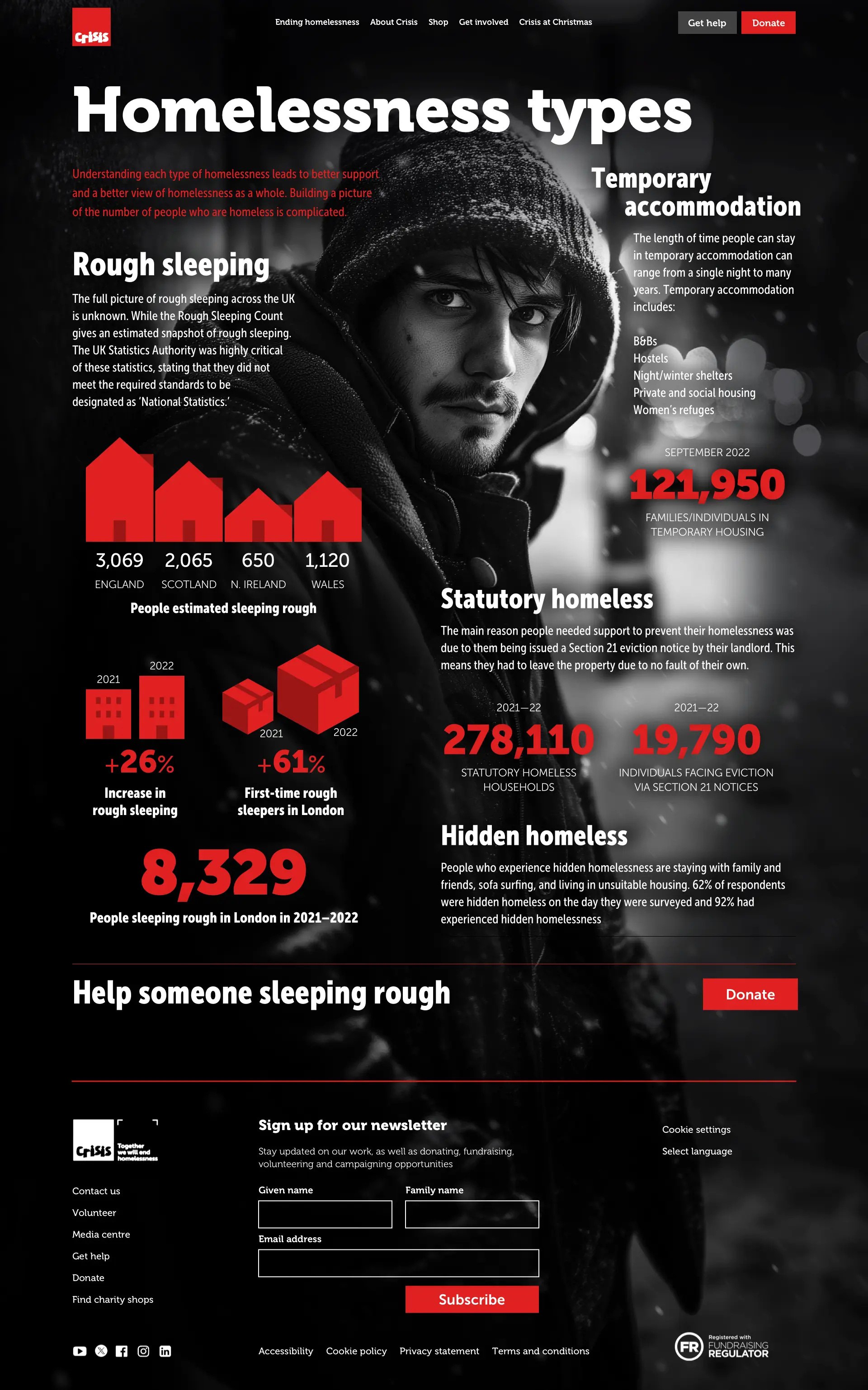
Take this article on the cost of homelessness. It’s packed with facts, but you wouldn’t know that from its content design. The same applies to this article on types of homelessness. Again, it’s full of figures, but they’re buried in a block of text, and nothing in the design explains or illustrates them.
When tackling a redesign like this, my first job is to study the content, looking for facts, figures, or phrases that I can highlight using graphics or typography.
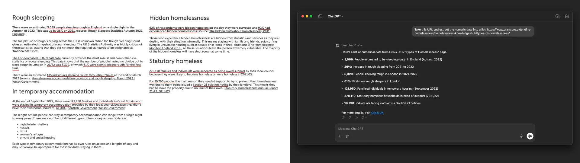
I could scour the document and underline the data, but I prefer to let ChatGPT handle that job. I added a prompt and provided the URL of the “types of homelessness” page. ChatGPT then gave me a handy list of the numerical data on the page.
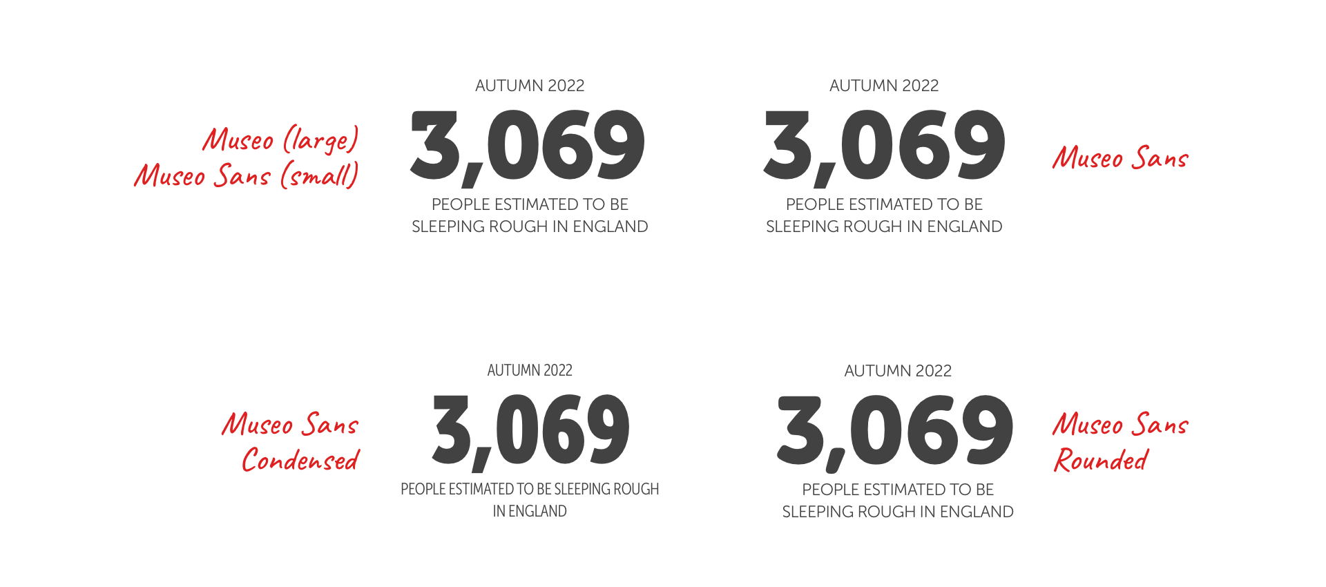
Numerical data is text, and a typeface with fantastic-looking numerals can go a long way in bringing this content to life. A typeface like Museo and Museo Sans, chosen by Crisis, offers a variety of styles and weights for designing facts and figures. There are serifs, sans-serifs, condensed, and rounded styles, which I can mix to add interest while keeping the design connected. I often use a condensed version of a typeface when space is limited and on small screens. Then, I switch to a regular or extended version when there’s more space available.
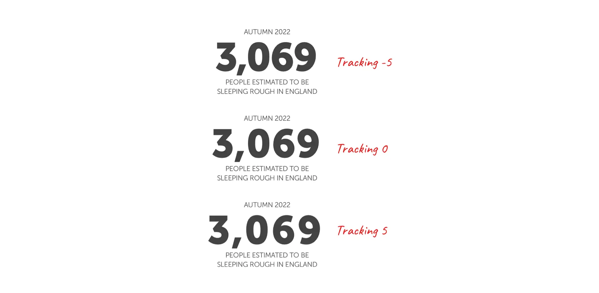
Making minor adjustments to the tracking for numerals—letter-spacing for CSS types—can significantly affect their appearance. Ordinarily, longer strings look better when there is more space between the numbers, but when numerals appear larger, negative tracking solidifies them into blocks.
But it’s not just numerals that need the type styling; symbols do, too. So, when 3,069 gets abbreviated to 3k, how should the “k” look? I made it smaller than the number. Should the plus (+) and percentage symbols be lighter in weight? I could sit them on the baseline or shift them up.
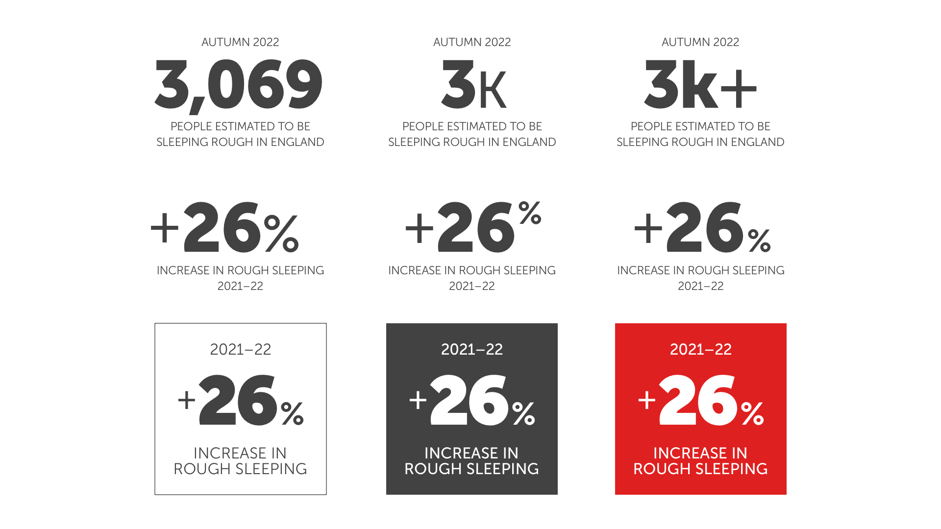
How should the typography adapt when reversed on a darker background? The symbols could be lighter, and the numbers made heavier by switching to the display version of a typeface if there’s one available. Museo Sans has a terrific display font for these large, boxed-in numbers.

The original Crisis article design didn’t differentiate between the different types of content. This improved design doesn’t only change how the content looks. Dividing the content into clearly defined sections and emphasising the numbers helps people understand it more easily.
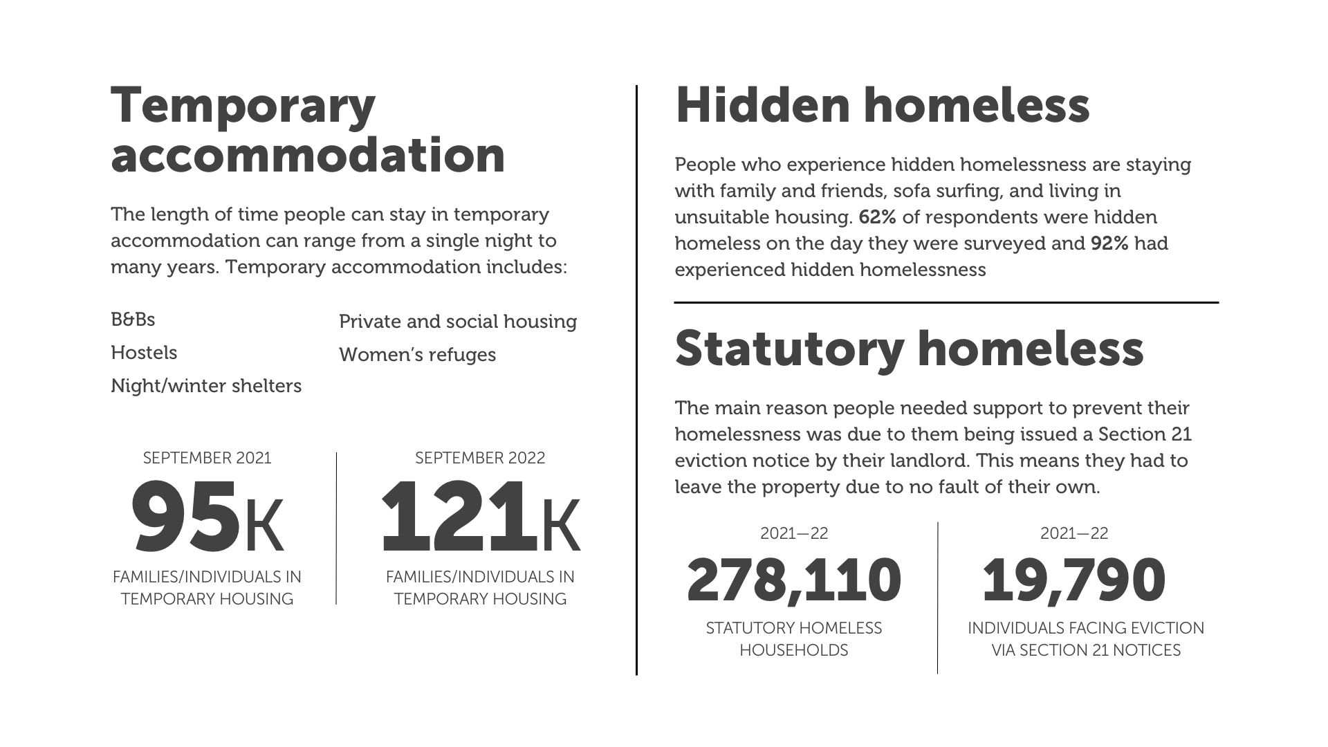
I’m obsessive about details. Look closely; maybe you’ll see I’ve used thicker lines to separate sections and thinner lines between the items inside a section.
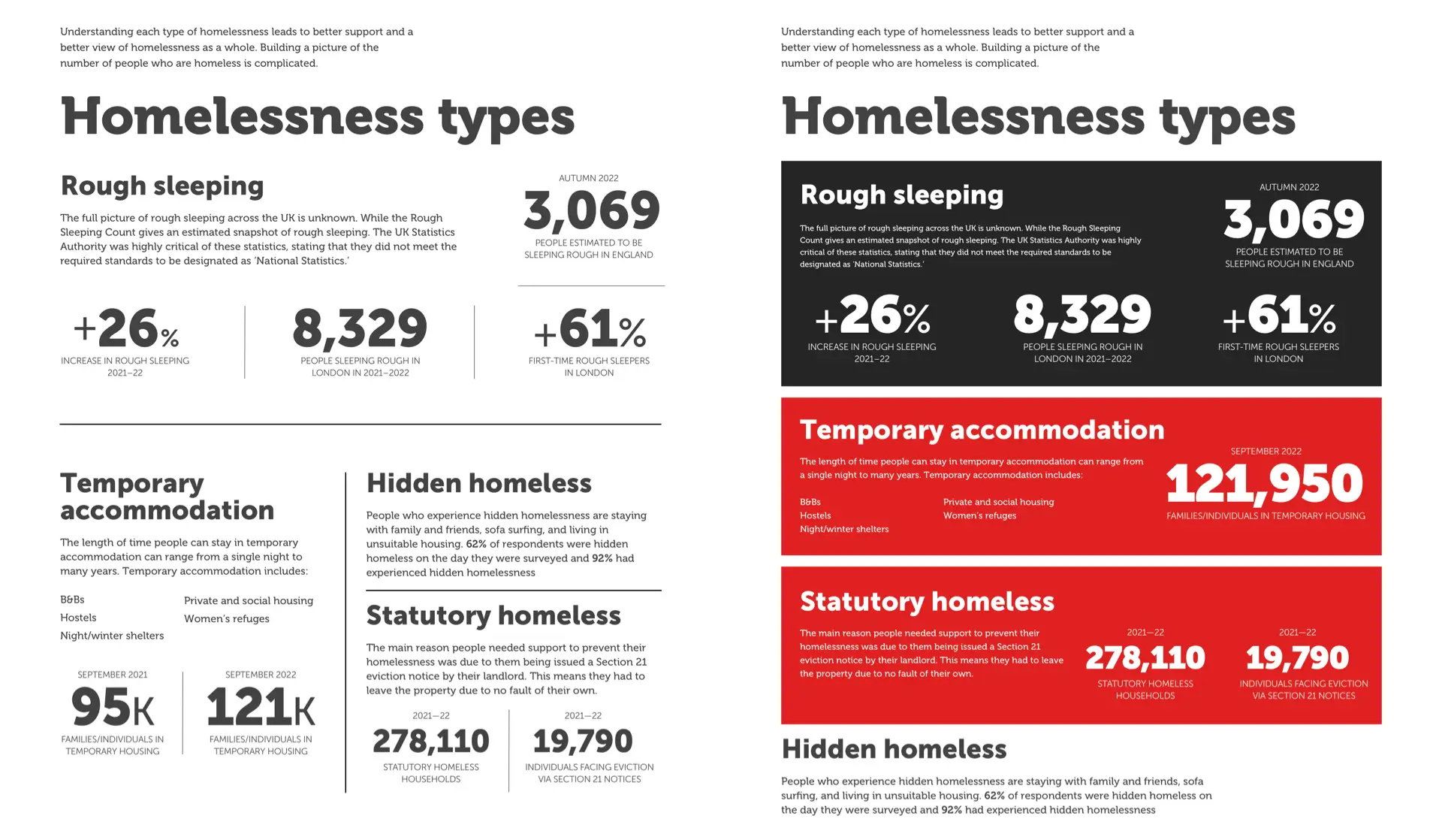
The Crisis brand is bold and impactful, so I should style those sections to align with the brand with the solid colours and sharp edges of the Crisis logomark. I’m always keen to keep colours to a minimum, and the pairing of signature red and dark grey makes very stylish panel backgrounds.
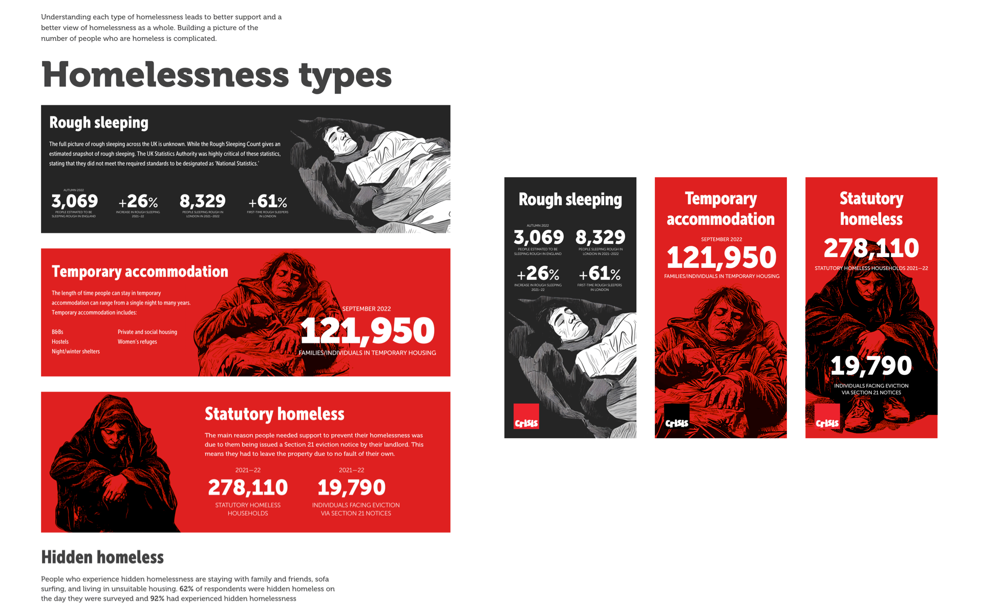
I could consider adding images to illustrate the content in each panel. To maintain their overall size, I switched to the condensed version of Museo Sans, which fits the same content into a smaller space. The small screen design of these panels would also make very effective infographics for sharing on the charity’s social channels.
Consider the purpose of information
Before beginning any new content design, it’s critical to consider the purpose of the information and the messages you intend to communicate. This Crisis article about homelessness types should tell its audience that:
- Homelessness is a growing problem
- The effects of homelessness are serious
- Homelessness comes in several forms
- It affects people in different ways
Remember, this page isn’t disconnected from other parts of the website. It’s part of a journey, and its goal should be to convince people of the seriousness of homelessness and encourage them to support Crisis by donating. Sadly, the original design fails at every step, and it’s crying out for a redesign.

Crying out for a redesign
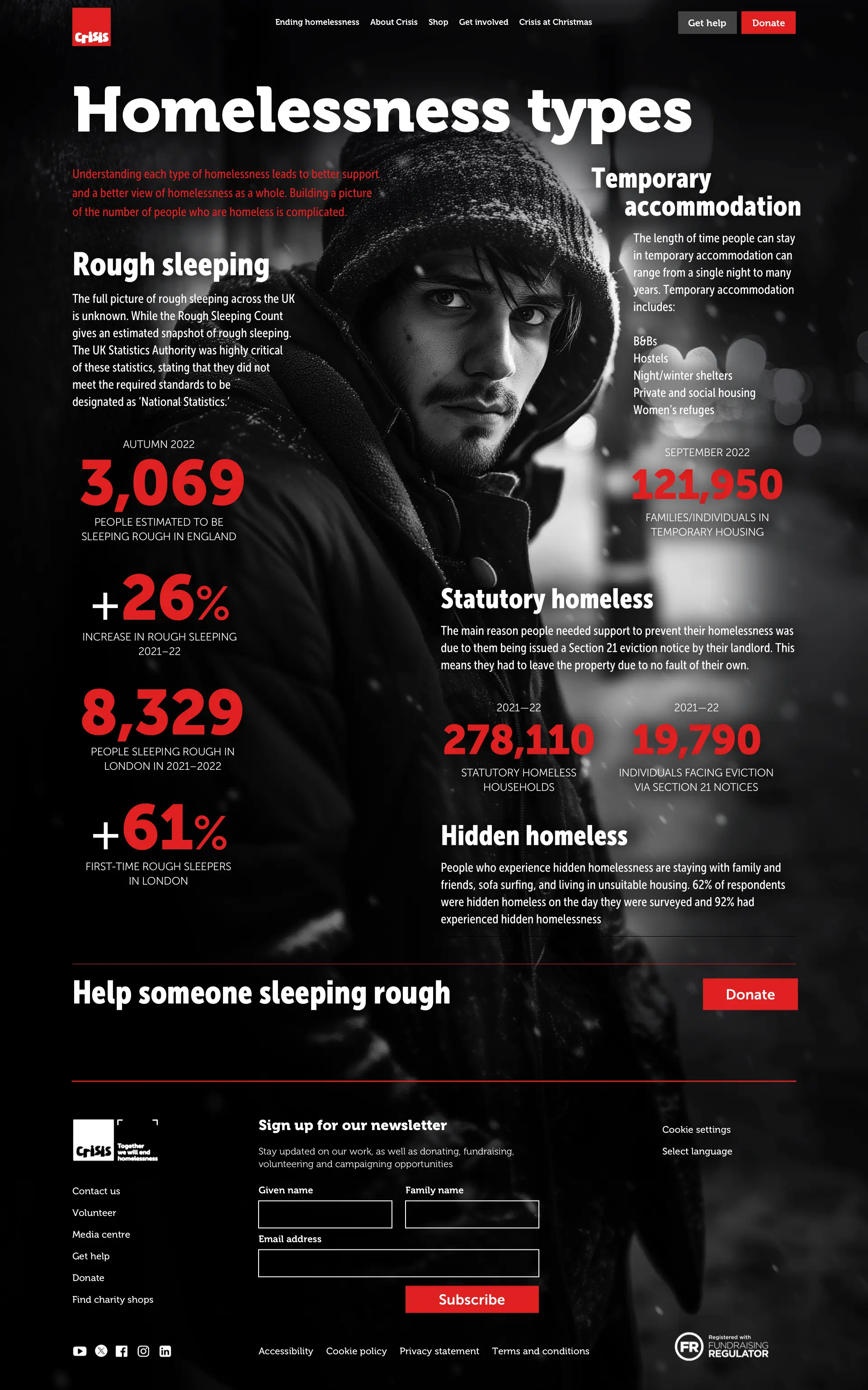
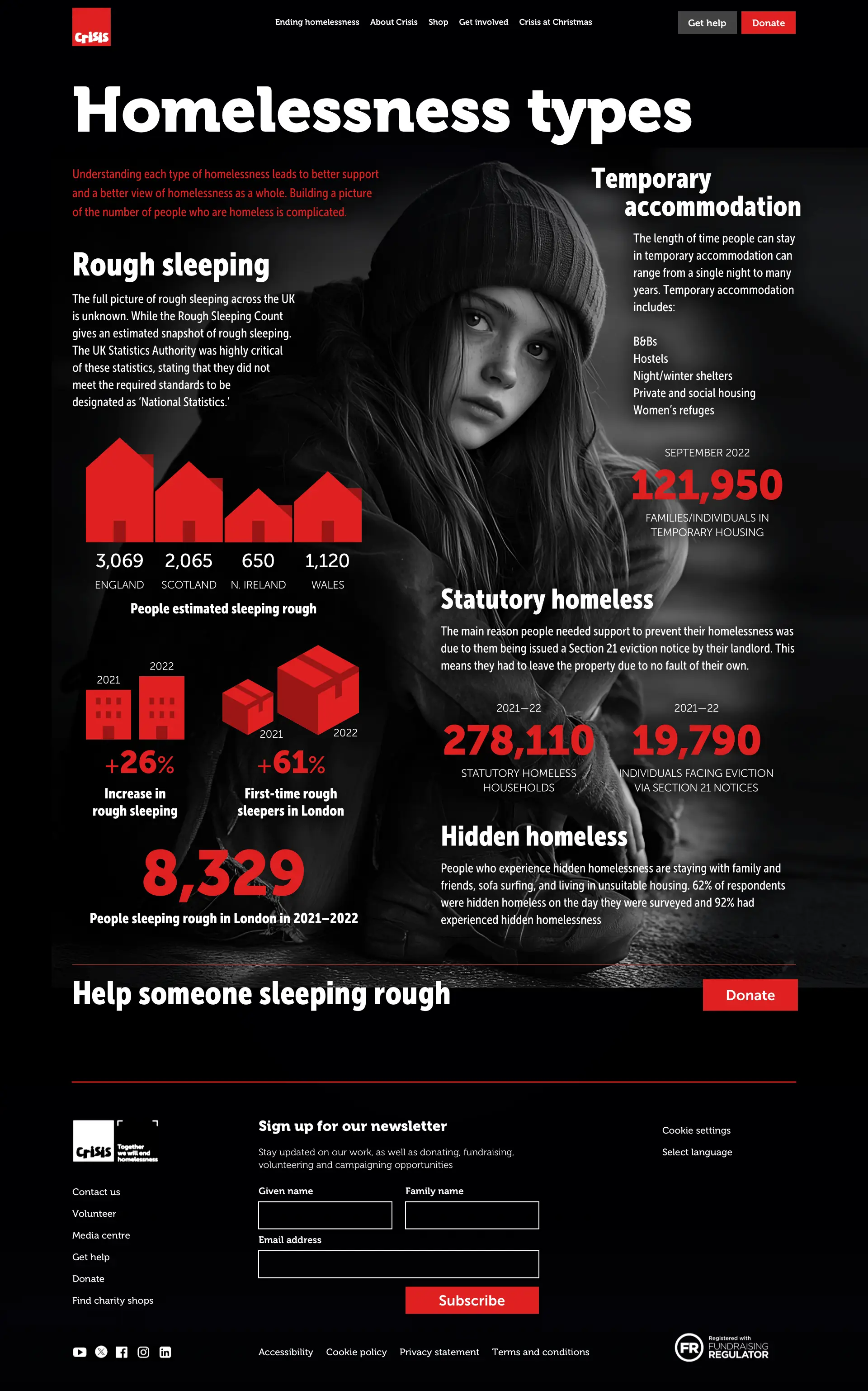
I started by selecting an evocative background image. Then, I removed the colour and applied a vignette.
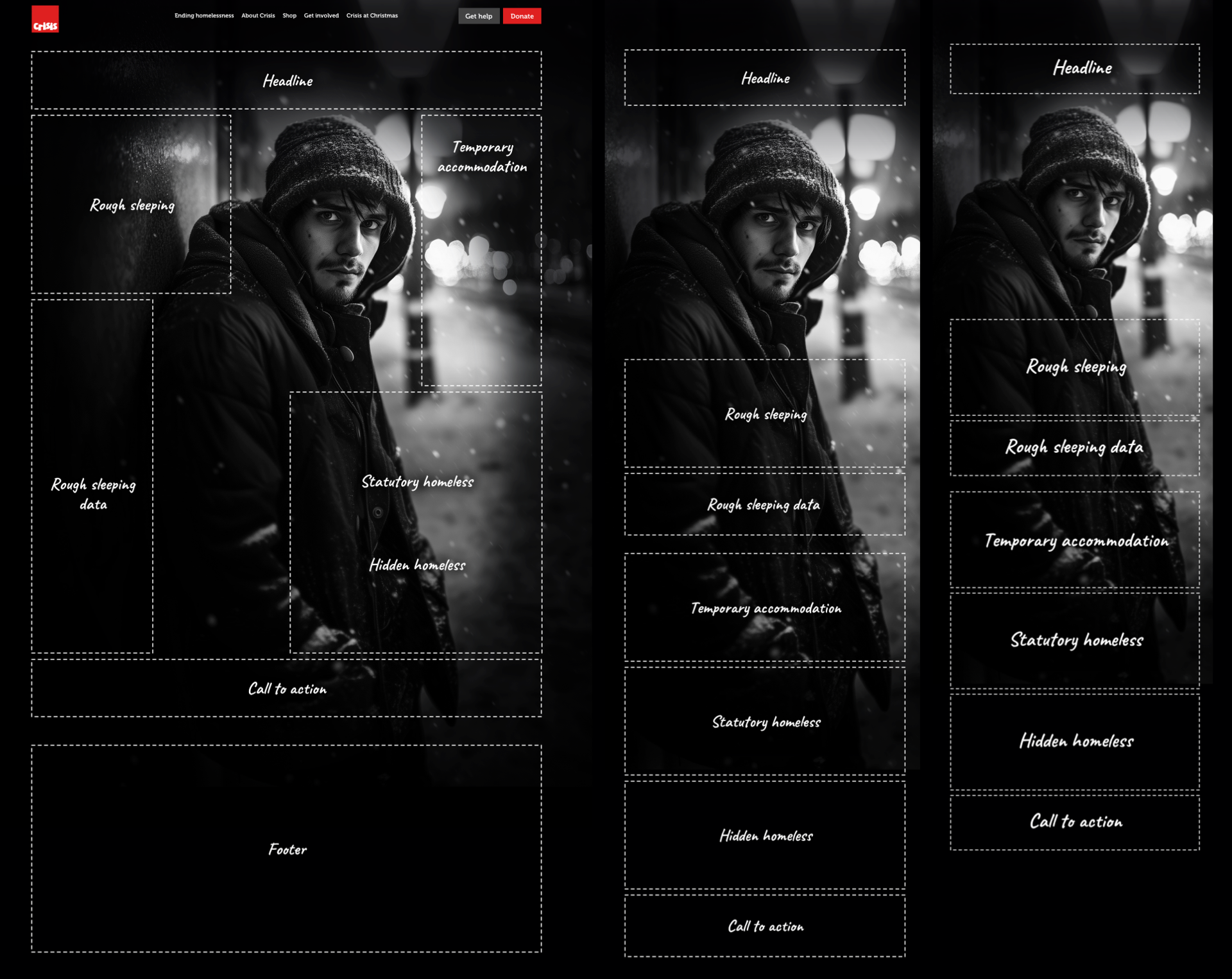
I blocked out content areas and arranged them around the image’s focal point, considering the hierarchy and source order and how it would be displayed on medium-size and small screens.
Reading content on the original design is a thoroughly unpleasant experience. Far from being immersive and allowing someone to settle into reading, its single column of unappealing text could look more attractive and engaging. Restructuring the content into sections and using a compound grid of four and five columns can transform someone’s reading experience. So, what’s a compound grid?
Simply put, it’s two or more grids that overlap or stack on the same page. The familiar 12-column grid Crisis uses gives us four even-width columns. Odd numbers of columns are less frequently used online but can be helpful, especially when it overlaps four columns, creating a compound grid with eight columns and a distinctive rhythmic pattern.
So now I have three options for laying out Crisis’s content: the familiar four columns, the flexible five columns, and a combination of the two. I can use one or more of these on a page to create various layout patterns that all feel connected.
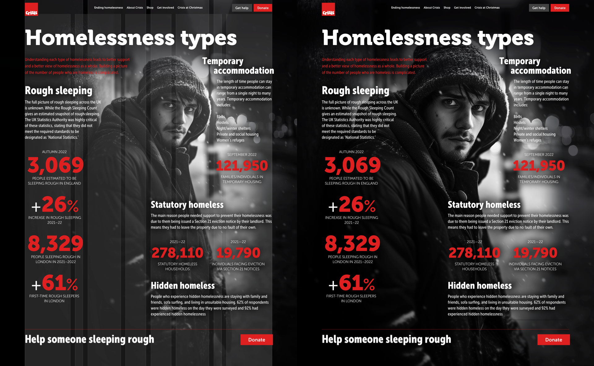
For this redesign of the article about the types of homelessness, the compound grid adds tension to the composition. The look in the young man’s eyes draws someone into the content and makes them want to discover more. Zooming into the man’s eyes helps someone connect with his situation. It amps up the drama and increases our pathos.
Crisis should want its website design to be as bold and impactful as its brand values. Those oversized numerals already look captivating, but by combining their gigantic size with graphic elements, they won’t politely ask someone to pay attention; they’ll demand to be noticed.
Storytelling stirs emotions
Storytelling stirs emotions and fosters strong personal connections. When people interact with a narrative, they’re significantly more likely to remember it. Visual elements like graphics, illustrations, and photographs enhance the memorability of stories. This is down to our innate attraction to images. Our brains process pictures more easily, enabling us to retain their information.
Illustrated content doesn’t just make your content look more appealing; it makes information glanceable and can explain complex ideas in ways that text alone can’t.
Plenty of libraries have off-the-shelf charts, so you often see these data visualisations in products and websites. However, rather than relying on someone else’s methods for presenting data, you should find ways which are authentic to a brand.
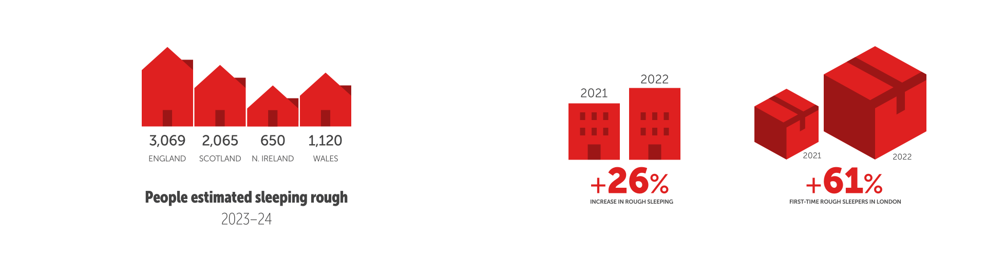
Instead of an out-of-box column chart, I used differently-sized houses to represent the number of people sleeping rough in the four nations of the UK. This design is understandable, visually appealing, and customisable with the Crisis signature colours.
Content should be illustrated in ways that resonate with a brand’s identity, and brands should tell stories in their own way and use their unique style to stand out.
Illustrating content
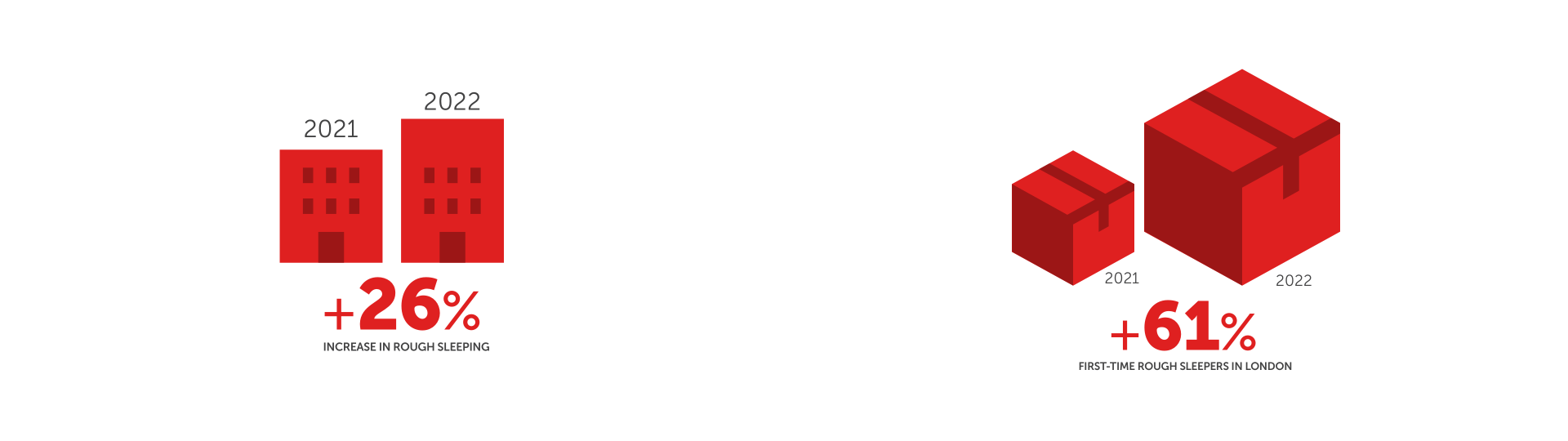
Remember, illustrating content is as much about the story behind the data as it’s about the data itself. Graphics like these present information in engaging and informative ways. I used differently-sized buildings to represent the 26% increase in rough sleeping; then, I increased the size of one of these boxes to demonstrate the 61% increase in London’s rough sleepers.
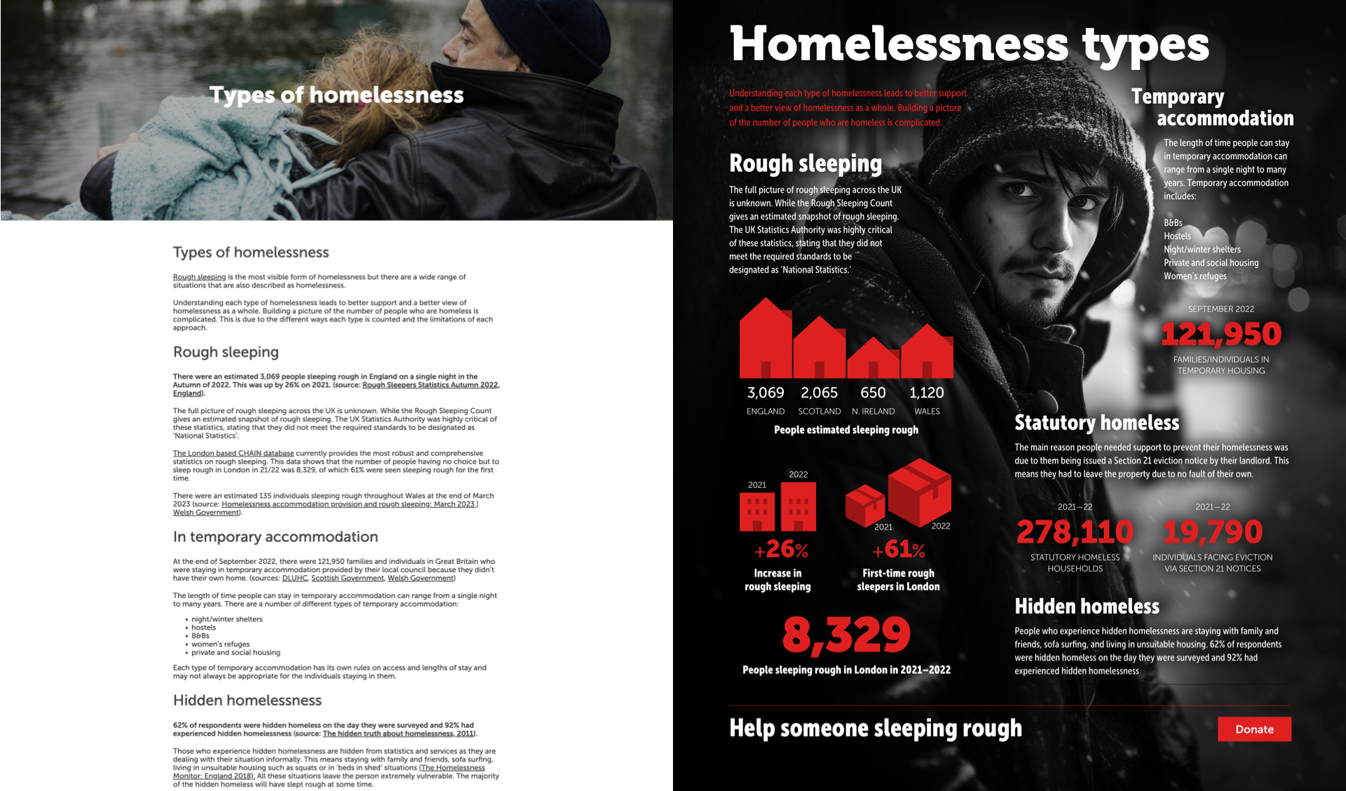
Graphics simplify complex subjects by breaking them into easily recognisable visual assets. This makes graphics like these powerful tools for communicating with diverse audiences. So, whereas the original design hides its information, this redesign brings it into view. I combined evocative imagery, graphic illustrations, and a selection of type styles and weights to add a new dimension to the design while balancing creative direction and user experience design.
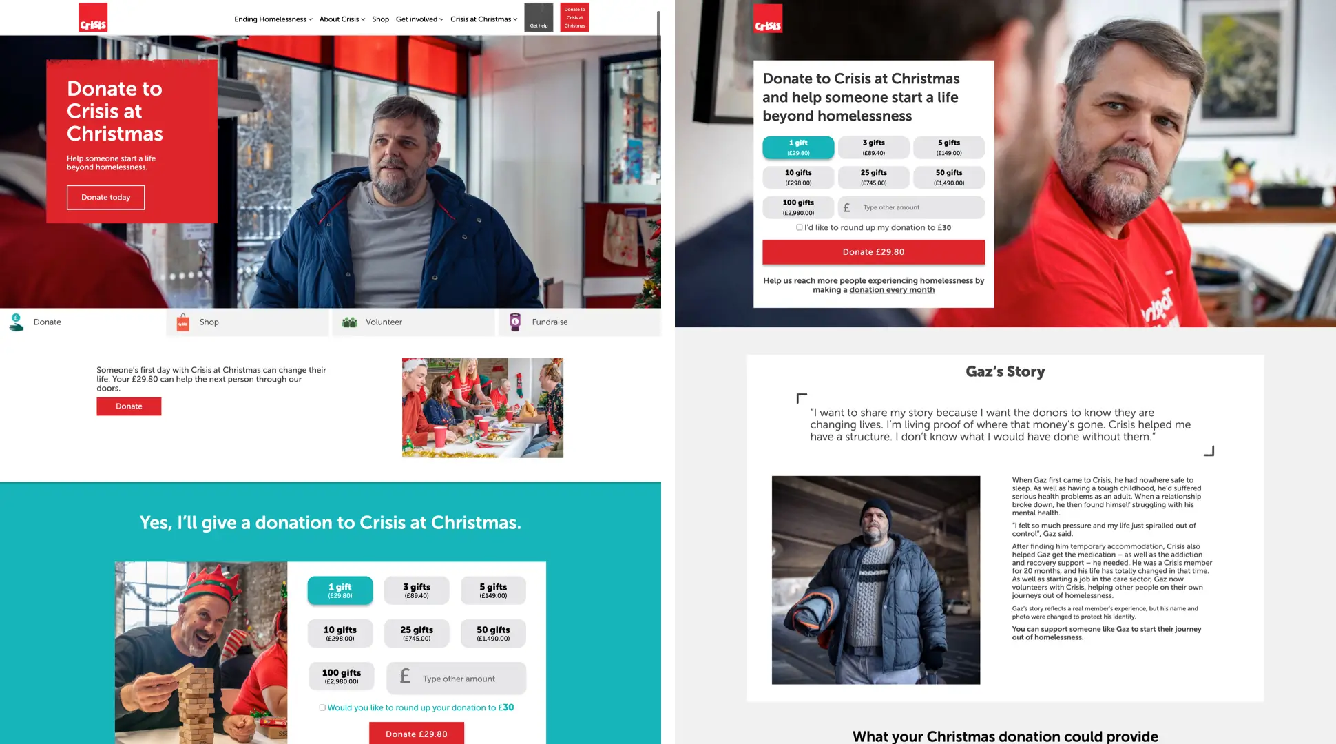
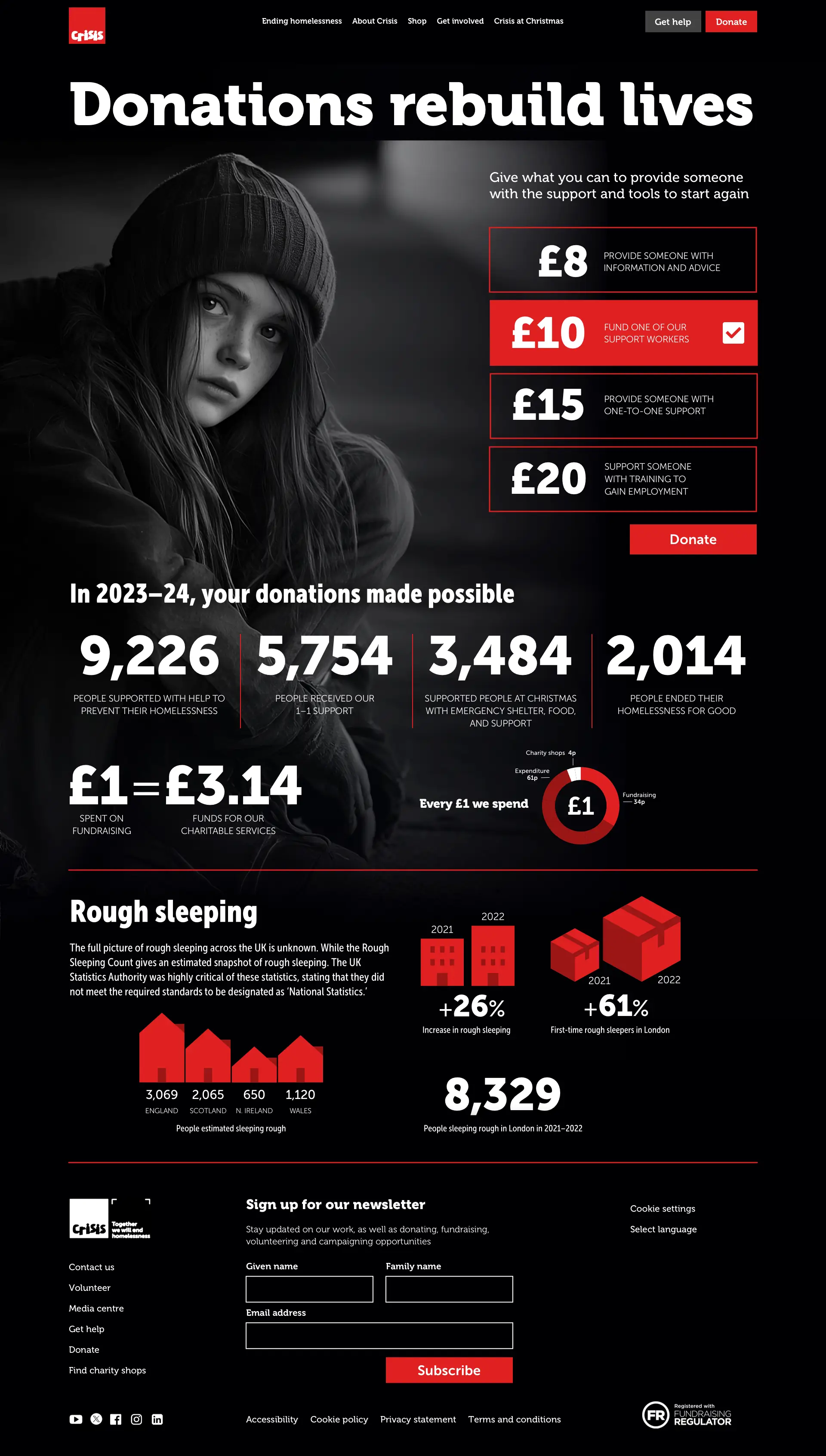
When someone donates, they have several questions that need answering. They want to know what or whom their donation will benefit and how that money will be spent. Answering these questions can be a fabulous opportunity to combine creative direction with user experience design.
The Crisis Christmas campaign
The Crisis Christmas campaign page includes a motivating story and information about what a Christmas donation could provide. But somehow, the composition of this page feels disjointed, as there’s no connection between the story and the donation form.
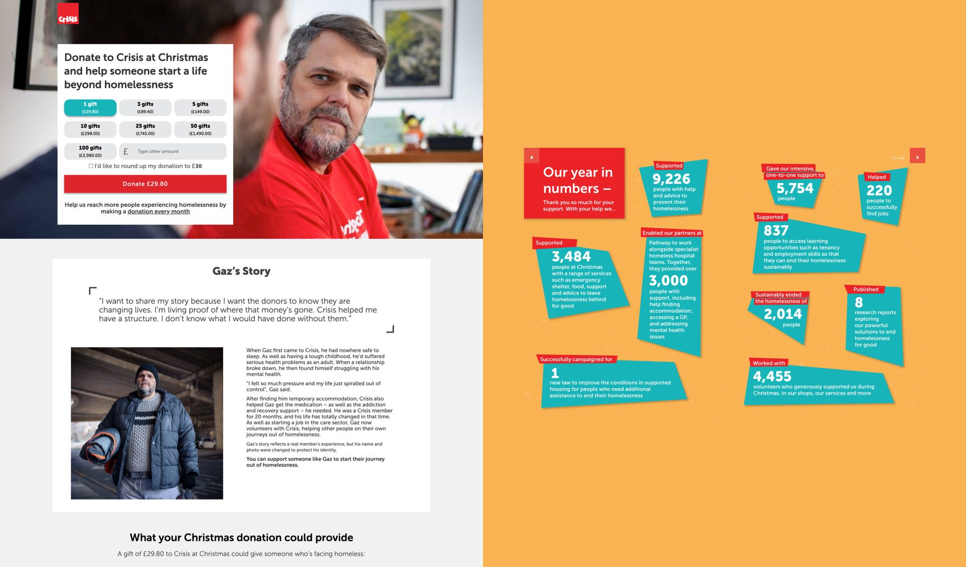
There’s also nothing about how someone’s money will be spent nor any information about their previous successful activities to reinforce why someone should donate. They’d have to track down the Crisis Annual Report for that information.
That Crisis Christmas campaign page could be instantly improved using a modular grid to add hierarchy and structure. The donation form fills four of the twelve modules in the top-most field, and the adjacent donut chart lets people know precisely how their money will be spent.
The modular grid, module size, and typographic scale add hierarchy and structure to the added stories. Most occupy a single module, but Johnny’s story has been proven to attract donors, so I set that in six of the eight columns in that field to create a large spatial zone.
Creative direction can help maintain the connection between motivation and donation by making them part of the same journey rather than separate experiences.
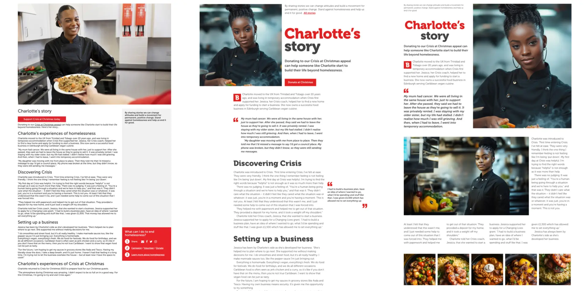
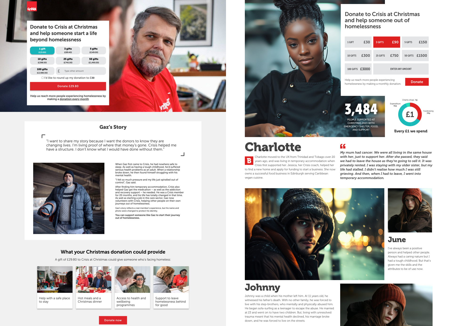
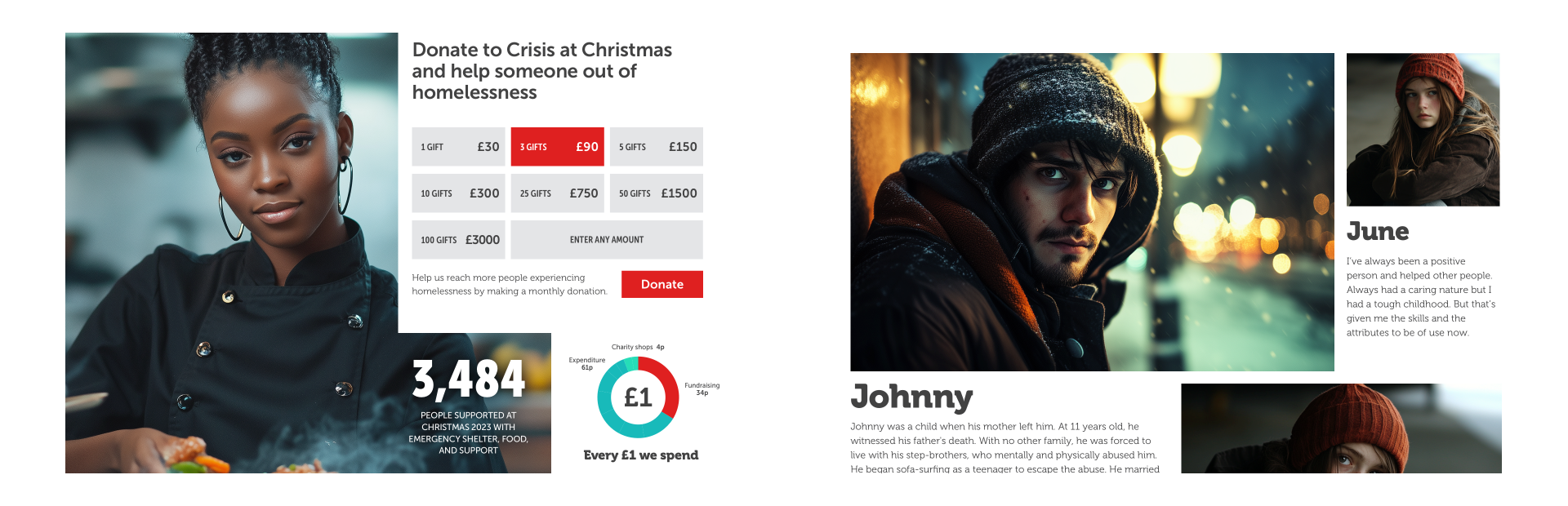
Connecting motivation and donation
Motivational stories help people know what or to whom their donation will benefit, so connecting them to ways for someone to donate makes sense. This new design for Charlotte’s story page inspires donations, and it’s essential to keep her in mind when someone takes the next step to support her.
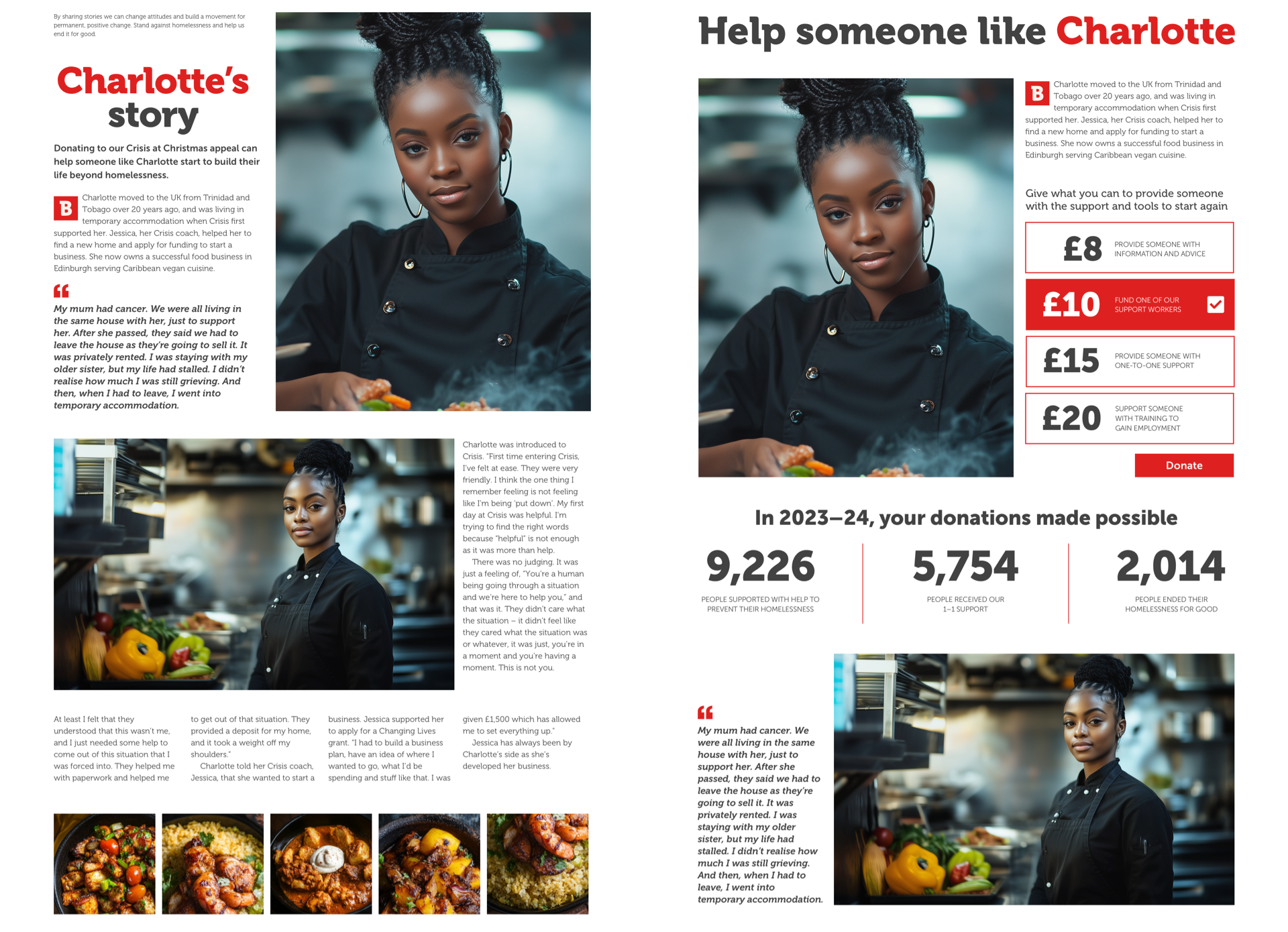
This redesigned donation page includes images and text that connect these two pages. Previous successful activities can reinforce why someone should donate, so this new page provides information about how many people Crisis helped last year, the number of people who received 1–1 support, and how many ended their homelessness for good.
Where possible, donation pages should feel connected to the page that refers them. This is done by using creative direction to keep critical messages at the forefront of people’s minds. That’s as true for information pages as it is for motivational stories.
When someone’s motivated to donate after learning about the various types of homelessness, how many people sleep rough, and the number of families in temporary housing, the following donation page should reinforce that information.
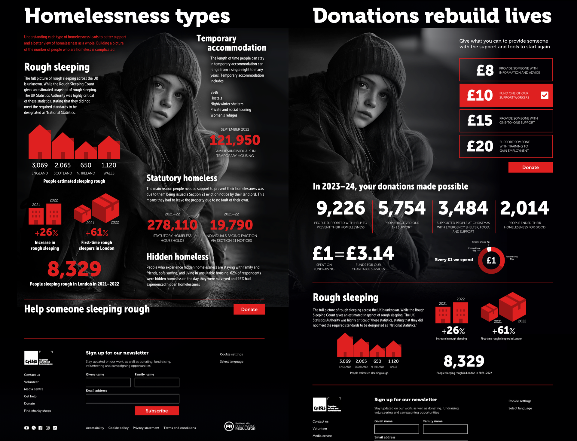
So, on this final donation page redesign, I connected its design with the referring page using the same graphic illustrations and photographs. The photograph establishes an emotional connection between the subject and the reader. At the same time, the graphic illustrations and typography bring the content to life and make her story—and how Crisis can support her—even more compelling.
Full versions of my designs
Article redesign
Information with typography
Information with graphics

Donation page
Information with graphics
Donation page
I’m passionate about combining creative direction with user experience design and would love to help more charities. Of course, this redesign was me imagining what I’d do if Crisis called Stuff & Nonsense. I have no insight into their CMS, design, development, or editorial processes and haven’t had to consider their unique challenges. Most of all, I don’t have to answer to anyone if my assumptions are wrong.
What do you think? Does my redesign make the facts about homelessness more real? Does it better tell the story of the Crisis charity, and would it encourage more people to support them?
And if you’re reading this from Crisis, I’d love to work with you.