Designing for Equfund
For the past few weeks, I’ve been working with Equfund, refreshing their visual identity, redesigning their website, and developing a consistent brand experience for customers across different channels and touch-points.
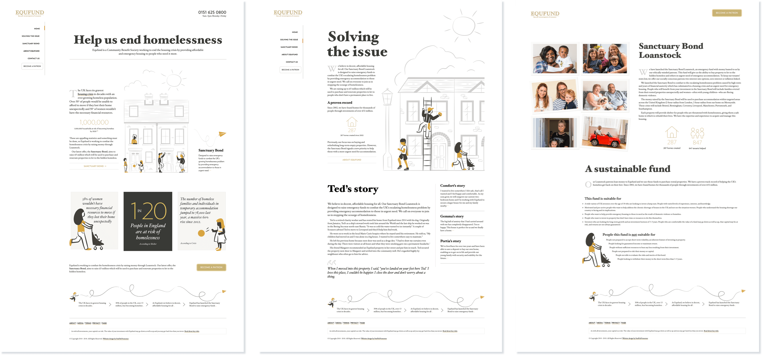
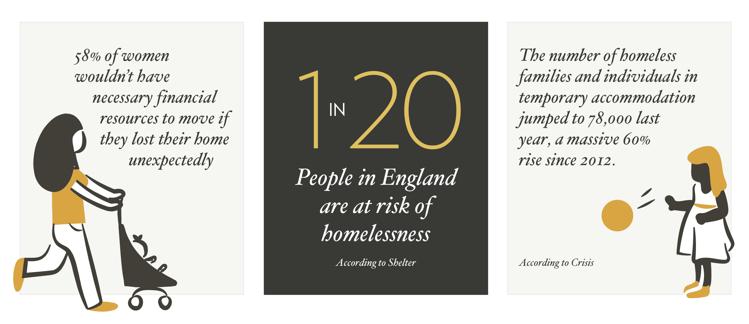
I’ve written an Equfund case study for my portfolio. It covers how I introduced a brighter colour palette and a fresh new typeface, plus how I commissioned Vic Bell—the talented artist who made our very own Errol the gorilla—to create a series of playful illustrations to visualise the role Equfund plays in helping people stay in their communities.
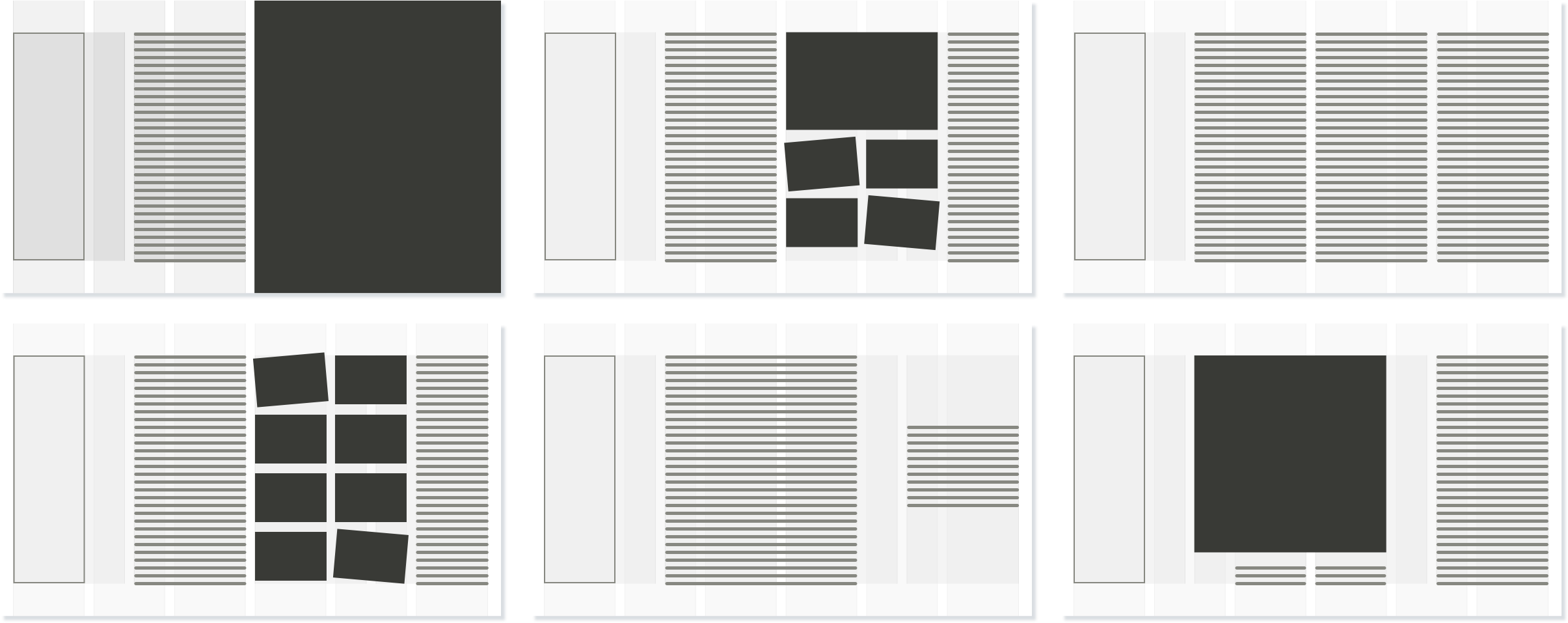
One of the aspects of the design I’m most pleased with is how the 6&4 overlapping compound grid I chose allow for so much flexibility, while providing a solid foundation for the various layouts. If you haven’t experimented using overlapping or stacked compound grids, they’re incredibly useful and that’s why I devoted so much of my new book to explaining how to use them.
In a nutshell, a compound grid is two or more grids of any type—column, modular, symmetrical, and asymmetrical—on one page. They can occupy separate areas or overlap.

In this design for Equfund, six columns overlay four to create interesting ways to align and size content. A 6&4 compound grid, famously used as the basis for Karl Gerstner’s work on Capital magazine in the 1960s. This grid makes an incredible variety of compositions possible. You might use widths from one or the other. Or you could combine widths from both to form columns which don’t conform to either. You can use these new widths to inform the sizes of images and text.
When it came to developing this website using CSS Grid, I needed a simple way to refer to each layout. As Equfund are based near Liverpool, I cheekily named each layout after a famous Liverpool FC manager or player: Beardsley, Clemence, Dalglish, Hanson, Hughes, Keegan, Rush, and Shankley.
View source on the Equfund website and you’ll find class attribute values like class="beardsley". This isn’t the first time I’ve devised a naming system like this. For Stuff & Nonsense, my layouts are named after famous Japanese monsters like Godzilla and Mechagodzilla. It’s a silly thing to do, but you know what, it works.
A few years ago, I began to specialise in helping businesses, charities, and NGOs to develop consistent brand experiences for customers across different channels and touch-points. Working with Equfund was incredibly gratifying and I’m looking forward to next year and developing their brand assets and website further.
Read the case study and go to the Equfund website.
Could you or your team benefit from knowing how to use art direction to improve your product or website? My in-house training and workshops can help.