Designing Zombie Hunt part four: Catering for small screens

This week I’m diving deep into how I approach projects, using a recent design for Zombie Hunt as an example. Yesterday, I wrote about designing a layout grid. Today is all about catering for small screens.
One of the questions I get asked most often about designing the compound and modular layouts I wrote about yesterday is, “how do you adapt them for small screens?” I’ve never found catering for small screens especially challenging. In fact, I look at it as an extra creative challenge, and it’s become one of my favourite parts of the job.
Like every aspect of design, designing for various screen sizes means making choices—some large, others small—about the placement and look of elements within a layout. These choices might be about whether to implement expanding navigation to save a little of the limited space on small screens. They may include how to order content visually and whether to make content stack vertically or overflow horizontally. There are no hard and fast answers to these questions, and that’s part of the joy of designing.
Making small decisions
Designing projects like Zombie Hunt means thinking about these choices and coming up with the best possible solution for a design. For example, I consider whether it was best to always show navigation links or if I should reveal them behind a menu icon. To make my decision, I think about the number of navigation items, the vertical height these items occupy, whether I can save significant space, and the complexity of implementing expanding navigation.

Zombie Hunt has relatively few navigation links, so the potential space savings weren’t significant enough to warrant implementing expanding navigation. Expanding navigation isn’t the only way to save space; there’s often sufficient available for creative layout on small screens.
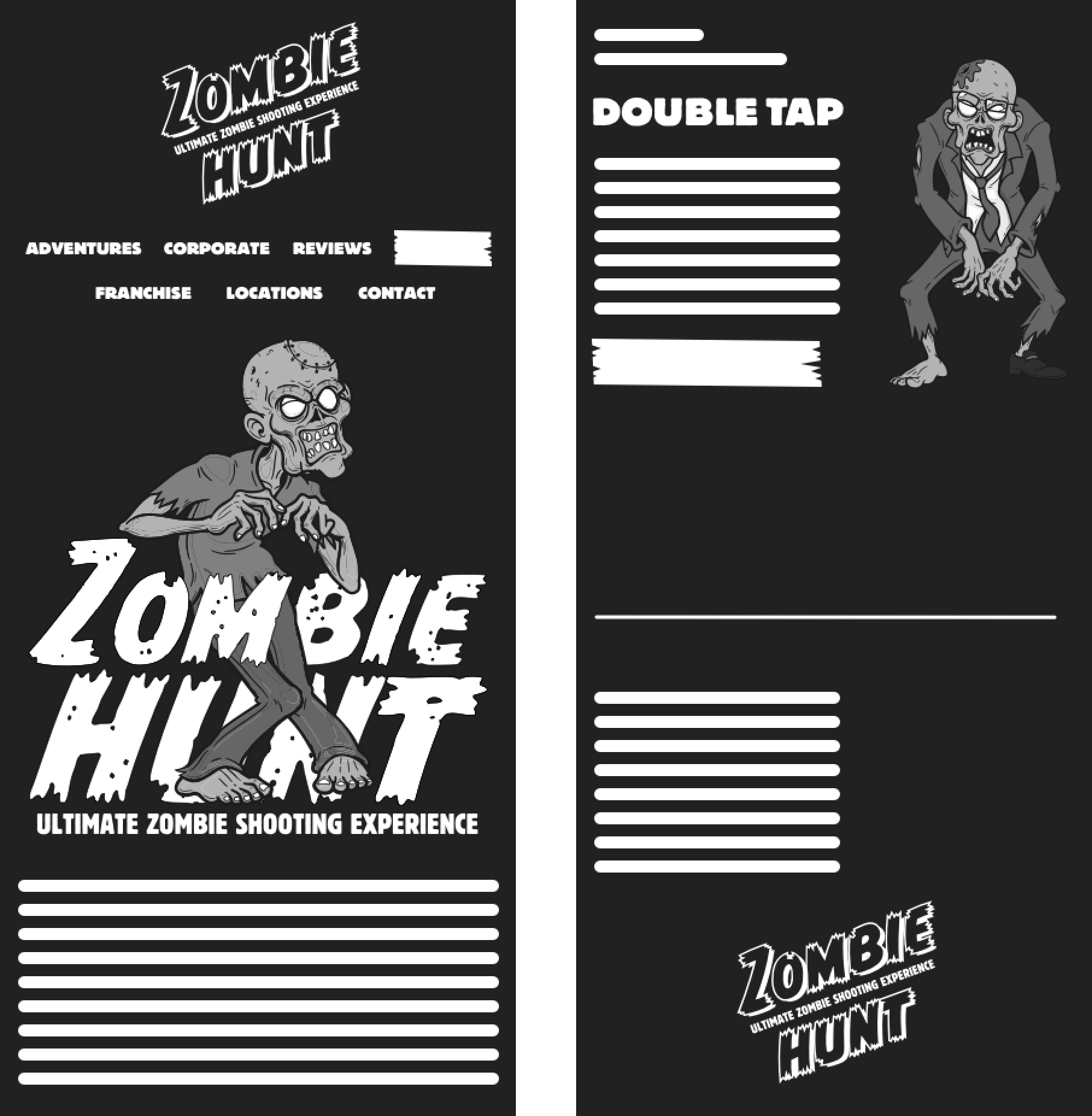
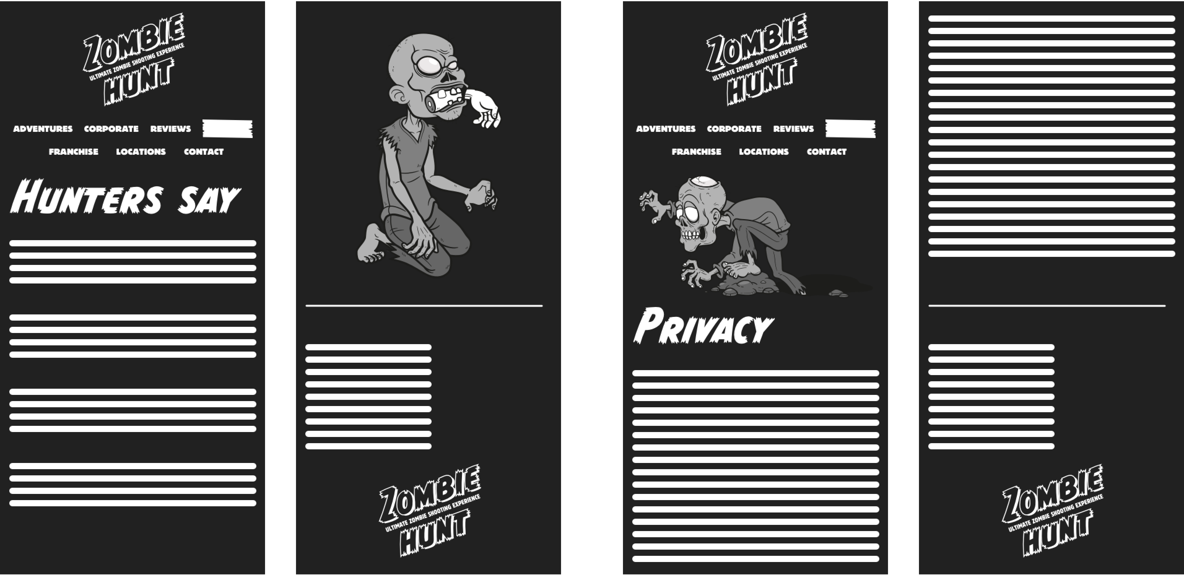
I considered several options for the Zombie Hunt small screen navigation. Some saved space by placing the logo and navigation side-by-side, but the close proximity of links compromised usability. Ultimately, I chose to stack the Zombie Hunt and navigation vertically, spreading the links and allowing plenty of space for larger tap targets.
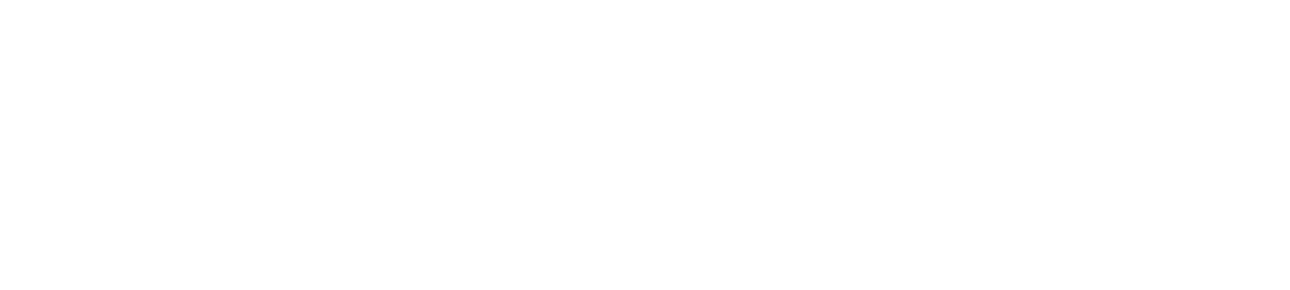
One of my biggest challenges for small screen designs is deciding how to place critical content—for example, the Zombie Hunt events—nearest the top. On the surface, this might not seem like much of a challenge. But, sometimes, the source order may not match the visual hierarchy, and that order might need to change depending on screen size.
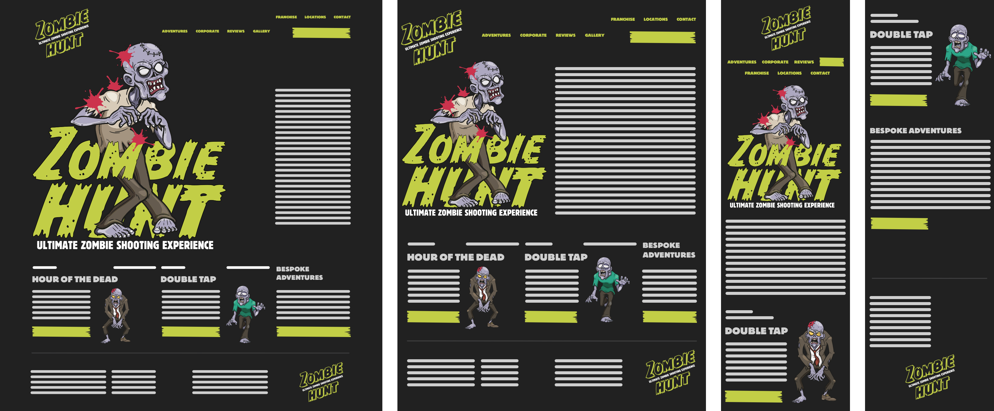
This large illustration on the Zombie Hunt adventures page pushes information about the events below the first visible area. People must scroll past this illustration to reach the critical content.
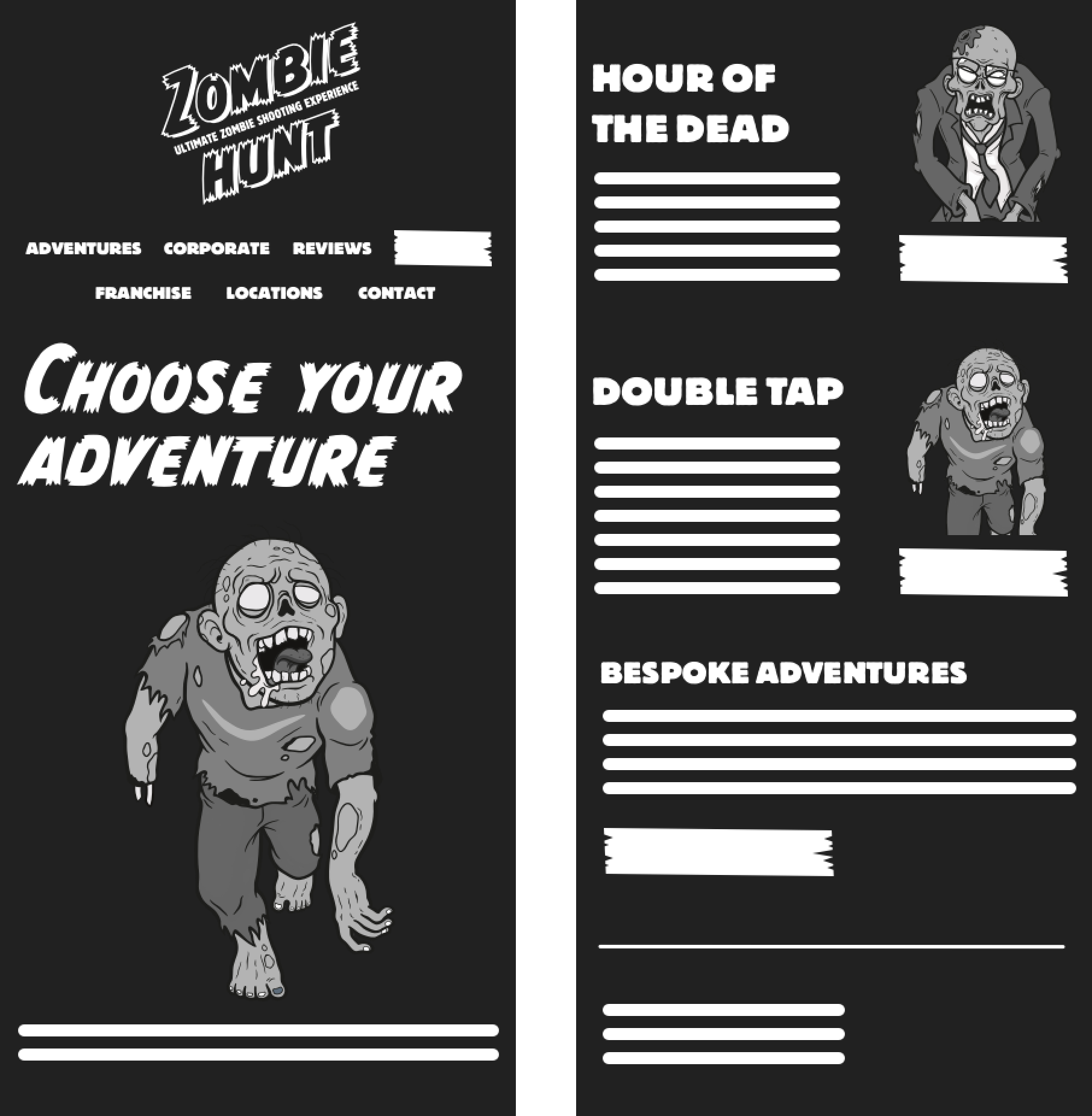
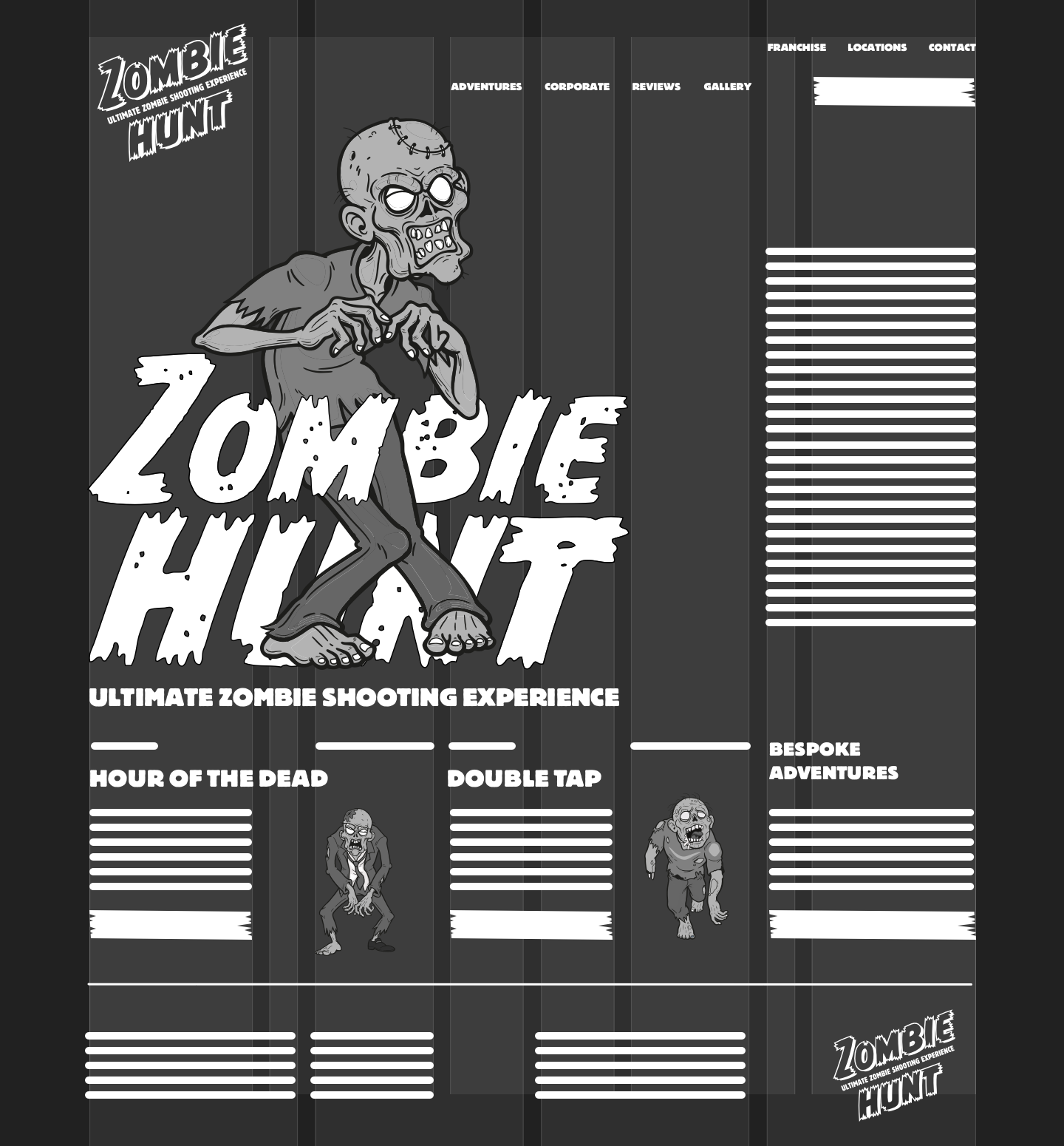
This alternative adventures page layout places event information at the start, so people needn’t scroll to see it. This layout solves one problem, but losing the large illustration's visual impact creates another.
I could shrink the illustration and reduce its height to allow some critical content to appear below it. But, this also reduces the illustration’s visual impact. It would be a far more elegant solution to maintain its scale and impact using the picture element or a clip-path to crop the image.
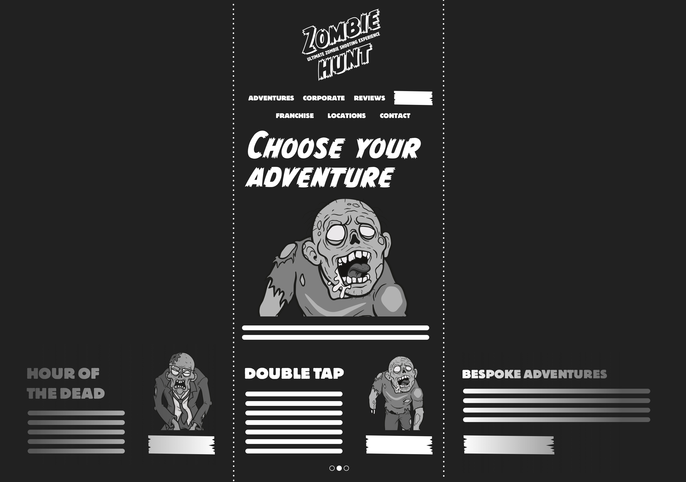
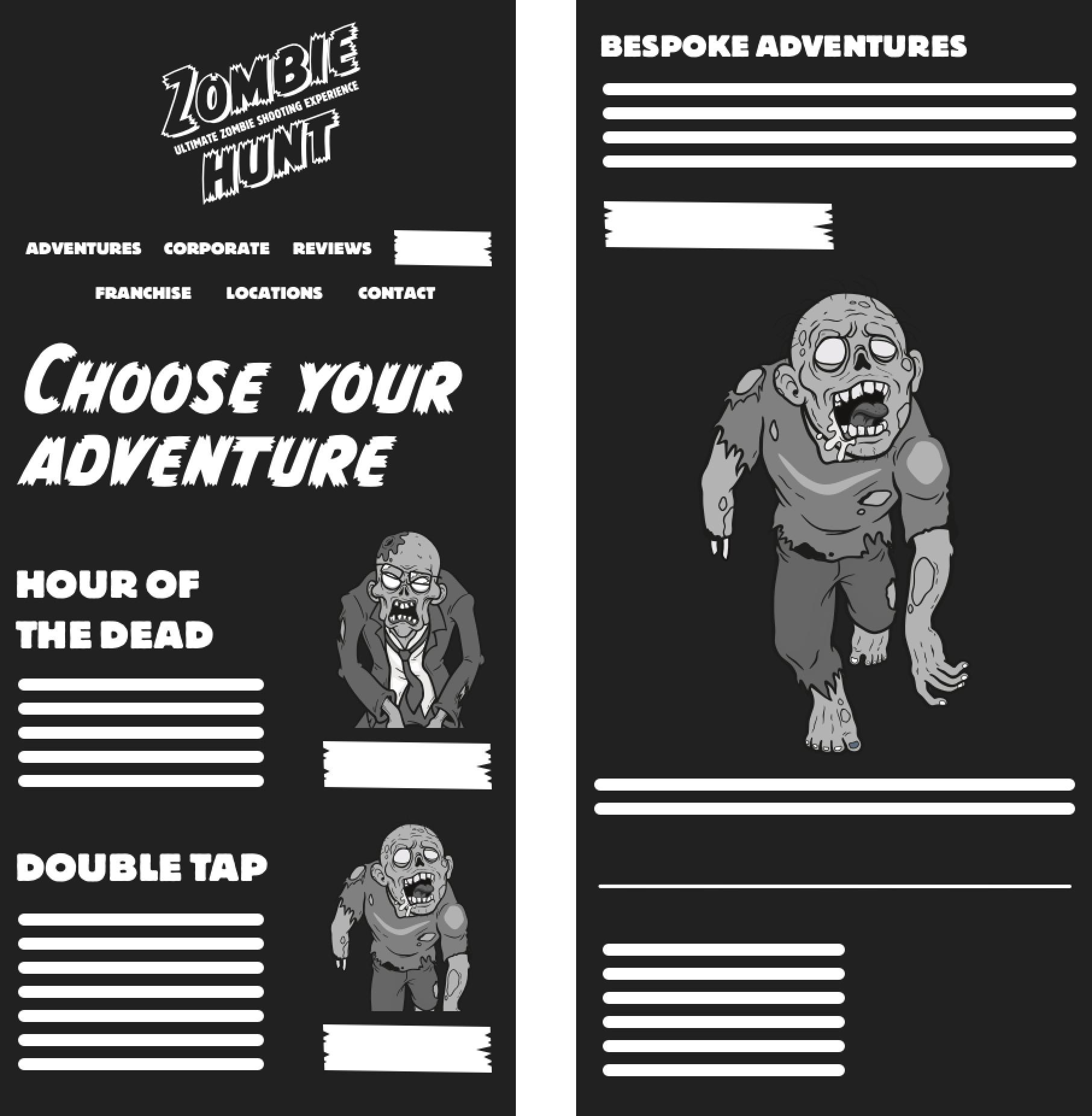
Another might be to arrange the Zombie Hunt events in a horizontally scrolling panel which brings them all closer to the top.
Creating connections
It’s essential to maintain a connection between layouts across various screen sizes. As I wrote yesterday, the Zombie Hunt home page design uses the ample space available on larger screens by placing content onto a 4+5 compound grid.
Adapting a design for smaller screens needn’t mean abandoning the layout altogether. In fact, that same 4+5 compound grid can perfectly suit smaller screens by placing elements into a different number of columns. But can that grid be as effective on medium-size screens where space is more limited?
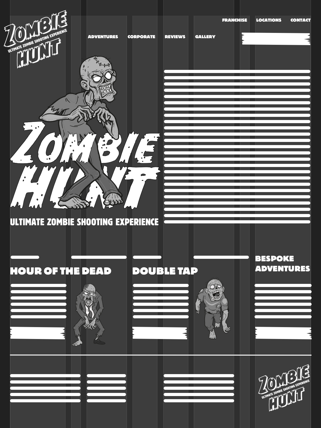
In a large-screen layout, there was a dramatic difference in the illustration and running text proportions. But, in a medium-size screen layout, white space is reduced, and elements are evenly sized.
Designing mobile “first” has never particularly suited my approach to design, and I’ve always found adding layout progressively as screen sizes increase challenging to achieve. Instead, I now try to make as many aspects of my designs flexible, so they work at every screen size.
I set my type sizes so they’re readable on every screen and rarely increase them as screens get bigger. I use viewport-based units wherever I can so that whitespace is proportional to the space available. And, I use fluid images which change size along with their containers.
Like many designers, I use horizontal layout only where I need it. One example is the horizontal arrangement of text and illustrations in Zombie Hunt events which appears at every screen size.
This means many of my Zombie Hunt page designs use a single column on small screens, adding layout only where and when I need it and keeping complexity to a minimum.
Far from being a chore, creating designs for multiple screen sizes has become one of my favourite parts of working on a project like Zombie Hunt because it provides another aspect of design where I can be creative.