The Labour Party’s website could do better at promoting their policies, so I imagined how that could be done
So far, Rishi’s announced the general election to the soundtrack of Things Can Only Get BWetter, spoke to reporters outside the Titanic exhibition (spoiler: It sank,) was photographed under an Exit sign, and accidentally grew big ears after announcing a crackdown on Mickey Mouse university degrees. Yes, it’s all going very well. But, even with all these mishaps, Labour can’t take victory for granted. Sadly, their website design sucks. So, I imagined what I’d make if Labour came calling.
What’s up with Labour’s current design? Well, besides the absence of any typographic or visual hierarchy, inconsistent use of colour, and the lack of focus on key calls to action, there’s the fact that their design lacks a clear identity. The layout, images, and typographic design are interchangeable with countless other websites—hardly an example of the Change that Labour want to present.
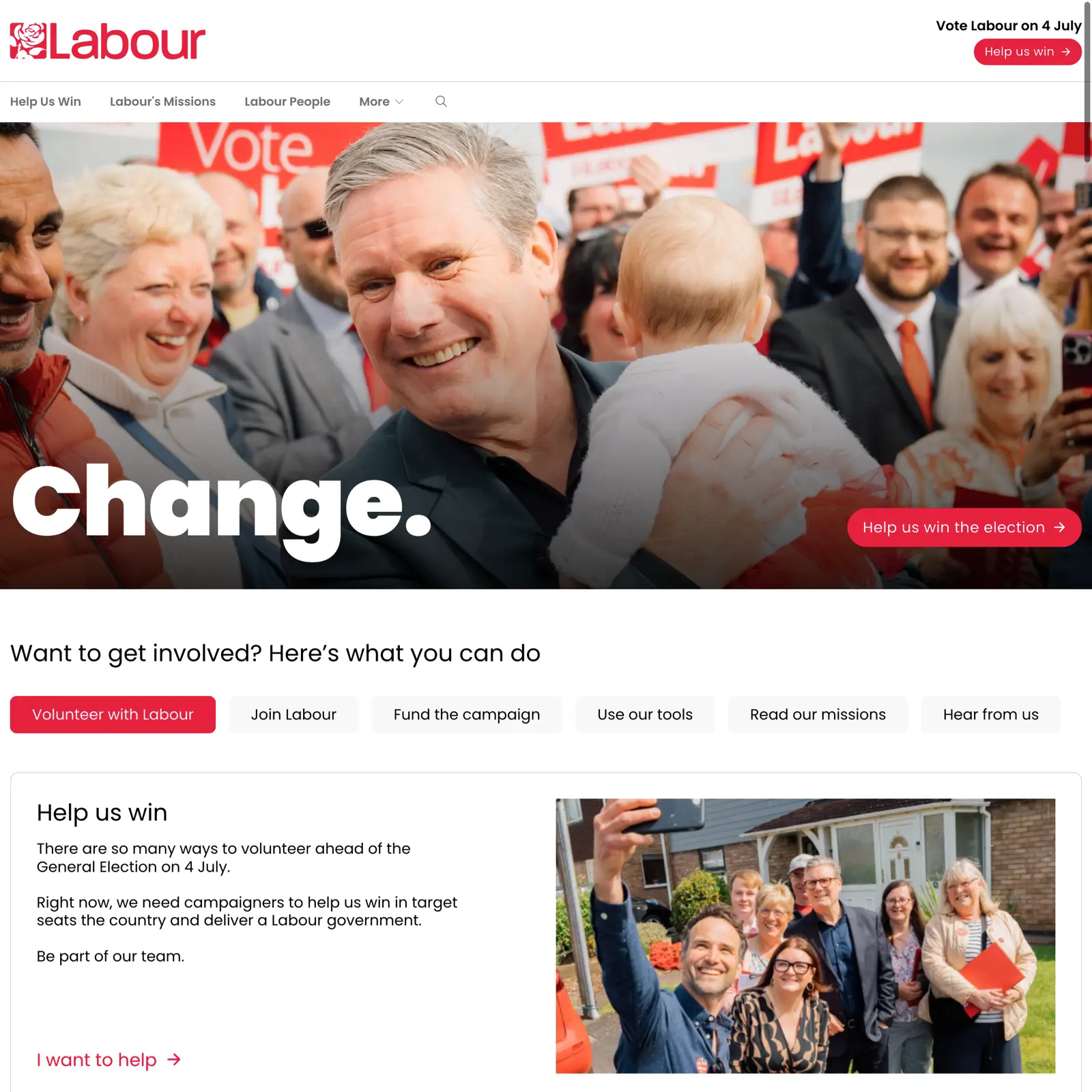
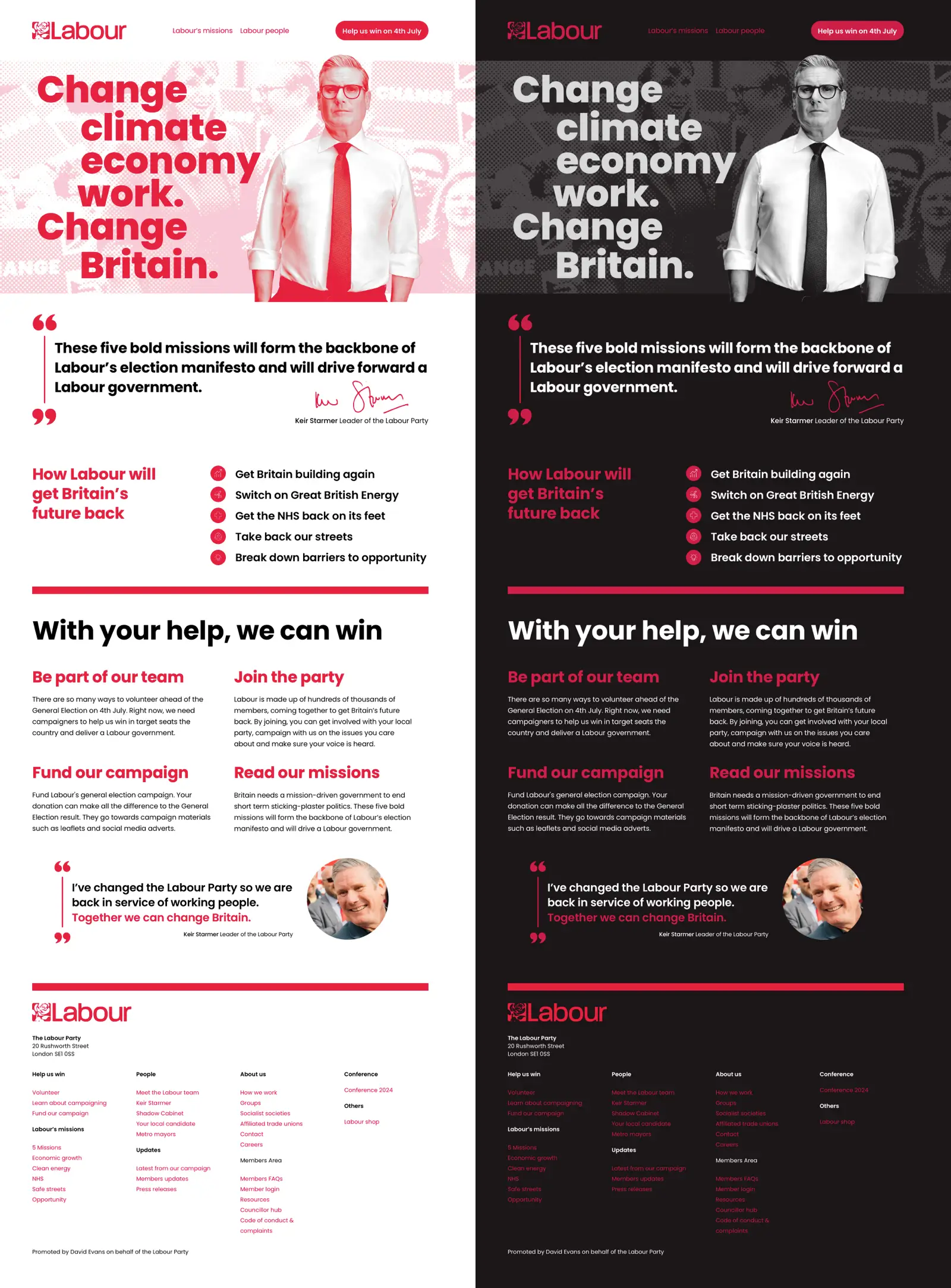
How would I fix this? I’d start by working on their content, organising it into an obvious typographic and visual hierarchy. Then, I’d use a hierarchical grid layout to focus the eye on key messages and their associated calls to action. Finally, I’d develop a distinctive visual identity with a simplified colour palette and a distinctive image treatment. If I had time, I’d make a dark theme version of my design because, hey, why not?
When I started imagining what I’d make if Labour came calling, I gave myself some constraints. I’d keep the same 12-column grid and reuse the Poppins typeface. I’d use Labour’s signature red throughout and only use content, icons, and images already on Labour’s website.
Full-width banner images or graphic elements are ubiquitous—crikey; I even have one on my current website design. Full-width banners aren’t inherently bad, but using them as filler or because everyone else has them is.
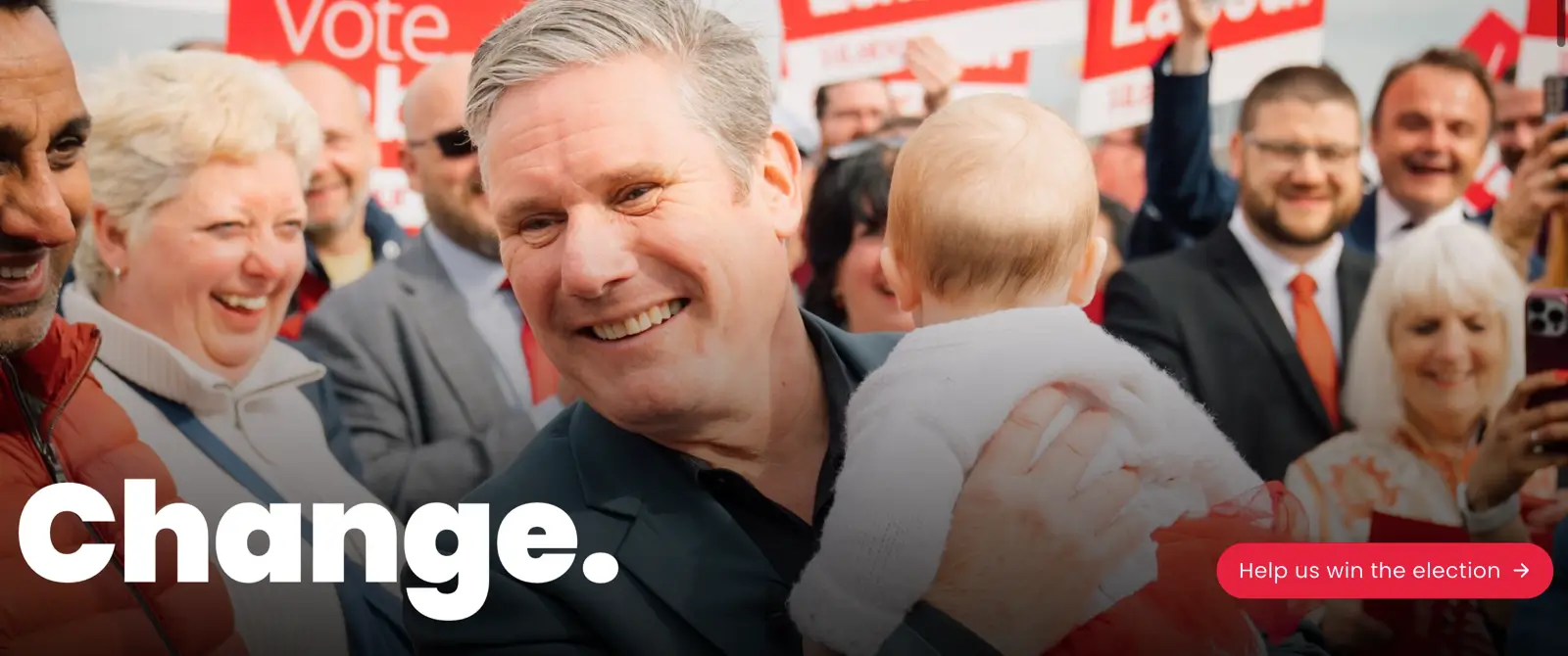
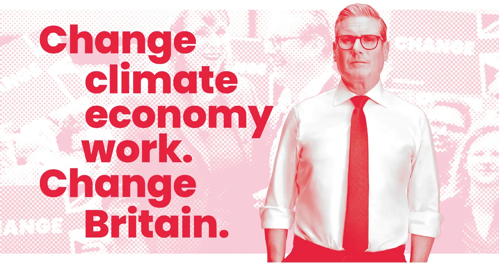
I decided to replace the stereotypical picture of Keir Starmer cuddling a baby with a stylised monochrome portrait of the Labour leader. I set this against a halftone background, which evokes the grassroots campaign materials I used to deliver through mailboxes in my youth. I added a bold typographic design, which adds context to Labour’s message of “Change.” Its proximity to Sir Keir’s portrait associates the message with the messenger.
The Conservatives have been attacking Labour for (falsely) “having no plan,” so I moved their five missions from close to the bottom of the page to near the top.


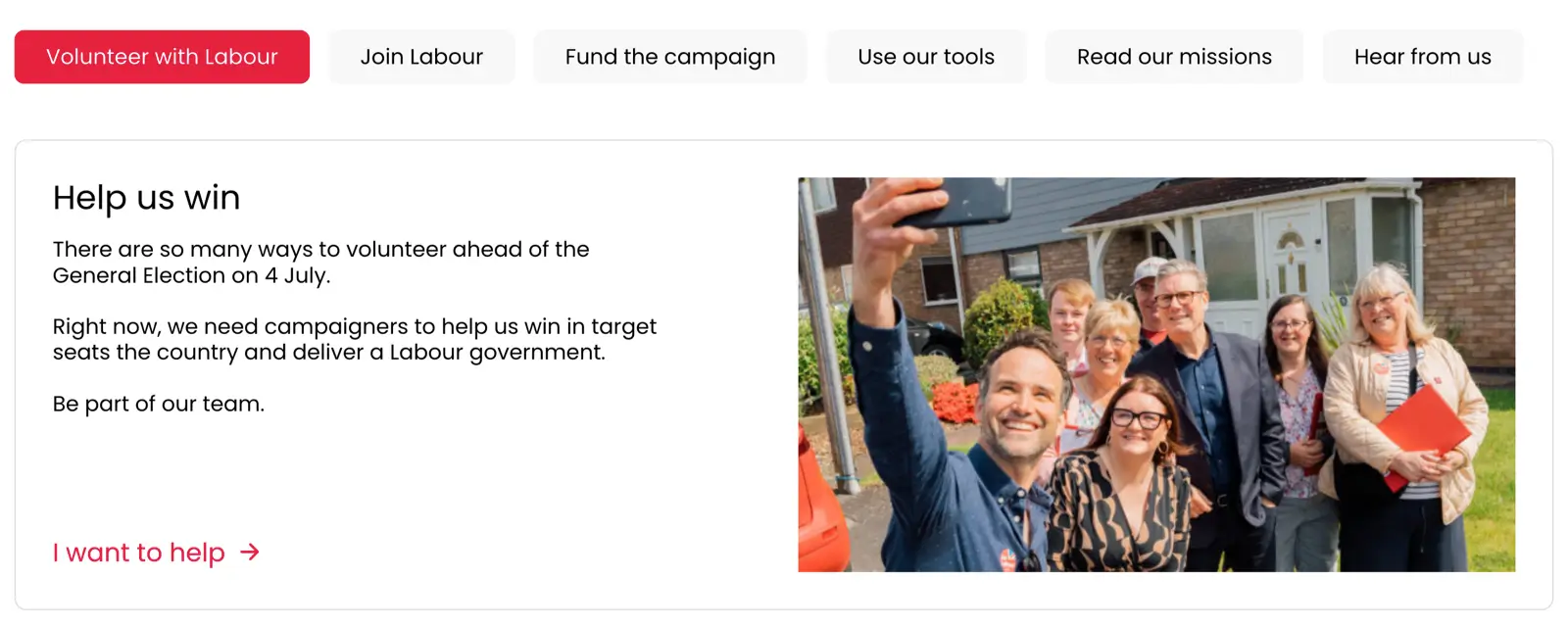
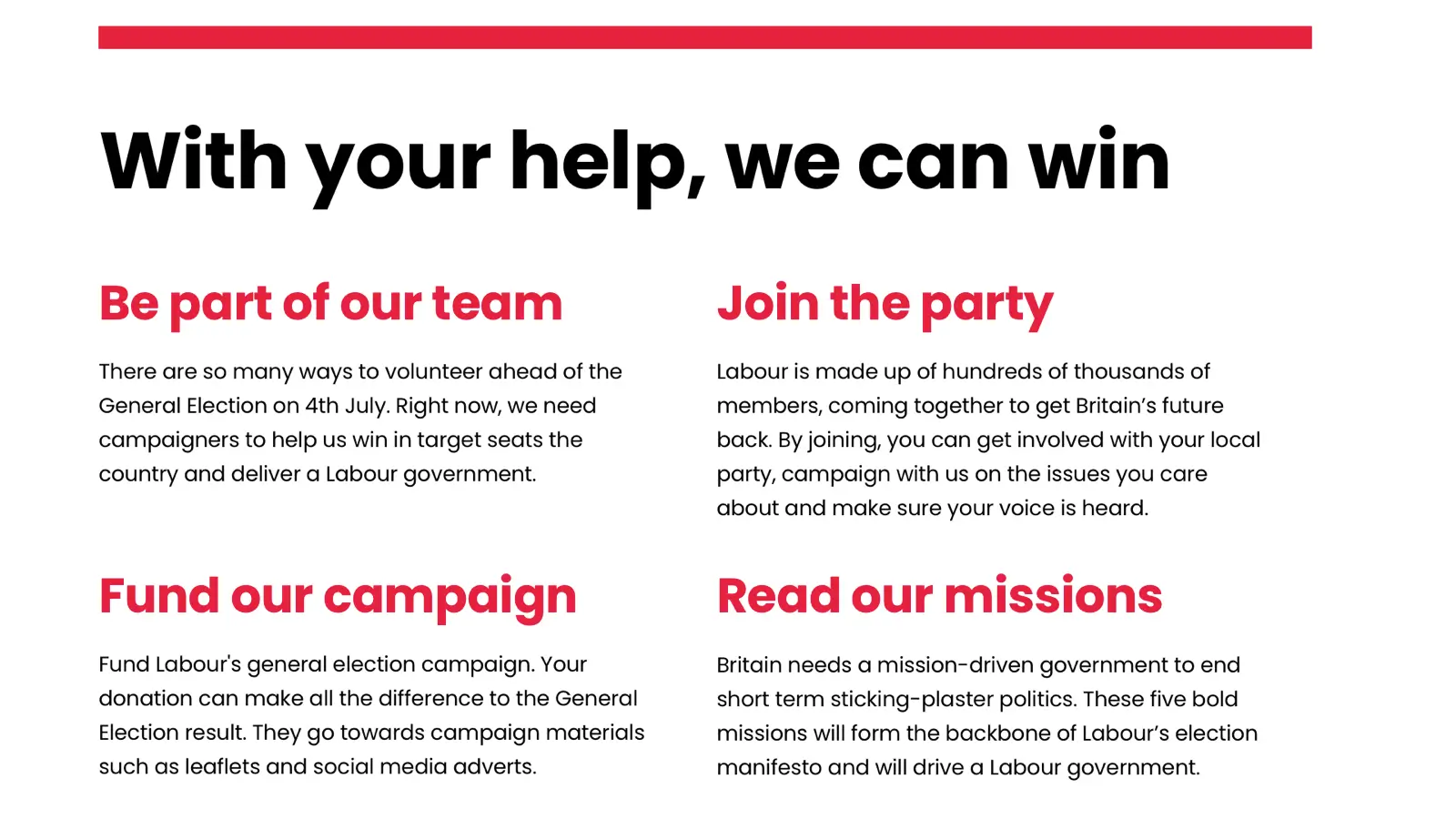
At this stage of the election campaign, fundraising and volunteering are vital to Labour’s success. All but one of these topics are currently hidden behind a tabbed interface, so I moved them out and made them highly visible under a headline that provides context: “With your help, we can win.”
Policy details matter, and design details matter, too, so I added detail to quotations without introducing unnecessary visual clutter or confusion.


Of course, this redesign is just me imagining what I’d make if Labour came calling. I have no insight into Labour’s messaging or strategy. I haven’t had to consider what may or may not be possible with their CMS, and I don’t have to answer to anyone if my assumptions turn out to be wrong. Still, I enjoyed spending some time imagining, and I’m pleased with the outcome.
Sir Keir, Angela, if you’d like help with your design, I have the time.