Labour’s 1997 election website is lost to history, so I imagined how it might’ve looked
The 2024 General Election is just days away, and opinion polls suggest Labour will win with a majority bigger than 1997. Even though I’m not as excited about Labour’s vision as I was then, I still keep my fingers tightly crossed. As I found a few weeks ago, there’s barely anything left of Labour’s labourwin97.org.uk campaign website from its victory in 1997 under Tony Blair. It wasn’t archived by the Wayback Machine, so I imagined what it might’ve looked like.
Reconstructing Labour’s website means knowing what websites looked like in 1997. The Wayback Machine is one source, and the Web Design Museum has a section on Web Design in the 90s which starts the year before the 1997 election. It includes screenshots of websites from Adobe, AOL, Apple, and, interestingly, the very first BBC election website.
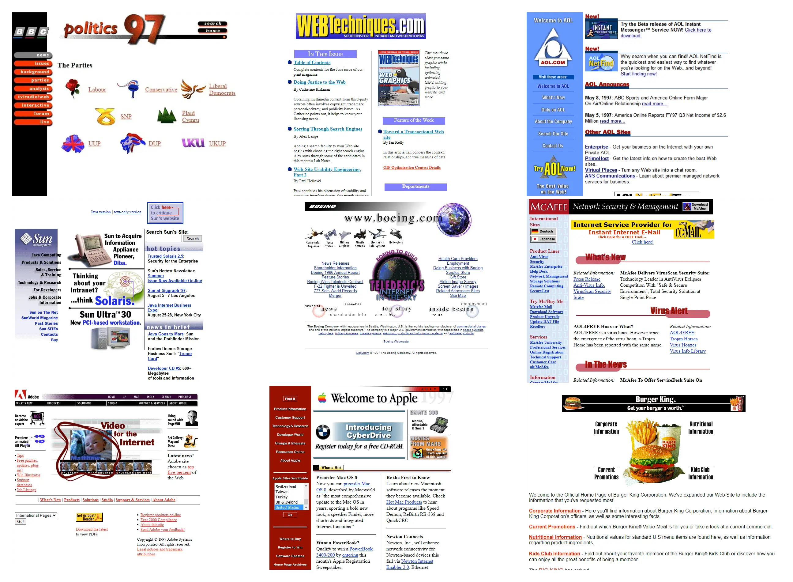
Back then, links were (mostly) blue, the typographic hierarchy was (relatively) flat, and fonts came from the system unless they were embedded in images. Shadows were popular for graphical-type elements, and list markers were (frequently) three-dimensional. As for the layout, widths were (almost) always fixed with a side column that contained the navigation. The BBC’s election website typified this design style with its fixed sidebar and three-dimensional and pill-shaped navigation.
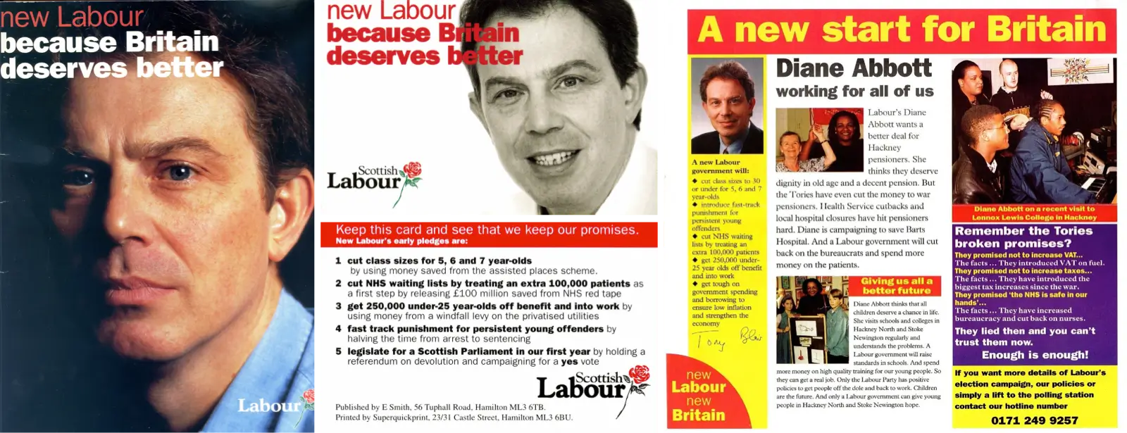
Labour’s printed campaign materials from the 1997 election are also useful, including campaign leaflets, the famous policy pledge card, and the cover of their manifesto. Back then, Labour’s signature red was a different hue and more saturated than its current colour, and they used their now-defunct yellow accent.

For text in today’s online and offline materials, Labour has standardised on Poppins, the free-to-use typeface designed by Indian Type Foundry and available from Google Fonts. In 1997, Franklin Gothic was their chosen typeface, mostly used in bold or black and with subtle negative tracking.
Knowing what we know about the design styles common in 1997 and how Labour branded itself offline, how might its general election website have looked?
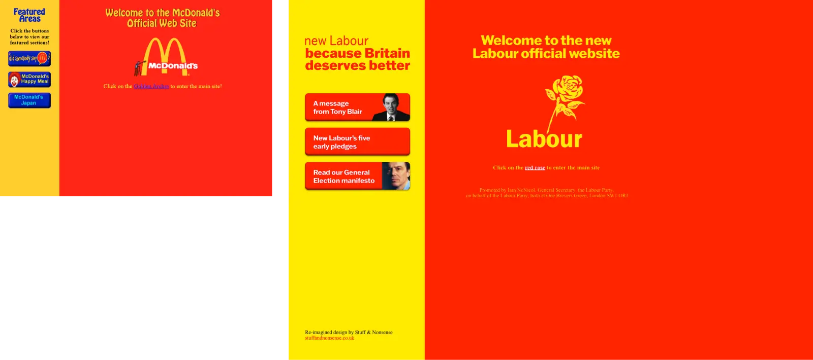
Macromedia acquired FutureSplash in 1996 and rebranded it as Macromedia Flash. Although Flash wasn’t installed on most desktop browsers until the early 2000s—launching a generation of websites with splash screens—you could find similar intro screens in the late 1990s. With its eerily similar colours, McDonalds’ intro screen encouraged people to “Click on the Golden Arches to enter the main site!” Labour could’ve followed their lead by asking people to “Click on the rose.” Similarly, the three buttons on the left could’ve taken people to the most important areas of Labour’s website: their message from Tony Blair, five pledges, and the election manifesto.
Microsoft FrontPage was launched in 1996. Macromedia then launched Dreamweaver, its IDE for web development, in the same year as the 1997 general election. Both made laying out web pages using HTML tables easier, spurred on by David Siegel’s 1997 book Creating Killer Web Sites. But, both David’s book and the popularity of Dreamweaver came after the election. This didn’t stop designers at the time from creating relatively complex, often off-the-grid layouts.
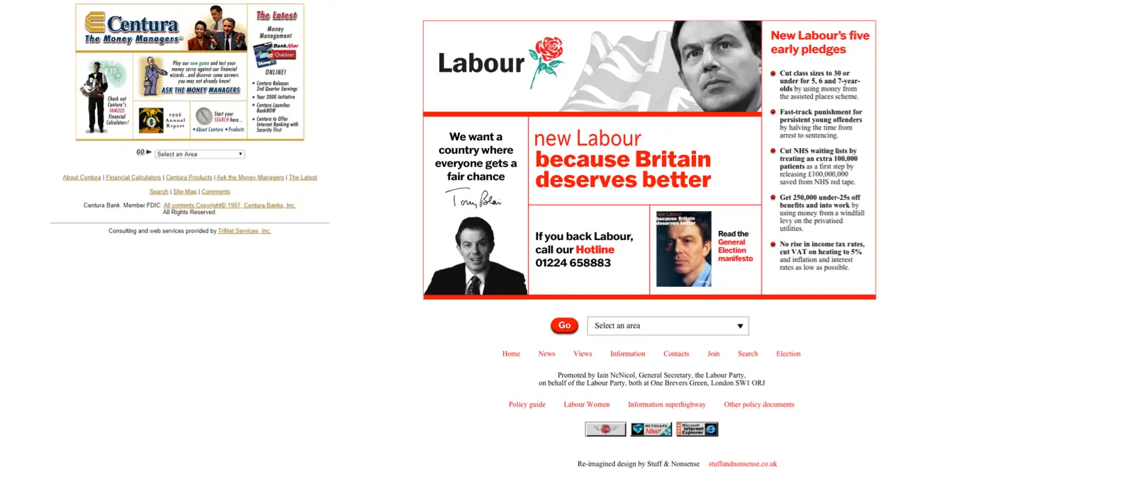
Designers at Nokia—then “Europe’s largest mobile phone manufacturer”—used image maps and tables to create an integrated panel including HTML and replaced text content and a sliced-up graphic. Labour’s designers might've made something similar, combining the black-and-white photograph of Tony Blair with new Labour messaging and red/yellow sticker-style graphics they used offline.
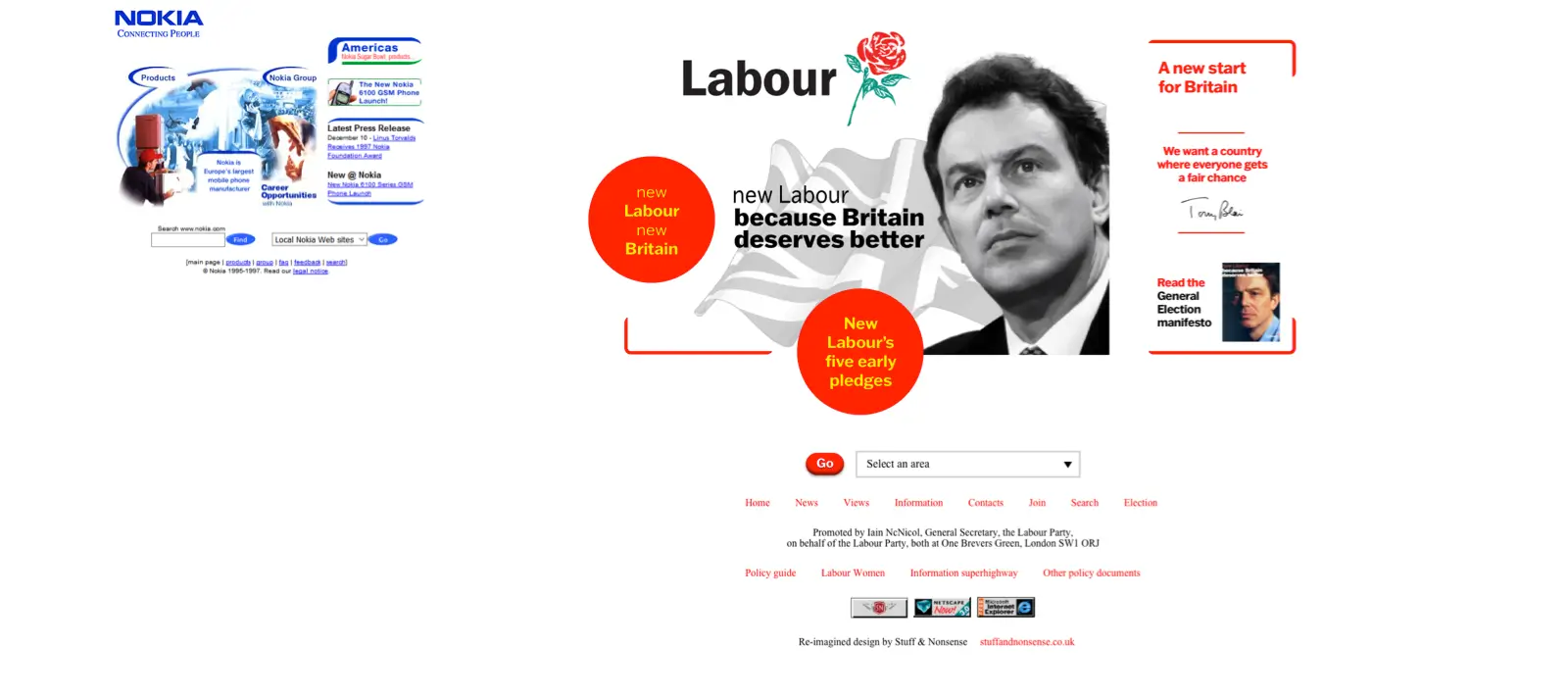
Whereas the Nokia grid is implied, many designs—like this 1997 design for Centura—featured an explicit grid made obvious by its use of borders between the HTML table cells. Those boxes contained graphic text elements that Labour might’ve used for their links to Tony Blair’s message, five pledges, and election manifesto. Labour could’ve also included their five pledges as HTML to make the page more appealing to search engines. Infoseek had launched in 1994. A search facility was added to the Yahoo! directory in 1995 and Excite launched the same year along with AltaVista. Google wasn’t founded until a year and a half after Labour’s victory.
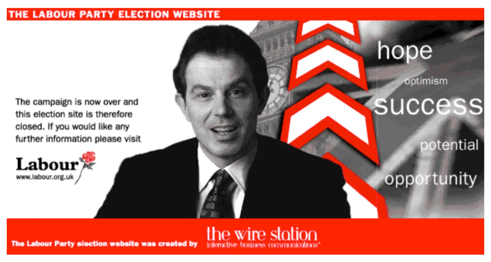
So, how do I imagine Labour’s lost 1997 general election website looked like? Judging by the post-election graphic with which Labour replaced their labourwin97.org.uk campaign website, their offline materials, and the design styles popular at the time, it would’ve included a black-and-white photograph of Tony Blair similar to their election manifesto.
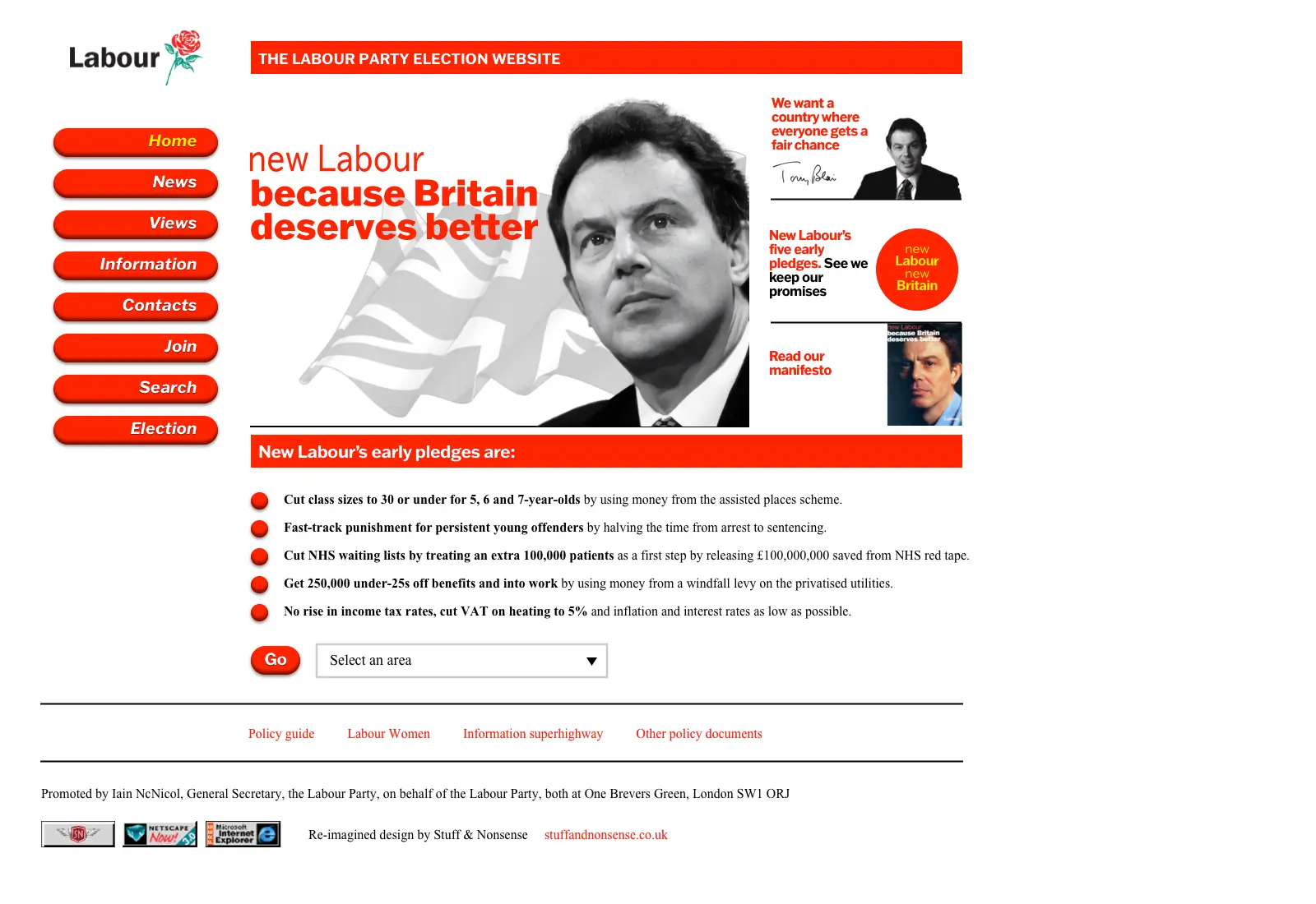
Gleaning what I can from code snippets on the Wayback Machine of other Labour websites around the time, the navigation would’ve included links to news and views. These could’ve been styled similarly to the three-dimensional pill-shape buttons on the BBC election website.

It could’ve also included graphic text elements linking to the most important content, plus a Javascript “jump” menu, which was also popular. And, of course, there may have been those “Best viewed in” browser badges.

What did Labour’s lost 1997 general election website look like? This is my best guess, but I don’t know. Maybe if someone at Labour Party HQ answers my email, I might, at last, find out.