Layout Love. How and why I built it
I’m not a framework user. I’ve never once used Bootstrap and I didn’t use 960gs or Blueprint before that. I can understand the benefits of using a framework or off-the-shelf templates, but they weren’t ever for me. Still, I wanted a simple set of layout modules I could call on for design projects, so I developed my own. I call them Layout Love.
I’m sure frameworks are fine, but whenever I’ve looked at the grids they suggest using, I’ve always been underwhelmed. Twelve even columns, maybe sixteen at a pinch. That’s your lot.
I wanted a simple set of layout modules based on compound, modular, and ratio-based grids because these all help develop layouts which are far more visually interesting than I can get from twelve columns. I wanted them to be design agnostic, easy to use, and free from the bloatware which comes along with a framework.
So, I started to design and develop several sets of layout modules. I called them Layout Love, and rather than keep them to myself, I’m offering them to everyone to use which I hope will encourage people to make layouts which are more interesting. I made five sets:
- 3+4 Columns compound grid
- 4+5 Columns compound grid
- 4+6 Columns compound grid
- Modular grids based on 4, 5, and 6 columns
- Ratio-based grids (Auron (Golden), biaron, diagon, sixton, and doppelquadrat)
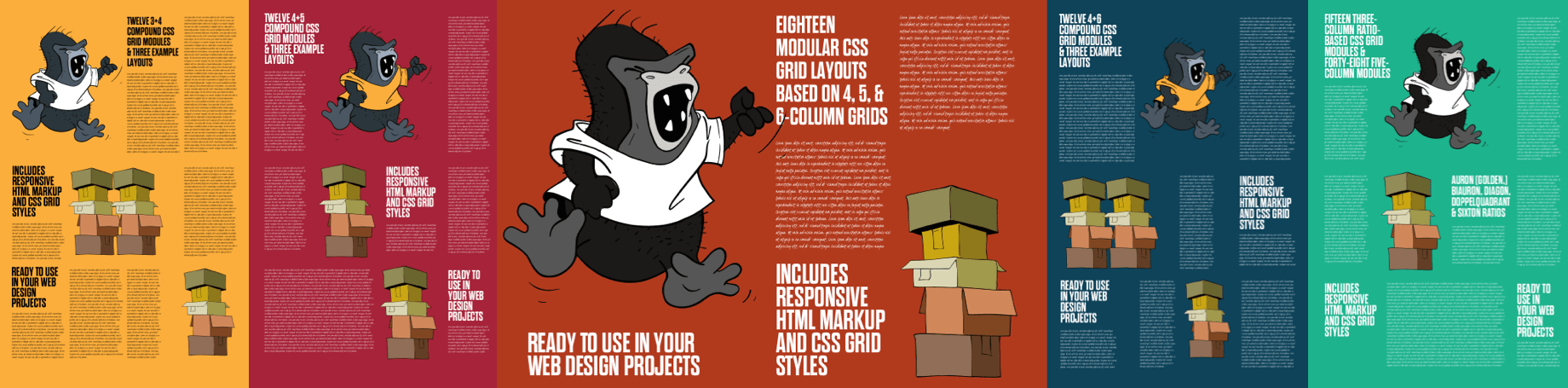
These sets are each priced at £2.99 and you can buy all five for just £9.99.
Developing Layout Love
I developed my Layout Love templates using only minimal HTML and modern CSS (Grid.) I also made them intentionally un-opinionated and so they’re easy to drop into any project, as they only contains the HTML and CSS Grid you need to implement the layouts.
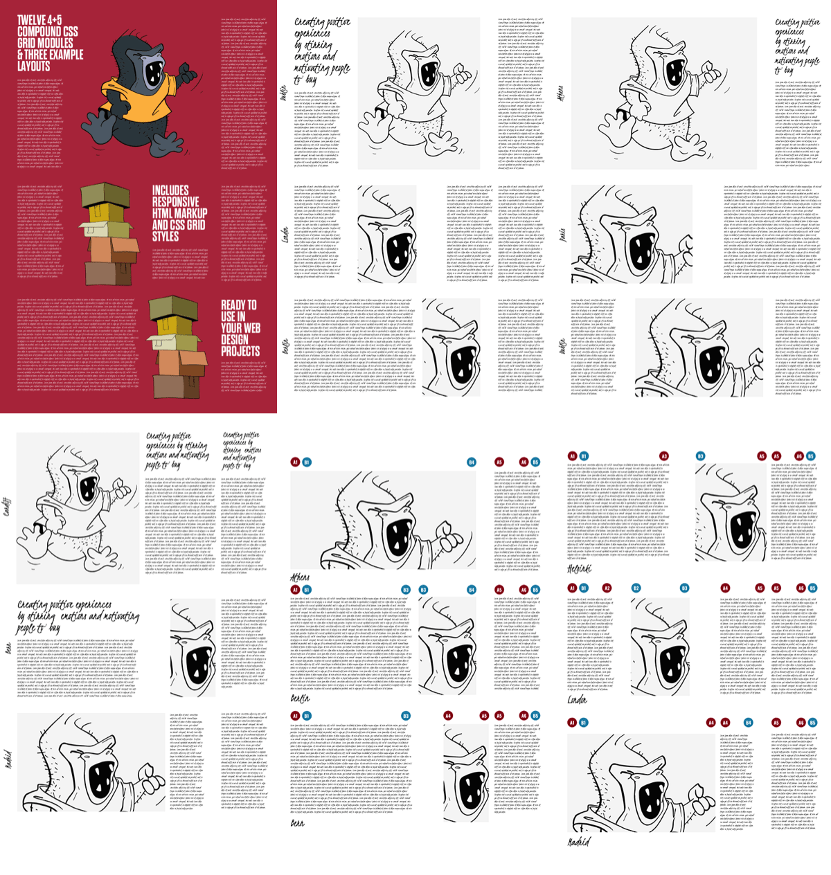
Compound layouts
For the three compound grid sets, there are twelve layout modules and three full-page layouts in each. I gave each module the name of a European city, but these can be easily changed to any naming convention:
<div class="grid-athens">
<div class="a1-b4">…</div>
<div class="a5-a6">…</div>
</div>

<div class="grid-berlin">
<div class="a1-b3">…</div>
<div class="b3-b4">…</div>
<div class="a5-a6">…</div>
</div>
Those child elements can either be styled using :nth-child selectors from their parent, or by using their class attribute values. I defined the grid using CSS Custom properties which includes line names and numbers:
:root {
--grid-4-5: \
[a1] 6fr   [a2] 1fr   [b2] 4fr
[a3] 3fr   [b3] 3fr   [a4] 4fr
[b4] 1fr   [a5] 6fr   [a6];
--grid-column-gap: 2vw;
--grid-row-gap: 5vh; }
These values are applied at large viewport widths when a class attribute contains the word ‘grid” is at the beginning of its value:
@media (min-width: 64em) {
[class^="grid"] {
display: grid;
grid-template-columns: var(--grid-4-5);
gap: var(--grid-row-gap) var(--grid-column-gap); }
}
I have two approaches to layout development—descendent-based and class-based—and both have advantages. When using a class-based approach, I refer to those named lines in class selectors:
.a1-b4 {
grid-column: a1 / b4; }

.a5-a6 {
grid-column: a5 / a6; }
When I use a descendent-based approach, I give a city-based name to the grid container and then place child elements using descendent pseudo-selectors:
.grid-athens > :nth-child(1) {
grid-column: a1 / b4; }

.grid-athens > :nth-child(2) {
grid-column: a5 / a6; }
I use the same approach for all my compound grid layouts.
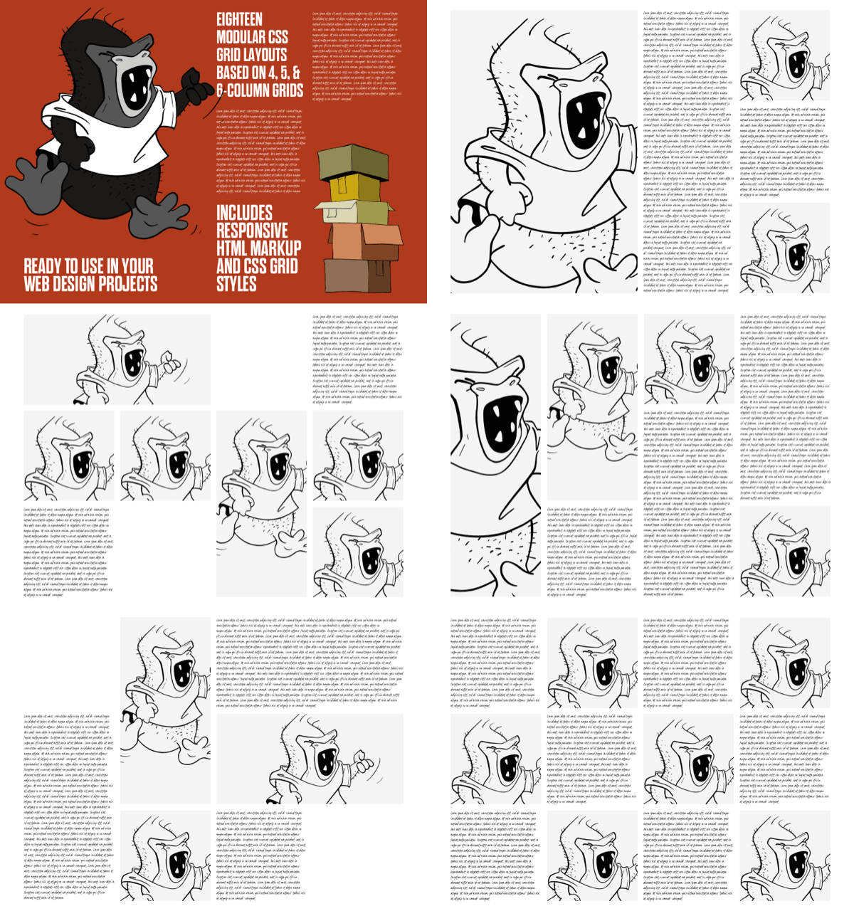
Modular layouts
My approach to modular grids is a little different. Grid modules are individual units—most commonly rectangles or squares—which repeat horizontally and vertically. The Layout Love modular set includes grids based on four, five, and six columns. Each grid container has a modular class attribute value and a data- attribute containing the number of columns:
<div class="modular" data-layout="modular-four-columns">
<div>…</div>
<div>…</div>
<div>…</div>
<div>…</div>
…
</div>
I use both class and data- attributes. First, I specify the number of columns and gaps for each grid as scoped CSS Custom Properties. These properties will be used in calculations later:
[data-layout="modular-four-columns"] {
--modular-width: 95vw;
--modular-columns: repeat(4, 1fr);
--modular-column-count: 4;
--modular-gap-count: 3;
--modular-gap: 2vw; }
I then apply grid properties to grid containers with the word “modular” somewhere in their class attribute values:
[class*="modular"] {
display: grid;
grid-template-columns: var(--modular-columns);
grid-auto-rows: var(--modular-row-height);
gap: var(--modular-gap); }
You might have noticed I haven’t yet defined a value for that --modular-row-height custom property. The most commonly used method for setting an element’s aspect ratio uses a pseudo-element/padding hack which I wanted to avoid. So instead, I use calc to calculate that row height based on the width of the grid container and the number of columns and gaps it contains:
[data-layout*="modular"] {
--modular-row-height:
calc( (var(--modular-width) - (var(--modular-gap-count)
* var(--modular-gap)) ) / var(--modular-column-count) ); }
Just like the sets of compound grids, the modular set includes over a dozen layout modules, each named after a European capital city.
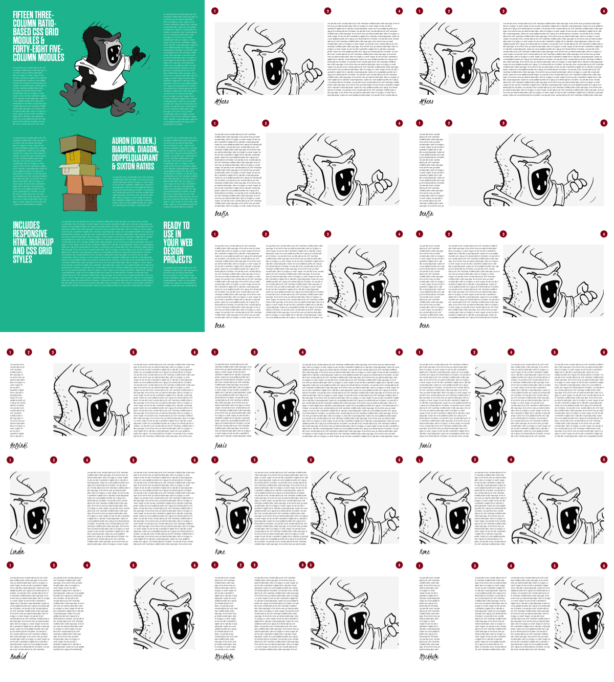
Ratio-based layouts
One of the biggest issues with how frameworks work with grids is that they offer no help in deciding on the proportional relationships between elements. Ratios can be an enormous help in determining these relationships, but they’re rarely spoken about in relation to web design. I’d like to change that.
Most people will have heard of the golden/Auron ratio of 1:1.618, but there are several other ratios which are used to create what Czech designer Wolfgang von Wersin called “dynamic rectangles.” Layout Love includes these five ratios:
- Biauron 1:1.236
- Diagon 1:1.414
- Auron 1:1.618
- Sixton 1:1.732
- Doppelquadrat 1:2
Layout Love includes three and five-column layout modules based on these ratios. I apply ratio-based grid properties to grid containers for each ratio. The first column has a 1fr width, the second multiplies that by the ratio, third multiples that by the ratio again, and so on:
.grid-biauron-3 {
grid-template-columns:
[a1] 1fr
[a2] 1.236fr /* 1fr x 1.236 */
[a3] 1.262fr /* 1.236 x 1.236 */
[a4]; }
I use the same type of calculation with the other four ratios to develop fifteen three-column and forty-eight five-column layout modules. Each is named after a European capital city, making them easy to drop into any development project:
<div class="grid-biauron-3 grid-athens">
<div>…</div>
<div>…</div>
</div>

.grid-biauron-3.grid-athens > :nth-child(1) {
grid-column: a1 / a3; }

.grid-biauron-3.grid-athens > :nth-child(2) {
grid-column: a3 / a4; }Choosing the right grid
Choosing to use either a compound, modular, or ratio-based grid will depend on content, the type of product or website being designed, and the feeling you wish to evoke. I’ve used every set on recent design projects and they’ve all helped me design more interesting layouts. They’ve also saved me many hours of development work and I hope they can do the same for you.