Layout ❤: Modular grids for visually appealing layouts
As I’ve said plenty of times before, a well-chosen grid can do much, much more than align content. Our choice of grid can influence how we approach a design and it can change how we think about layout. That’s especially true of modular grids.
First, a quick explanation. There are several components to a grid: columns, fields, flowlines, gutters, margins, modules, and spacial zones. Grid modules are individual units—most commonly rectangles or squares—which repeat horizontally and vertically. Modules can be any size: based on your content, the aspect ratios of images, and even advertising sizes. We don’t hear as much about modular grids for web design as we do column-based grids. I’d like to change that.
In CSS Grid, spacial zones are called grid-template-areas. Whatever you choose to call them, they’re adjacent modules bound together to form larger areas.
Tip: I wrote about compound grids in more detail in my book “Art Direction for the Web.” Buy the e-book for £12.99.
At first glance, modular grids might seem complicated. However, they’re easy to work with. Modular grids are excellent for bringing order to large amounts of varied content and you can also use them to create visually appealing layouts when there’s very little content. They’re also fabulous for making diverse designs with plenty of drama and energy and can be especially useful for laying out portfolio or product pages.
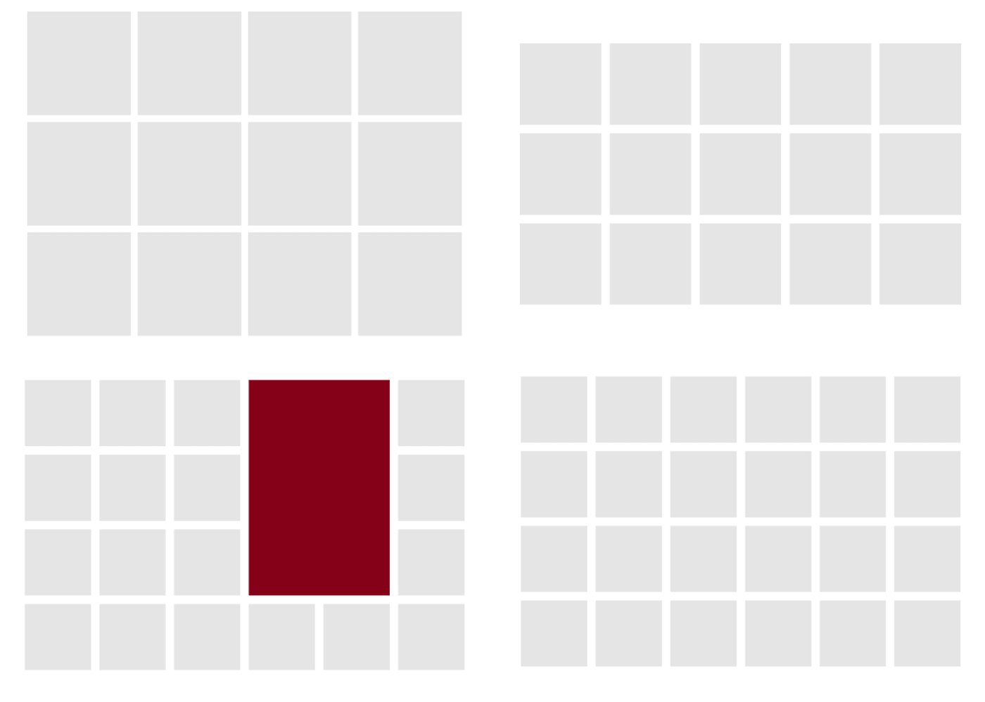
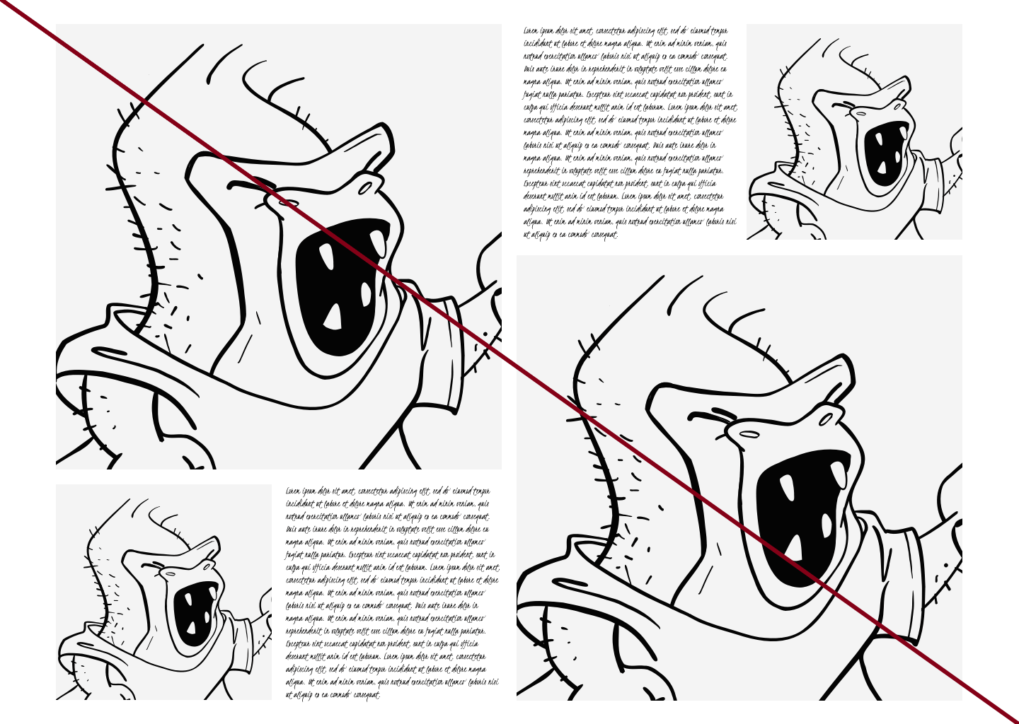
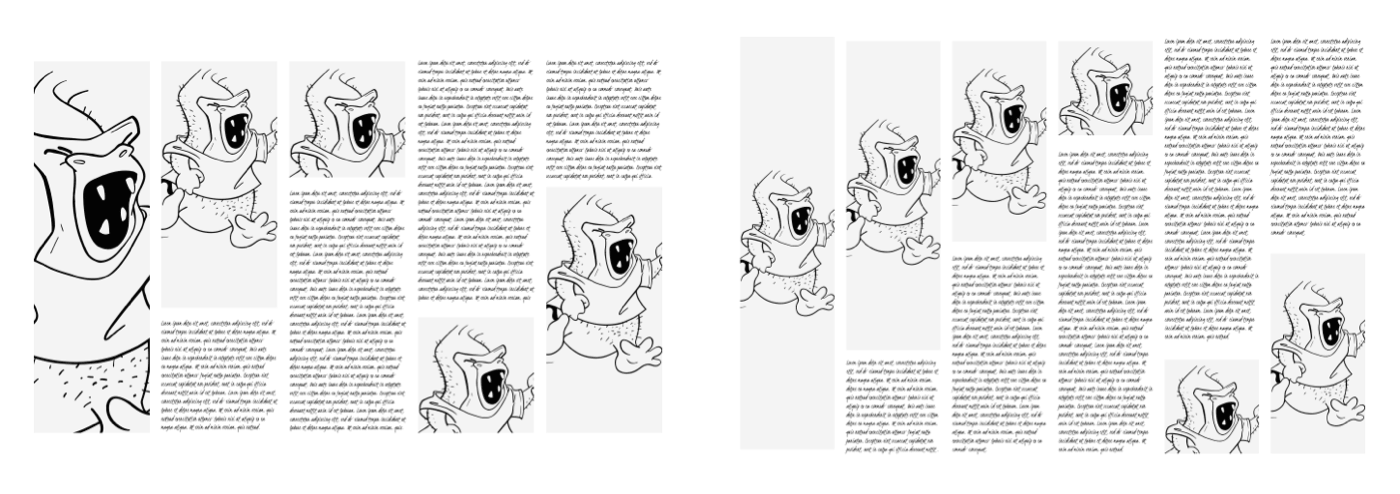
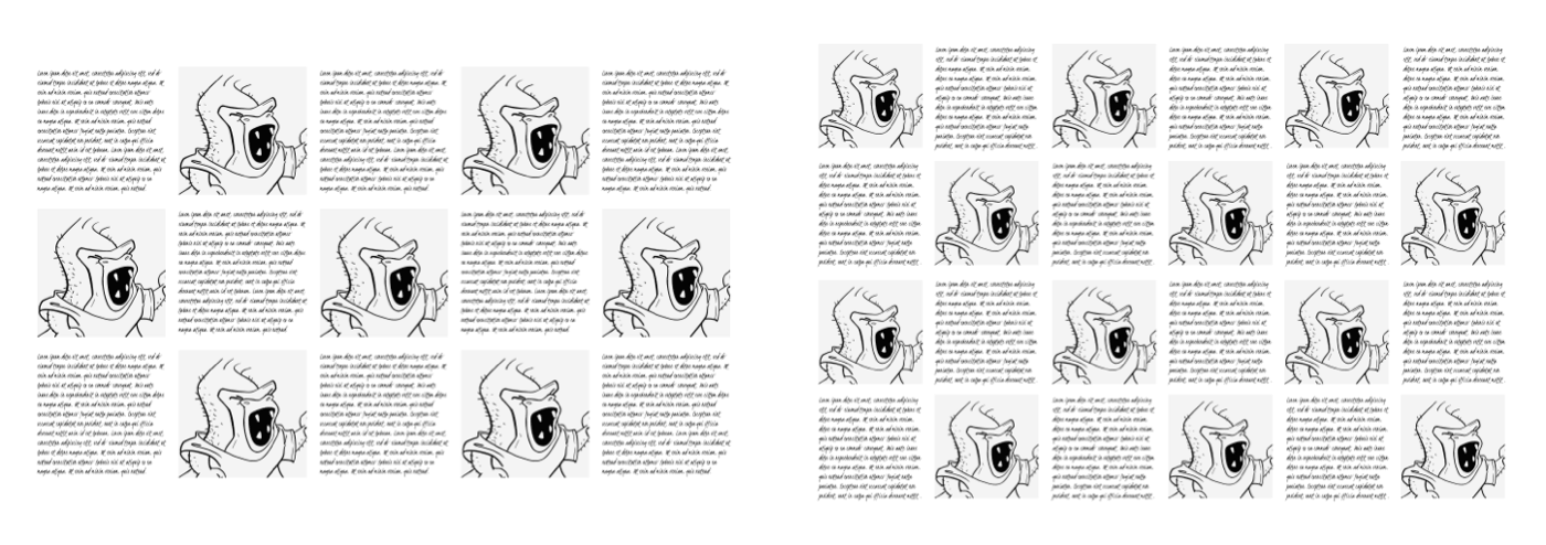
For these examples, I start with a modular grid comprised of three columns and rows. Each module is a landscape orientation rectangle, but could also be portrait orientation or a square.
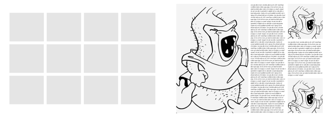
This simple modular grid is ideal for making a bold statement, perhaps on a home or landing page, or a product page on an e-commerce website. In this arrangement, the large image in a 2x3 spacial zone adds immediate impact and is complemented by a solid column of running text which fills the height of this layout.
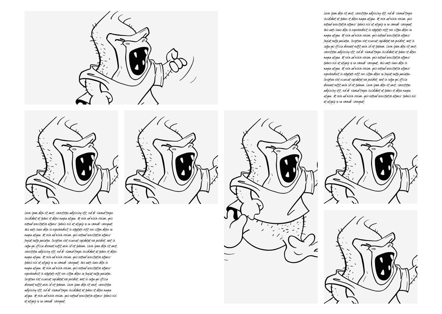
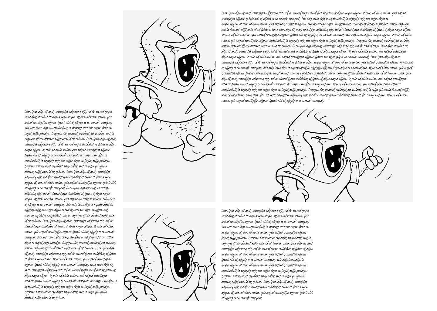
A modular grid offers a huge variety of potential layout options. In this next arrangement, two larger spacial zones—one landscape, the other portrait—offer space for larger images and have been placed alongside a series of smaller images and text blocks of the same size. Not every module in a modular grid needs to be filled with content and here, empty modules add breathing space inside this energetic arrangement.
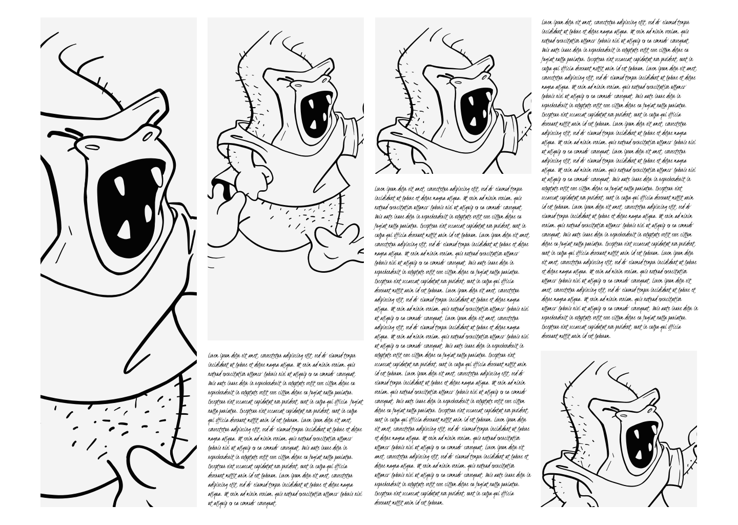
A carefully considered modular grid can add rhythm to a layout. I might place images and text vertically to emphasise my columns and use each column for a discrete piece of content.
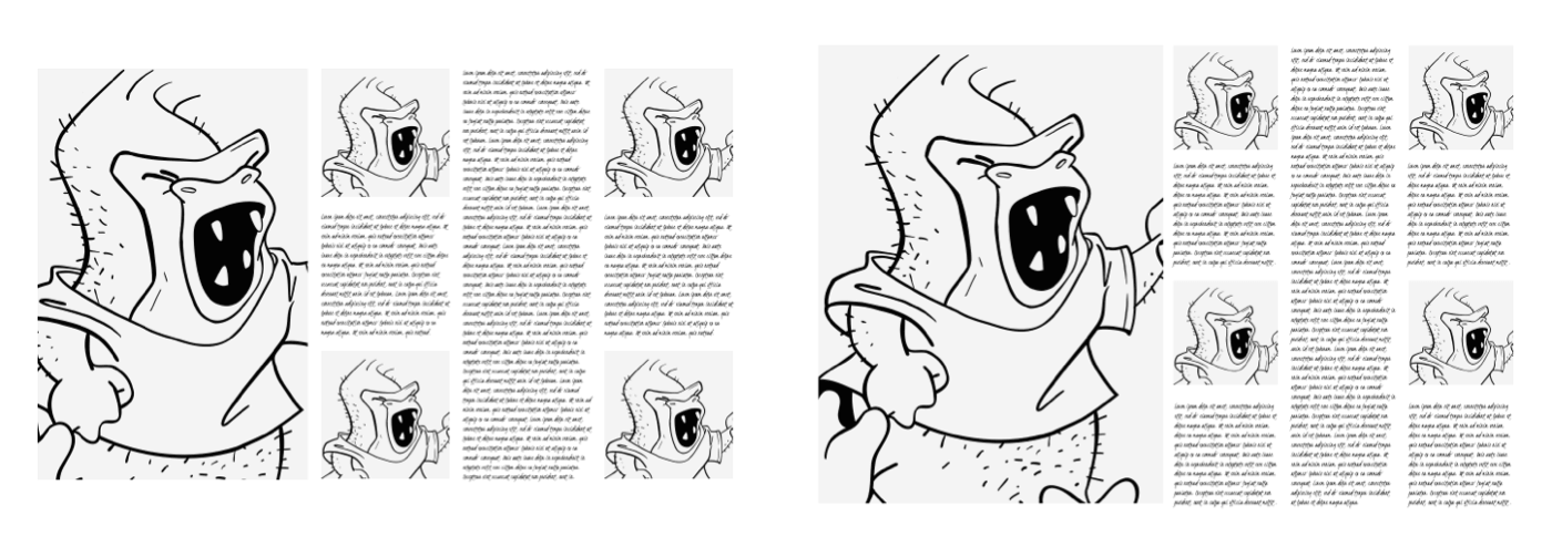
Angles can help you make a layout look less structured and feel more organic. I may opt for square spacial zones and mirror them along a diagonal axis.
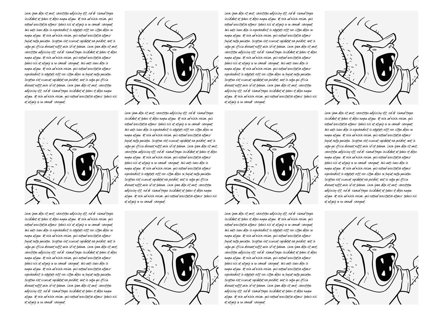
For a more structured feel, I might repeat a pattern of single modules across the width of my layout. The even sizes and deliberate placement of elements in this arrangement create a sense of order.
Or, for an altogether different feel, I may arrange an equal amount of horizontal and vertical spacial zones, and single modules, leaving two opposite modules empty to draw the eye across a page.
Choosing different quantities of columns and rows for a modular grid can have a huge impact on the feeling created by a design. Three and four columns have a less formal feel and are better suited to longer passages of running text. Adding columns and rows makes a design feel increasingly formal and might be better suited to arranging more content.
When I increase the quantity of columns and rows in a modular grid they become smaller and quickens the speed of reading. Varying the amount of modules across several pages allows me to change the pace of someone’s experience across a complete design.
My choice of how many columns and rows to include in a modular grid will depend on several factors, including the amount and type of content, the feelings I want a layout to evoke, and the speed of the experience I want to create.
Layout ❤
All these modular grids and more are available in my Layout ❤ modular grid set to make prototyping and site development work simpler. You can use Layout ❤’s HTML and CSS for any personal or commercial design project, which could save you many hours or work.
More from Stuff & Nonsense
Services I offer
Product UX design
The contract template trusted by thousands of designers and developers to keep their web projects running smoothly.
Design mentorship and teaching
Whether you’re stuck, starting out, or stepping up—Andy’s here to help you become a better designer.
Squarespace templates for sale
Take your Squarespace designs from good to great with my bespoke templates.
Andy Clarke on YouTube
Join Andy on YouTube to learn how you can make better product and website designs.