Nutty responsive assumptions
The Stuff and Nonsense nutty boys header is pretty tall and I decided I wanted to reduce its height for small screens, such as phones, in landscape orientation. When I wrote the CSS to make this happen I made some nutty assumptions. In the spirit of sharing our mistakes:
The header’s fluid and introduces more nutty boys as the viewport width allows. I serve what I assume to be phone screens a parallel set of styles to reduce the header size. I currently do this with a filthy Modernizr hack and a CSS media query.
First I made the nutty assumption that phones have touch screens so I use Modernizr to test for that capability and if positive add a .touch class.
.touch {
/* Styles */
}
Then I assumed that phones have small screens (or small viewport sizes).
I launched our responsive mods before the iPhone 5. At that time I reduced the header size using a media query that quarantined reduction styles to touch screens no larger than the then iPhone’s landscape 480px.
@media only screen
and (max-width: 480px) {

.touch {
/* Styles */
}

}
When the iPhone 5 was released I soon found its landscape 568px meant that its users missed out on the reduction styles, so I naively increased the media query’s max-width to a generous 599px, assuming that phones stopped and tablets began at 600px.
@media only screen
and (max-width: 599px) { }
I later carried these assumptions to our nutty boys header. I also assumed that someone using a small touch screen would only ever see two characters as that’s what I see on my iPhone 4S. So I wrote reduction styles for just the first two characters.
@media only screen
and (max-width: 599px) {

.touch {

.madness {
background-image : url(banner-madness-lg-2x.png);
@include background-size(726px 327px);

.madness__m {
transform : translate(20px,0);
width : 175px;
height : 327px;
background-image : url(madness__m-lg-2x.png);
background-size : 175px 233px; }

.madness__a {
transform : translate(40px,0);
width : 248px;
height : 327px;
background-image : url(madness__a-lg-2x.png);
background-size : 248px 327px; }

}/*madness*/
}/*touch*/

}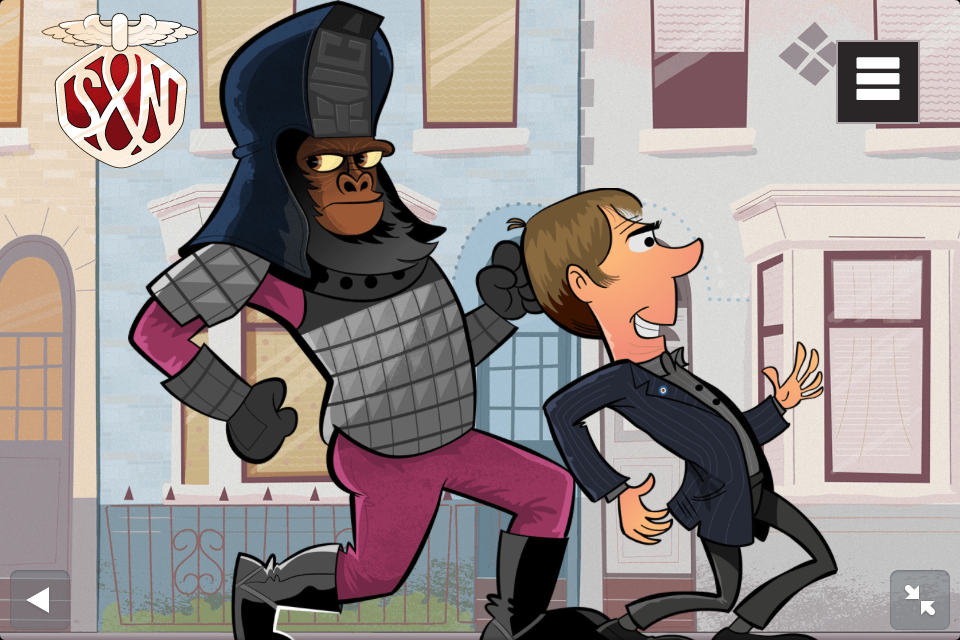
The week before launching our nutty boys, I checked the header on an iPhone 5 and had a nasty surprise. I could see three characters and without reduction styles the third was out of scale with the rest.
So I shrank Marv down to match the others, assuming that someone using a slightly larger small touch screen would only ever see three characters.
@media only screen
and (max-width: 599px) {

.touch {

.madness {

.madness__m { /* Styles */ }
.madness__a { /* Styles */ }

.madness__d {
width : 214px;
height : 272px;
background-image : url(madness__d-lg-2x.png);
background-size : 214px 272px; }

}/*madness*/
}/*touch*/

}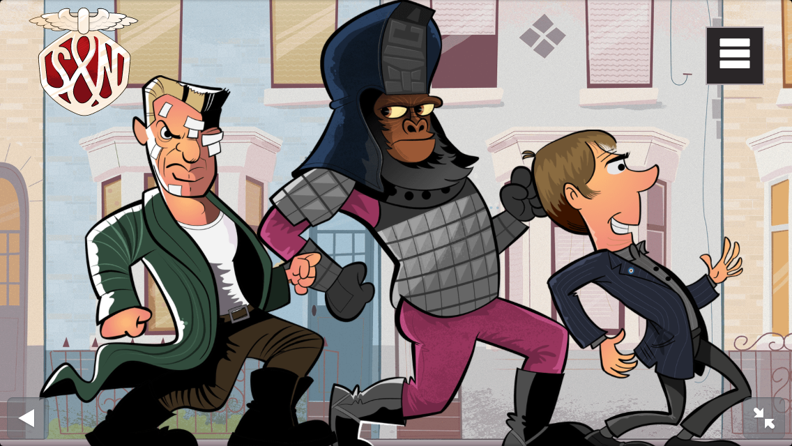
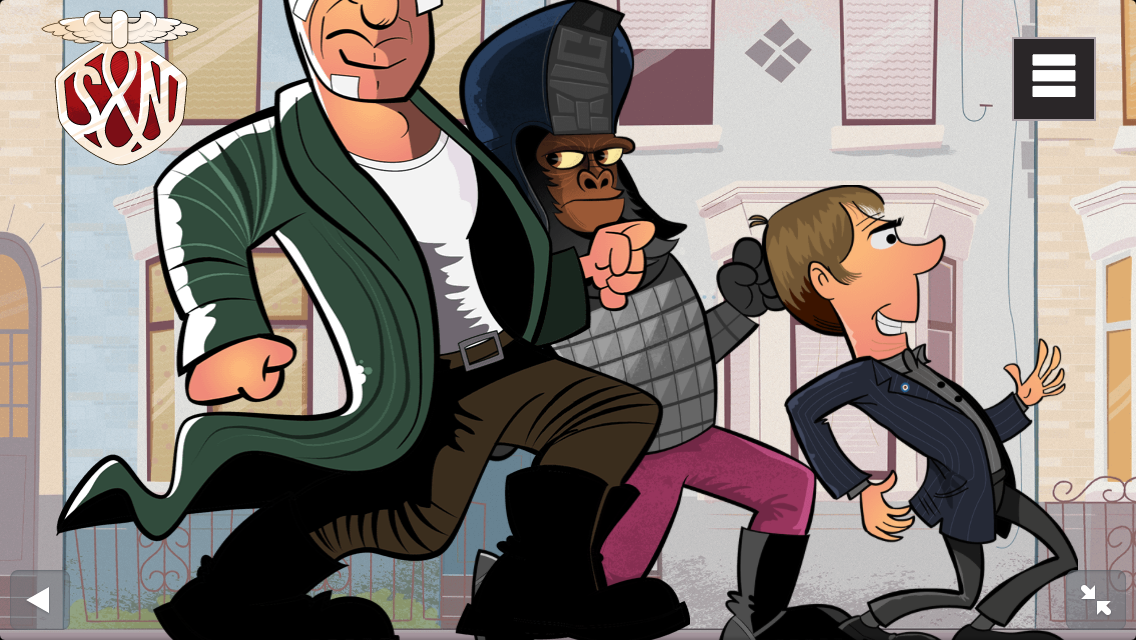
Yesterday I checked the header on a Sony Xperia phone and had another nasty surprise. I could see four characters and without reduction styles the fourth was out of scale with the rest.
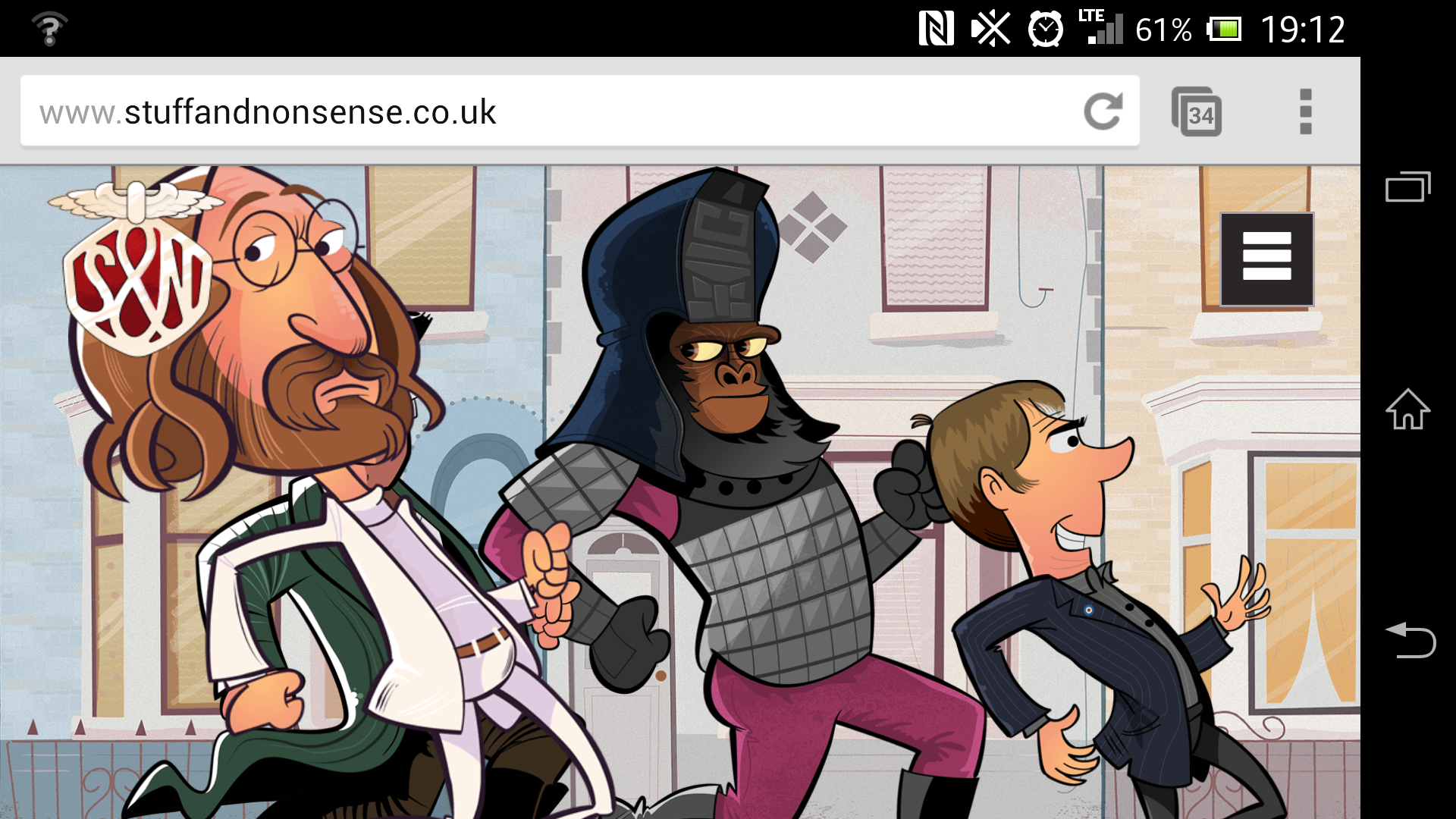
But before I shrink Lennon down to match the rest — assuming that someone using a larger small touch screen will only ever see four characters — I think I need to fix my assumptions before I fix my CSS.
I’m still figuring out what to do next, so if you’ve a good idea how I can accomplish what I want to do, please let me know. I’m all ears.