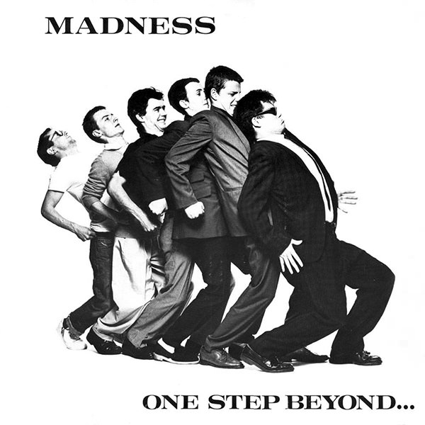
One Step Beyond
I hope you enjoyed yesterday’s new, Madness-inspired home page header. We certainly enjoyed making it.
Although I love our responsive mods on scooters, I’d always intended to do different things with our header to keep people (and me) entertained. Back in December I started talking to Josh about an idea I’d had, to pay homage to Madness with six characters who mean something to me doing Madness’ famous One Step Beyond nutty boys dance with me. I gave Josh a list:
- Me (obviously) dressed like the medium mod from previous header
- Marv (Sin City) or Dr Manhattan (Watchmen)
- Mr. Benn
- General Ursus from Beneath The Planet Of The Apes
- Karl Marx or Lenin or Che Guevara
- John Lennon
Jeffrey ZeldmanSalvador Dali
We refined the list and as I’d done last year with the mods, I set up a Dropbox folder full of reference material on each character and Madness themselves:
It was hilarious showing Josh early Madness videos. Despite the fact that Josh is a different generation and from a different culture, he interpreted what I was asking for perfectly from the very first sketch.
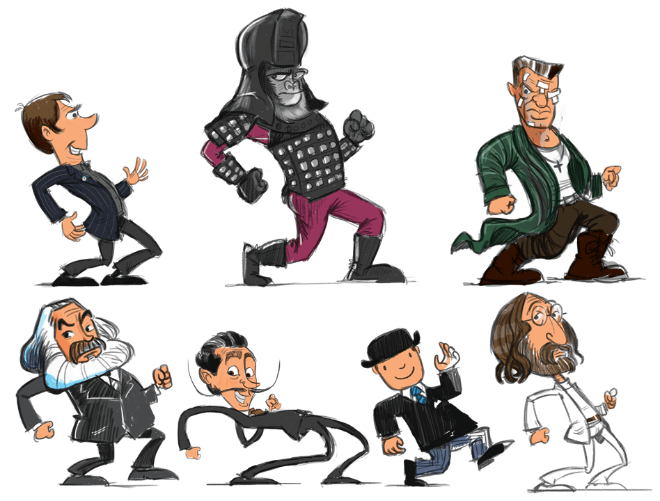
I knew that the finished nutty boys were going to be spectacular, but nothing could’ve prepared me for the final results:
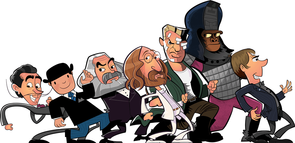
Then it was my turn, to implement the nutty boys into a new header. Early on I’d thought of taking an adaptive approach showing one, three, five and seven nutty boys across five breakpoints. Then, one night, Jeremy appeared as a vision and showed me the error of my ways. So instead I wrote breakpoints based on content, in this case the width of each nutty boy. I ended up with, as you’d expect with seven nutty boys, seven breakpoints at 444px, 560px, 585px, 747px, 856px and 1000px. The wider your viewport, the more nutty boys you’ll see, up to an extra Easter egg at 1382px.
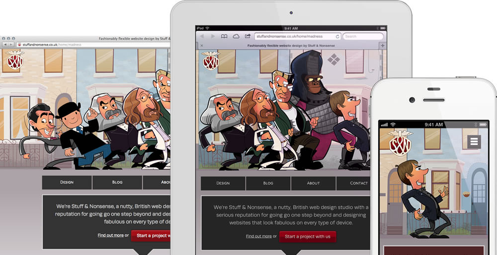
My old thinking did trip me up once though. For phone size screens I shrink the header size down to make the most use of vertical space and serve these styles using a combination of media queries and Modernizr classes:
@media only screen and (max-width: 599px) {

.touch {
/* styles */

}/*touch*/
}/*599px*/
On my iPhone 4S, this size allows for only two characters in landscape orientation, so I wrote styles for just those two. But when I tested the site on an iPhone 5 (in an Apple Store,) that phone’s extra width is enough for three characters. It’s another great example that you (I) can’t take anything for granted and that testing on actual devices is essential. I’ll be testing on larger phones in the next few weeks as I get my hands on them.
I want to say thank-you to Josh (again) for doing such an amazing job.