Quick typography tips №2
Here’s a quick design tip for making headlines more interesting using text-decoration.
I really enjoy thumbing through print magazines and finding inspiration for making my typographic designs more interesting. I can’t remember the last time I saw the CSS text-decoration property used online for anything other than hyperlinks. But, text-decoration and related properties can be used on other text elements too. Here’s the design I’m making:
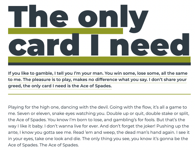
The headline has a thick, offset green underline. The standfirst paragraph which follows it also has an offset underline plus a thicker top border. These offsets are simple to apply, starting with that headline:
h1 {
text-decoration-color: var(--color-accent);
text-decoration-thickness: 10px;
text-decoration-line: underline;
text-underline-offset: 3px; }
Unsurprisingly, the text-decoration-line property sets the type of decoration on any text element. There are several value options including line-through, overline, and underline.
Whereas in the past the colour of a text-decoration always matched the current colour of the text, today there’s the text-decoration-color property to change that. For this design, I set the decoration colour from the default blue/grey to my green accent:
h1 {
text-decoration-color: var(--color-accent); }
A thick underline adds extra impact to my headline, so I change the thickness of that decoration to 20px which matches the weight of the headline text:
h1 {
text-decoration-thickness: 20px; }
The text-underline-offset property sets the distance from a decoration line’s default position which can be especially useful for fine-tuning the look of hyperlinks and my headline. I position this underline 3px lower than its default position:
h1 {
text-underline-offset: 3px; }
These text-decoration and text-underline-offset properties—combined with tight leading—turn an uninteresting looking headline into a design element which feels considered and intentional.
This headline looks even better when combined with a standfirst paragraph which shares some of the same styles. First, I add thick top and thin bottom borders, plus a little padding:
h1 + p {
padding: 1rem 0;
border-top: 10px solid var(--color-dark);
border-bottom: 2px solid var(--color-accent); }
I add a hairline width underline and offset the decoration so it fits neatly between my lines of text:
h1 + p {
text-decoration-color: var(--color-accent);
text-decoration-line: underline;
text-decoration-thickness: .5px;
text-underline-offset: 6px; }
I’ve long been of the opinion that every text element can be an opportunity to add interest to a design and this is especially true of headlines. It’s also true that typographic design doesn’t stop with choosing a typeface and that simple techniques like this can help make a design more special.
Here’s this headline design on CodePen for you to experiment with.