Moonwalk Audio: Designing their studio website that reflects their personality
Standout website design with bespoke illustrations and integrated audio to help Moonwalk Audio tell their story.
Author Jas Dosanjh wanted a website as personal and distinctive as her memoirs. I took inspiration from her book covers to create a visual identity built around expressive typography, carefully chosen colours, and animated illustrations that bring her stories to life.
“I need a website. I’ve been without one for about 4 years now (not good, I know!)”
That’s how author Jas Dosanjh introduced herself in her first email to me. She’d written a series of deeply personal memoirs about growing up in a Sikh Punjabi family, and wanted a website that reflected both her writing and her personality. Jas had found me by asking ChatGPT to recommend a creative web designer. She wanted something personal, designed specifically for her, rather than a website built from a template.
Her Life Out of Reach series explores difficult experiences, including family oppression, abuse, forced marriage, and the expectations placed on girls and women. Her books are frank, sometimes confronting, and deeply personal.
Jas had already worked with a book cover designer to establish a distinctive visual style for her series. She wanted that artwork to play an important part in her new website. My challenge was to bring her books and personal story together in a design that felt unmistakably hers.
I started by looking closely at the artwork Jas had commissioned for her book covers. She had an existing colour palette, but I felt its colours were too cold and impersonal for the website I had in mind. Her covers offered a much richer source of inspiration. I sampled colours directly from the artwork, then simplified them into a palette of six colours supported by a dark blue base. These colours gave me a consistent system to work with while retaining the warmth and character of the original illustrations.
Typography was just as important. The book covers used Orpheus Pro, an elegant, high-contrast serif typeface. I created type samplers to explore how it would work across the website, using the same process I describe in Standout Designs for the Web. Although Orpheus Pro worked beautifully on the covers, its high contrast made it less suitable for longer passages of text.
I researched alternatives before choosing Cormorant, a serif typeface with an expressive, literary quality that complemented the artwork. For supporting text, I retained P22 Underground, another typeface from Jas’s existing visual identity. The combination gave me the typographic personality I wanted: expressive enough to reflect Jas’s books, and comfortable to read when her words needed to take centre stage.
The artwork from Jas’s book covers became the foundation of the website’s design. I wanted visitors to experience more of that artwork than the covers alone could show, so I took individual elements, including leaves and embroidery-inspired details, and redrew them as SVG illustrations. These small decorative elements appear throughout the website, adding interest and helping to separate sections.
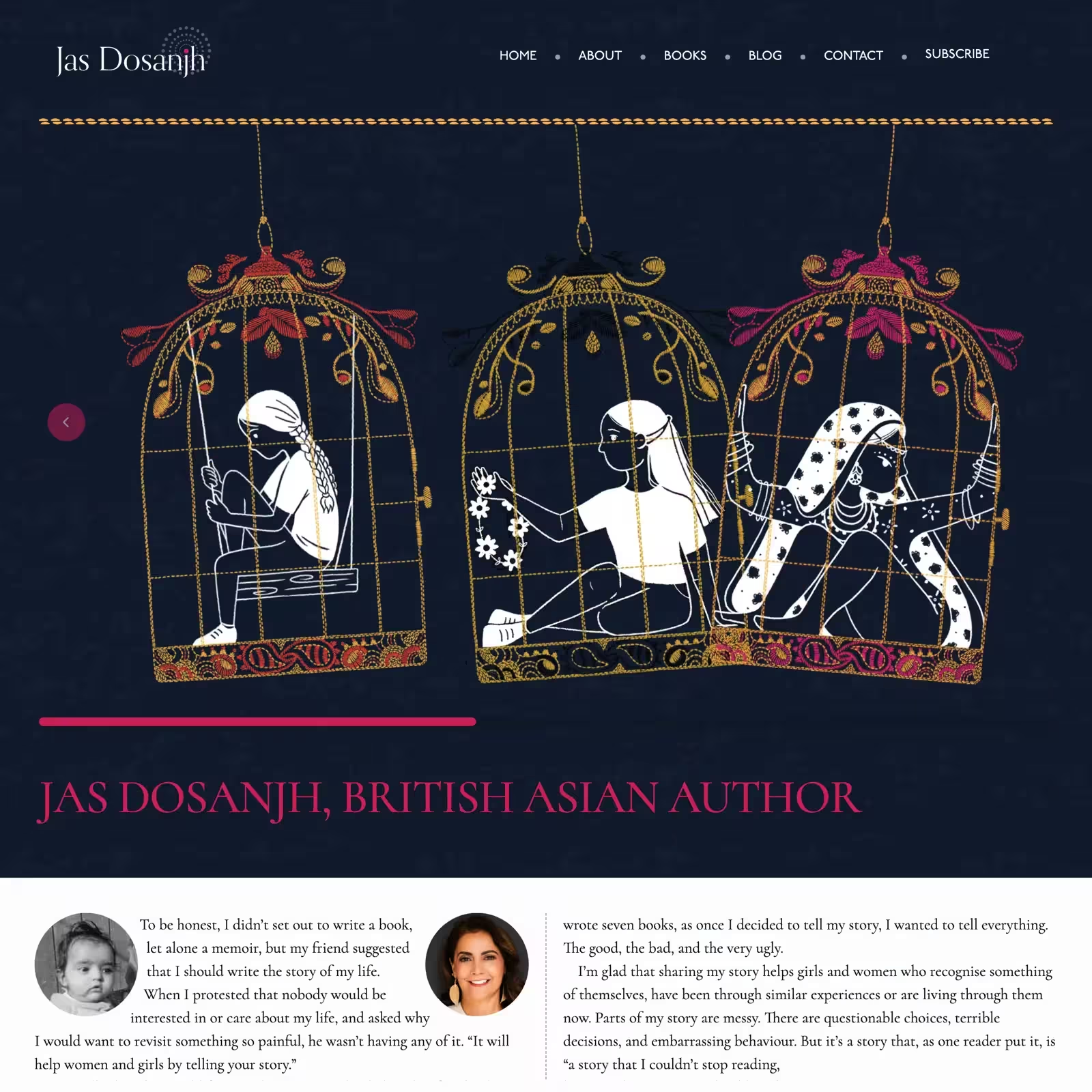
The most prominent use of the artwork is an animated, interactive banner on the homepage. I took the central cage motifs from the covers and turned them into a collection of gently moving illustrations. Each cage swings subtly until someone hovers over it, when it stops moving and grows slightly larger. Each cage also links directly to its corresponding book page, making the illustration a way to explore Jas’s writing.
I carried the same artwork through to the individual book pages, using monochrome versions of the motifs and backgrounds to give each page its own character while maintaining a consistent visual language.
Before developing the finished layouts, I created a series of simple wireframe sketches. These helped Jas and me discuss how visitors would move through the website and how its different sections should connect. Her personal story was particularly important, so I wanted to give careful consideration to how it would be presented. Jas’s words communicate experiences that are sometimes painful and difficult to read. I wanted the typography to give those words a confident voice, supported by colours that felt calm and considered.
Jas’s book covers provided a rich collection of colours to work with. Rather than introducing an unrelated palette, I sampled colours from the illustrations and refined them into a smaller, more practical system. Six colours, supported by a dark blue base, gave me enough variety to create interest while keeping the design consistent.
Orpheus Pro was already part of Jas’s visual identity, so it was my starting point for exploring typography. Creating type samplers helped me understand how it behaved at different sizes and in different contexts. Its high contrast looked beautiful in display settings, but I wanted something more comfortable for extended reading. Cormorant gave me the literary character I was looking for, while P22 Underground provided a familiar supporting voice.
The cage illustrations were among the most distinctive elements of Jas’s book covers. I wanted to make them central to the homepage, so I created an animated banner where the cages swing gently. Hovering over a cage pauses its movement and makes it slightly larger. Clicking takes visitors to the corresponding book. The interaction is simple, but it gives the artwork another purpose beyond decoration.
I enjoy finding opportunities to use small decorative elements to give a design personality. For Jas’s website, I redrew leaves and embroidery-inspired details from her book covers as SVGs. Using these illustrations throughout the website helped connect its different sections to the original artwork.
Jas’s personal experiences are central to her writing, and I wanted her words to have the strongest presence on the website. My typography choices helped establish that voice, while the colours created an atmosphere that felt calm but confident. The wireframe sketches also helped us explore how visitors would discover Jas’s story alongside her books.
Jas loved the design direction from the beginning and was closely involved as the website developed. One of her messages made me smile:
Oh my God! I love it! I’m so glad that you’re having fun. It looks amazing, it really does. I couldn’t believe that my sad little story could look so pretty!
Her reaction meant a great deal to me. Jas had trusted me with something deeply personal, and seeing her respond so positively to the design was enormously satisfying. The finished website brings together her books, their artwork, and her own experiences in a design that reflects her personality and gives her writing room to speak.
I built the website using Eleventy, with the source code maintained in a GitHub repository and the finished site hosted on Netlify. I also wanted Jas to have complete control over her website. She owns the accounts associated with it, including the repository and hosting. That means she can manage her website, make changes, or work with another designer or developer whenever she chooses.
Every client brings something different to a project. Sometimes that’s an established visual identity, sometimes it’s a collection of ideas, and sometimes it’s a deeply personal story. Jas brought all three.
Her book covers gave me a starting point for colour, typography, illustration, and interaction. By exploring those elements and developing them into a consistent visual language, I created a website that feels connected to her books and personal to her.
This project also demonstrates why I spend time testing ideas before committing to them. Creating type samplers helped me make a better-informed decision about typography. Simplifying colours sampled from the artwork gave me a practical palette. Redrawing decorative details as SVGs made them useful throughout the design.
Most importantly, working closely with Jas helped me create a website that she feels represents her. And by making sure she owns and controls the website and its accounts, I’ve given her the freedom to decide what happens to it next.
If you’re an author, artist, or creative with a story to tell, I’d love to help you bring it to life. Whether you have an established visual identity or are starting from scratch, let’s create a website that reflects your personality, celebrates your work, and feels unmistakably yours.
Standout website design with bespoke illustrations and integrated audio to help Moonwalk Audio tell their story.
Portfolio website design combining expressive illustration, animation, and graphic design.
Portfolio website design combining editorial layout and typography design.
Planning a new website? I’d love to help you create something memorable.