Anatomy of a mouse


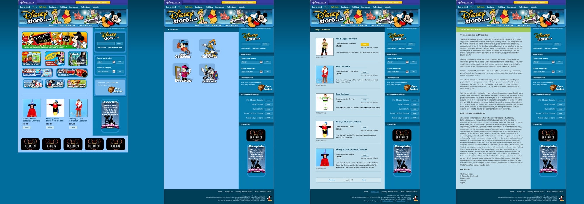
Day two: First of all I wanted to say the biggest “thank you” to everyone who gave their time to review the accessibility decisions that I made during the design and build of the 2004 Disney Store UK.
These people (you know who you are) earned my deepest respect and gratitude for participating. Without people like them, web accessibility would be stuck in a siding just outside Watford, under a sign that reads “Welcome to Text Only.”
Wearing badges is not enough
I hoped that this post whould raise some discussion about where we decide to draw the line when attempting to design an accessible site. I believe now that it’s a pipe-dream to design a site that can be used by everyone. I am a fairly able-bodied geezer (save for the back trouble), but there are still plenty of sites that I find difficult or impossible to use. Even paragons of usability such as Amazon.com sometimes confuse the hell out of me. My brain screams “Too much content!” I dread to think how I might react if I was dyslexic or had other cognitive disabilities.
In 2004, I banned accessibility badges or Bobby icons from all Stuff and Nonsense websites and included an accessibility aims statement like this one instead:
I have tried our very best to make this web site usable by as many people as possible. Some people with disabilities find using the web difficult and many sites do not accommodate those with visual or other disabilities. While I know that it’s impossible to design a site that everyone can use, designing this site with accessibility in mind means that more people can access its content.

When designing a site for any client, the demands of politics, commerce, current practices, creativity and accessibility must all be balanced. I wish that we lived in a utopia where all accessibility decisions were simple (and some people do). But I don’t live in that world, and in a perverse way, these challenges and decisions make my job all the more interesting.
At this point I should also mention that my client was amazingly receptive to the aim of making the new store as accessible as possible. Where we did disagree, he would carefully explain the reasons for his point of view and he never said, “Because that’s the way I want it.” I understand more now about his issues than before and I hope that I can take the experience with me to other projects.
Rather than run through every decision, I thought it might be more interesting to talk about my process for making the Disney Store UK website as accessible as I could. First, the website was developed using valid markup and CSS, as this in itself can go a long way towards a website that’s more accessible. That isn’t to say that web-standards in themselves guarantee accessibility—I don’t agree with Jeffrey Veen all the way—but when you write code to standards, a certain amount of attention to accessibility should come naturally.

Secondly, the store was developed using an ecommerce platform from a company that I founded in 2004 which took the majority of headaches out of developing accessible stores. I also ran automated checks through Bobby and Cynthia Says in order to see if there were any glaring omissions. Sometimes under a tight schedule, it’s easy to miss a form label or two adjacent links, and these tools are ideal for such reference.
But Bobby doesn’t give a site what I call usable accessibility. It’s only a machine and the real test is to give a site to a human being and see what they think. For this I tested with screen-readers and text-browsers and opened the work-in-progress to a handful of trusted testers who provided some very valuable feedback. An outside opinion really counts and can often highlight things that might otherwise have been missed. For example:
I examined the code and saw that the photos of the figurines had alt text which was the same as the link text after it…

Advice like that is worth it’s weight in gold.
Designing with accessibility in mind in often about alternatives. So I added <noscript> content to scripts which generate content like the Disney worldwide toolbar at the top of each page. I also added static alternatives to the Flash banner and aimed to provide meaningful alt or title attributes to images and titles. It doesn’t sound like much, but a little can go a long way. Brand agency Akiko were also keen to help by adding a ‘Stop animation’ feature to the Flash header.
There were two main areas of contention, the assets which take pride-of-place on the home page and a request that links to other Disney sites open in new or pop-up windows.
Text embedded in images
I understood the issues around non-resizing text embedded in image files, but these were non-negotiable. My solution was to mark-up the assets as lists as I described before and add meaningful alternative content to the title attributes on links. This solution was by no means perfect, but sometimes we have to take a pragmatic view.
New or pop-up windows
Here I took another pragmatic approach. Opening external links in new windows had to be an option, so I took the view not to impose that view on a user, but instead to inform them and give them a choice. Likewise with forms inherited from their old website, my intention was to inform people and offer them alternatives:
Currently, our feedback forms open in a new (pop-up) window and may not be accessible to all. If you need an alternative way of providing your opinions, please email our customer services department.
Next I’ll write about:
Replies
-
#1 On October 6, 2004 08:52 AM Gazzer said:
I’m glad you mention the pop-up/new window issue and I like the way you have approached it. However, this forces you to use a transitional DTD which means one day the methodology you have used will be defunct and I wonder how you will tackle it when that time comes? Are pop-ups/windows going to disappear, are we going to compromise, will we just code around it or will W3C provide us with an alternative?
The Disney site is excellent by the way.
-
#2 On October 6, 2004 11:44 AM Phunky said:
As far as popups go, I follow my good man Youngpup and his popup way. I know people will shout “what if they don’t have JavaScript.” Well if they don’t, then they don’t get a popup but they still get a link.
-
#3 On October 6, 2004 01:01 PM Phil Baines said:
Good write up! The only issue that I have is that the “Stop Animation” feature needs to be clicked on every page. but this is not a fault in your department. I’m sure that a little bit of remote scripting could be built in to tell the server that you don’t want it animating on the next page load. As a side note, do you take notes while your working on the project to help with future blog entries, or do you spend a good amount of time afterwards thinking about the related blog entry?
-
#4 On October 6, 2004 01:42 PM Mike Stenhouse said:
I really like your accessibility-statement-rather-than-a-badge approach. I went through an audit with the RNIB for a site I did last year and their set of guidelines seem fairly open-ended (frustrating at the time) but more aimed at actually making the site accessible than ticking boxes. It changed my approach to accessibility but I hadn’t thought to put it into words.
On your window opening, how about allowing people to set their preference and storing it? Having to listen to every link twice would wind me up after a while. I have absolutely no idea where you could put this kind of setting so that people would actually use it though and it might be overcomplicating things.
Anyway, great job on the site, it looks lovely and I’m very tempted by the Muppet mini bean bags. They’re just what my life’s been missing.
-
#5 On October 6, 2004 06:29 PM Mike said:
Glad to see you used my image replacement technique—it’s always exciting for me to see new sites popping up with the negative text-indent.
Great job on the site as well man. Big time sites converting to web standards do us all a favour.
-
#6 On October 7, 2004 04:20 PM Andy Budd said:
I really like the “Stop animation” button. It’s something I’ve never seen on a site before. Just out of interest, why did opening up links in a new window have to be an option?
-
#7 On October 7, 2004 09:42 PM Malarkey said:
@ Meester Budd: External links opening in a new window HAD to be an option, period, and we needed to find a solution that satisfied our accessibility needs. We thought that offering advice and giving users the choice of same/new window was the best option.
