Eleventy in a Box
A premium Eleventy starter kit for designers and developers who want to spend less time setting up the same project structure and more time designing distinctive websites.
This week I’m diving deep into how I approach projects, using a recent design for Zombie Hunt as an example. Yesterday, I wrote about making decisions about colour. Today is all about using colour across dark and light themes.
Back in November 2018, I wrote about implementing a dark mode design which was then only a feature available in Safari Technology Preview 68. It’s now common to see dark UIs across devices and platforms, and designing multiple themes has become one of the favourite parts of my work.
Designing alternative themes for a project like Zombie Hunt isn’t simply about inverting colours, swapping black for white or white for black. It’s about creating multiple themes which feel right for a company’s brand, whether someone chooses dark or light. It also involves other design considerations, including typography.
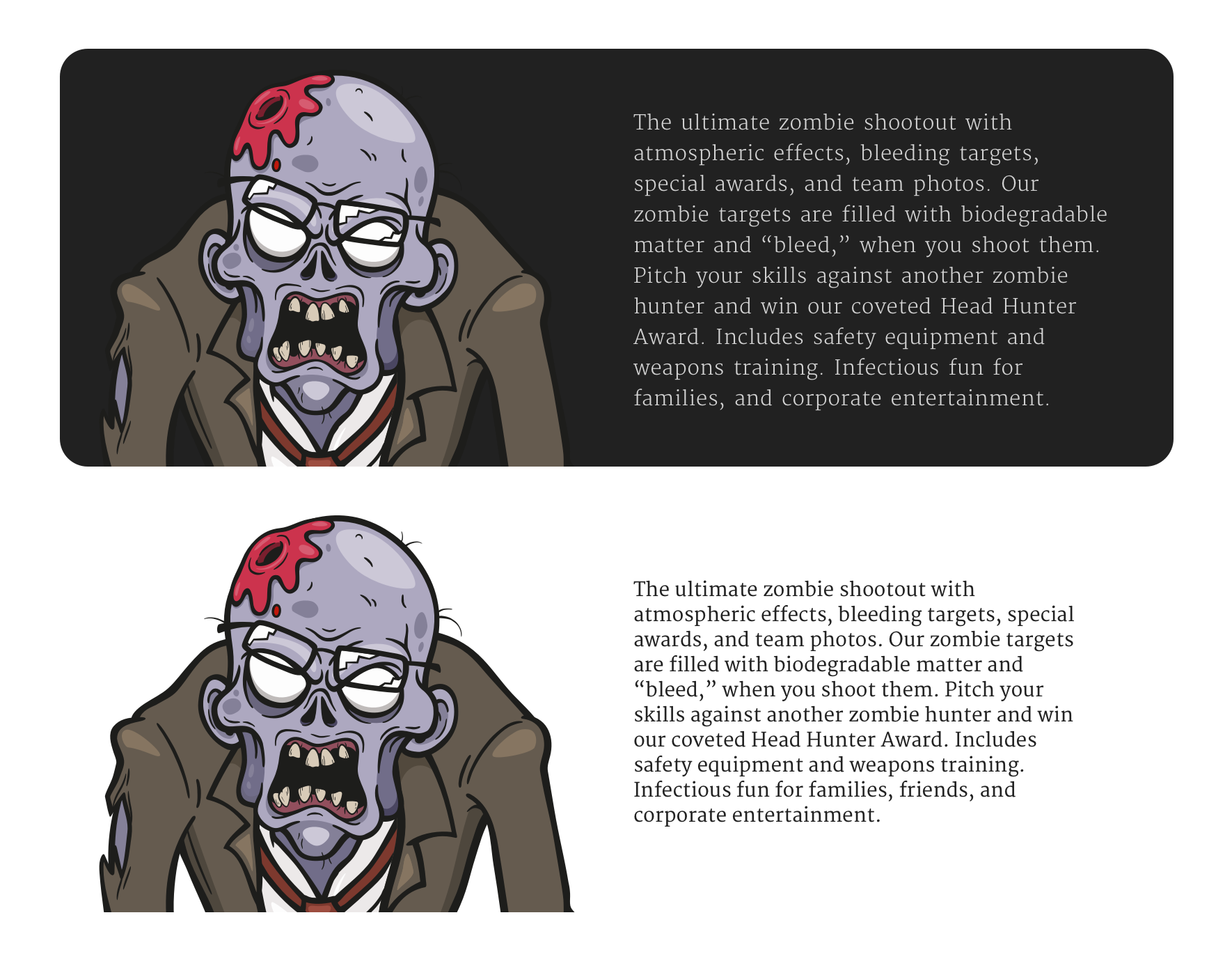
Dark themes needn’t mean black backgrounds and white text, and Zombie Hunt’s dark background is deep grey (HSL 0,0,15.) Light themes needn’t mean white backgrounds and black text. In fact, solid black and bright white are often poor choices as their high contrast can make text trickier to read, especially over long periods.
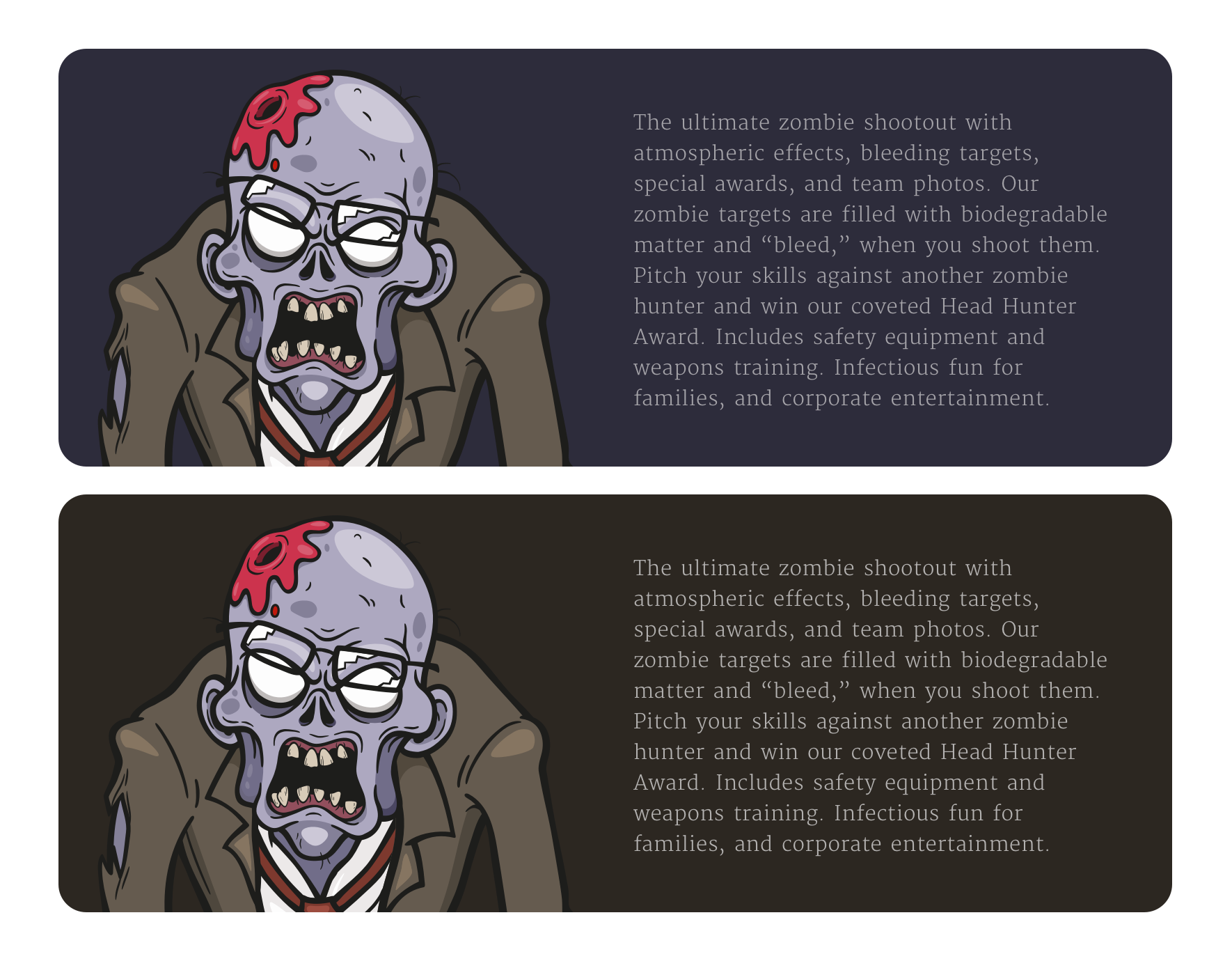
Reducing contrast and bringing both black and white elements closer to a mid-grey can make the reading experience less taxing on the eye. But, dark greys aren’t the option for darker backgrounds, and deep blue/purple or dark brown can work just as well, depending on the brand.
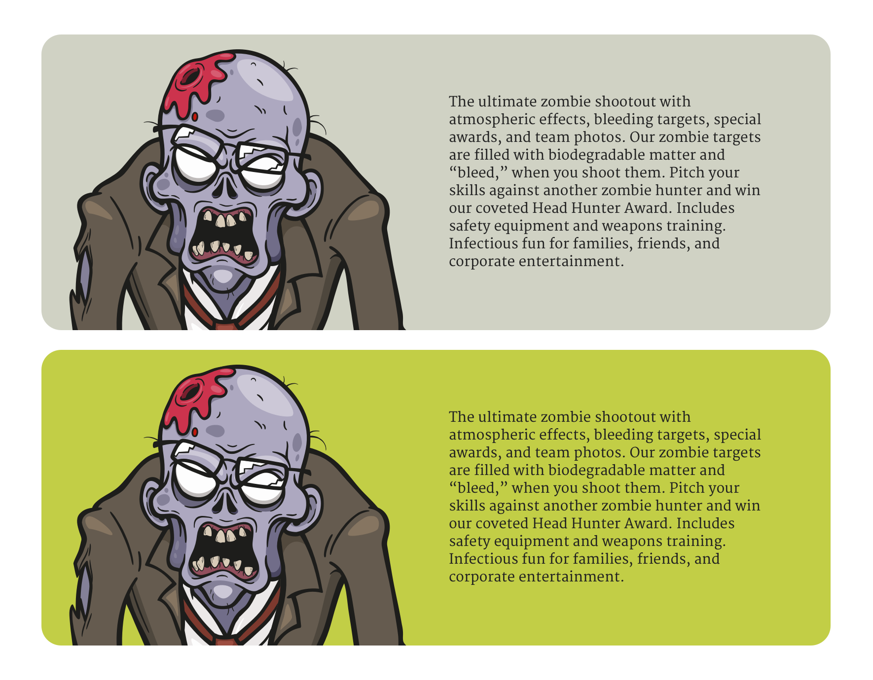
Light themes can include off-white backgrounds using grey lightly tinted with colour or even more colourful options. This was the choice I made for Zombie Hunt’s light theme.
The choice of theme colours will depend on three factors:
Even though it’s important to consider maintaining a visual connection between dark and light versions, designing multiple themes often involves choosing different colours from a palette. For Zombie Hunt, I used yellow as an accent colour for my dark theme and as the background for my light theme. The yellow helps visually connect both themes, even though they have very different looks. This meant choosing purple as an alternative accent colour for my light theme.
Reversed-out designs with darker backgrounds and lighter foreground elements need other considerations. Foreground colours often benefit from minor adjustments to lightness or saturation; this is where the HSL colour model (Hue, Saturation, Lightness) is invaluable.
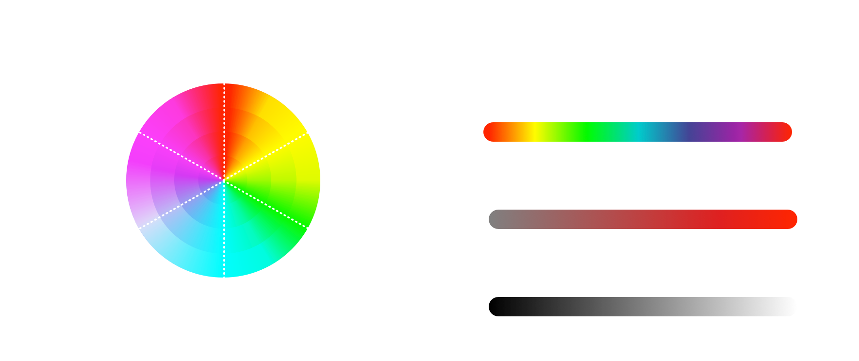
In the HSL model, colours are described by three values: The hue is a degree angle around the colour wheel where red is at 0/360deg, green is at 120deg, and blue is at 240deg. Saturation is the distance from the centre of the colour wheel. The least saturated values are nearest to the centre (0%) and the most saturated values furthest away (100%.) Lightness is also a percentage, from the darkest value (0%) and the lightest (100%.) It’s the combination of these three values which makes the final colour.
Foreground colours can often benefit from increased saturation to help them stand out from a dark background.
They can also sometimes benefit from a slight increase in lightness.
Text can often look entirely different against dark and light backgrounds, even when the size and weight are exactly the same.
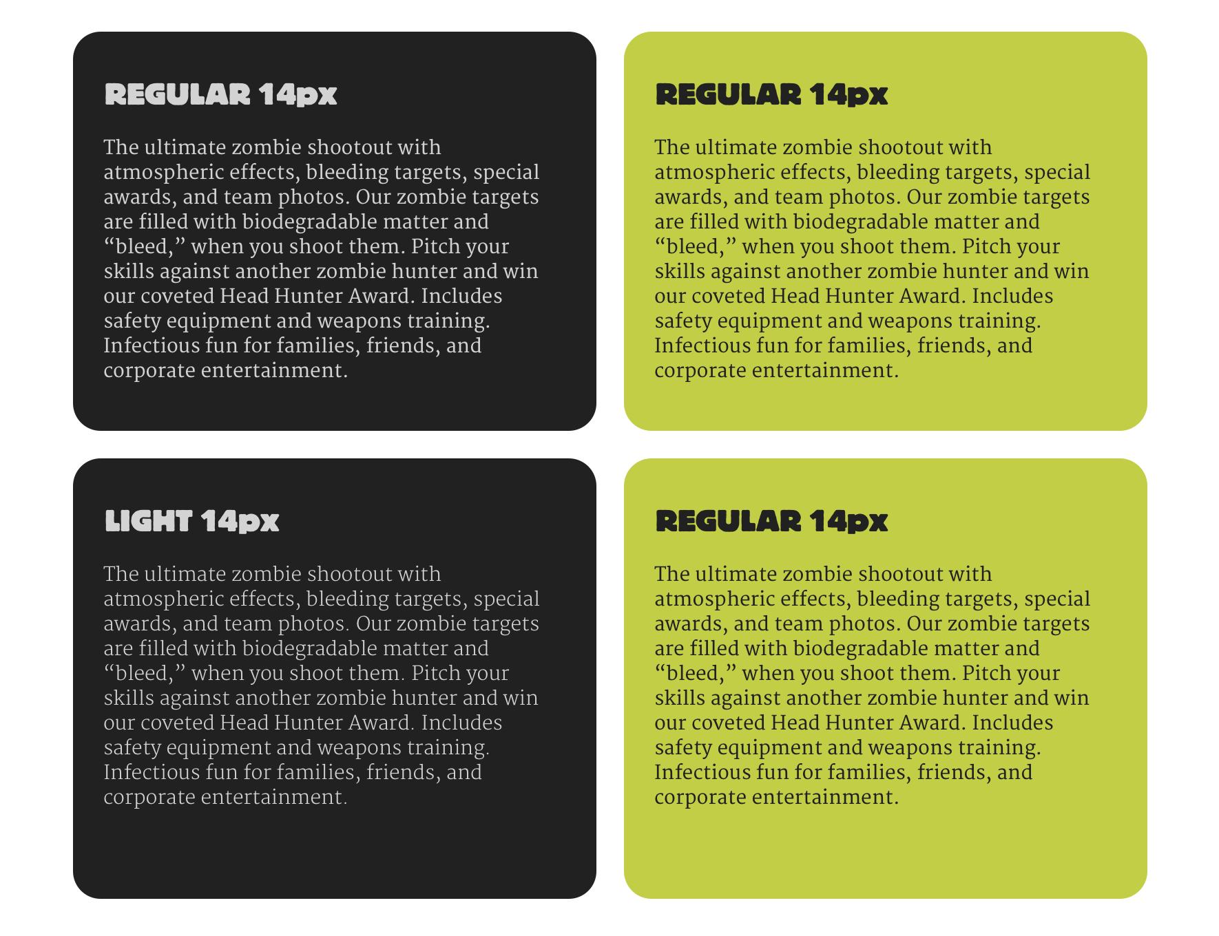
Light text against a dark background has a higher optical contrast and tends to be trickier and more tiring to read. Fortunately, there are typographic techniques to reduce this contrast which can improve legibility and readability.
Lighter weights open up the letterforms, so they appear further apart. When a typeface has a lightweight option, I often use that for dark theme designs while staying with a regular weight for light themes.
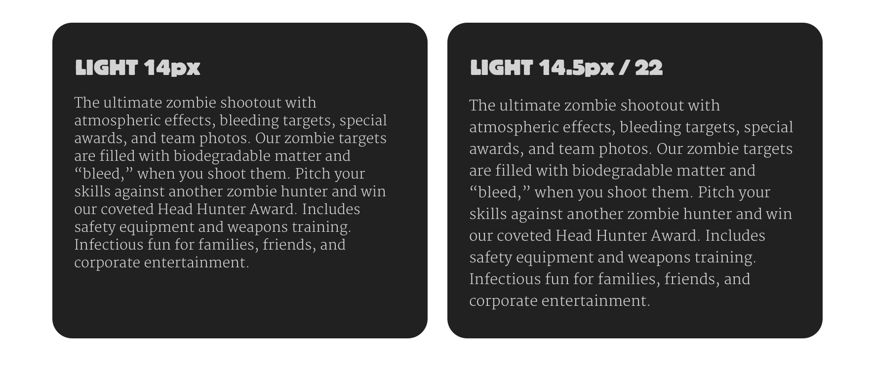
I also frequently increase the size of small text in dark theme designs, for example, by increasing 14px to 14.5px, 15px, or 16px, depending on the typeface.
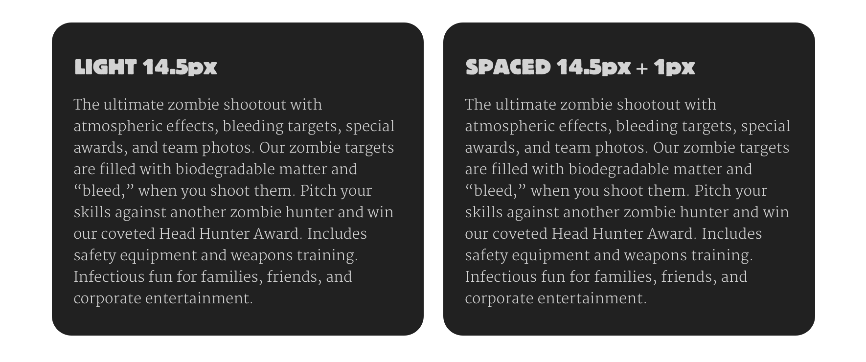
Some typefaces also benefit from increasing the space between letterforms (tracking) and are made more legible by reducing the contrast in a dark theme design.
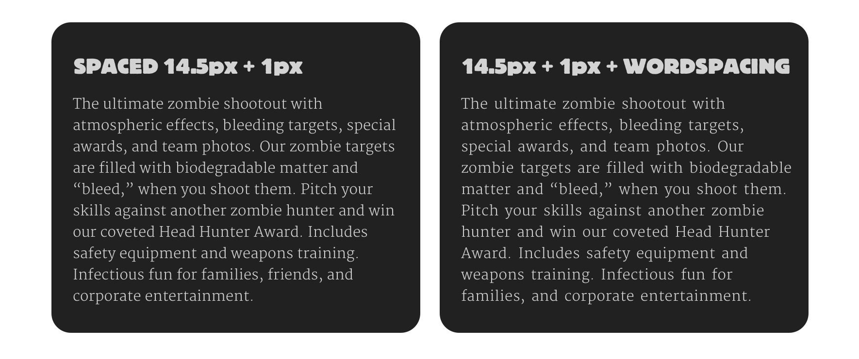
With many wider typeface designs, I also experiment by adding a tiny amount of extra word spacing, which can make a massive difference in contrast and make a passage of running text more readable.
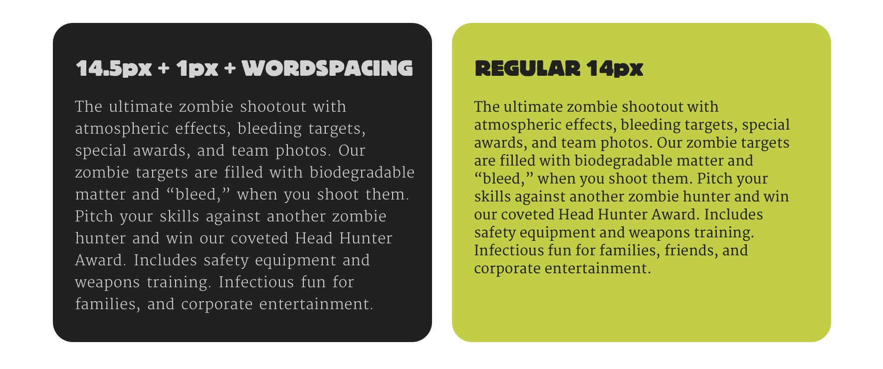
I find it fascinating how typography changes between dark and light theme designs. Like almost every aspect of typographic design, there are no hard and fast rules for adjusting type across themes, and many choices depend on the typeface you’re working with. So, it’s crucial to compare typography between dark and light themes and make adjustments until the design feels right.
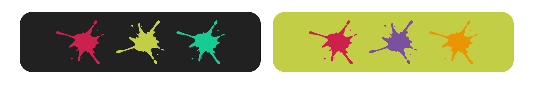
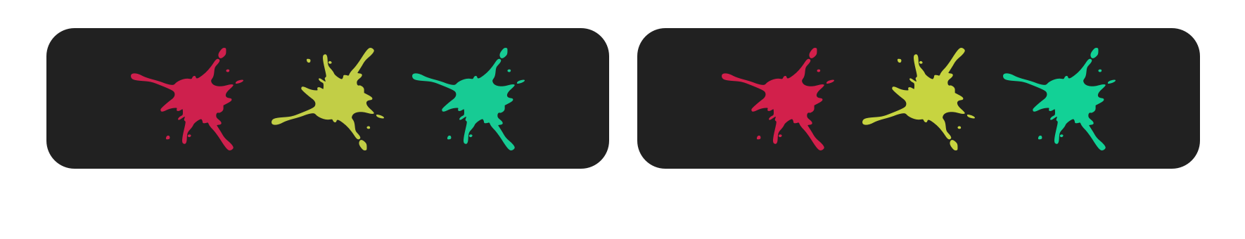
Colours within graphical elements can also be adjusted slightly or changed entirely between dark and light themes.
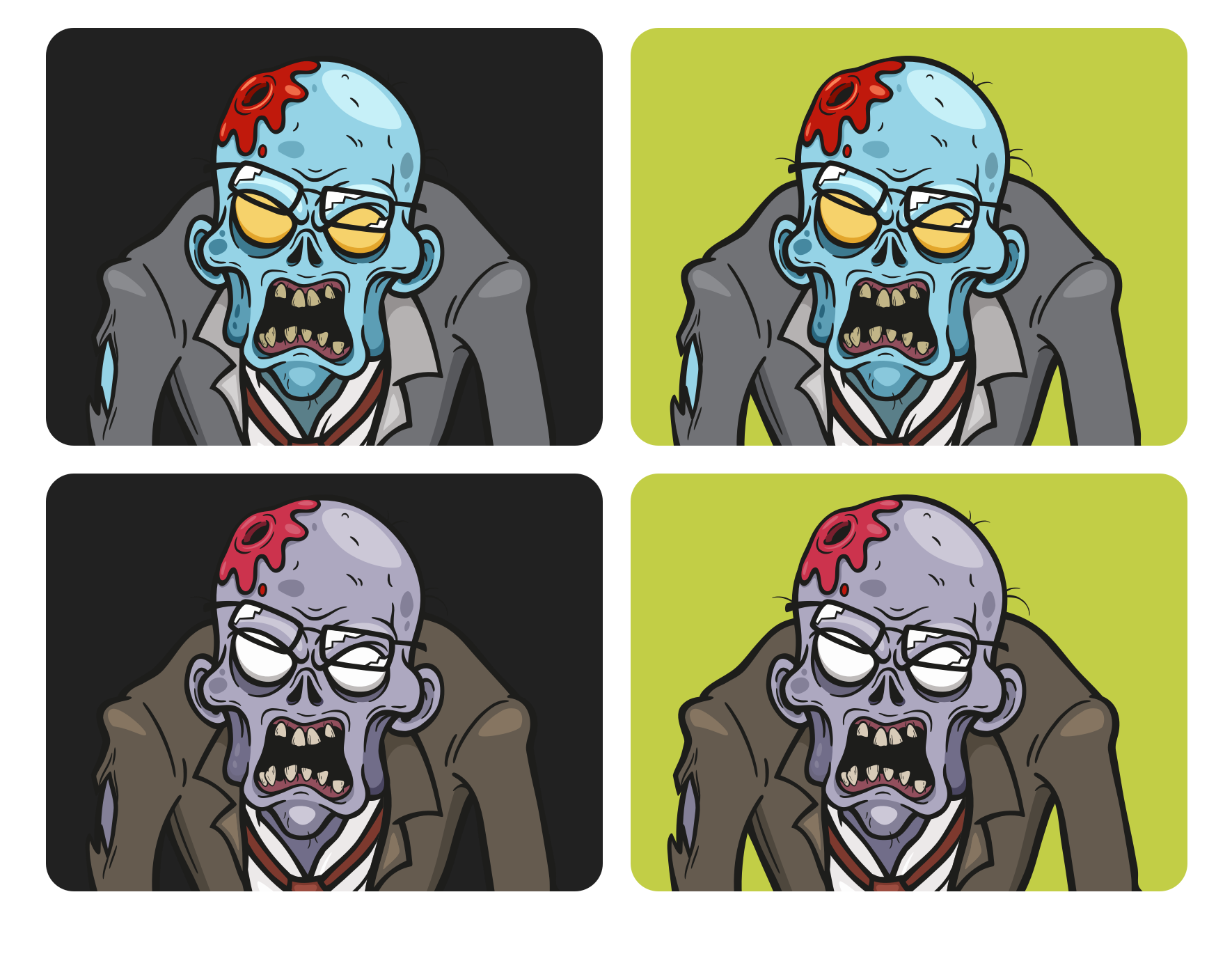
When SVG images are placed inline into the HTML, their fill and stroke colours be adjusted using CSS. For Zombie Hunt, I developed a palette of colours with similar saturation and lightness values, which worked against several background colours and felt integral to my design.
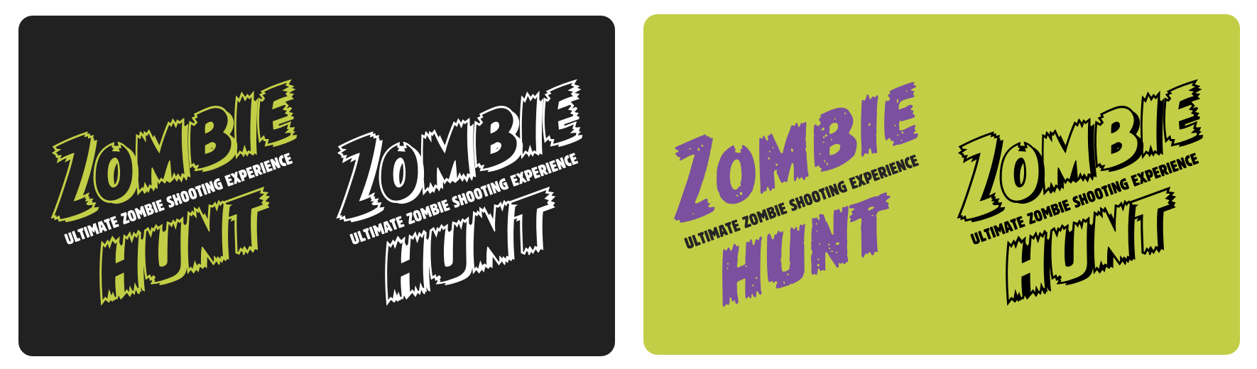
Finally, during the process of creating Zombie Hunt’s light theme, I noticed the outline version of John Roshell’s CC Monster Mash typeface— which I’d used for the Zombie Hunt logotype— became lost against the lighter background. So, I used it only for the dark theme and switched to its regular “worn” version in my light theme.
Creating multiple themes has become one of my favourite parts of working on a project like Zombie Hunt because it provides another aspect of design where I can be creative. It also satisfies my often obsessive need to pay attention to the smallest details while making a massive difference to a design.
A premium Eleventy starter kit for designers and developers who want to spend less time setting up the same project structure and more time designing distinctive websites.
Contract Killer is plain and simple and there’s no legal jargon. It’s customisable to suit your business and has been used on countless web projects since 2008.
Free compound grid and modular grid layout generators, plus a set of HTML/CSS layout templates you can call on to make more interesting layouts, available to buy.