Redesigning your product and website for dark mode
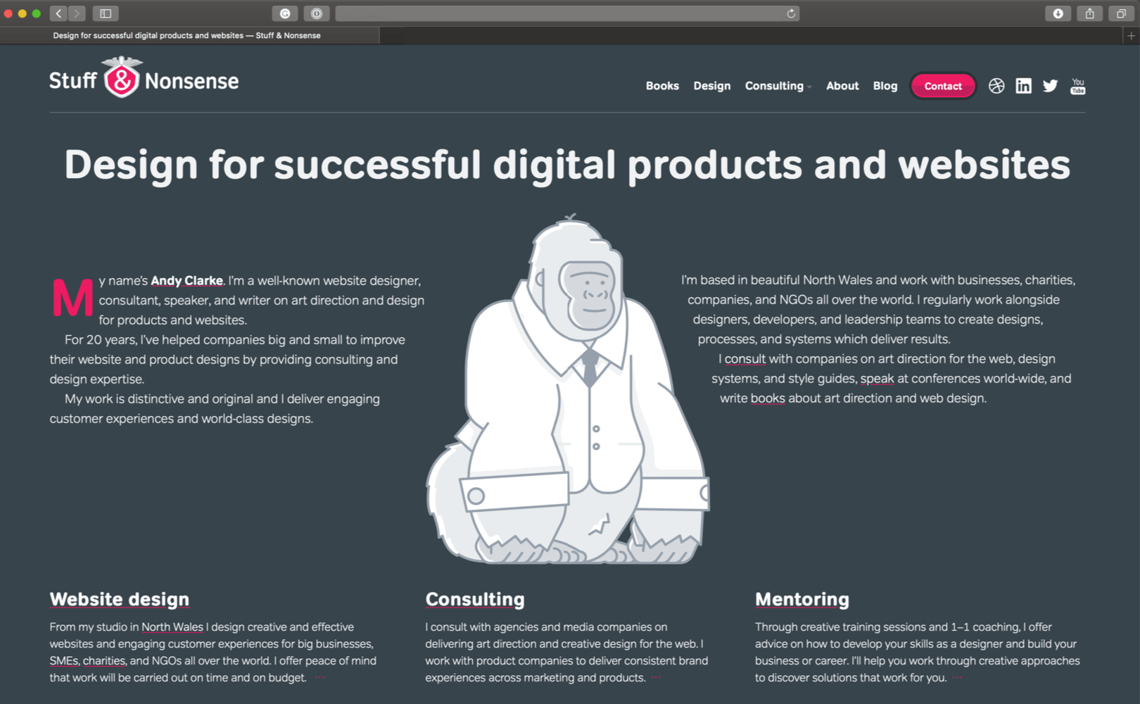
If, on the off chance: You’re reading this entry using Safari Technology Preview 68, and You’ve already upgraded your MacOS to Mojave 10.14, and You’ve selected Dark appearance in System Preferences You’ll have noticed that I’ve implemented a brand new dark mode version of my website.
Implementing dark mode is easy, but designing for it is less so. Here are some things you should consider when designing a dark mode version of your product or website to ensure you maintain accessibility and readability, and a consistent feel for your brand between Light and Dark.
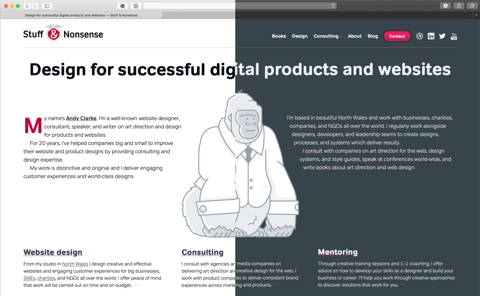
Like plenty of other people, I’ve used darker themes in my text editors for years because I find them easier on the eye when working for long periods. I was excited to try MacOS Mojave’s new dark mode feature when it launched last month.
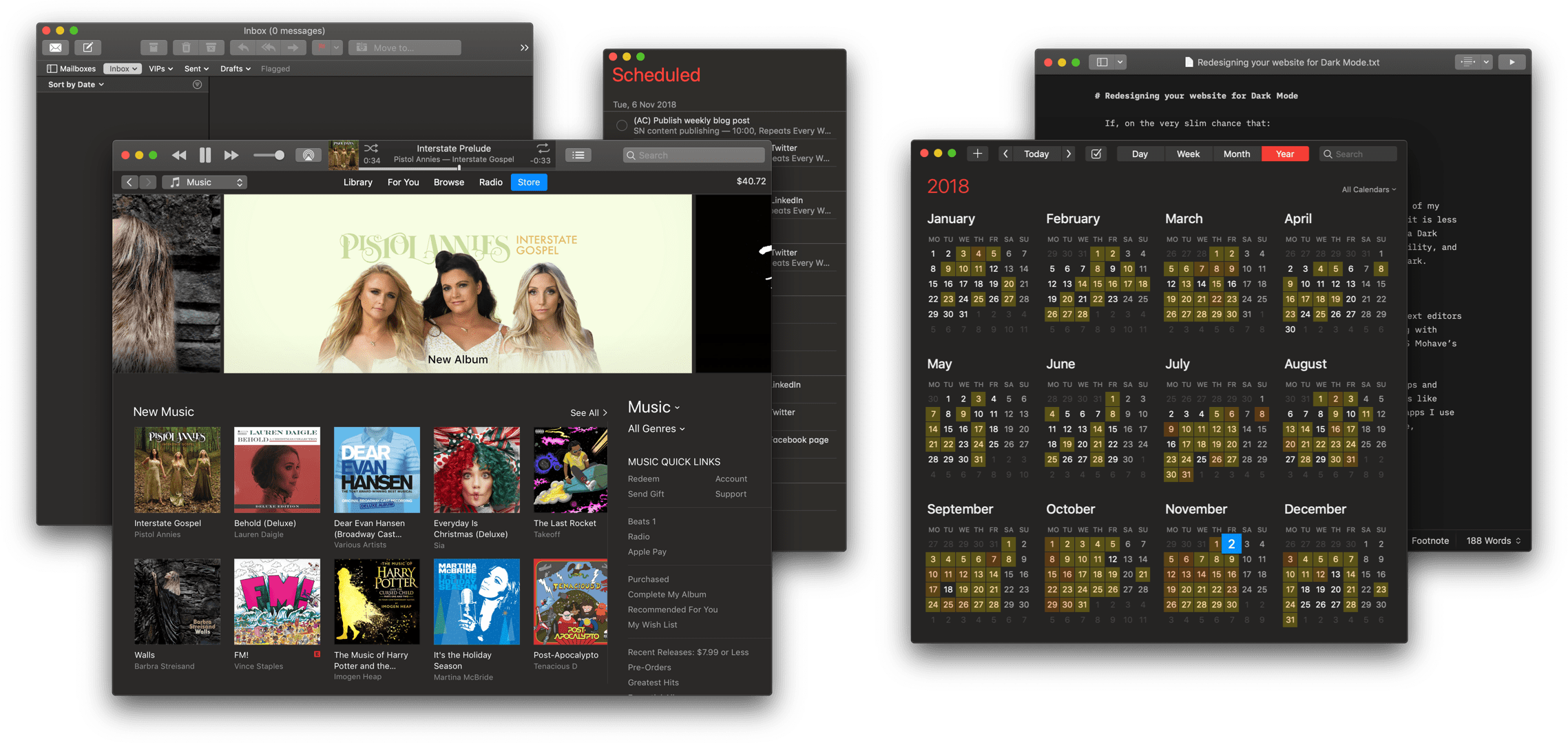
Dark mode is definitely a feature designed first for native apps and Apple have done a fabulous job of updating built-in apps like Mail, iTunes, and Reminders with their recommended AppKit dark mode colours. Many third-party developers of apps like Fantastical, iA Writer, and Sketch have also been quick to update and some have chosen their own palette of dark colours.
There’s no one true dark colour
Apple has their own set of dark mode colours in AppKit. The colours in their palette are darker for backgrounds and lighter for foreground elements including toolbars. Using a feature called ‘Desktop Tinting,’ the look of Apple’s dark mode colours also changes depending on which Accent colour you choose in System Preferences.
Pick any colour other than Graphite and colours are tinted by your desktop picture. As Apple says, this is to “help windows blend more harmoniously with their surrounding content.” If you’re not one for harmony, the only way to disable Desktop Tinting is to choose Graphite as your accent colour.
Implementing dark mode on products and websites
Implementing a dark mode version is an obvious choice for native apps, but the case for dark products and especially websites is less clear. If you choose to do it, there’s a Level 5 Media Query now making its way through the standards process which detects whether someone has set their operating system to either light or dark mode:
@media (prefers-color-scheme: dark) {
/* dark mode styles */ }
There are three values to choose from:
no-preference: Someone hasn’t expressed a preference. Obviously.light: Someone has selected a light themedark: Someone has selected a dark theme
prefers-color-scheme is part of a suite of preference media query options including prefers-contrast, prefers-reduced-motion, and prefers-reduced-transparency.
NB: As I write this in November 2018, prefers-color-scheme has been implemented only in Safari Technology Preview 68, but is part of the standards process and not a proprietary property. You can use it today and when Apple updates mainstream Safari, and Chrome and Firefox implement prefers-color-scheme in the future, people using those browsers will also see your dark mode designs.
CSS Custom Properties
Custom Properties are ideal for working with prefers-color-scheme as they make switching modes with just a few lines of CSS possible. First, I defined my colour values for all non-dark modes (including browsers and operating systems which don’t support prefers-color-scheme:
:root {
--color-background: #ffffff;
--color-border: #cacfd5;
--color-text-default: #0b1016;
--color-base: #f4f5f6;
--color-accent: #ba0d37; }
I then defined a set of alternative colours for dark mode:
@media (prefers-color-scheme: dark) {
:root {
--color-background: #38444c;
--color-border: #697278;
--color-text-default: #f0f2f3;
--color-base: #293238;
--color-accent: #ec1a62; }
}
Of course, you might make changes for dark mode on your product or website which extend beyond simply changing colours. As prefers-color-scheme is a property of a media query, you could change any and all aspects of your design if you wanted to. Frankly, I doubt you’d want to change its layout, but you should consider altering typography styles to ensure you maintain readability. (More about that in just a minute.)
Designing for dark mode
Your choice of dark mode colours will depend on three criteria:
- Complimenting the look of other dark mode apps and your OS
- Ensuring accessibility and readability
- Maintaining your visual identity between light and dark modes
After all, your product or website design should reflect your brand no matter which mode someone prefers.
Choosing colours
Deciding on the colours you use for dark mode involves more than simply inverting them, making white backgrounds black, and black text white. Pure white text on full black backgrounds makes reading long passages of text tiring for the eye.
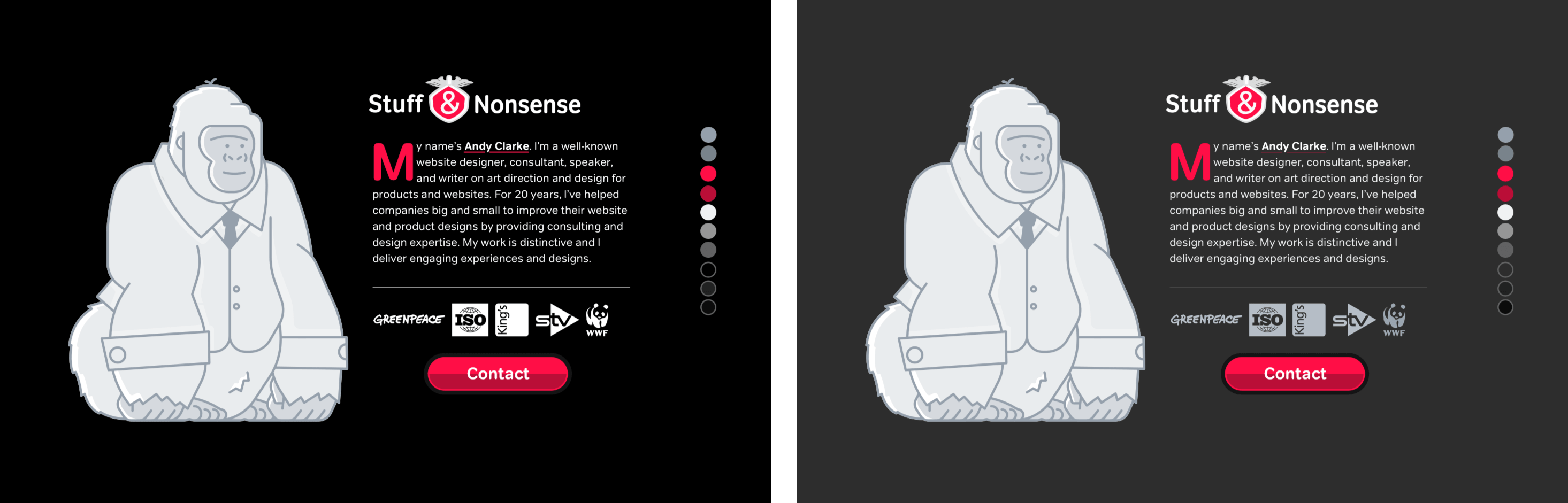
Apple chose “dark lines to create visual separations between views” in both light and dark modes. You may choose to follow their lead, or you might use lighter lines if they fit better with your visual identity.
If you absolutely must go back to black, consider reducing contrast by softening one or both colours and using a slightly off-white for running text and/or a dark grey background instead.
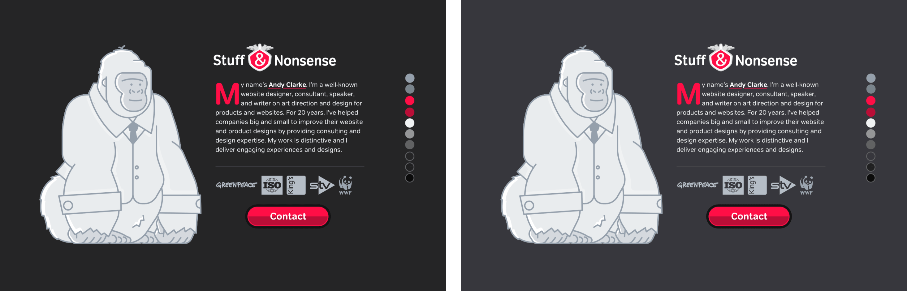
Maintaining your visual identity between light and dark modes is as important as complimenting the look of other dark mode apps. When you want your brand to be connected across light and dark designs, choose darker shades from the same palette of neutral colours for both. (My technique using multiple background fills and blending modes in Sketch can be especially useful for this.)
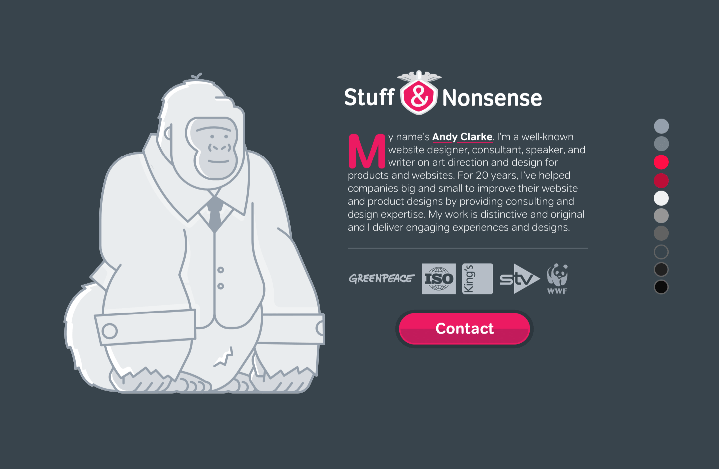
Somehow, none of the previous palettes suits Stuff & Nonsense, so my dark mode design uses a blue/green grey (#38444c) for the background. I created this colour by multiplying one grey from my gorilla illustration.
Colour contrast and accessibility
You should always consider accessibility and ensuring sufficient colour contrast while designing. This is especially important when lowering contrast to improve readability and I find Lea Verou’s contrast ratio calculator invaluable. Checking colour contrast while you’re designing will often save potential problems caused by considering accessibility only later on in your process.
Typography
Designing for dark mode shouldn’t stop with choosing darker colours. You should also consider altering typography styles to maintain readability for people who use dark mode. Light text against dark backgrounds appears higher in contrast than when the same colours are used in reverse, so to make your dark mode designs easier to read you’ll need to add more white/dark space to your text.
If your fonts offer a lighter weight, using that for your dark mode design will open up the letterforms and make them appear further apart:
p {
font-family: var(--font-family); }
@media (prefers-color-scheme: dark) {
p {
font-family: var(--font-family-light); }
}
Increasing leading in paragraphs of running text will also improve legibility. For example, if text in your light design has a line-height of 1.5, increase that to 1.7 for your dark mode design:
p {
line-height: 1.5; }
@media (prefers-color-scheme: dark) {
p {
line-height: 1.7; }
}
Another simple, but effective way to make your text more readable against dark backgrounds is to increase the space between words (tracking). You won’t want to go too far, just a tiny amount of extra space can make a huge difference:
@media (prefers-color-scheme: dark) {
p {
word-spacing: .05em; }
}
More dark mode considerations
Implementing alternative colours and typography for a dark mode design is a straightforward process, but even so my implementation for Stuff & Nonsense isn’t perfect, yet. I have no idea why I embedded drop shadows into my portfolio images instead of using a CSS filter, but over the next week I’ll remove those bitmap shadows and replace them with:
.mechagodzilla img {
filter: drop-shadow(0 2px 4px #969696); }
@media (prefers-color-scheme: dark) {
.mechagodzilla img {
filter: drop-shadow(0 2px 4px #0b0b0b); }
}
For the very few people using Safari Technology Preview 68 on MacOS Mojave 10.14 today, spending time on a dark mode design might seem like a luxury—and it was—however I expect prefers-color-scheme to come to other browsers, and especially to iOS soon, so maybe it will be a worthwhile investment.
Further reading
- Apple Human Interface Guidelines dark mode
- Paul Miller: Using dark mode in CSS with MacOS Mojave
- Bug Mozilla to add support for CSS prefers-color-scheme
- Can I Use prefers-
- Media Queries Level 5 (prefers-color-scheme)
- Safari Technology Preview Adds dark mode CSS
November 2, 2018 • Andy Clarke • css • design