Eleventy in a Box
A premium Eleventy starter kit for designers and developers who want to spend less time setting up the same project structure and more time designing distinctive websites.
Two weeks ago, I took a week—away from work on Nozomi Networks—and spent some time working on a redesign for Zombie Hunt. The team are franchising their successful business and needed a new design to attract customers and potential franchisees.
Here’s a link to the completed website.
Over the next week, I’m going to show you my process and the decisions I make when I work on a project like this. Starting today, with how I make colour palettes.
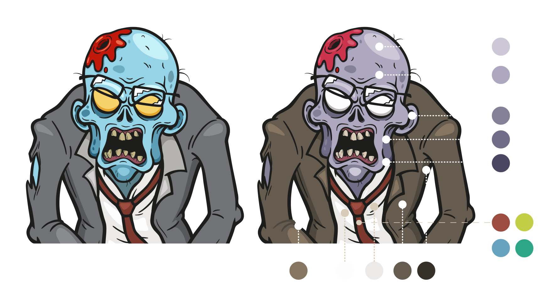
The team at Zombie Hunt had already made certain choices about colour. The page backgrounds were pure black and text was pure white. Their branding was near-primary red and green, and the website was filled with camouflage-coloured graphics and icons.
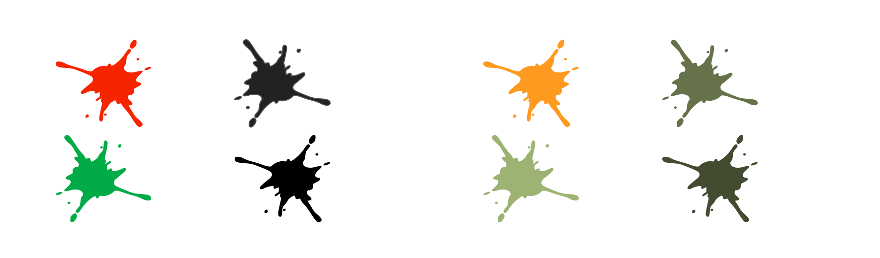
I understood what they were hoping to achieve with their colour choices, but they’d left plenty of room for improvement. Black (0% brightness) and white (100% brightness) have the highest contrast, making the text more difficult to read and even causing eye strain over long periods. The near-primary red and its complementary green—two colours opposite one another on the colour wheel—created uncomfortable vibrations when placed next to each other.
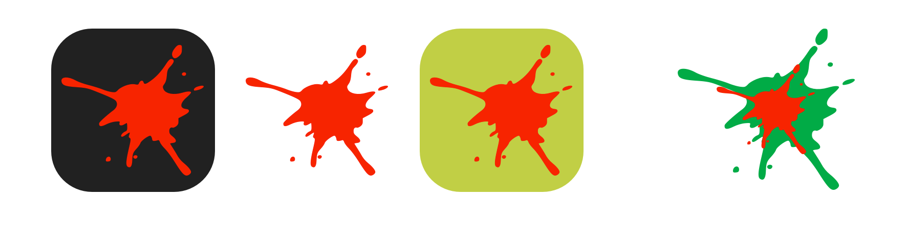
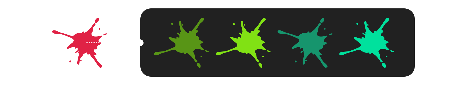
I needed to find an alternative red on which to base all my colour decisions, so I chose one analogous to the original. Analogous colours are three colours which are adjacent on the colour wheel. My new red (R224 G11 B69) contains blue and a hint of green. It’s 91% saturated and has 46% lightness (H344 S91 L46), making it more adaptable against various background colours.
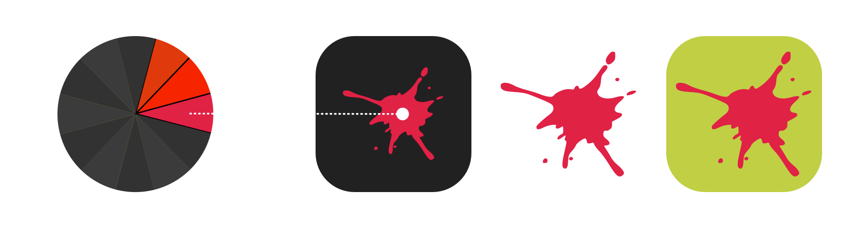
Maybe you’re as surprised as I was to learn that the colour wheel— the basis of all colour theory and is used to define relationships between colours—was invented by none other than Sir Isaac Newton of falling apple fame. Those relationships include:
Unless I aim for a very high impact in a design, I mostly avoid using pure complementary colours as they often make creating a broader palette of colours tricky.
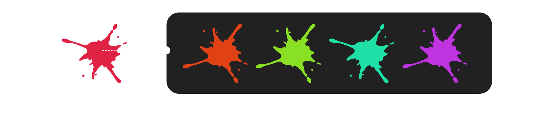
Whereas a split complementary palette provides a more flexible choice of colours which feel easier on the eye.
A double split complementary palette offers even more options for harmonious colours.
And, a triadic palette—where colours are spaced evenly around the wheel—offers a range of hues which all feel connected to the base colour.
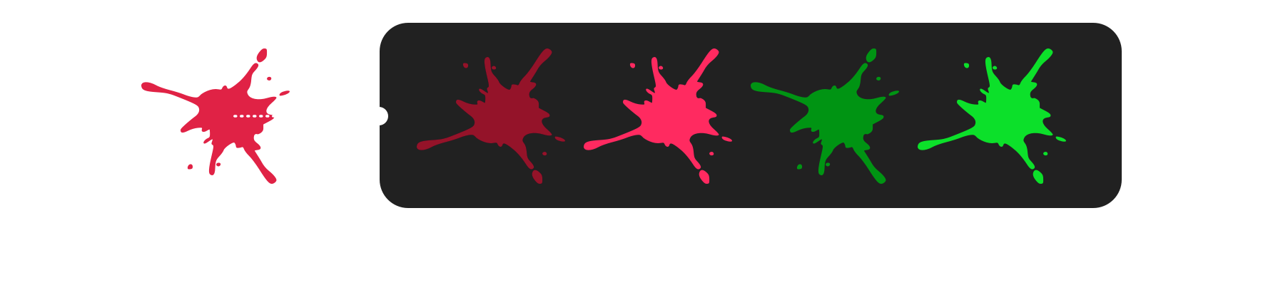
The mathematics of colour theory is only the starting point of colour design. The end result often comes from experience, intuition, and what feels right. I learned a long time ago that although there’s a definite science to the relationships between colours, there are no rules for how you can combine them. I regularly choose some colours from a split or double split combinations and combine them with other colours from triadic combinations.
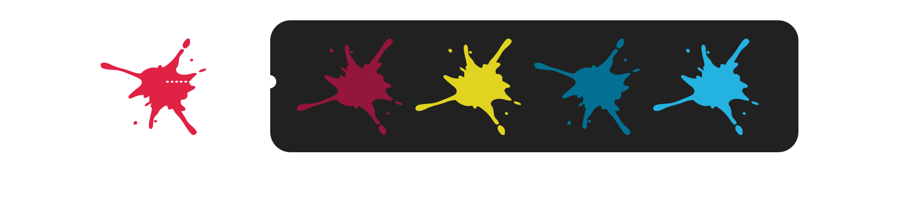
My choice of three colours for the Zombie Hunt design felt right, but they still seemed too vibrant for the look I was aiming for. As I mentioned, colour theory is a starting point, not a set of hard and fast rules, so I desaturated those colours to make them feel better.
I then used the desaturated yellow to develop a small set of extra accent colours, which I could use sparingly across my design.

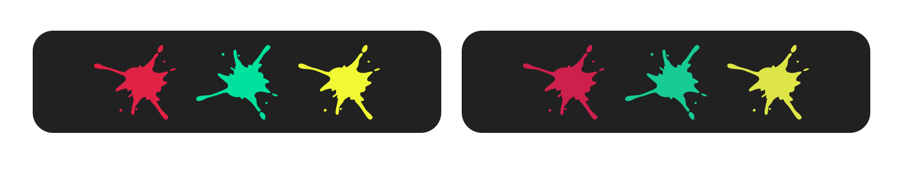
Even though colour theory gives me a firm basis for colour design, I often rely on a bit of intuition to get the precise colours I need. The theory had helped me decide on a desaturated yellow for the new Zombie Hunt design; somehow, it still didn’t feel right. So, I experimented with combining the green from my double split complementary palette with the yellow from my triadic palette and found that a screen blending mode gave me the colour I was looking for.

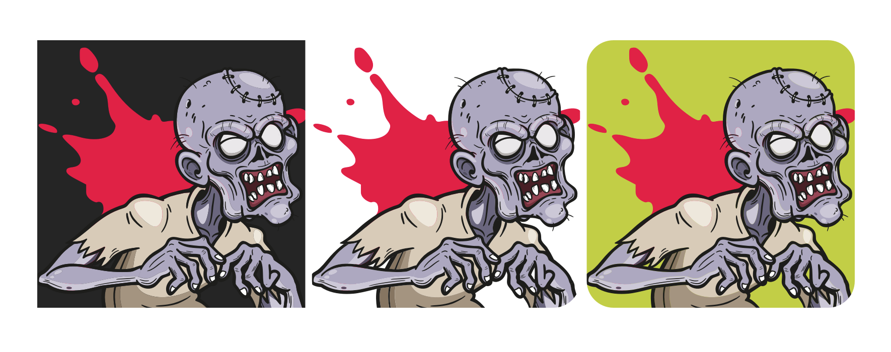
To save money and time on the project, the team at Zombie hunt and I decided to launch the new design using illustrations from a stock library. We found a style we all enjoyed, but the colouring of these illustrations troubled me as they felt out of step with the rest of my design. So, I developed a palette of new colours and created tints by adjusting their lightnesses.
These extra colours—together with my freshly designed colour palette of red, green, and yellow, gave me a broad range of harmonious colours that feel like they belong together.
I’ve always believed that considering accessibility should be part of the design process alongside intuition and theory. It also shouldn’t be a consideration we test at the end of the process, but instead should be an aspect we consider from the beginning of a design.
There are plenty of tools available online to help ensure that colour choices remain accessible and, at the very least, have sufficient contrast between colours. The Institute for Disability Research, Policy, and Practice (WebAIM) has its own popular tool, although I prefer Alex Clapperton’s Colour Contrast Checker and Lea Verou’s Contrast Ratio Checker.
| Background colour | Foreground colour | Colour contrast | Ratio |
|---|---|---|---|
| Page: #262626 | Text: #d3d3d3 | AAA (all sizes) | 10.1:1 |
| Page: #262626 | Link text: #c2cc46 | AAA (all sizes) | 8.66:1 |
| Buttons: #c2cc46 | Link text: #262626 | AAA (all sizes) | 8.66:1 |
| Background colour | Foreground colour | Colour contrast | Ratio |
|---|---|---|---|
| Page: #c2ce46 | Text: #262626 | AAA (all sizes) | 8.79:1 |
| Page: #c2ce46 | Link text: #7b509f | AA (large) | 3.49:1 |
| Buttons: #7b509f | Link text: #f9a61a | AA (large) | 3:1 |
Having checked the contrast between background and foreground colours in my design’s dark and light themes—and even though my light theme has lower contrast that its dark counterpart for buttons and link text—I was happy with my choices.
Throughout the rest of this week, I’ll write more about my process and many other decisions I make when I work on projects like Zombie Hunt. So, stay tuned for the next instalment.
A premium Eleventy starter kit for designers and developers who want to spend less time setting up the same project structure and more time designing distinctive websites.
Contract Killer is plain and simple and there’s no legal jargon. It’s customisable to suit your business and has been used on countless web projects since 2008.
Free compound grid and modular grid layout generators, plus a set of HTML/CSS layout templates you can call on to make more interesting layouts, available to buy.