Thrilled to work on Worrysome
Although I don’t get to do it as often as I’d like, I enjoy working with startups. So, I was thrilled to be asked to work on a website design for Worrysome, a new business which aims to take the worry out of worrying.

Worrysome has a unique proposition and business model. Everyone knows that worrying doesn’t stop bad things from happening. So, instead of worrying about climate change, dieting, getting old, or job security, pay someone else to worry for you.
For just £2.99 per month per worry, they worry about everything from ageing to the rise of artificial intelligence, from climate change to crime, and from Brexit to being perfect. You receive a Worrysome certificate to print and hang on your wall, letting you know you can stop worrying and get on with your life.
Typeface choices
As a start-up, Worrysome has no brand guidelines or visual identity, so I spent time with Rolf Spolia—Worrysome’s Head of Marketing—to discuss the company’s ideas for their brand values. Rolf and Lila Proofs—their Head of Product—wanted an approachable, friendly design. I chose two typefaces for their design. “Obviously” by OH no Type Co.’s James Edmondson for headlines and body copy. “Shelby” by Laura Worthington as my accent typeface and for the Worrysome logotype. While these fonts are currently served via Adobe Typekit, there are plans to self-host them as the site develops.
Colour palette
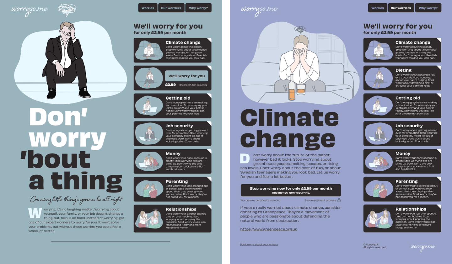
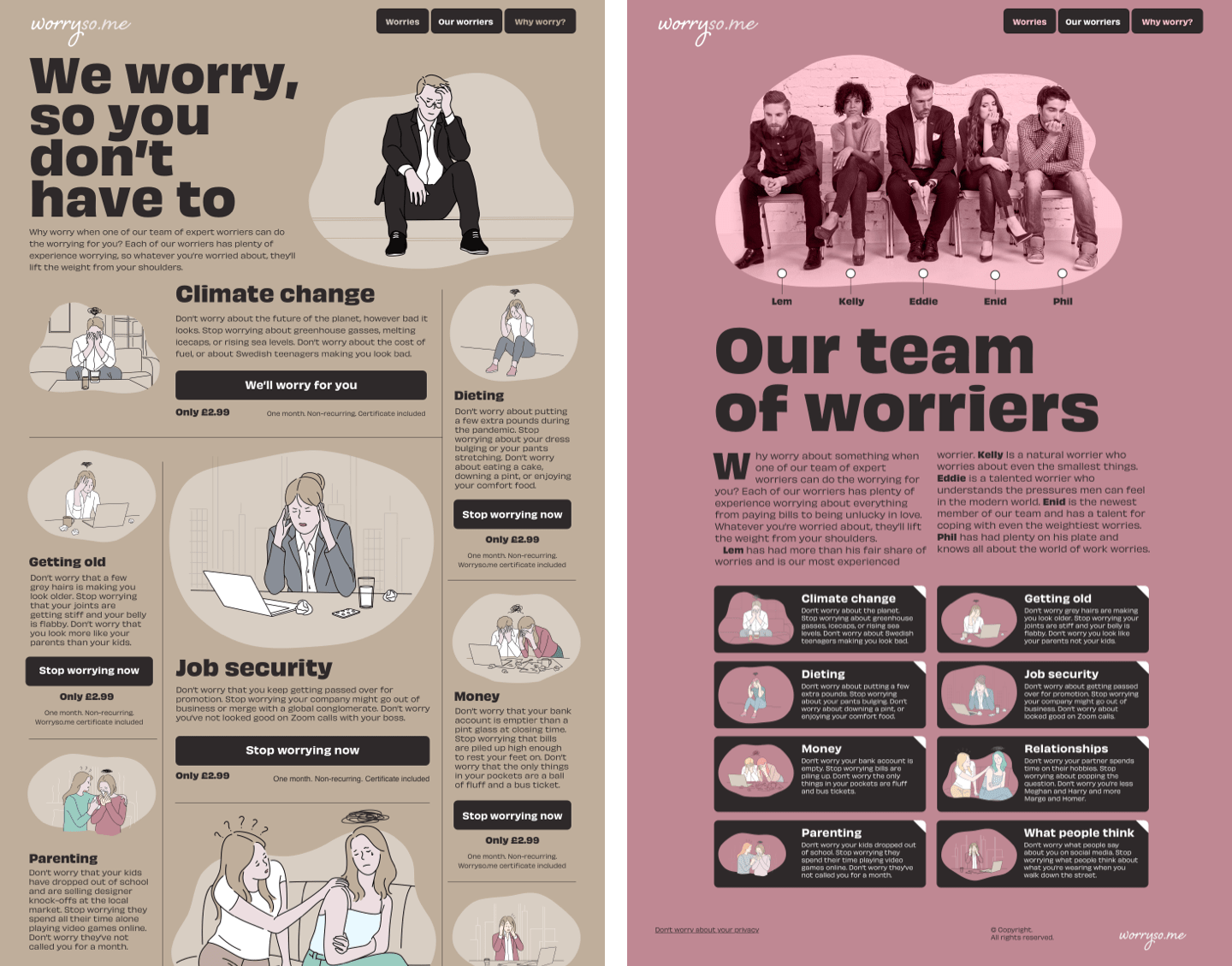
I opted for a muted pastel palette of colours for this design. Starting with the blue used on the home page, I calculated a set of split complementary colours and use them across the Worrysome website.

Illustrations and SVG
I based the Worrysome design around illustrations—which can be themed to match the website’s colour palette—and commissioned Italian Australian illustrator Flori Alsop. Just as I’d done with the vector illustrations for Stuff & Nonsense, I took the SVG files Flori delivered, optimised them using Jake Archibald’s SVGOMG! online tool, then added class attributes to individual paths.

This enables me to adjust the colour of their fills to match the different theme colours:
<svg>
<path class="illustration-col-theme">…</path>
</svg>

[data-theme="theme-blue"] .illustration-col-theme {
fill: rgb(154, 180, 190); }

[data-theme="theme-brown"] .illustration-col-theme {
fill: rgb(191, 174, 155); }

[data-theme="theme-green"] .illustration-col-theme {
fill: rgb(164, 195, 187); }

[data-theme="theme-pink"] .illustration-col-theme {
fill: rgb(191, 136, 147); }
Layout grids
As this project came hot on the heels of my design for Stuff & Nonsense, my familiarity with a 4+5 compound grid tempted me to use it again. I needn’t have worried the two designs would look too similar as this grid is flexible and offers countless layout variations.

There’s the familiar asymmetrical two-column layout on the home page, two even columns from the four-column grid on the team page, and the much more elaborate modular grid for the worrying topics.
They worry, so you don’t have to
Paying someone to worry for you may seem like a strange concept. But while we were designing and developing their new website, one of their team worried about Getting fat for me and it worked. Of course, I didn’t lose any weight, but I wasn’t worried about eating burgers, donuts, or ice cream for the entire month. Taking worries like that off my shoulders is well worth the £2.99 per month they’re asking.
And if you believe that, you really are an April fool.