Stuffed with layout options: Using a 4+5 compound grid
A generation of product and website designers has grown up with 12 or 16 column grids from Bootstrap-style frameworks. In those frameworks, columns are used mostly for aligning content. In my new design for Stuff & Nonsense, I wanted to go beyond that and use a compound grid to influence the entire design.

When you use grids imaginatively, they do much, much more than align content. A grid brings cohesion to a composition. It helps people understand the stories you’re telling by suggesting hierarchies. Grids inform people what to read first, then next, and how much attention to give it. They define the position of valuable information or a call to action. A thoughtfully chosen grid leads to a wealth of possibilities and any number of exciting designs.
Compound grids
A compound grid is two or more grids of any type—column, modular, symmetrical, and asymmetrical—on one page. They can occupy separate areas or overlap. The interplay of two grids makes a compound layout more interesting than one grid in isolation. Compound grids offer enormous flexibility, but people rarely speak about them. After spending time experimenting with different numbers of columns, I settled on a compound grid where four columns overlap five columns. I might use widths from one or the other.
Tip: I wrote about compound grids in much more detail in my book Art Direction for the Web. Buy the e-book for £12.99.

Or I could combine widths from both to form columns that don’t conform to either. Seeing how the two grids interact makes this much clearer.

Overlapping a 4-column grid and 5-column grid results in eight columns with four different widths. This grid has a rhythmic pattern of 6|1|4|3|3|4|1|6, which when expressed using fractional units in CSS Grid is:
[class*="grid"] {
grid-template-columns: 6fr 1fr 4fr 3fr 3fr 4fr 1fr 6fr; }
Part of the joy of designing using a compound grid like this is seeing how the unusual arrangement of columns can result in more unusual layouts than anything achievable using a 12 or 16 column framework grid.
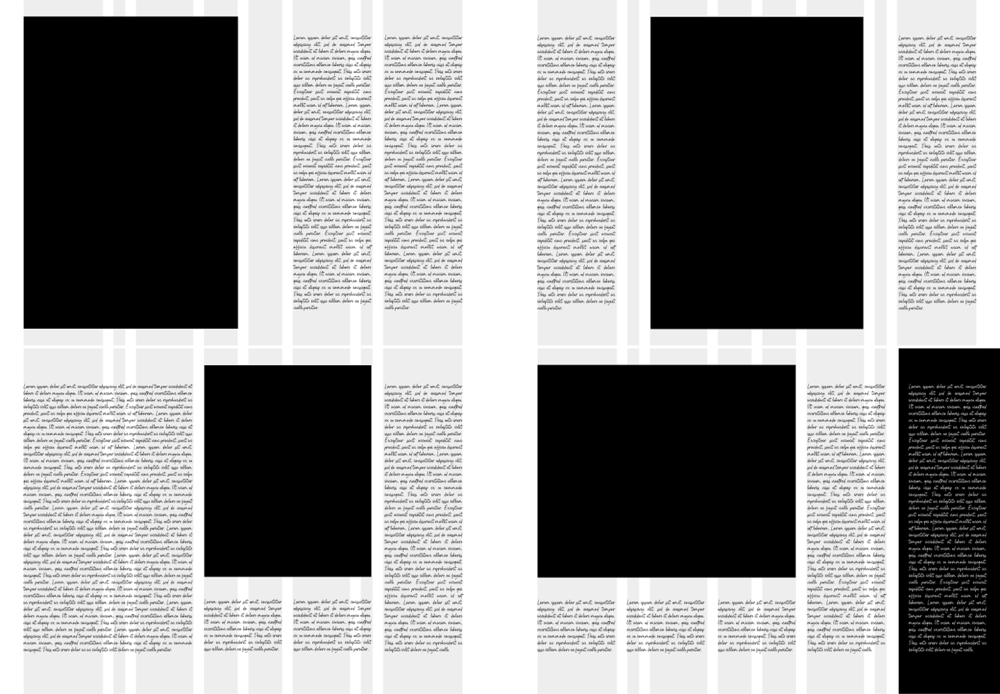
Clockwise from top-left:
- 1. A full-height image might occupy half the width. Two columns of copy are perfect for when the viewport becomes wide enough. Between them, an empty column adds whitespace to the composition.
- 2. Those same elements rearranged, placing the full-height image in the centre. The two outer columns might contain two different stories.
- 3. This composition gives a long-form article an editorial feel. Offsetting the image draws your eye down into the story.
- 4. Adding a column of reversed-out copy emphasises the distinction between two content types. CSS Grid makes implementing complex layouts more straightforward than ever before.
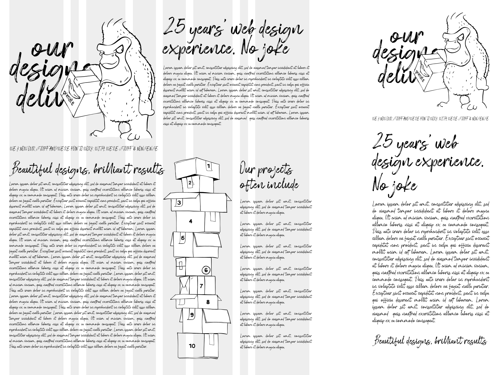
Home page composition
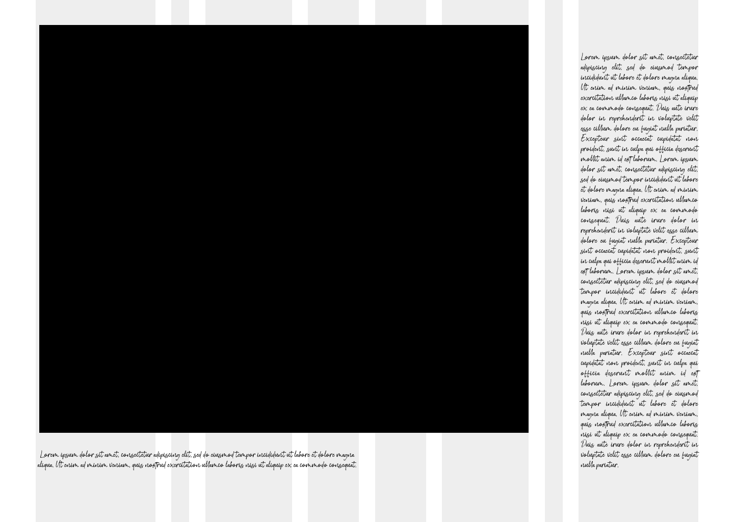
To add drama to the Stuff & Nonsense home page, I dedicated the largest amount of space to the SVG hero panel I described last week. Separated by one of my thinnest columns is a single column of copy.
My compound grid also defines widths within the SVG hero panel, including the relationship between Fast Eddie and the headline text beside him. It also determines the width of the Stuff & Nonsense logo and the size of the circle device.

Compound grids are adaptable, and at this stage of my design process, I begin to think about how I might rearrange elements on my grid at several standard screen widths.
With the compound grid still visible, it’s easy to see how this grid enforces its structure on the elements while not appearing rigid.
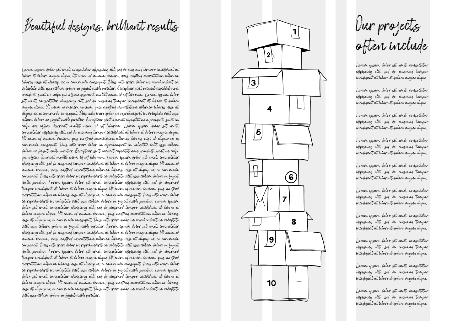
I used the same compound grid columns to inform proportions in the second section of the Stuff & Nonsense home page. Here, I reserved a tall space—made up of two columns of different widths— for an image. Using two differently-sized columns of whitespace adds to this composition’s unusual feel.
The vertical nature of this section’s layout helps emphasise the tall stack of boxes that Fast Eddie has delivered.
Compound and modular grids
A module is a rectangular or square unit of any size. Modules repeat horizontally and vertically to form a modular grid. They’re easy to work with, so it surprises me that so few web designers use modular grids. Modular grids are excellent for bringing order to large amounts of varied content, and you can also use them to create visually appealing layouts even when there’s very little content.
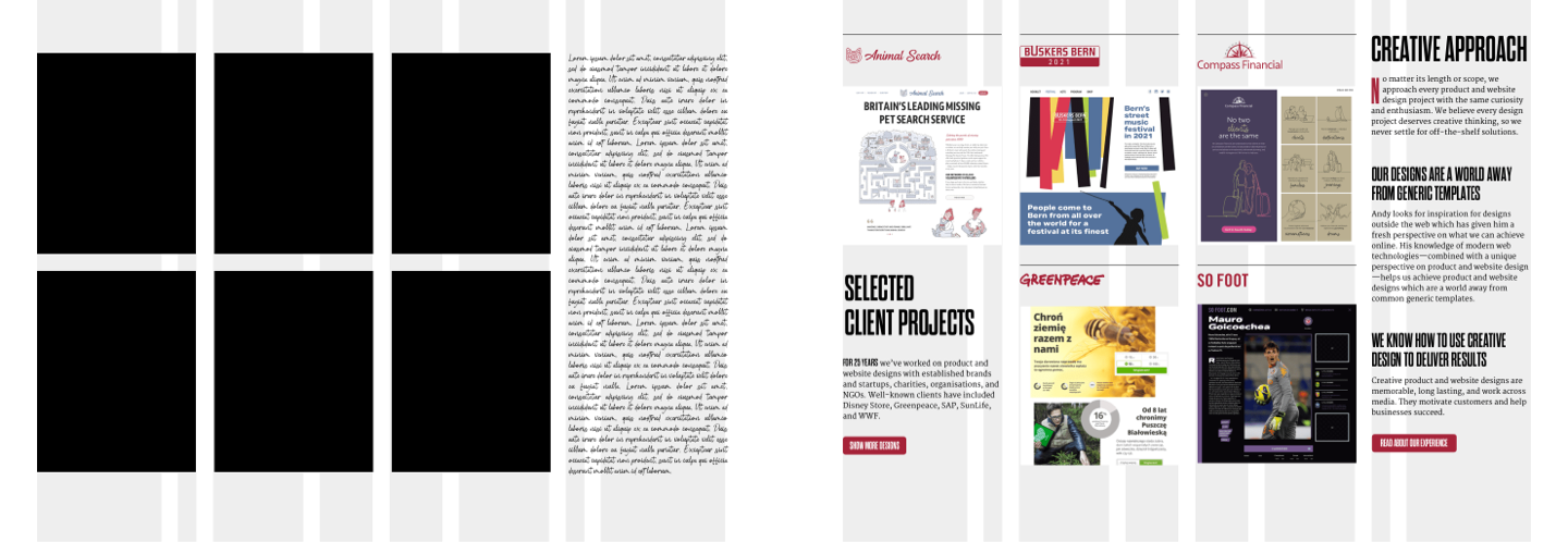
The layout of my home page’s client portfolio section is based on the same 4+5 compound grid with added modular grid components.
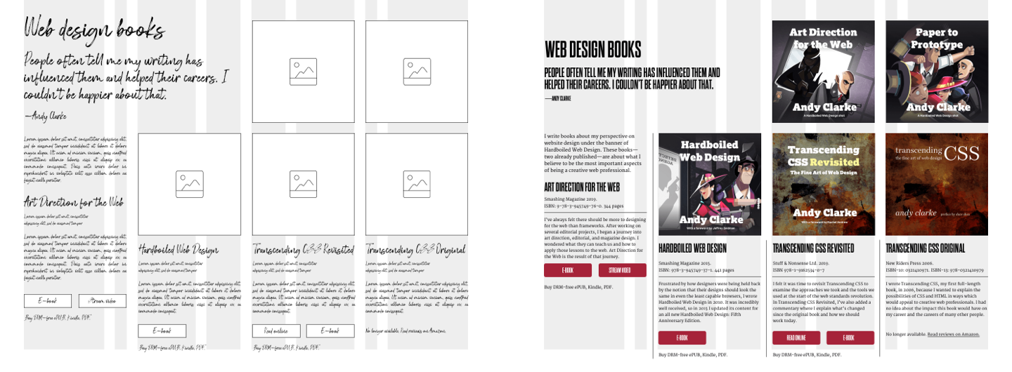
Arranging elements differently gives a very different feel to the page describing my books. This variety of pages helps to keep my design feeling fresh. By using the same compound grid, I achieve a sense of connectedness across all my pages.
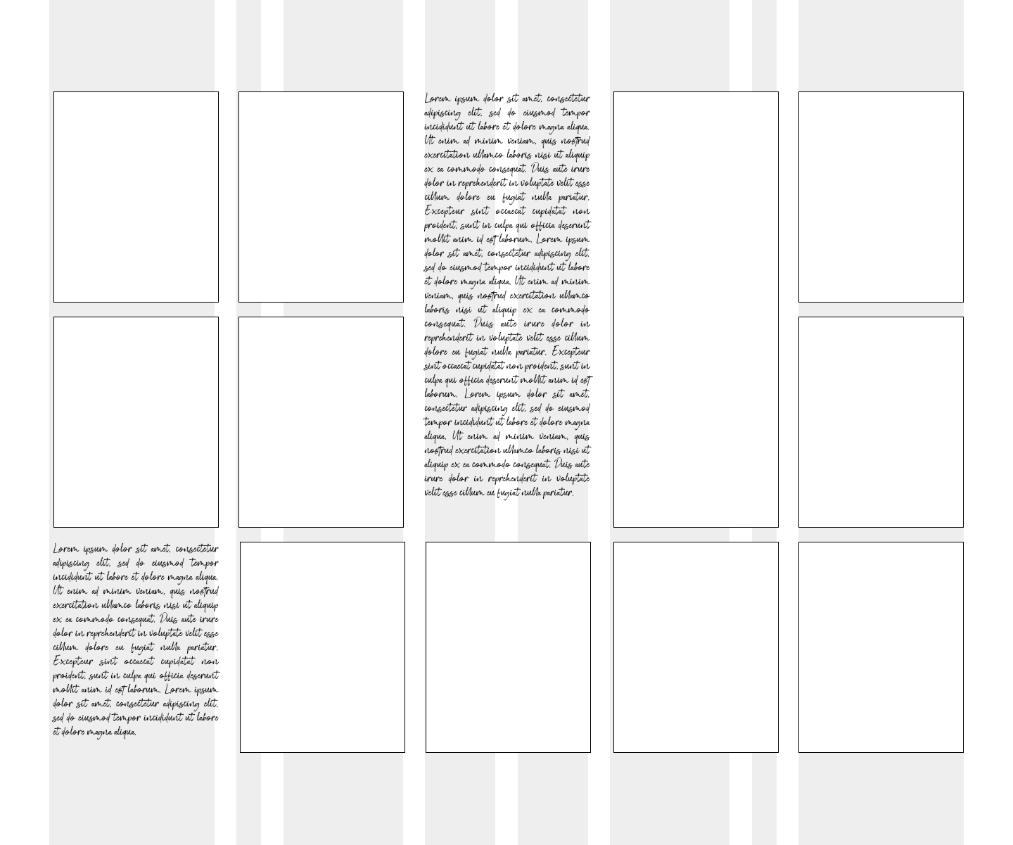
I’m still amazed at how varied layout possibilities from a compound grid can be, especially when combined with grid modules. This became even clearer to me while I was designing the various compositions across my design portfolio pages.
Although each of my portfolio entries looks and feels differently, they’re all based on the same modular 4+5 compound grid. However, this time, the compositions use columns from the 5-column grid. Grids with five columns aren’t commonly used on the web.
I based my design portfolio pages—Animal Search, Buskers Bern, Compass Financial, Greenpeace, So Foot, SunLife, and WWF— on the same 5-columns with modular grid components.
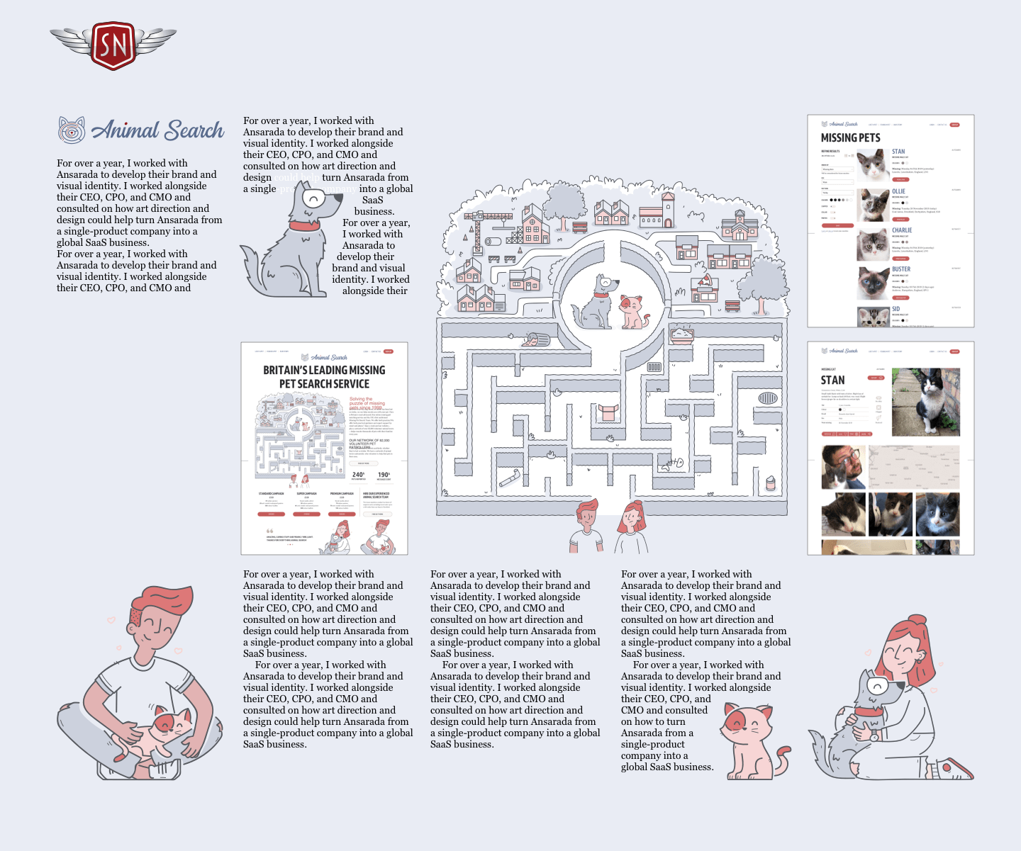
Although each of the pages are different from each other—and my other pages—the 5-column component in my compound grid helps connect them with the rest of my website.
I wrote about more about compound grids in my book Art Direction for the Web. If you like this post, why not buy the e-book for £12.99?